Data Visualization and Exploration

Welcome (back)

Recent headline

A chart showing year-to-year changes in traffic to traditional publishers from search and social media platforms.
Figure 1: Changes in internet referrals globally, in the US, and in Europe, November 2024 to November 2025. link to source article

Discuss

A chart showing year-to-year changes in traffic to traditional publishers from search and social media platforms.
Figure 2: Changes in internet referrals globally, in the US, and in Europe, November 2024 to November 2025. link to source article
  • What do you notice?
  • What do you wonder?
  • What is effective?
  • What is confusing?

How would you describe this to someone else?

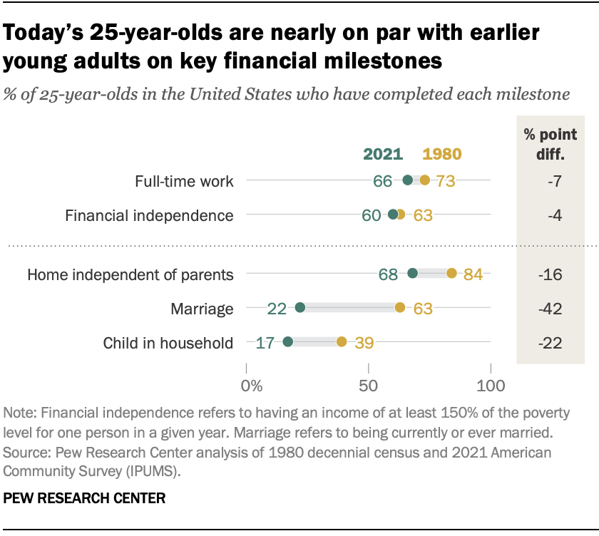
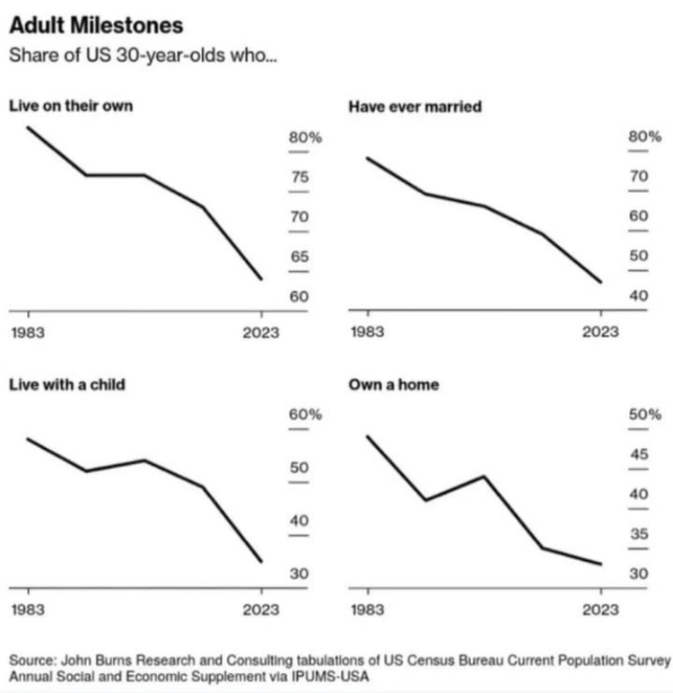
US Census Bureau “metrics of adulthood”

Discuss

  • What do you notice?
  • What do you wonder?
  • What is effective?
  • What is confusing?

How would you describe this to someone else?

Features of graphs

What did you notice about Figure 1 and Figure 3 that felt

  • familiar?
  • surprising?
  • confusing?
  • comforting?

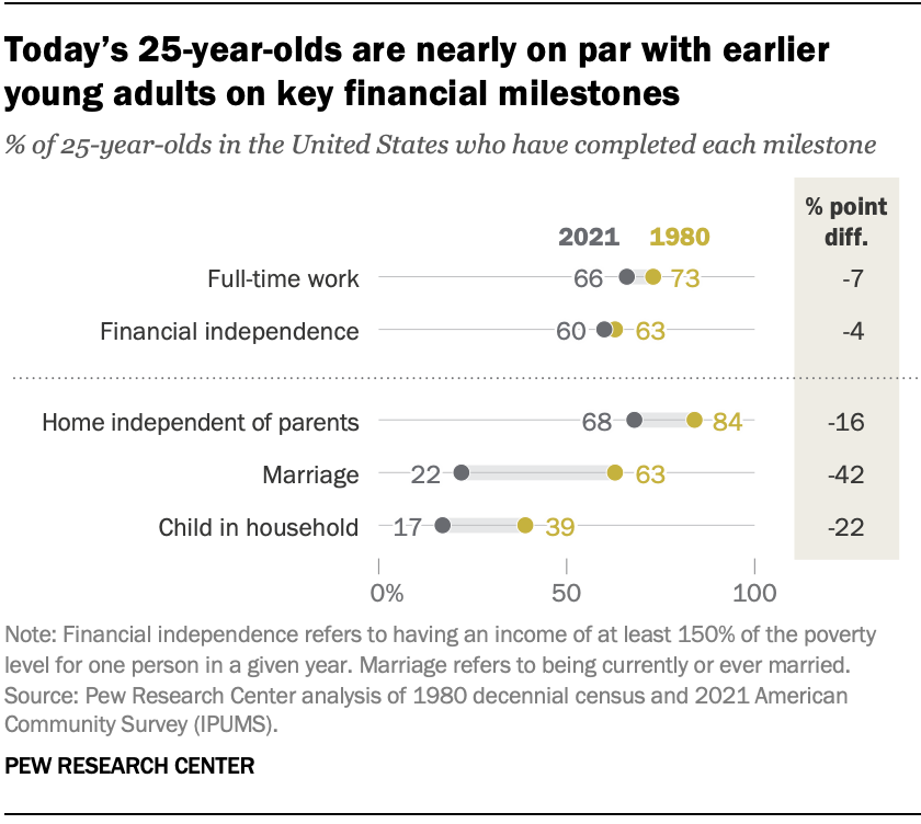
US Census Bureau “metrics of adulthood” (deuteranope)

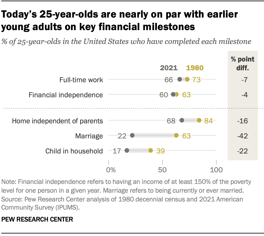
US Census Bureau “metrics of adulthood” (protanope)

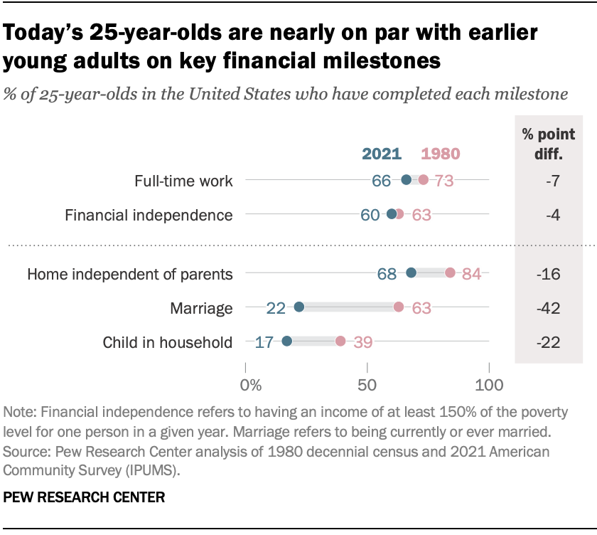
US Census Bureau “metrics of adulthood” (tritanope)

Re-analysis Goals

I have digitized and provided the data. Using base R for now, we will,

  • read it in,
  • inspect it with some basic commands, and
  • begin to visualize.

Tools

The subject of this class is a mix of tools and ideas.

  • the tools help you enact your idea
  • the ideas are largely independent of your choice of tool

We will use R and RStudio and a variety of file formats within.

  • simple R scripts (.R)
  • more heavily annotated markdown files (.Rmd or .qmd)

Decisions, decisions

Your tool should depend on your needs and goals.

Here, R/RStudio are a good fit with other classes

Take some time today and through the semester to practice, experiment, and explore these and other tools.

Reading data

  • Read the data using read.delim() (this is one of many largely interchangable functions).
dat <- read.delim("../data/milestone.csv", sep = ",")
  • Inspect using head() or tail().
head(dat)
#>     milestone year percent
#> 1 independent 1983      83
#> 2 independent 1993      77
#> 3 independent 2003      77
#> 4 independent 2013      73
#> 5 independent 2023      64
#> 6     married 1983      78

Graphing

Graphing syntax is flexible.

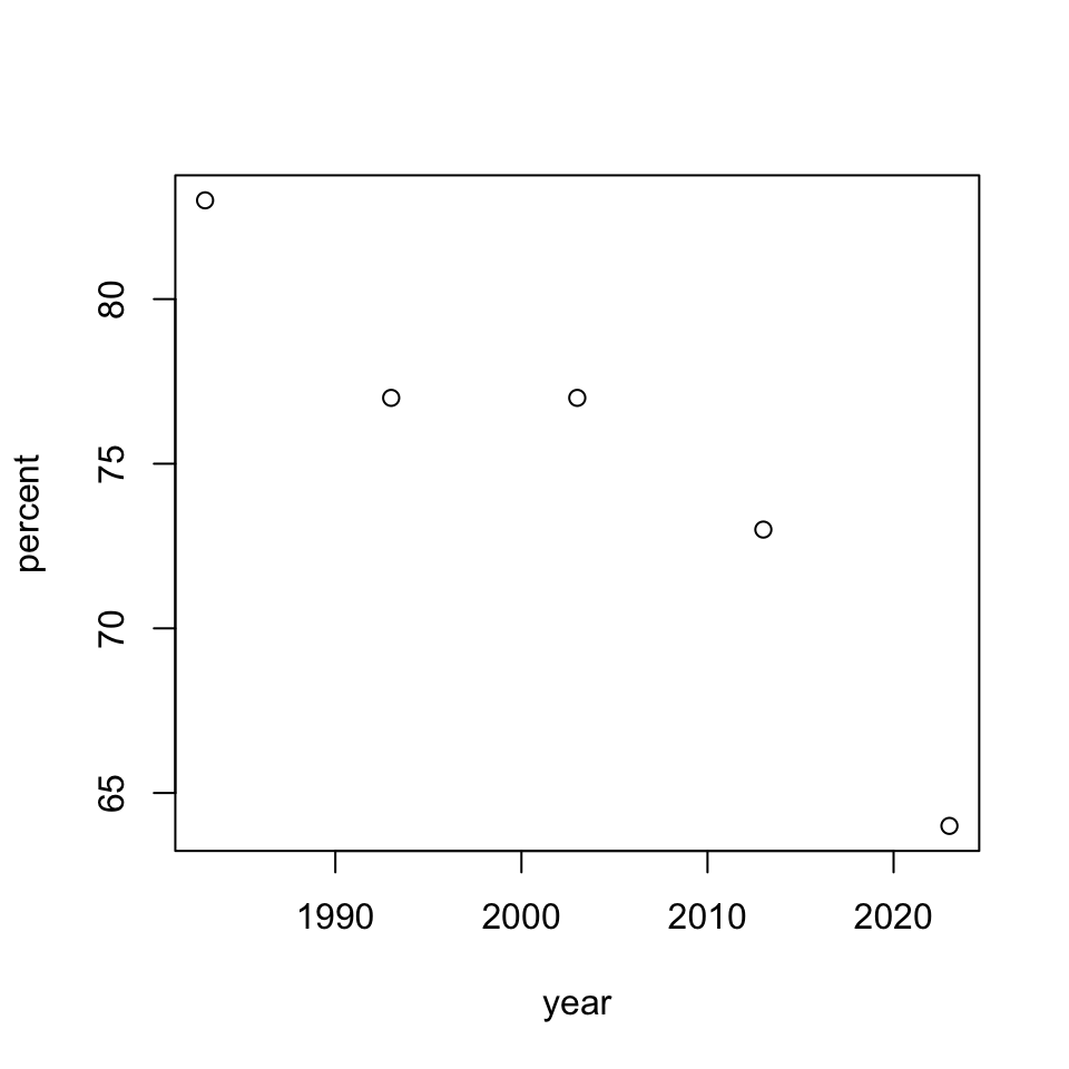
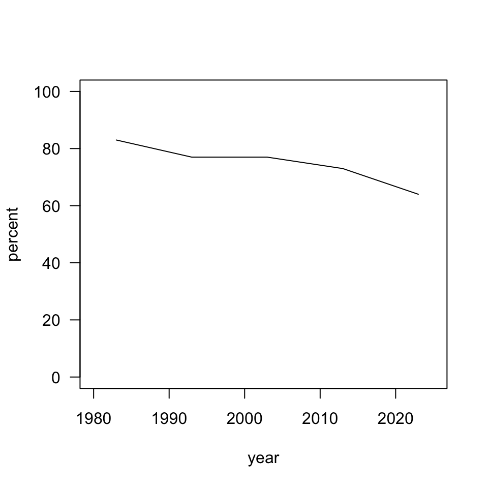
plot(percent ~ year, dat, subset = milestone == "independent")

A scatterplot of the percent of 25-year-olds living independently, showing a decreasing trend between the years 1983 and 2021 at about half a percent per year.

Pause

Looking at our graph, are there other ways to visualize this data?

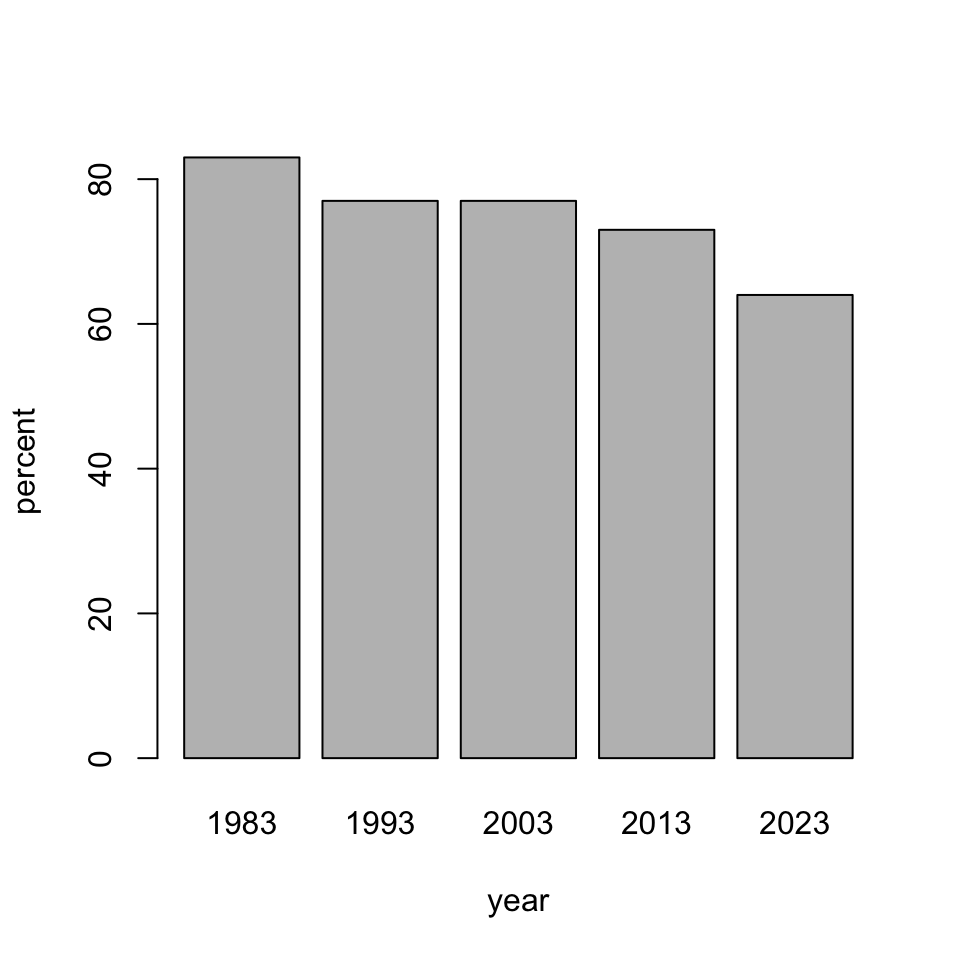
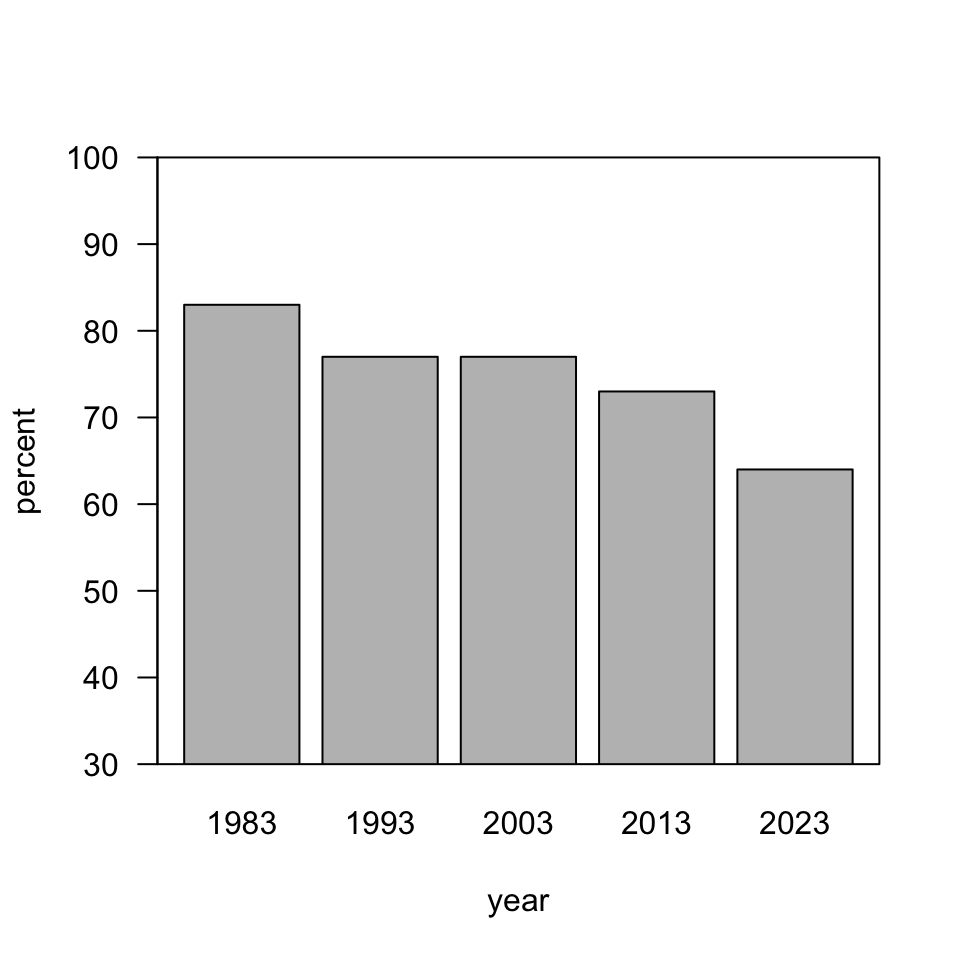
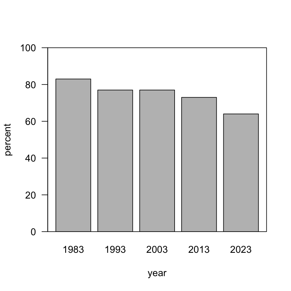
barplot(percent ~ year, dat, subset = milestone == "independent")

Problems?

  • Time is continuous.
  • But (some good), values are proportional to ink.
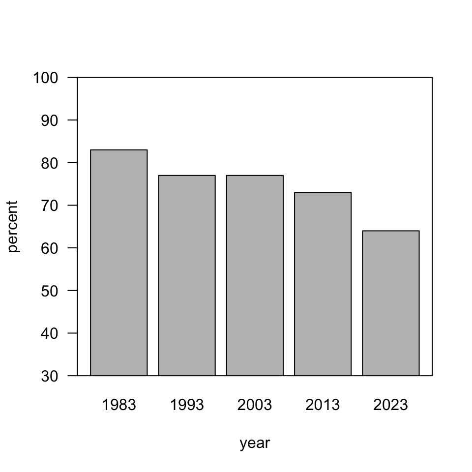
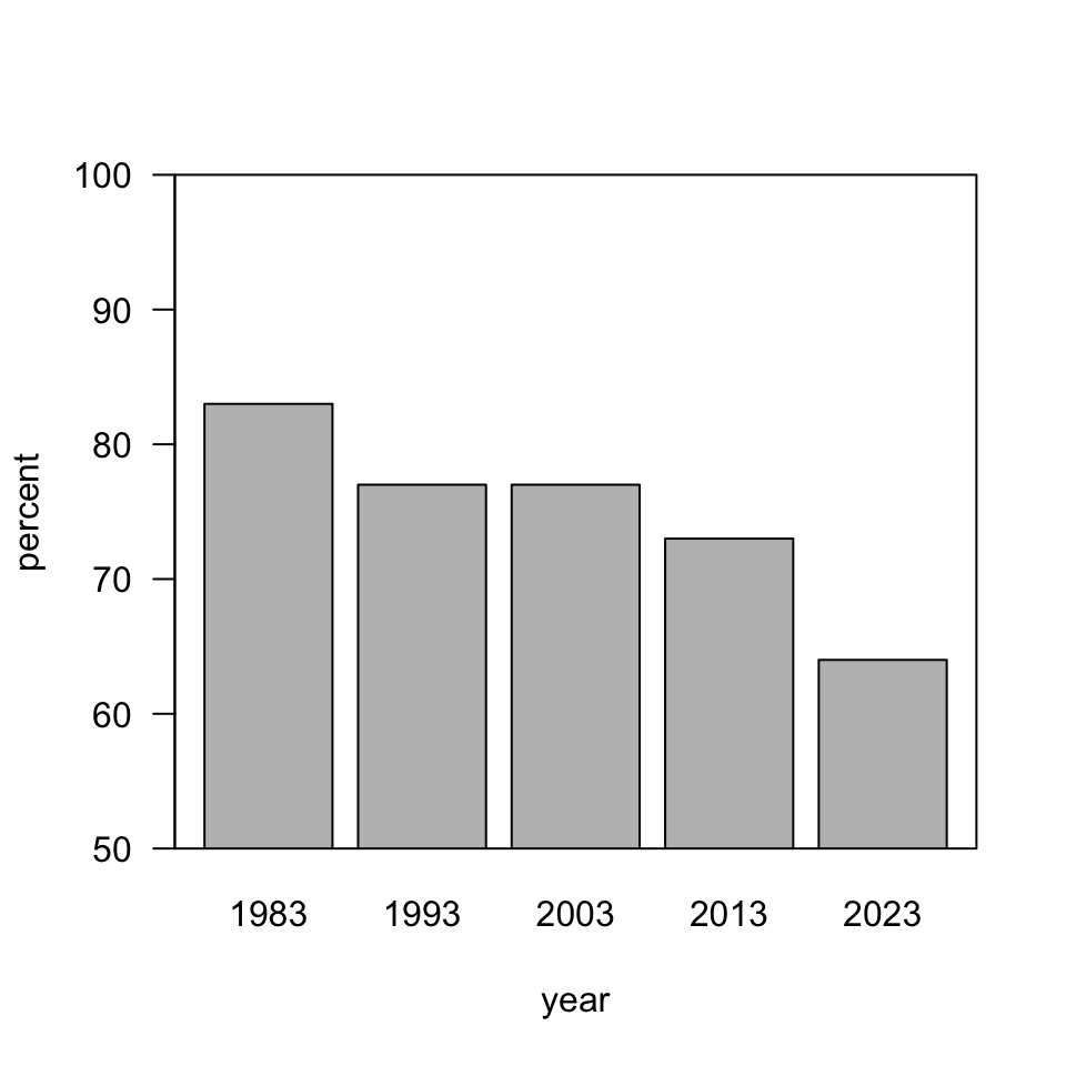
  • How would our interpretation change if the vertical axis started at 60, or 40, or 30 as in our motivating example?

A diversion - “proportional ink”

“Bad”

Worse

Axes in bar charts

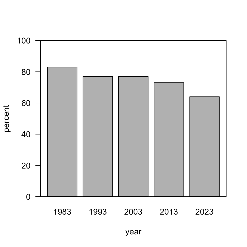
It is accepted (and expected) that bar graphs should start at zero.

The bar for 1983 is

1.3 times

1.56 times

2.36 times

taller than the bar for 2023.

Axes in line graphs (charts)

Line graphs are evaluated

  • based on position on a common scale, which is judged differently from
  • “amount of ink” used for bar graphs.

“Instead, a line chart should be scaled so as to make the position of each point maximally informative, usually by allowing the axis to span the region not much larger than the range of the data values.” - Bergstrom and West

Optional arguments

We can add optional, comma-separated arguments to refine the appearance.

  • type = 'l' to set a line type
  • xlim = c(1980, 2025) to set horixontal axis limits
  • ylim = c(0, 100) to set vertical axis limits
  • las = 1 to rotate vertical axis tick labels
  • type ?plot for more

Try (feel free to omit the line break).

plot(percent ~ year, dat, subset = milestone == "independent",
     type = 'l', xlim = c(1980, 2025), ylim = c(0, 100), las = 1)

Alternate syntax

These are largely interchangeable, but each has unique benefits.

  • plotting “x” and “y” simultaneously
plot(dat[dat$milestone == "independent", c("year", "percent")],
     type = 'l', xlim = c(1980, 2025), ylim = c(0, 100), las = 1)
  • plotting “x, y” separately (contrast with “y ~ x”)
plot(dat[dat$milestone == "independent", "year"],
     dat[dat$milestone == "independent", "percent"],
     type = 'l', xlim = c(1980, 2025), ylim = c(0, 100), las = 1)

A reasonable draft

plot(percent ~ year, dat, subset = milestone == "independent",
     type = 'l', xlim = c(1980, 2025), ylim = c(0, 100), las = 1)

Some decisions

We might want to modify axes labels in a number of ways. As it is, they are drawn directly from our variable names.

We could,

  • reencode them (e.g., xlab = "Time (Years)")
  • modify their font and size (e.g., font = 2, size = 1.5)
  • or suppress them with blank labels (e.g., xlab = "") and add labels with the more flexible mtext() function (next)

Sample result

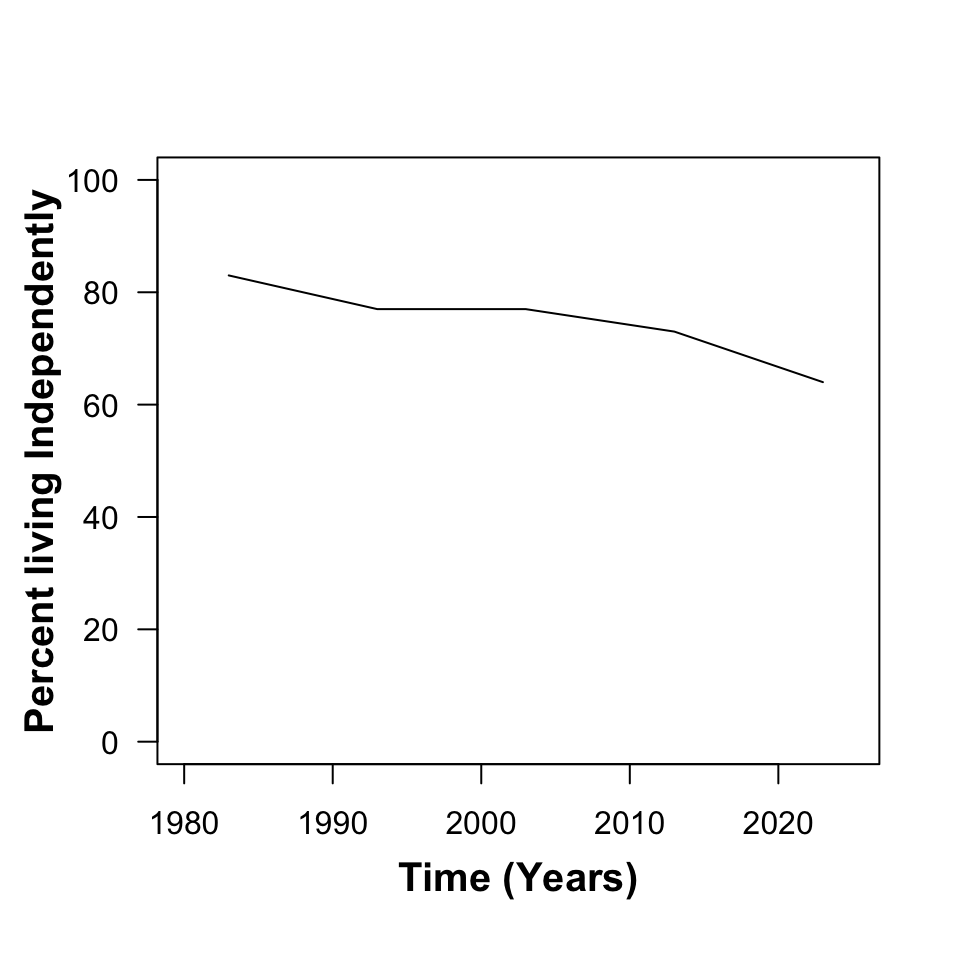
plot(percent ~ year, dat, subset = milestone == "independent",
     type = 'l', xlim = c(1980, 2025), ylim = c(0, 100), las = 1,
     xlab = "", ylab = "")
mtext("Time (Years)", side = 1, line = 2.5, font = 2, cex = 1.25)
mtext("Percent living Independently", side = 2, line = 2.5, font = 2, cex = 1.25)

Graphics layout parameters

A flexible command par() accepts a variety of layout and aesthetic specifications.

Include the following line before the plot() command you have been using.

par(mfrow = c(1, 1), mar = c(4.1, 5.1, 0.8, 0.8), xaxs = 'i', yaxs = 'i')

By going back and forth between graphs (or using ?par) learn about its arguments.

Challenge

Change par(mfrow = c(1, 1), ... ) to par(mfrow = c(2, 2), ... ) and in the three new panels add separate plots for the remaining milestones of adulthood described in the data.

Experiment with

  • line styles (width, color, style)
  • plot titles (using main = ... in the original plot or mtext(..., side = 3, ...) after the plot)

Plot nomenclature

By its appearance, we made a “connected line plot”.

  • Try changing the value of lty from l to b to p or o.
  • Make note of the differences.

Superimposed plots

Set par(mfrow = c(1, 1)) and plot the percent living independently against time.

By using lines() we can add lines corresponding to the values for the remaining three milestones.

This can be done simply by copy-paste-edit, or a bit more elegantly with a loop.

Contemplate the apperance of your graph - should it have a legend or line labels?