Data Visualization and Exploration

Learning from the past

Review

There is a lot to think about.

  • Creating reproducible workflows.
  • Overcoming insufficient program defaults.
  • Meeting non-overlapping audience expectations.
  • Assessing competing advice.

Things to think about

  • Your first homework.
  • Your experiences encountering data visualization in the wild.
  • Your data visualization goals and interests.

Goals

  • Revisit buddy.
    • changing passwords
    • locating data
    • creating folders and files
  • Historical context
  • Coding approaches

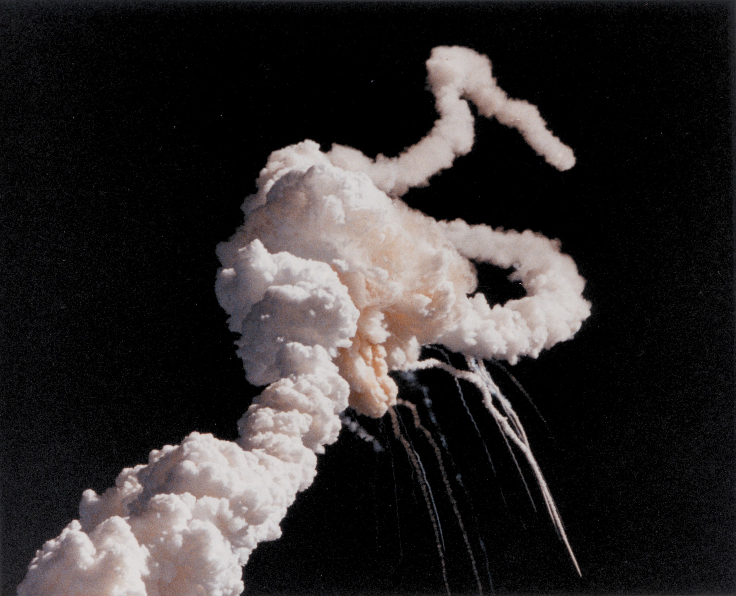
40 years since the Challenger disaster
Reactions

  • government panels
  • books and scientific reviews
  • podcasts
  • essays and blogs

Often cited as a data visualization failure. Why is that?

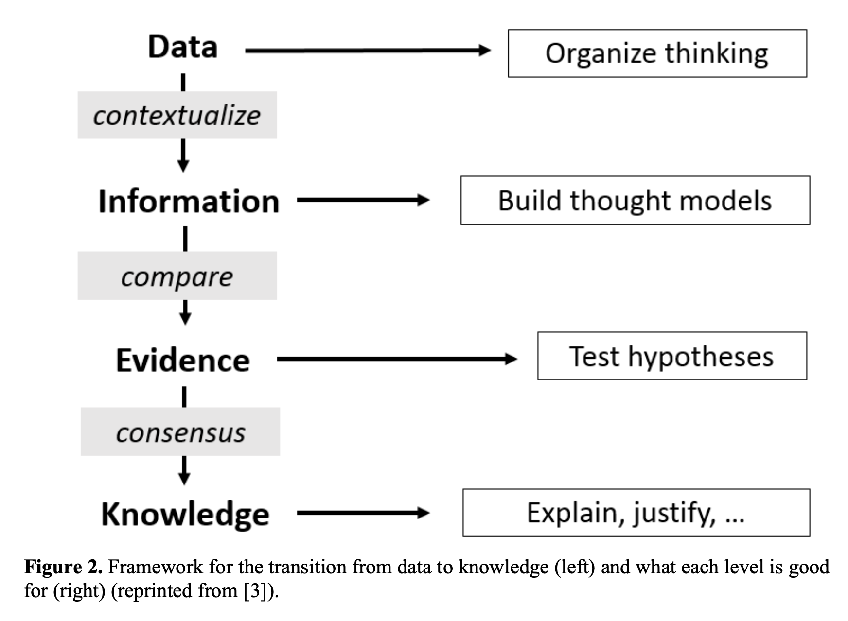
Data, Information, Knowledge …

… and sometimes “Wisdom”. But also other times “Evidence”.

  • Data is raw.
  • Information is insight from data.
  • Knowledge is the synthesis of information.
Data, Information, Knowledge …
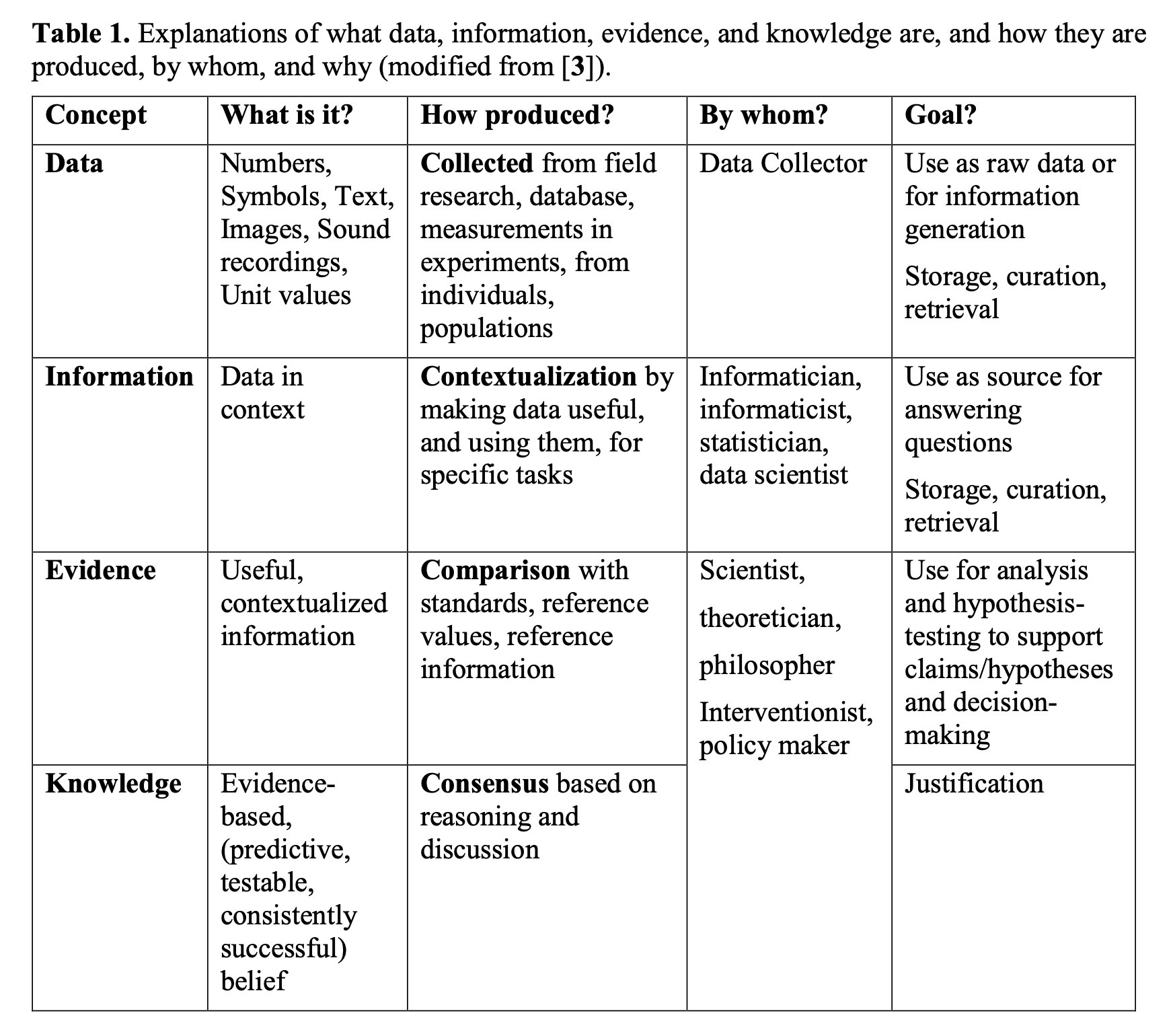
  • “[Data] can usually be tabulated and depicted as graphs, or displayed as figures.”
  • “Information is data that have been processed so it is clear what they are about.”
  • “Evidence is information that can be used to support a hypothesis by testing it.”
  • “[K]nowledge is predictive, testable, consistently successful belief.”

Where we fit in?

Data visualization (by this set of definitions) is a clear part of the “Data” stage.

This suggests, both

  • exploratory visualization and
  • explanatory visualization

play roles in the creating “Information”, but also later in developing “Evidence” and disseminating “Knowledge”.

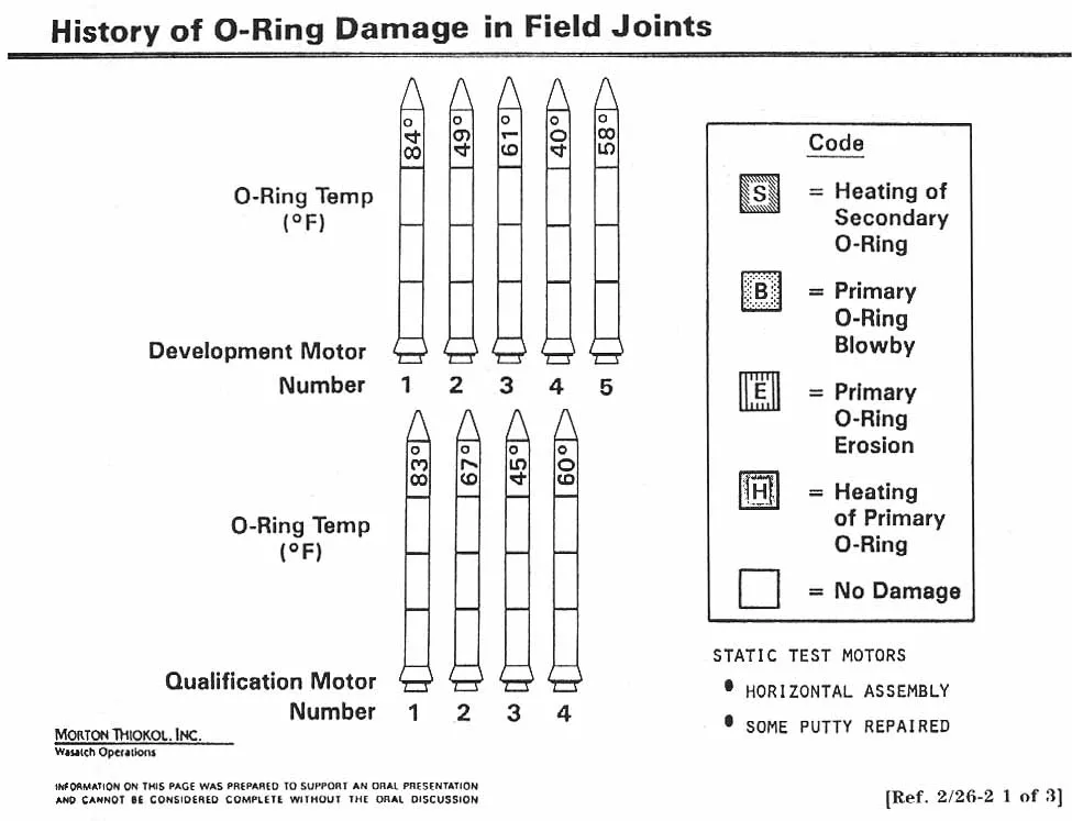
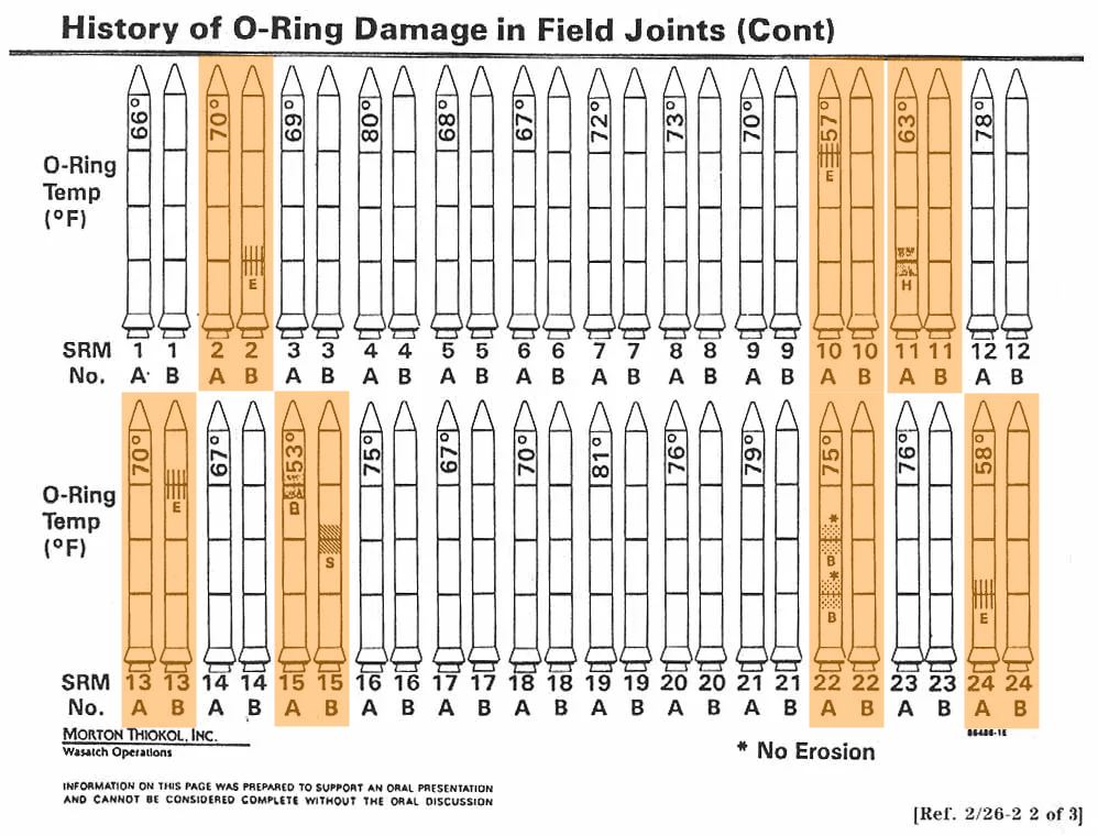
History of O-ring damage (legend)

History of O-ring damage (cont.)
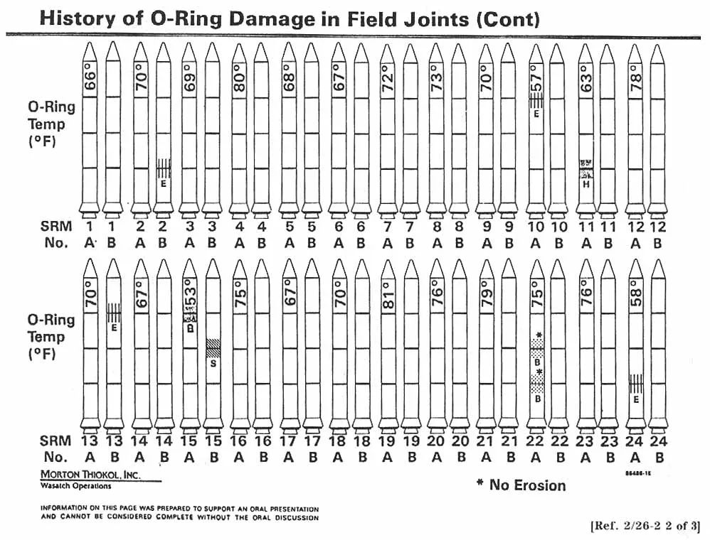
Is this data, information, (evidence) or knowledge?

O-ring damage and temperature
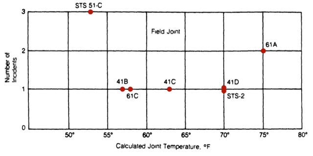
Number of incidents (between 1 and 3) plotted against temperature between 45ºF and 80ºF.
Figure 6: A plot of O-ring damage against temperature showing only failures.

Modern reanalyses occasionally fit a quadratic function to these points.

O-ring performance and temperature
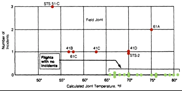
A quadratic no longer seems reasonable.

Data, trend, extrapolation
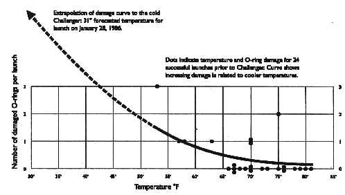
Air temperature at launch time was 36ºF (15ºF below previous cold launch). Compromised location (coldest point on the joint) was ≈ 28ºF.

A drastic oversimplification

Relevant engineers shared concerns pre-launch.

Were they communicated effectively?
Avoiding these and other pitfalls

Our goals remain two-fold

  • explore data
  • explain data

To do so we encode values in data by position, shape, color, and size.

Some encodings test the limits of our perception.
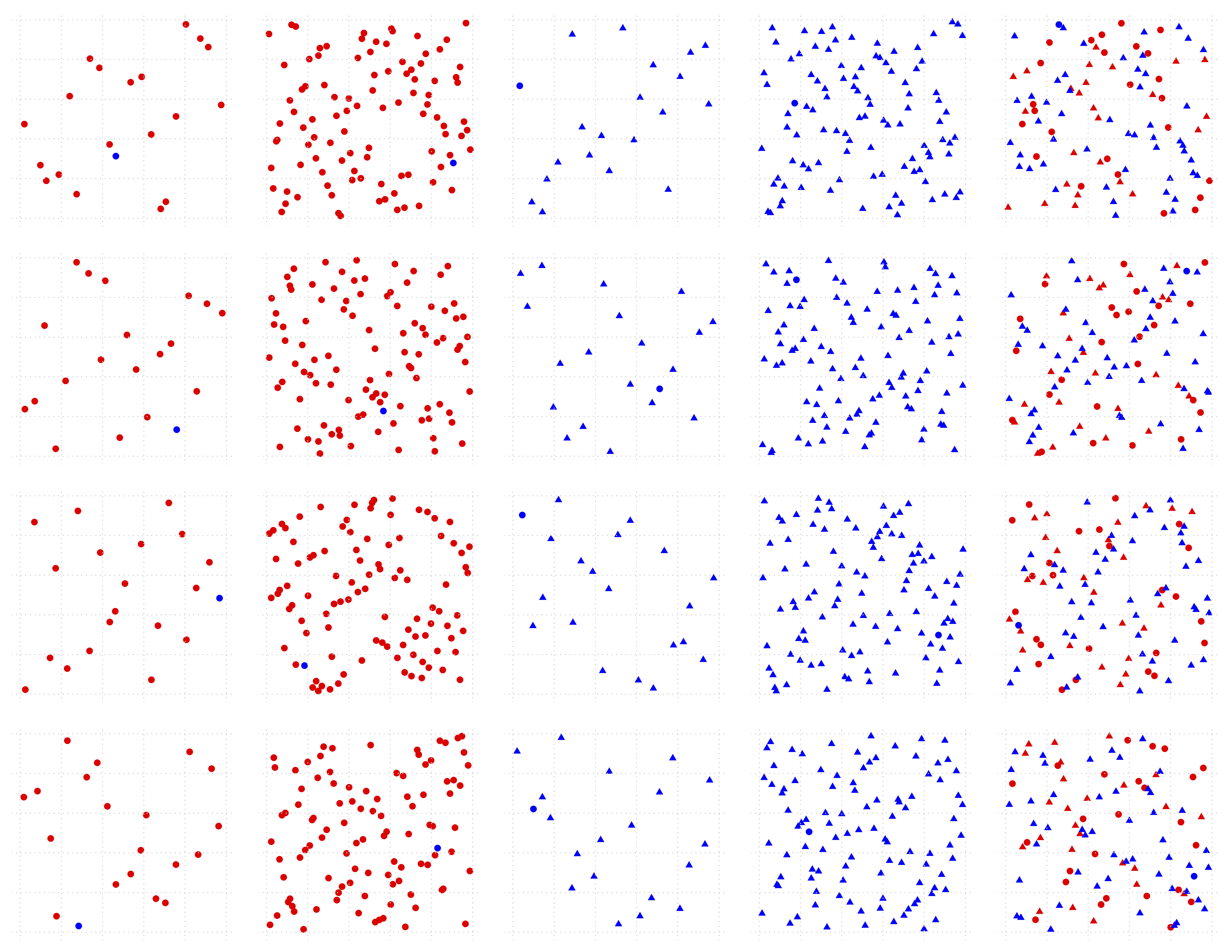
Challenges to human perception

Ranked best to worst in ease of perception.

Depending on the choice of graph, one or more of these elements could be involved.

  • Position
    • on a common scale
    • on unaligned scales
  • Length
  • Angle or slope
  • Area (size in 2D)
  • Depth in 3D
  • Color
    • brightness or luminance
    • saturation or intensity
  • Curvature
  • Volume (size in 3D)

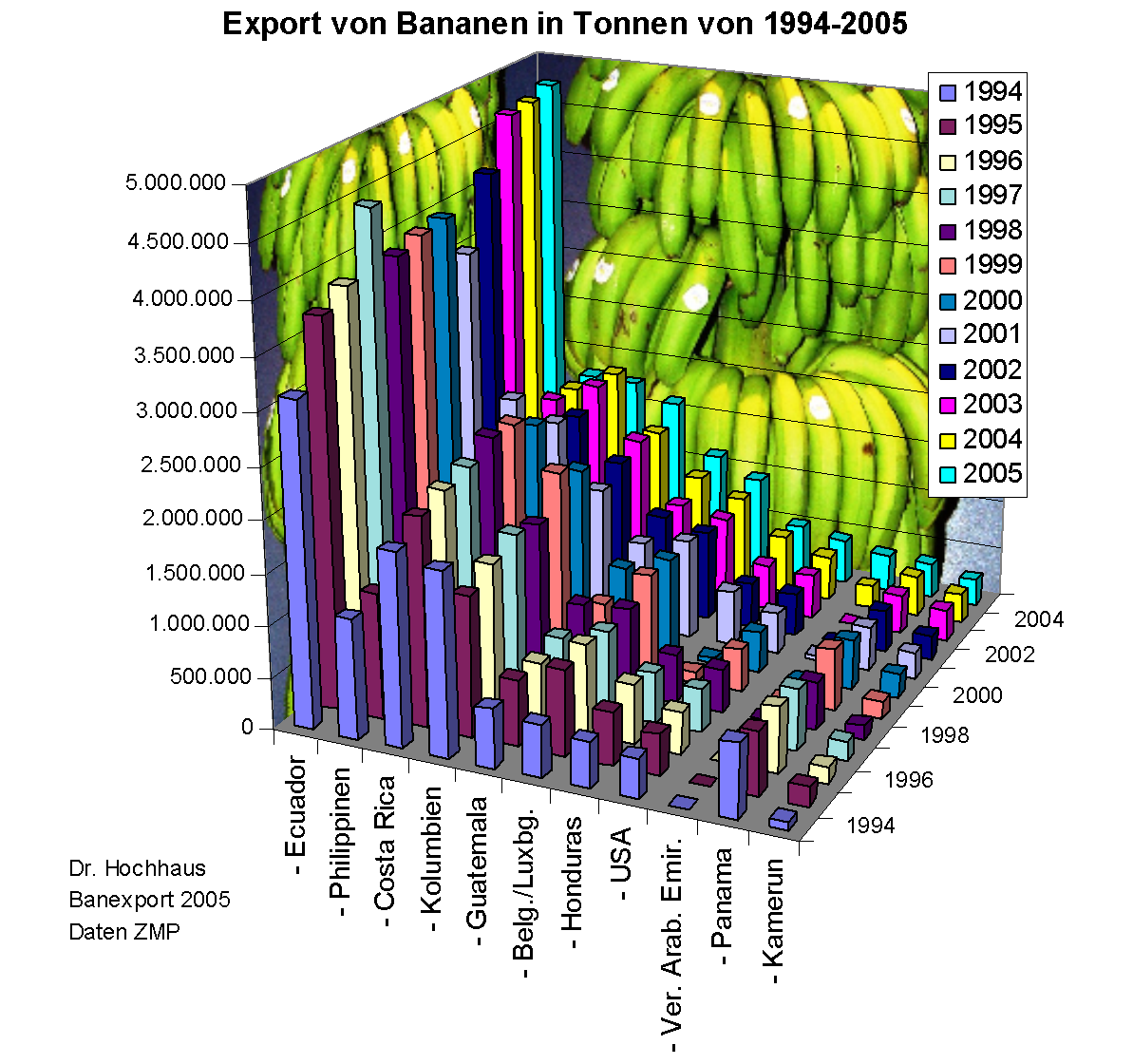
Challenges illustrated

We will now take a break to visualize our preattentive pop-out data.

In doing so, we will

  • practice R/Buddy
  • contrast .R with .qmd
  • think about relevant plot types
  • hint at raw data exploration and cleaning