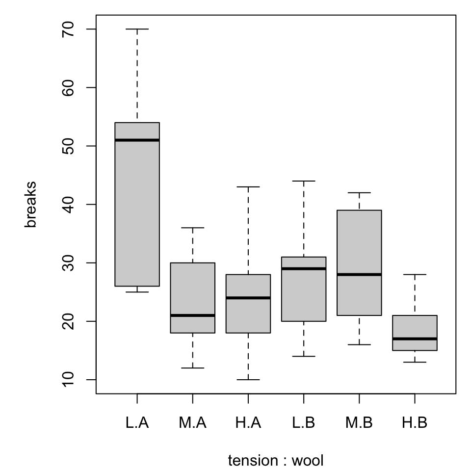
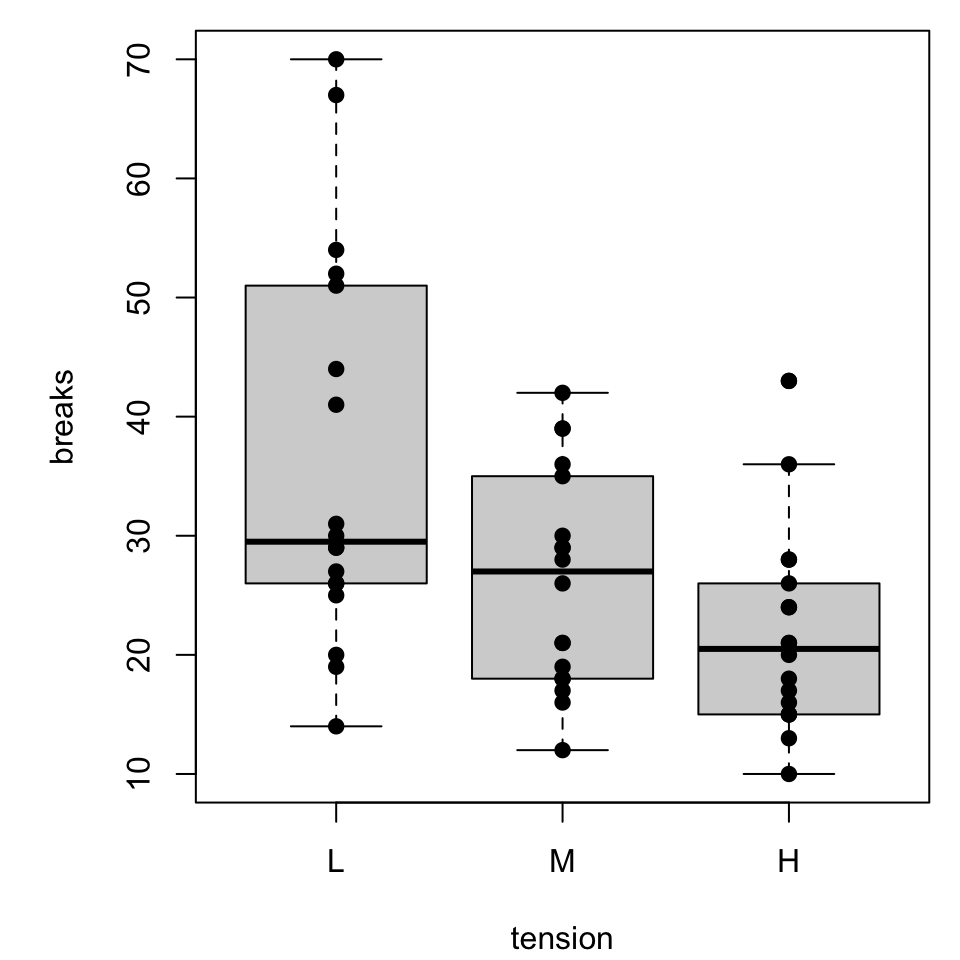
Depending on the choice of graph, one or more of these elements could be involved.
[…] “learning styles” refers specifically to the theory that there are ways that individuals learn best. […] learning preferences suggest that there are ways people prefer to receive information, but it may not impact learning.
Sometimes our expectations work against our perception.
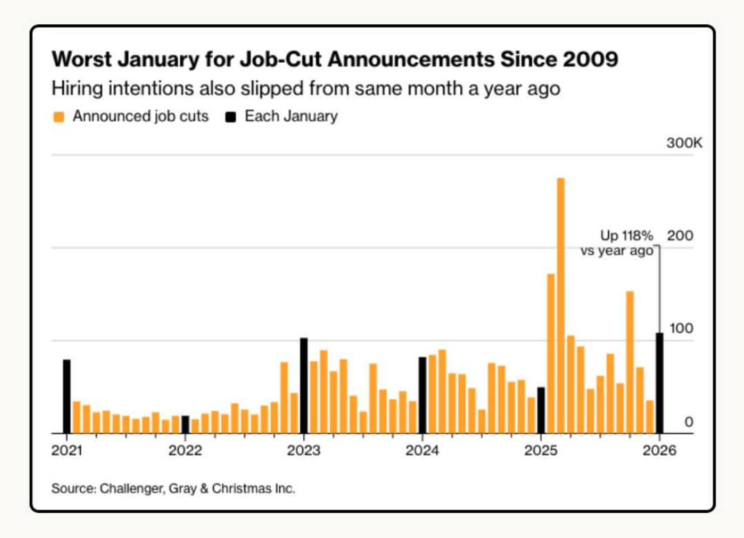
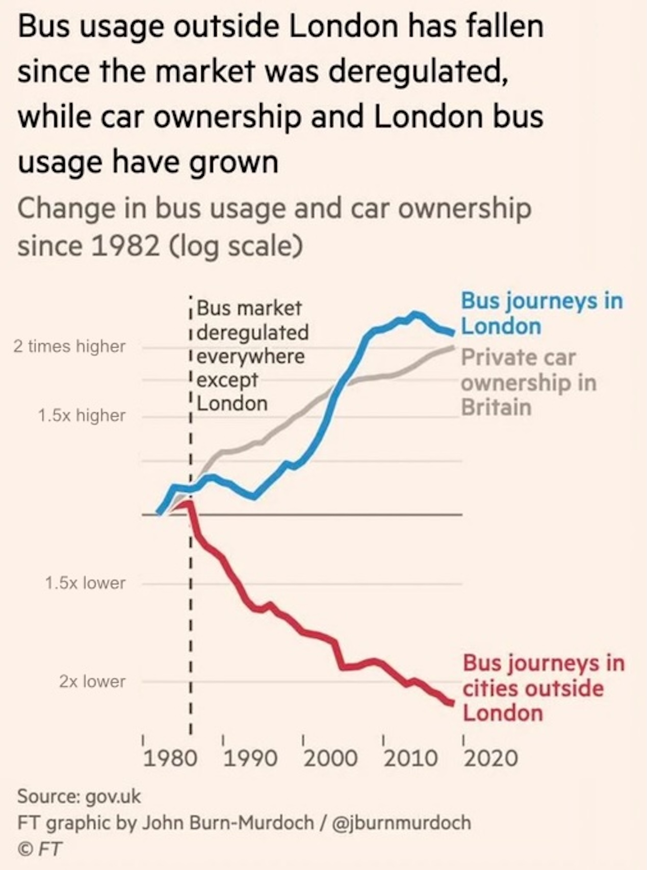
Figure 1: The title is “Worst January for Job-Cut Announcements since 2009”.
Critique
Was the previous graph
clear?
convincing?
easy to read?
A case study in perception
We will explore data from a friend that shows assigned student letter grades originally and after a retake.
dat <-read.delim("../data/grade.csv", header =TRUE, sep =',')head(dat)#> student_code exam_no semester first_letter retake_letter#> 1 student_21 Exam I S22 F F#> 2 student_30 Exam I S22 F D#> 3 student_35 Exam I S22 F F#> 4 student_50 Exam I S22 F D#> 5 student_53 Exam I S22 F A#> 6 student_63 Exam I S22 F B
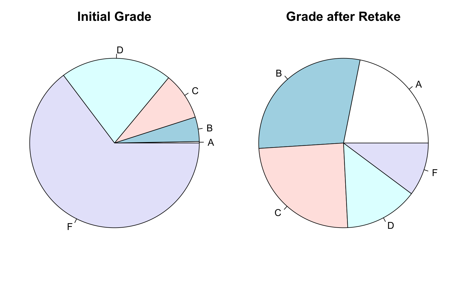
A pie chart of grades
layout(matrix(c(1, 2), nrow =1))par(mar =rep(0, 4))pie(table(dat$first_letter))mtext("Initial Grade", 3, line =-2, font =2, cex =1.35)pie(table(dat$retake_letter))mtext("Grade after Retake", 3, line =-2, font =2, cex =1.35)
Figure 2: Side-by-side pie charts showing grade distributions.
What do you notice, wonder, think?
Pie charts challenge us
We might be “used to” looking at pie charts, we might even have a “preference” for pie charts.
We should be careful with pie charts!
What problems, rooted in perception, could arise?
angle
area
color
What else could we try?
This might be a time to sketch.
But first, what does this data say?
What might we be trying to say?
Inspiration?
Three variants on bar charts (Lisa Charlotte Muth, 2022).
What issues (of perception) might arise?
Break for coding
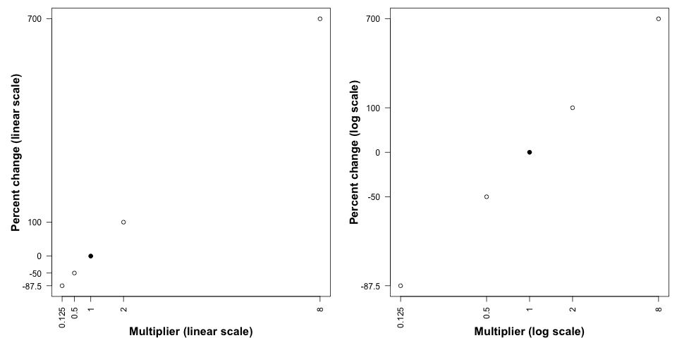
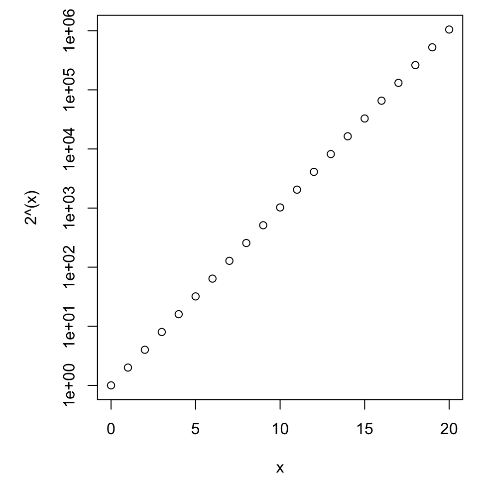
Axis scales
The choices involved in presenting axis information are important to making the message as clear and intuitive as possible.
Text orientation, placement, (font, and size)
Label placement and format
Program defaults are often an aesthetic nightmare.
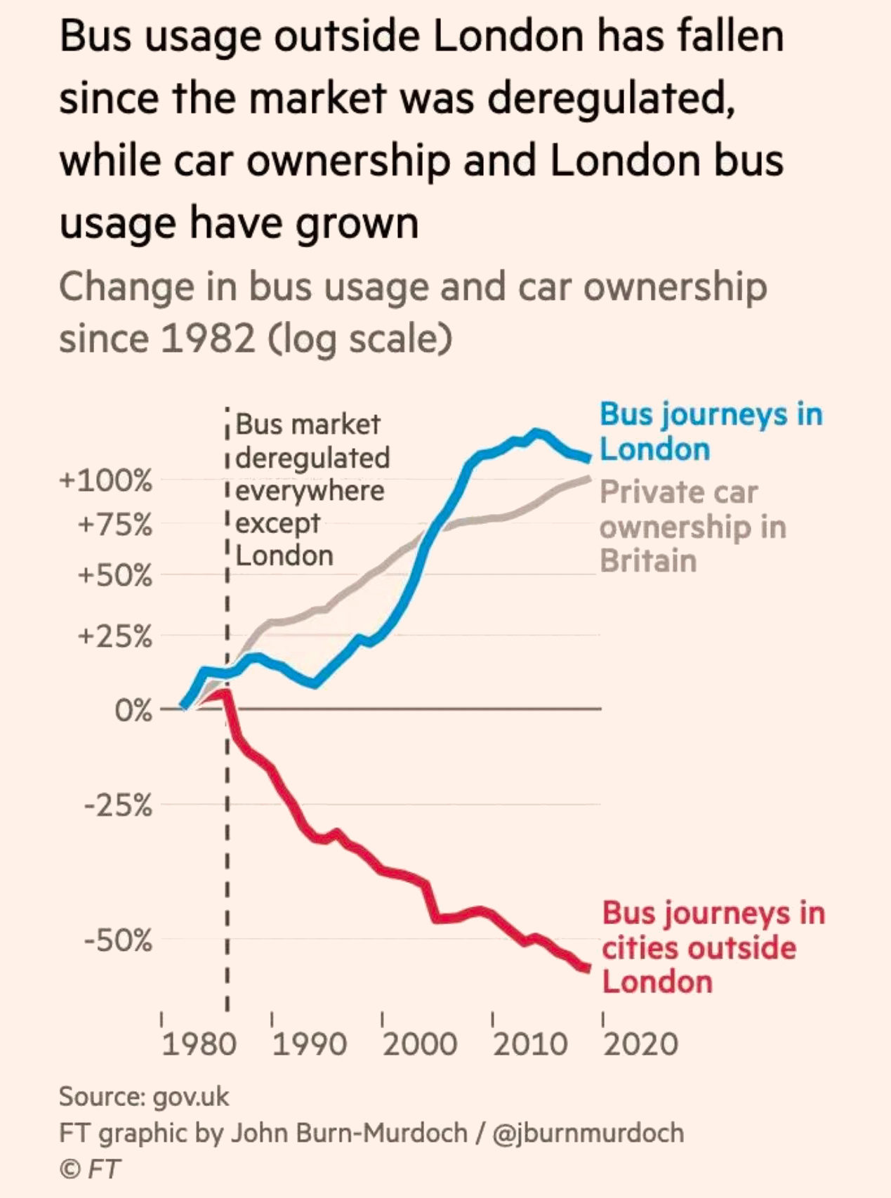
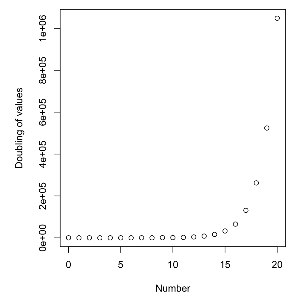
Exponential growth
Read in the data exponential.csv, give it a brief inspection, and make a plot that shows all three trials plotted against time. This could be done
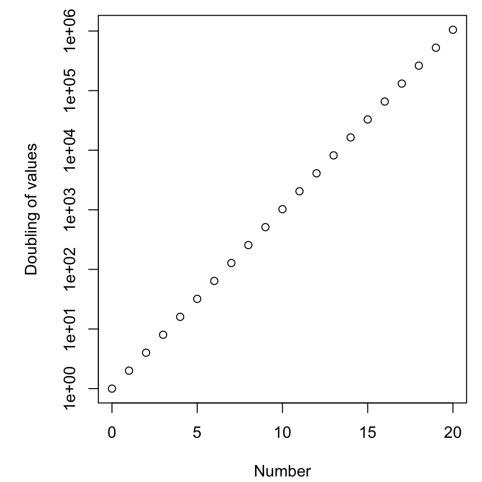
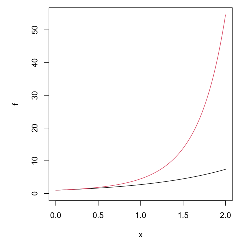
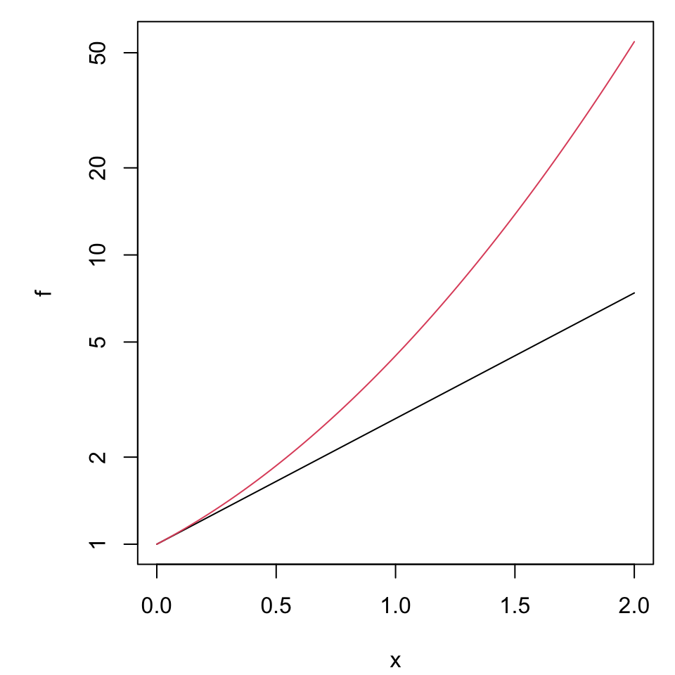
To illustrate value use a linear scale, to inspect rate of change use a log scale.
Consider the log-transformation of \(y = ae^{bt}\) which becomes \(\ln(y) = \ln(a) + bt\). (Verify this.)
For convenience we use the natural logarithm, but the rules work the same for any other choice of base.
This means the underlying exponential parameter \(b\) is emphasized as the slope when graphed on the log scale.
Boxplots
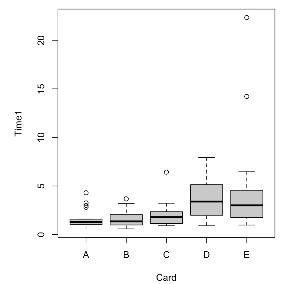
Recall the “preattentive pop-out” data stored in cards.csv.
dat <-read.delim("../data/cards2.csv", header =TRUE, sep=',')dat <-na.omit(dat)head(dat)#> ID Card Time1 Time2#> 6 KL05 A 1.28 0.71#> 7 KL05 B 1.28 1.03#> 8 KL05 C 1.10 1.34#> 9 KL05 D 2.10 0.83#> 10 KL05 E 2.53 1.38#> 11 John Doe A 1.60 1.18
What vizualizations are relevant?
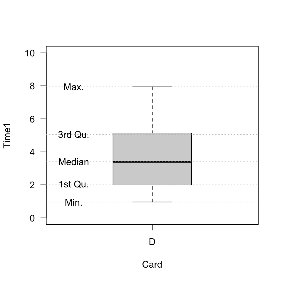
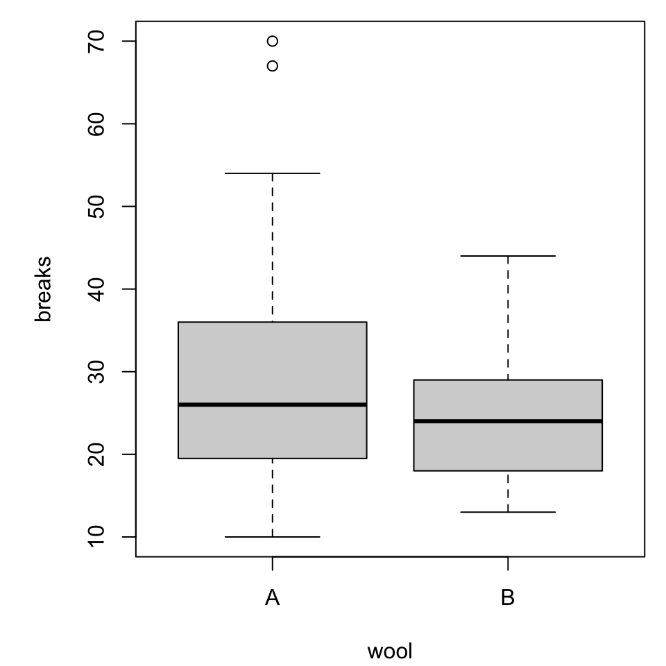
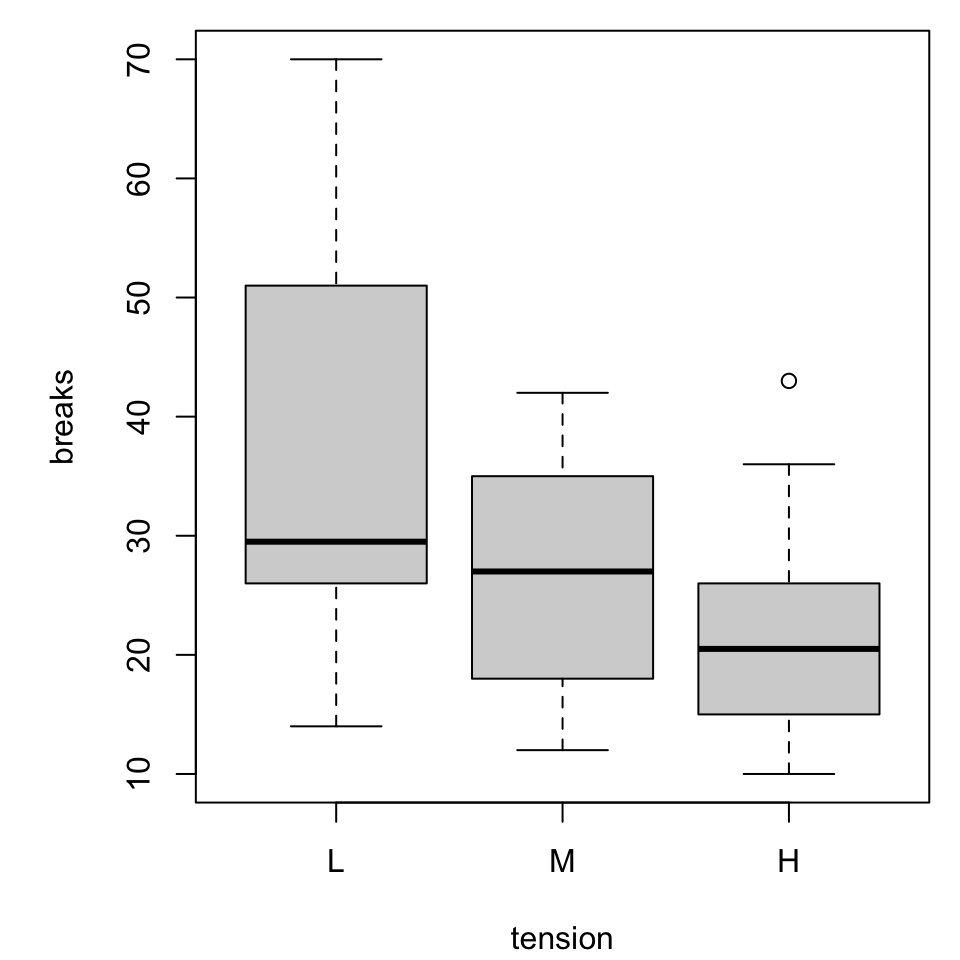
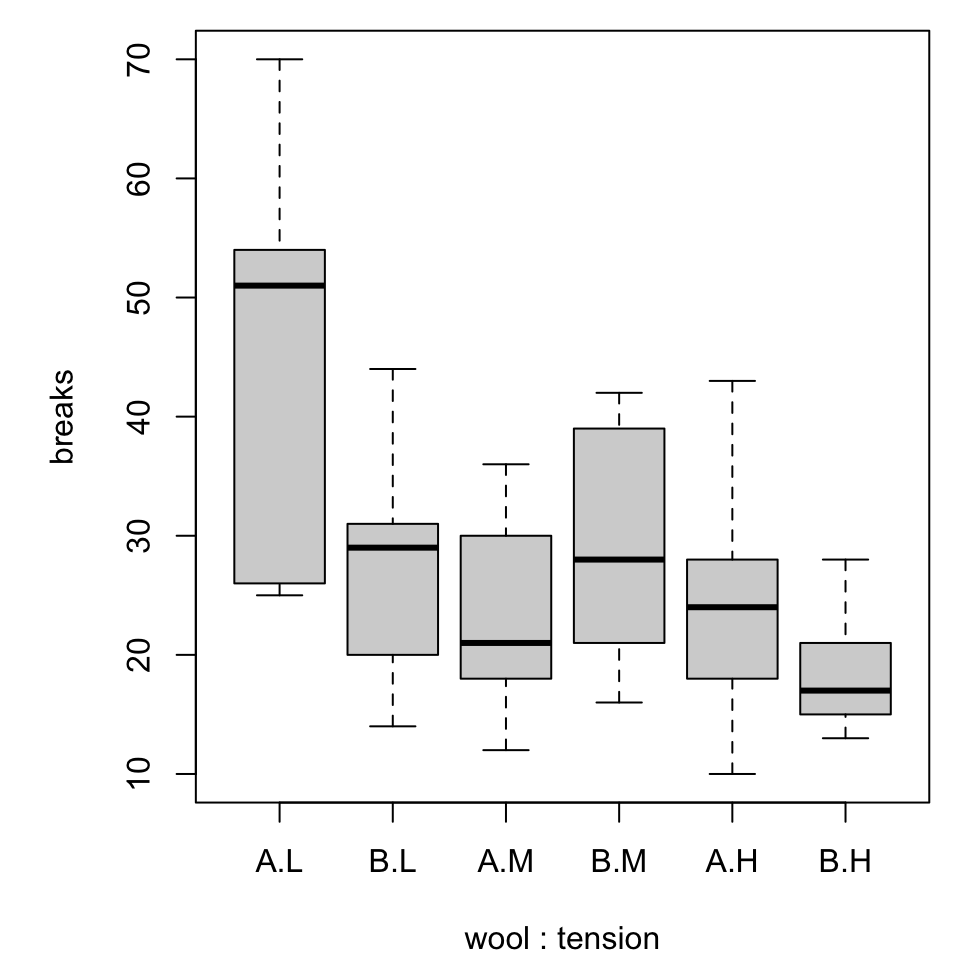
Boxplots
A basic boxplot, as we’ve seen, comes pretty quickly.