Data Visualization and Exploration

spread and distribution

Histograms and Densities

This is more difficult than it may seem.

  • but more from a conceptual (“how”) perspective, and
  • less form a technical (implementation) perspective

Histograms

Read in the data cards.csv.

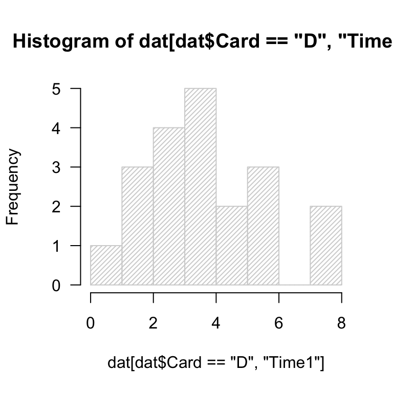
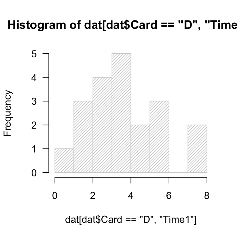
  • generate the default histogram of Time1 values for the Card == "D" subset.
  • experiment with breaks = ... to set the number of “bars”.
dat <- read.delim("./../data/cards.csv", header = T, sep = ',')
dat$Time1 <- as.numeric(dat$Time1)
hst <- hist(dat[dat$Card == "D", "Time1"], las = 1, density = 30, breaks = 5)
Figure 1: Histogram(s) illustrating experimentally-recorded preattentive pop-out times from a class demonstration.

Adding content

Layer on data from any other card (A-C) by using add = T and specifying a color.

What do you notice about the rendering of the histograms? Are you satisfied?

hst <- hist(dat[dat$Card == "D", "Time1"], las = 1, density = 30, breaks = 5)
Figure 2: Histogram(s) illustrating experimentally-recorded preattentive pop-out times from a class demonstration.

Layering many histograms

In general, this makes more than a couple histograms very difficult to read and interpret.

It is recommended that you use filled density plots to compare multiple distributions.

More on that later.

Deep challenges

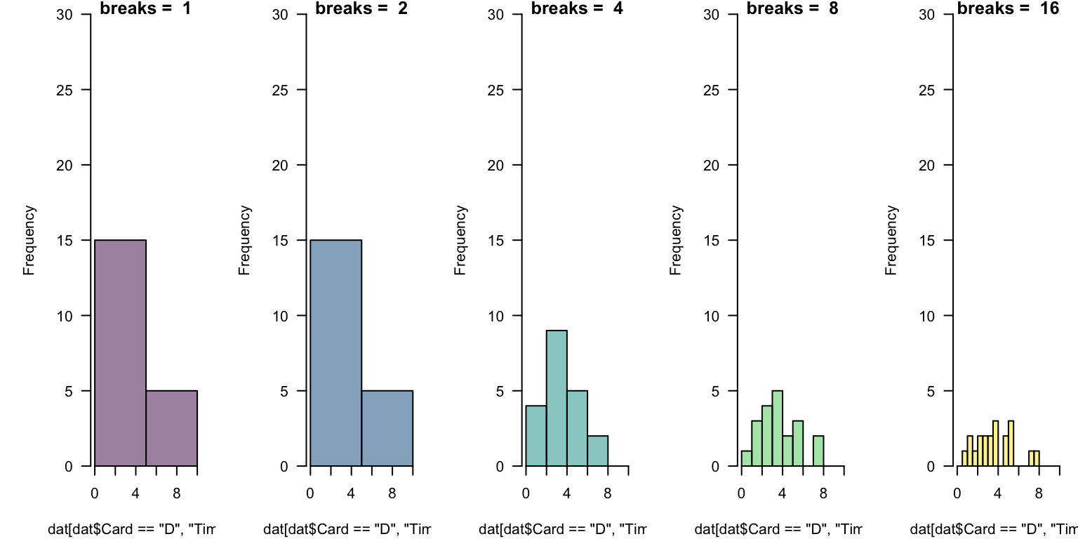
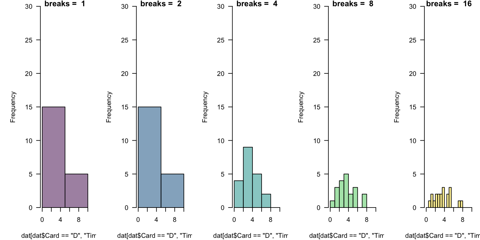
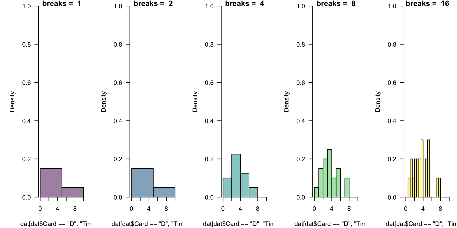
In general, there is no “right number” of “bins” (or “cells”) to display.

This takes experimentation. Which below is “best”? What might help you decide?

par(mfrow = c(1, 5), mar = c(4.1, 5.1, 0.8, 0.8), yaxs = 'i')
for(i in 0:4){
  hist(dat[dat$Card == "D", "Time1"], xlim = c(0, 10), ylim = c(0, 30), las = 1,
       breaks = 2^i, main = paste("breaks = ", 2^i), col = hcl.colors(5, alpha = 0.5)[i+1])
}
Figure 3: Histogram(s) illustrating experimentally-recorded preattentive pop-out times from a class demonstration.

Challenges Revisited

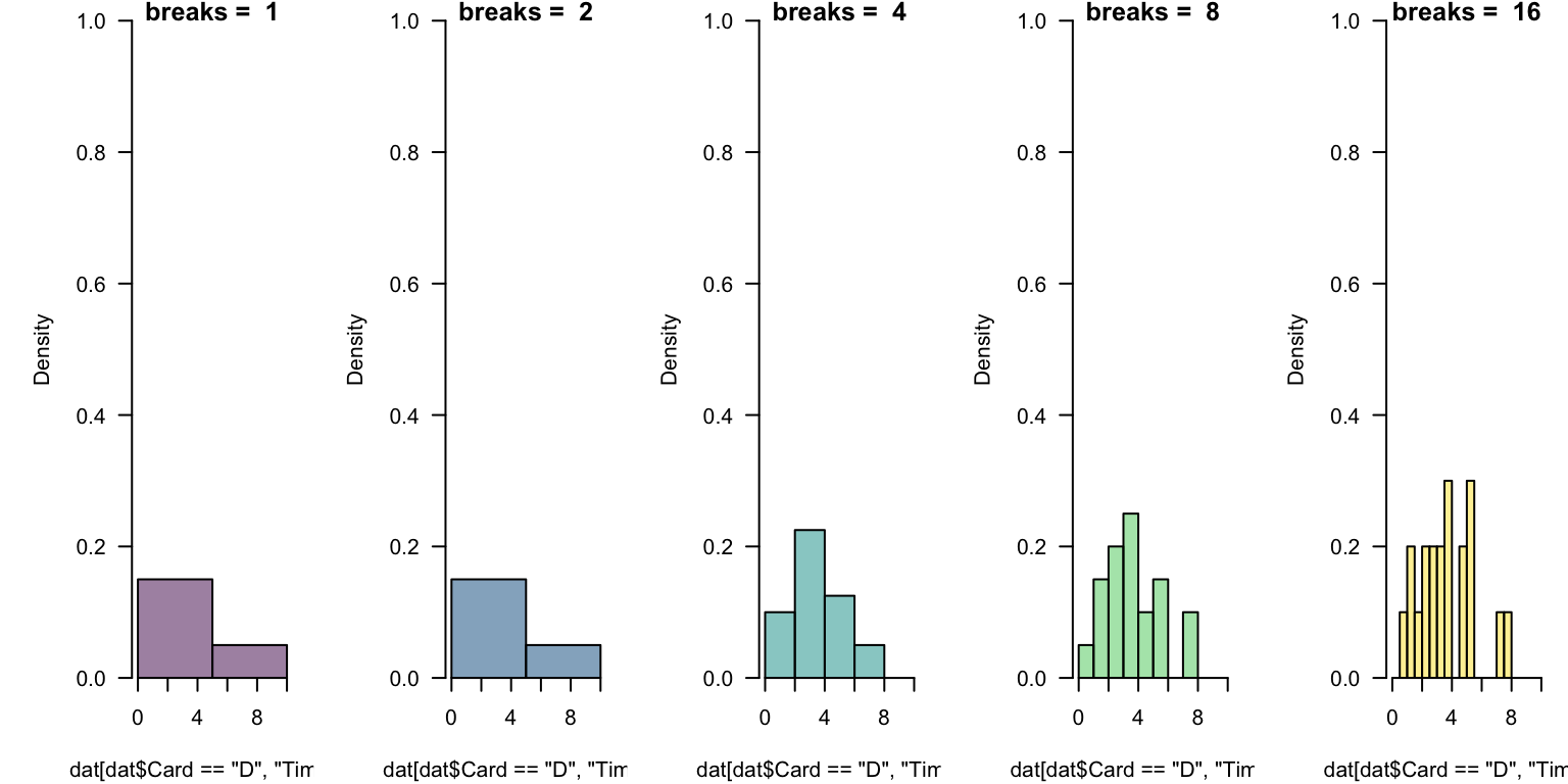
This takes experimentation. Which below is “best”?

par(mfrow = c(1, 5), mar = c(4.1, 5.1, 0.8, 0.8), yaxs = 'i')
for(i in 0:4){
  hst <- hist(dat[dat$Card == "D", "Time1"], xlim = c(0, 10), ylim = c(0, 1), freq = FALSE,
              las = 1, breaks = 2^i, main = paste("breaks = ", 2^i), 
              col = hcl.colors(5, alpha = 0.5)[i+1])
  }
Figure 4: Histogram(s) illustrating experimentally-recorded preattentive pop-out times from a class demonstration.

Reflection

Comparing Figure 3 and Figure 4, what do you notice?

Parameterizing breaks

The breaks = ... is quite flexible, but works in occasionally mysterious ways.

One argument breaks = n passes that number to an underlying function and asks for n + 1 points that delimit n bins.

One nice options is to define equally-spaced ranges using the colon operator or seq(from = ..., to = ..., length = ...).

Challenge breaks

Using any subset of the card data, experiment with various ways of implementing breaks discussed previously.

Comment on what this “tells you” about the data or how it might help you “tell others”!

Motivation for histograms

A great deal of statistical practice is related to assumptions of “normality”.

Histograms are a classic tool for the visual assessment of normality and can give evidence of other properties.

Use the code below to generate 100 sampled values from a normal distribution with mean \(\mu = 2\) and standard deviation \(\sigma = 1\).

Then, add a histogram. Finally, repeat the sampling process and histogram visualization.

rn <- rnorm(n = 100, mean = 2, sd = 1)

Transforming data

Generate the following data and make a histogram.

rn <- rlnorm(n = 100, mean = 2, sd = 1)

Now, make separate histograms of log10(rn) and log(rn).

What if anything do you notice?

Details, details

It really doesn’t matter which logarithm you use in transformation, each has merits.

  • it is generally easier for people to think (i.e., read an axis), written in powers of 10
  • it is mathematically nice to use the natural logarithm

Label your axis carefully.

Today is the 35th day of 2025. Notice \(\ln(35) \approx 3.555\), and \(\log(35) \approx 1.544\).

These mean that \(e^{3.555} \approx 35\) and \(10^{1.544} \approx 35\).

  • Both are fine ways to say “\(35\)”.
  • They differ by a “change of base”.

One implication is that if we report “log”-transformed data, we need to be specific about which base.

Log-transformed data

Using a base-10 logarithm, transform the “lognormal” data and generate a histogram.

What has changed?

Weibull distribution “shape” parameter

Separately, generate random values and histograms for shape = 1/2, 1, 2.

Try to assess the role of shape.

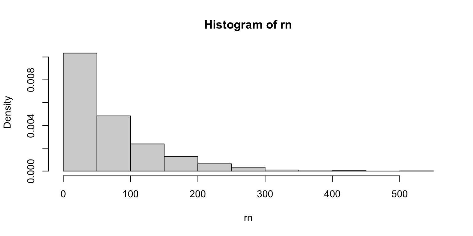
rn <- rweibull(1000, shape = 1, scale = 70)
hst <- hist(rn, freq = FALSE)
Figure 5

Histograms and densities

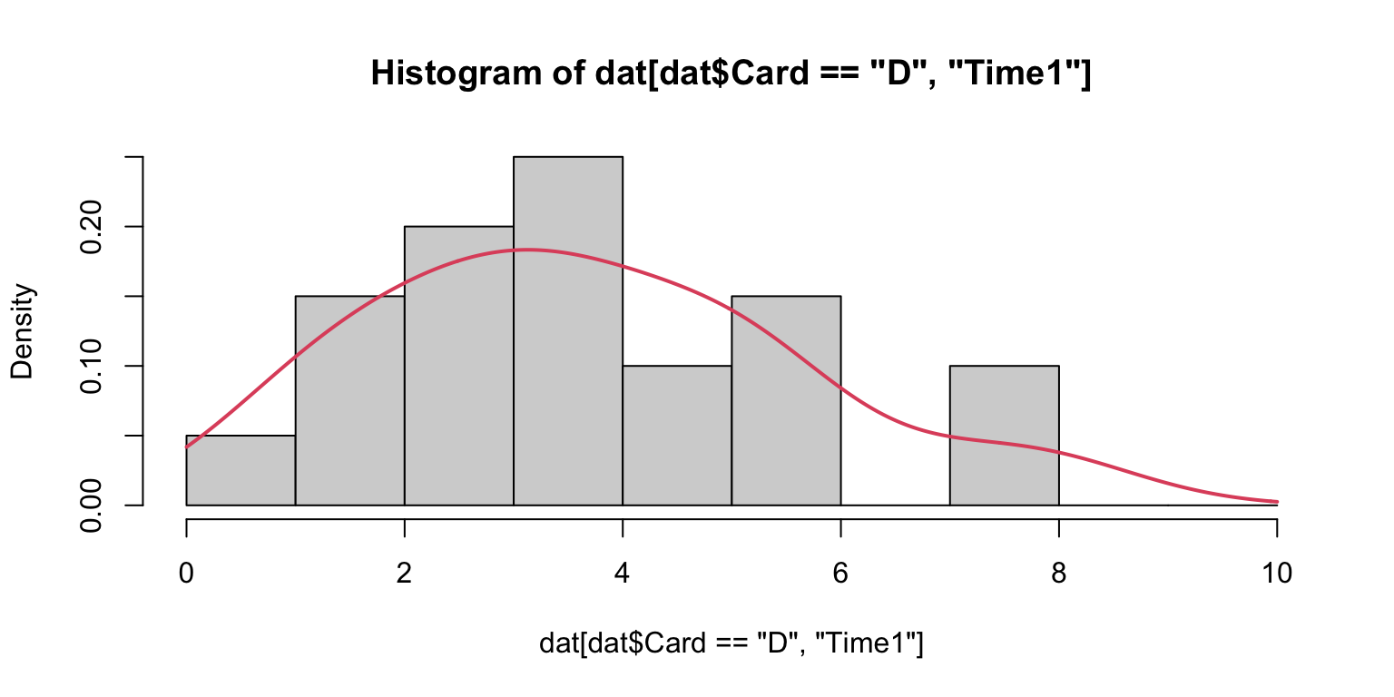
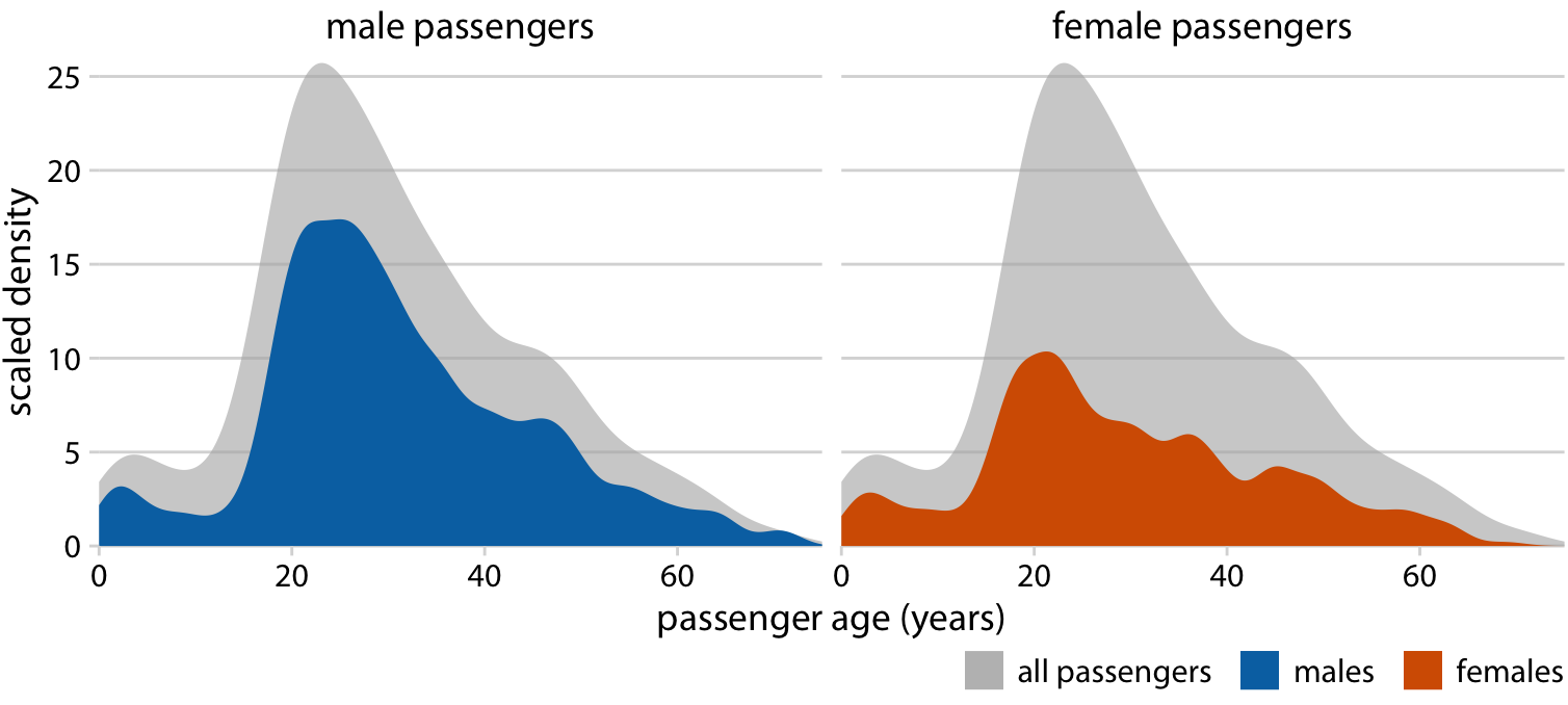
A common visual “test” of data properties is to overlay a density upon its histogram.

hist(dat[dat$Card=="D", "Time1"], breaks = 0:10, freq = FALSE)
lines(density(dat[dat$Card=="D", "Time1"], from = 0, to = 10, na.rm = T), 
      col = 2, lwd = 2)
Figure 6

Histograms and densities

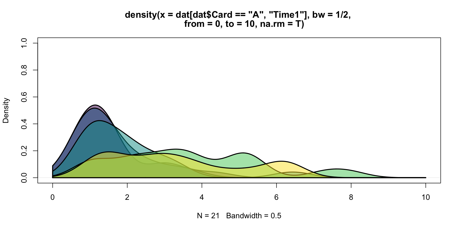
As mentioned, it is “best” to layer filled-density plots, rather than histograms.

That said, just like hist() has a variety of defaults choices, so does density().

Experiment with density(..., bw = ...) by choosing values for the “bandwidth”. Use your experiments to learn about what this argument does.

Layering densities

cols <- hcl.colors(5, alpha = 0.5)
plot(density(dat[dat$Card=="A", "Time1"], from = 0, to = 10, na.rm = T, 
             bw = 1/2), col = cols[1], lwd = 2, ylim = c(0, 1))
for(i in 1:5){
  den <- density(dat[dat$Card==LETTERS[i], "Time1"], from = 0, to = 10, 
                 na.rm = T, bw = 1/2)
  polygon(c(den$x, rev(den$x)), c(0*den$y, rev(den$y)), col = cols[i], lwd = 2)
}

Applications of layered densities

Tables

Have we made it?

  • I hope so, but if not we will soon.
  • Even within “base R”, there are a variety of useful data-exploring commands.

To be clear, tables are a form of data visualization.

These are someone analagous to MS Excel “Pivot Tables”.

Generating tabular displays (I)

Within “base R”, personal favorites are table() and aggregate().

table(warpbreaks$wool)
#> 
#>  A  B 
#> 27 27
table(warpbreaks[, c("wool", "tension")])
#>     tension
#> wool L M H
#>    A 9 9 9
#>    B 9 9 9

It is often useful to assign these tables to a temporary variable such as tab or tmp.

Generating tabular displays (II)

aggregate(warpbreaks$breaks, by = list(warpbreaks$wool), mean)
#>   Group.1        x
#> 1       A 31.03704
#> 2       B 25.25926
agg2 <- aggregate(warpbreaks$breaks, by = list(warpbreaks$wool, warpbreaks$tension), mean)

Alternate “model” syntax is possible!

Merging and renaming

We can use a related command merge() to combine multiple aggregated values and names() to give it some organization.

agg1 <- aggregate(warpbreaks$breaks, by = list(warpbreaks$wool,
                                               warpbreaks$tension), mean)
agg2 <- aggregate(warpbreaks$breaks, by = list(warpbreaks$wool, 
                                               warpbreaks$tension), sd)
agg <- merge(agg1, agg2, by = c("Group.1", "Group.2"))

Boxplots

Recall the “preattentive pop-out” data stored in cards.csv.

dat <- read.delim("../data/cards2.csv", header = TRUE, sep=',')
dat <- na.omit(dat)
head(dat)
#>          ID Card Time1 Time2
#> 6      KL05    A  1.28  0.71
#> 7      KL05    B  1.28  1.03
#> 8      KL05    C  1.10  1.34
#> 9      KL05    D  2.10  0.83
#> 10     KL05    E  2.53  1.38
#> 11 John Doe    A  1.60  1.18

What vizualizations are relevant?

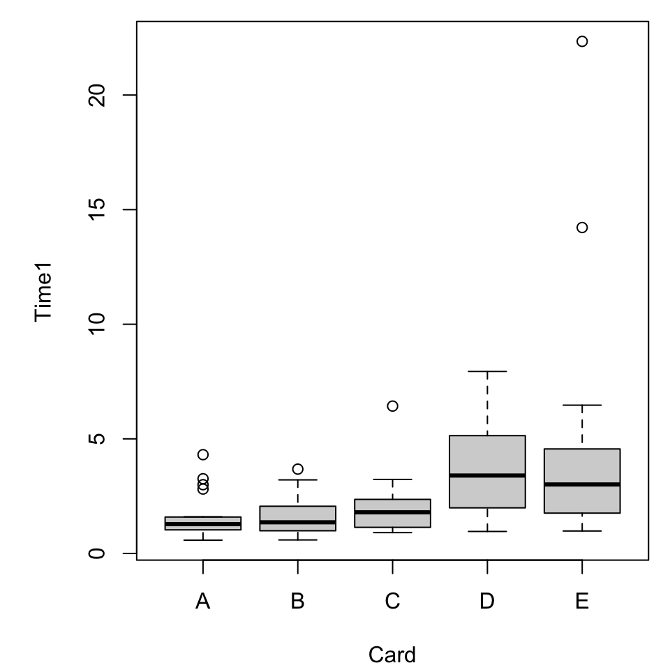
Boxplots

A basic boxplot, as we’ve seen, comes pretty quickly.
par(mar = c(4.1, 5.1, 0.8, 0.8))
boxplot(Time1 ~ Card, dat)
Figure 8: A boxplot of measured reaction times.

What does it mean?

Properties of a boxplot

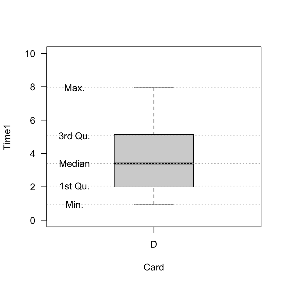
It might help to know what in our data is reflected in the plot.

summary(dat[dat$Card== "D", "Time1"])
#>    Min. 1st Qu.  Median    Mean 3rd Qu.    Max. 
#>   0.960   2.045   3.400   3.633   5.060   7.940

A highly annotated boxplot.

A highly annotated boxplot.

More categorical variables

For simplicity we will switch to a built-in dataset, warpbreaks. Use ?warpbreaks to view its description and citation.

Roughly, it contains columns

  • breaks the number of breaks per length of yarn
  • wool the type of wool (A or B)
  • tension the weaving tension (L, M, H)
summary(warpbreaks)
#>      breaks      wool   tension
#>  Min.   :10.00   A:27   L:18   
#>  1st Qu.:18.25   B:27   M:18   
#>  Median :26.00          H:18   
#>  Mean   :28.15                 
#>  3rd Qu.:34.00                 
#>  Max.   :70.00

Multiple boxplots

par(mar = c(4.1, 5.1, 0.8, 0.8))
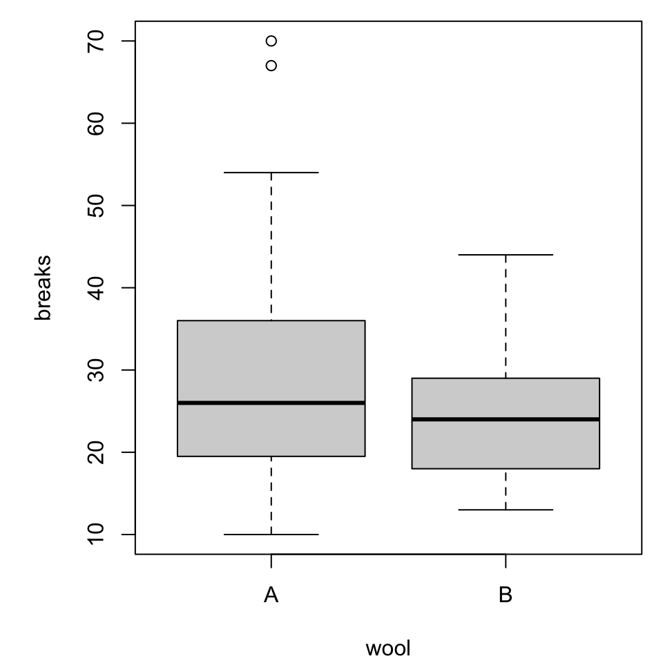
boxplot(breaks ~ wool, warpbreaks)
Figure 9: Number of breaks by wool type.
par(mar = c(4.1, 5.1, 0.8, 0.8))
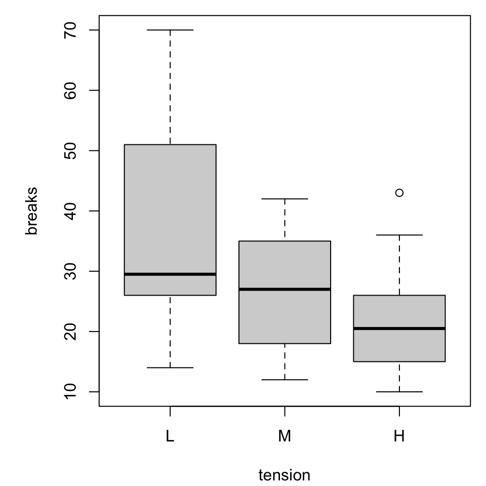
boxplot(breaks ~ tension, warpbreaks)
Figure 10: Number of breaks by tension setting.

Combined boxplot

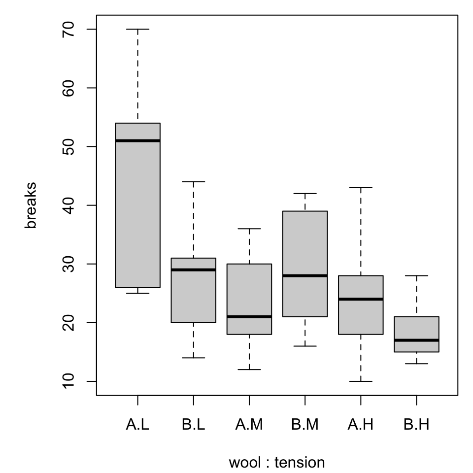
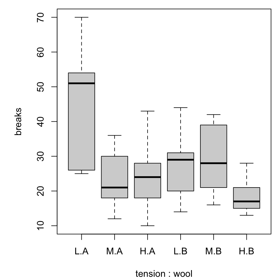
Notice that the order of specifying the variables matters!

par(mar = c(4.1, 5.1, 0.8, 0.8))
boxplot(breaks ~ wool*tension, warpbreaks)
Figure 11: Number of breaks by wool type within tension setting.
par(mar = c(4.1, 5.1, 0.8, 0.8))
boxplot(breaks ~ tension*wool, warpbreaks)
Figure 12: Number of breaks by tension setting within wool type.

Annotating boxplots

We could experiment with

  • replacing the variable codes with meaningful labels
  • coloring or shading the boxes in helpful ways

There are some interesting features that emerge.

  • Try specifying two or three colors for the second set of boxplots.
  • Do the colors appear in a helpful manner?

Extending boxplots

“Recently” boxplots (circa 1977) have evolved into violin plots (circa 1997).

  • Violin plots show the “shape” (in ways not equally appreciated by all) of the data.
  • We will revisit the idea, with caution, with ggplot.

More simply, boxplots can be overplotted with dots.

Boxplot with dots

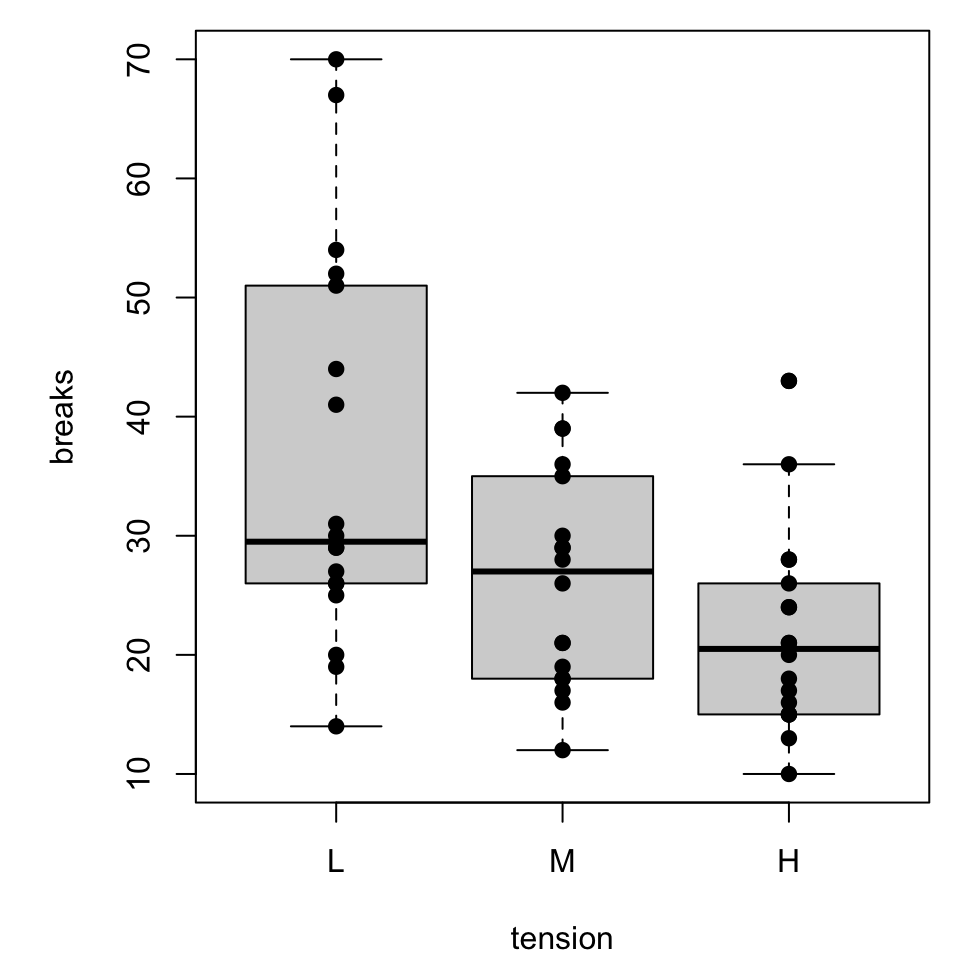
par(mar = c(4.1, 5.1, 0.8, 0.8))
bxp <- boxplot(breaks ~ tension, warpbreaks)
points(breaks ~ tension, warpbreaks, pch = 19)
Figure 13: Number of breaks by tension setting within wool type. Raw data added.

Since many of the dots might overlap, we might be interested in incorporating horizontal jitter to alter the readability

Things get a little slippery here.

  • tension and wool are categorical, so it might take a bit of scratchwork to determine sensible, numerical input values.
  • It would be reasonable to create auxilliary variables that are numerical analogs (i.e., L “=” 1, M “=” 2, …).