Data Visualization and Exploration
scales: colors and numbers
Transition from last week
- Last week we looked at plots showing the distribution of raw data values.
- There are a variety of ways to do this - context and audience matter.
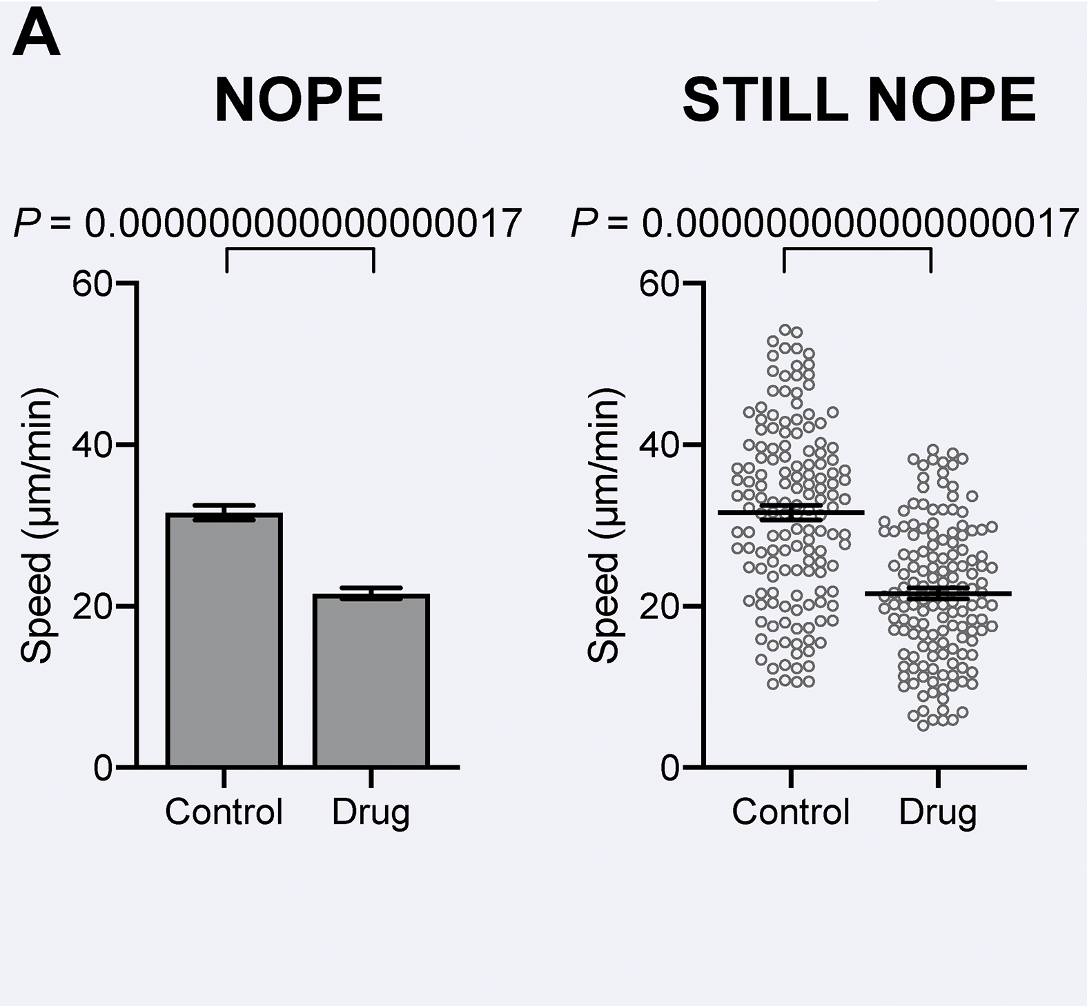
- Consider the sample data to the right with variables
Replicate (1, 2, 3)Treatment (“Control”, “Drug”)Speed (decimal values)
| 1 |
Control |
43.69202 |
| 1 |
Control |
41.85664 |
| 1 |
Control |
49.11707 |
| 1 |
Control |
49.79331 |
| … |
… |
… |
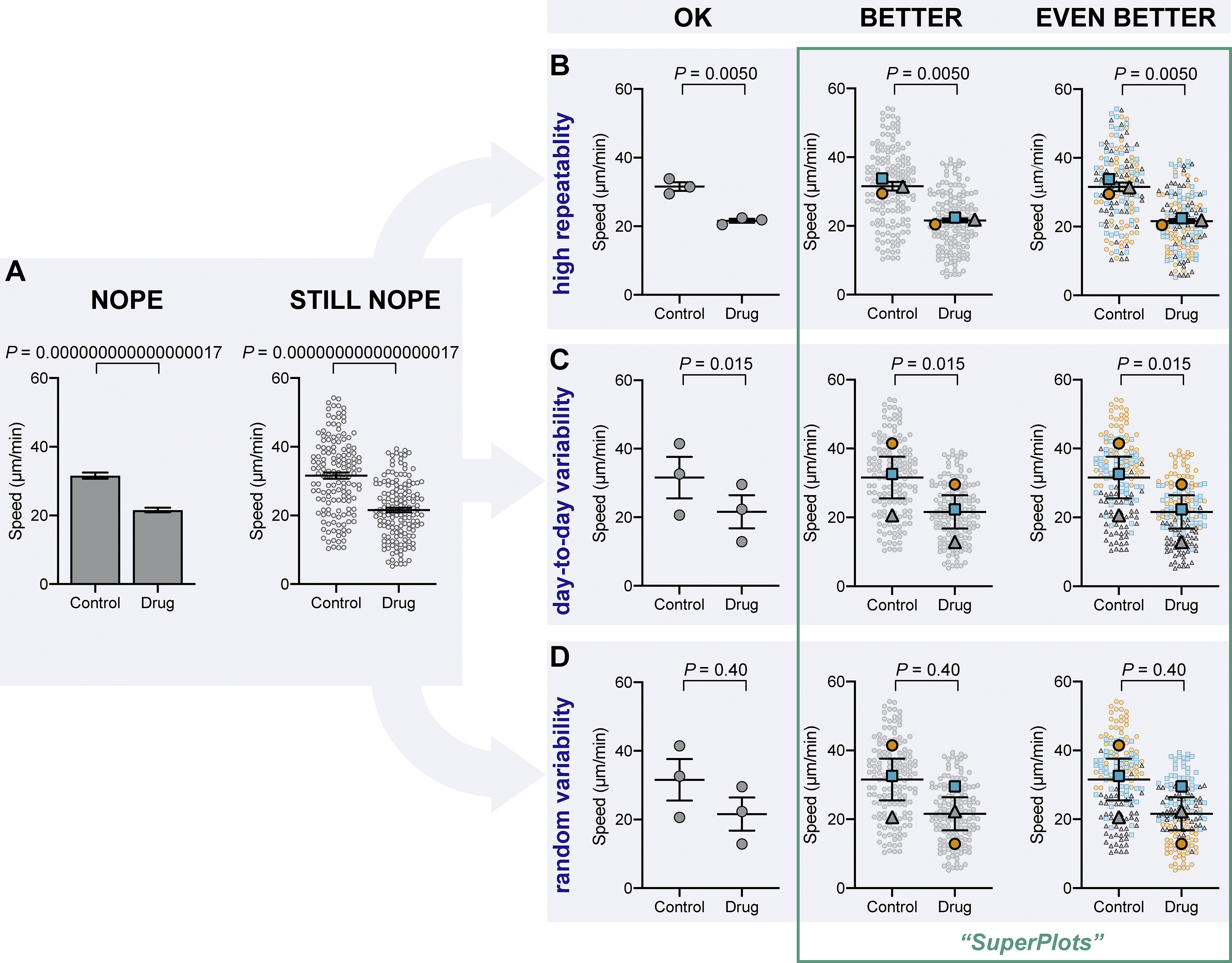
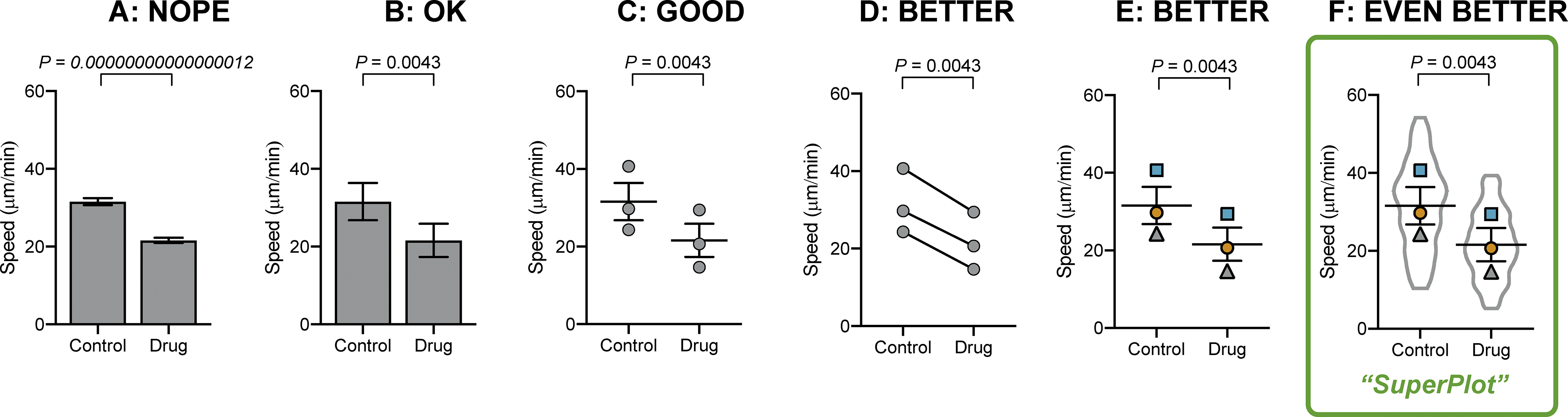
Bar plots to “SuperPlots”
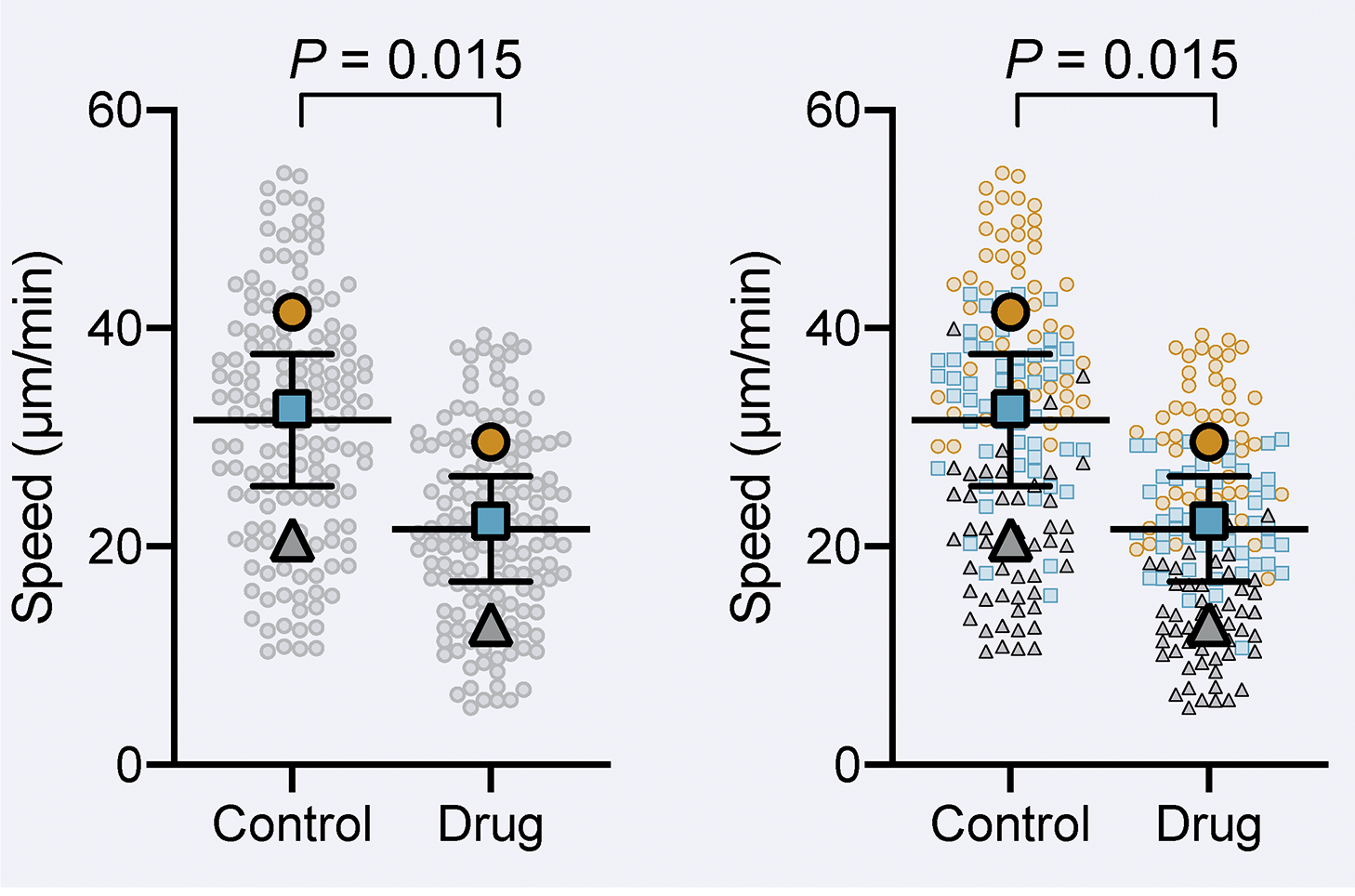
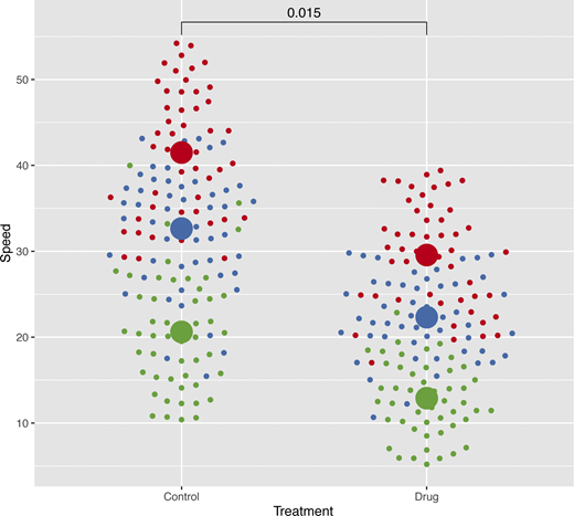
Replacing bar plots1
Do any of these panels stand out as familiar, helpful, confusing, surprising?
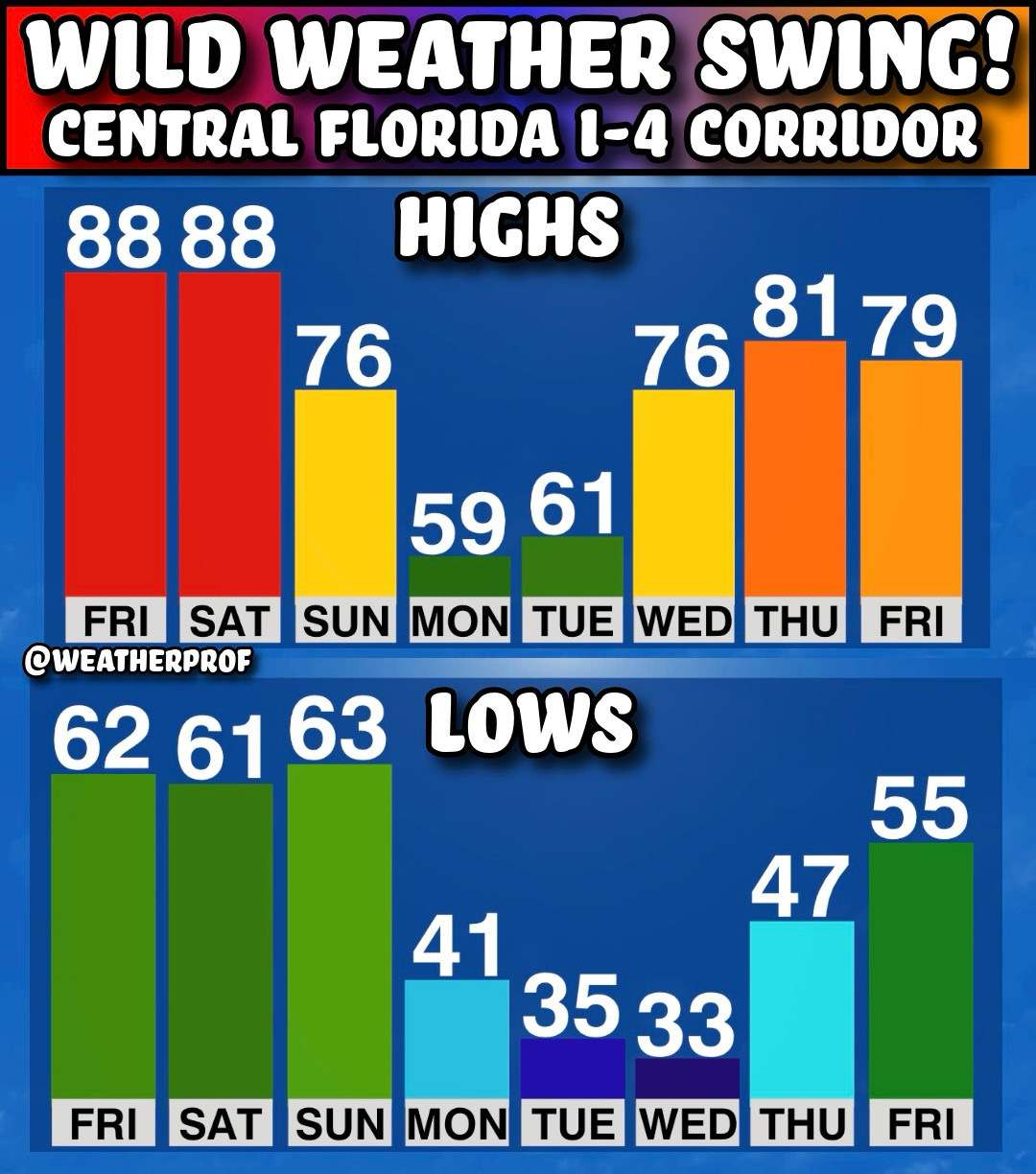
Weather in Florida
- What would you change?
- How would you do it?
- What data would you use?
- How would you get the data?
Weather in Florida
What data might go into the forecast graphic and how else could we represent that more effectively?
Color contrast
Color contrast measures the difference in luminance1 between two colors. A few good options are below.
Current WCAG 2.1 AA Recommendations
For text:
standard defines an acceptable contrast ratio as at least 3:1 for large or bold text and icons and 4.5:1 for general reading text.
For graphics:
shapes, icons, and large text relative to their background color meets a minimum ratio of 3:1.
Regardless of contrast, color alone should rarely be used. Encode redundantly with symbols, patterns, or labeling.
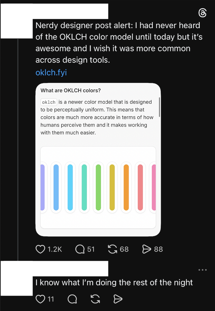
OKLCH
The webpage has a great interactive tool showcasing one key achievement of this color model - lightness.
Style guides (as constraints)
Some companies have style or branding guides that could influence what colors are available for use in data visualizations.
To compensate you could
- use shapes or line styles
- directly annotate data
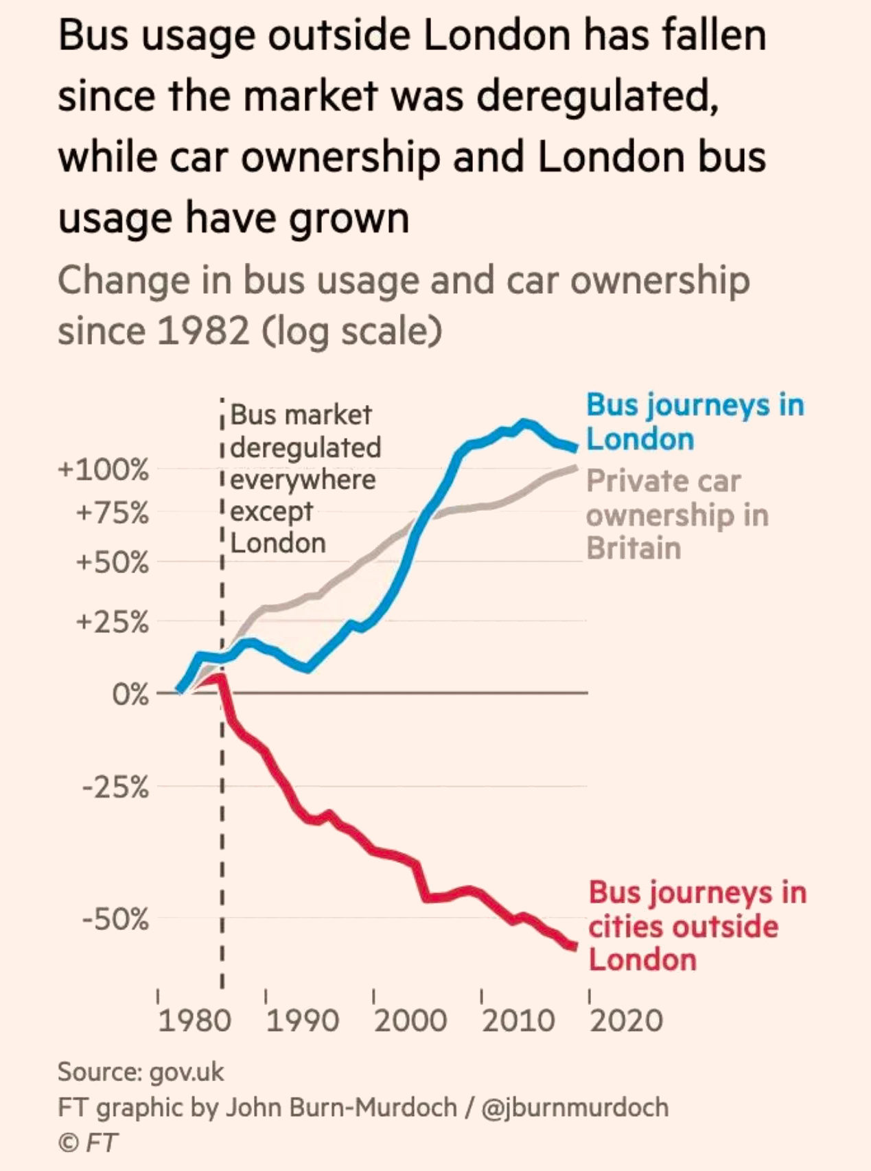
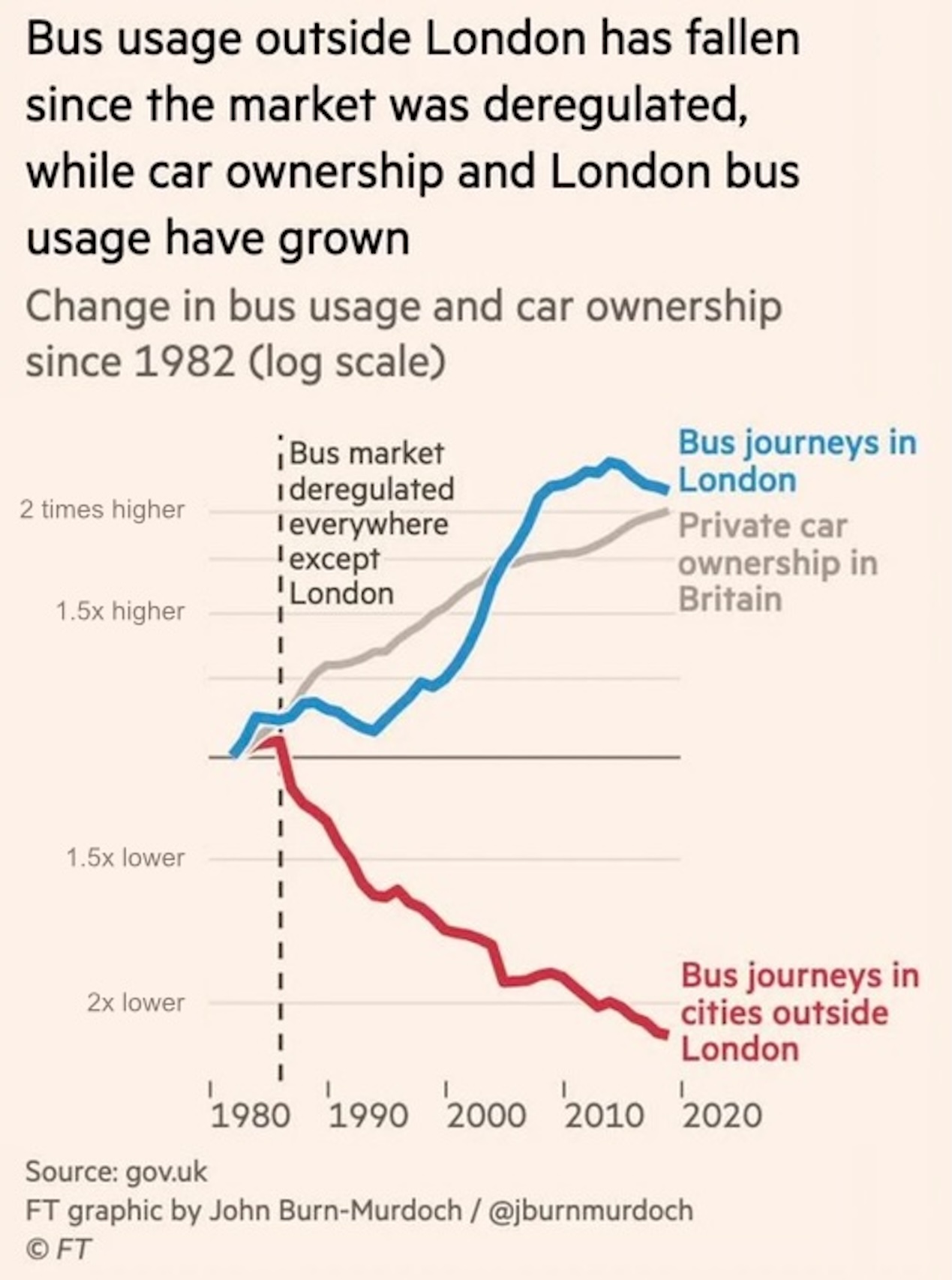
Properties of growth
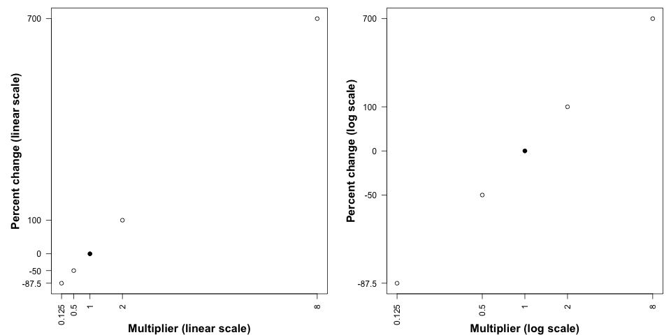
Suppose we are interested in “percent change” as a metric.
| 700% |
8 |
| 100% |
2 |
| 0% |
1 |
| -50% |
\(\frac{1}{2}\) |
| -87.5% |
\(\frac{1}{8}\) |
- Which is “more important” doubling or halving?
- How should each change be represented in a graph?
Re-analysis Goals
Graph all three columns of the data in exponential.csv, first on linear scale and next on a log scale.
Observe how the use of vertical space draws attention to the “action” in the data. In other words, “what do you notice?”
Dealing with ugly
The default R axes are not necessarily pleasing.
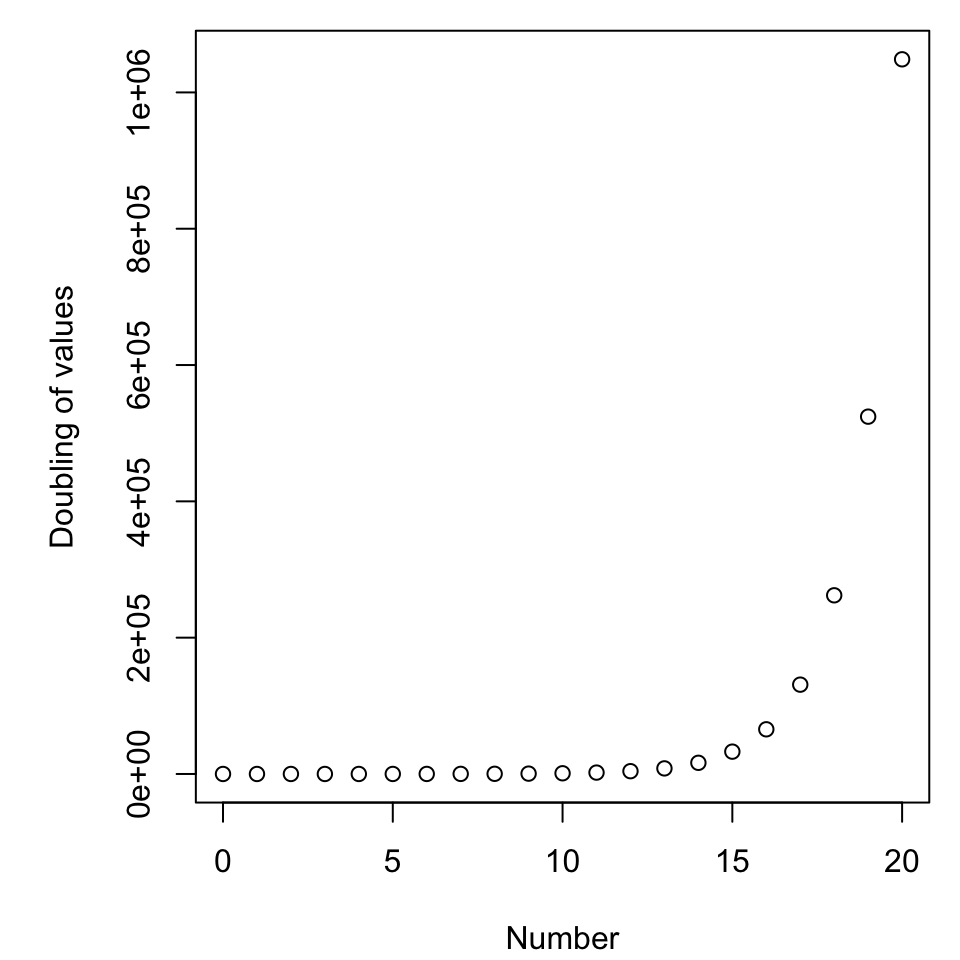
par(mar = c(4.1, 5.1, 0.8, 0.8))
x <- 0:20
plot(x, 2^(x), ylab = "Doubling of values", xlab = "Number")
As it is, few things will change that.
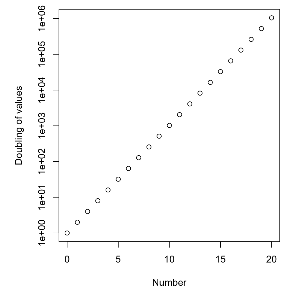
Changing the scale
The default R axes are not necessarily pleasing.
par(mar = c(4.1, 5.1, 0.8, 0.8))
x <- 0:20
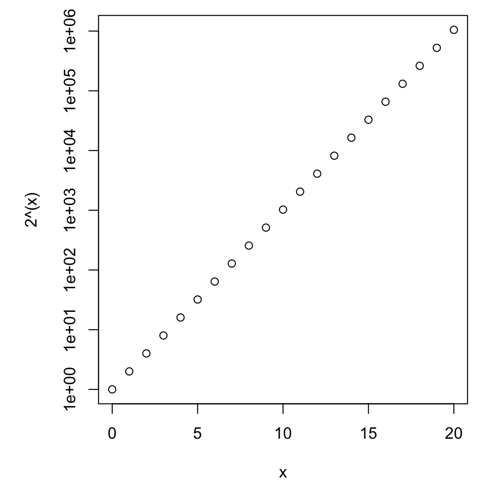
plot(x, 2^(x), ylab = "Doubling of values", xlab = "Number", log = 'y')
New questions
What to plot, what to label?
- Do we plot the logarithm and have a “nicer” axis?
- Do we plot the raw data and have more complex axis?
Regardless of choice, how do we make it user-friendly and “nice” aesthetically?
Improving aesthetics
Suppress axes with axes = F, but invite them back with the axis() command.
You’ll have to ask and answer
- “where are the ticks?”,
- “what are their labels?”, and
- “what is the vertical axis label?”.
Fortunately we do not have to worry about the horizontal axis (here representing “time”) because that pretty much only makes sense on a linear scale.
par(mar = c(4.1, 5.1, 0.8, 0.8))
x <- 0:20
plot(x, 2^(x), log = 'y')
Comparing values or growth rates
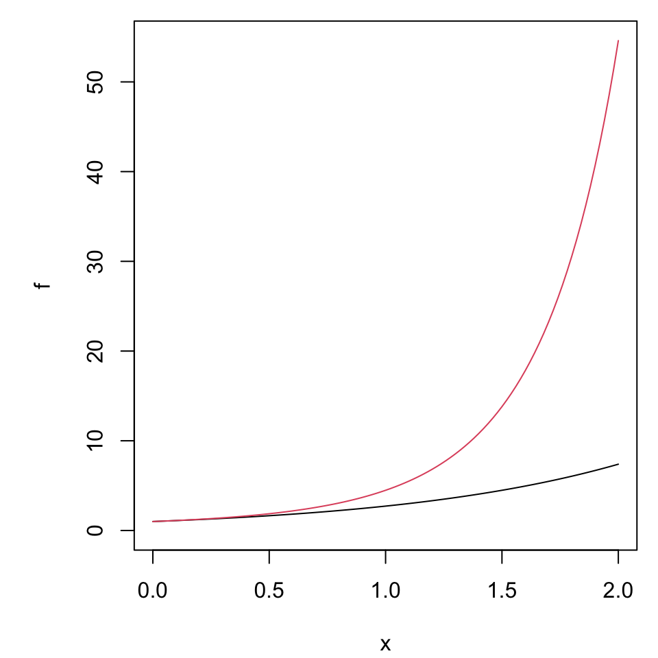
f <- function(x)exp(x)
g <- function(x)exp((1 + 0.5*x)*x)
par(mar = c(4.1, 5.1, 0.8, 0.8))
plot(f, xlim = c(0, 2), ylim = c(0, g(2)))
plot(g, xlim = c(0, 2), col = 2, add = T)
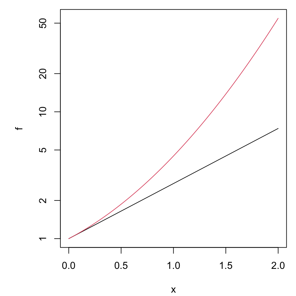
f <- function(x)exp(x)
g <- function(x)exp((1 + 0.5*x)*x)
par(mar = c(4.1, 5.1, 0.8, 0.8))
plot(f, xlim = c(0, 2), ylim = c(1, g(2)), log = 'y')
plot(g, xlim = c(0, 2), col = 2, add = T, log = 'y')
A good rule of thumb
To illustrate value use a linear scale, to inspect rate of change use a log scale.
Consider the log-transformation of \(y = ae^{bt}\) which becomes \(\ln(y) = \ln(a) + bt\). (Verify this.)
For convenience we use the natural logarithm, but the rules work the same for any other choice of base.
This means the underlying exponential parameter \(b\) is emphasized as the slope when graphed on the log scale.