Data Visualization and Exploration
some questions
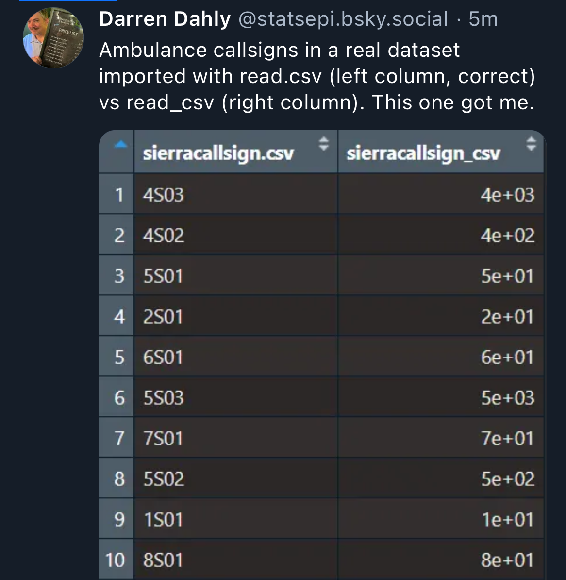
Chance encounters
Why we should always inspect raw data by making our own graphs and tables.
Chance encounters
What questions do you have about these?
Chance encounters
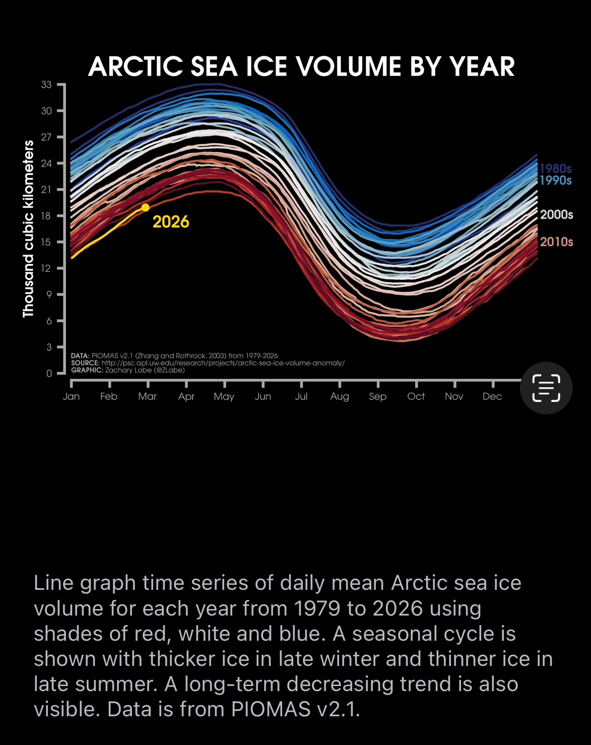
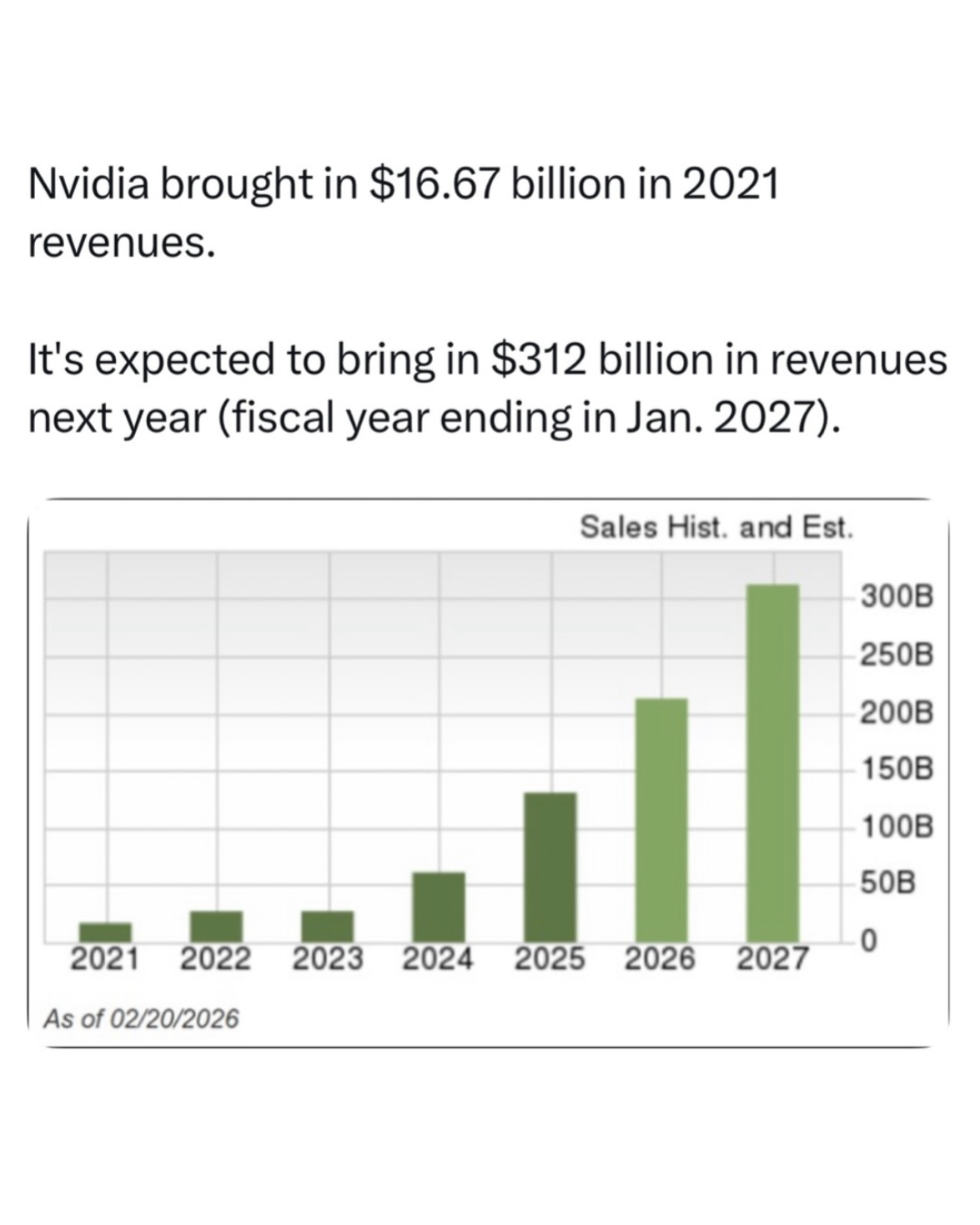
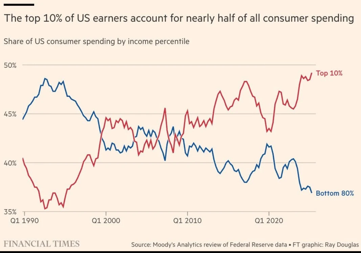
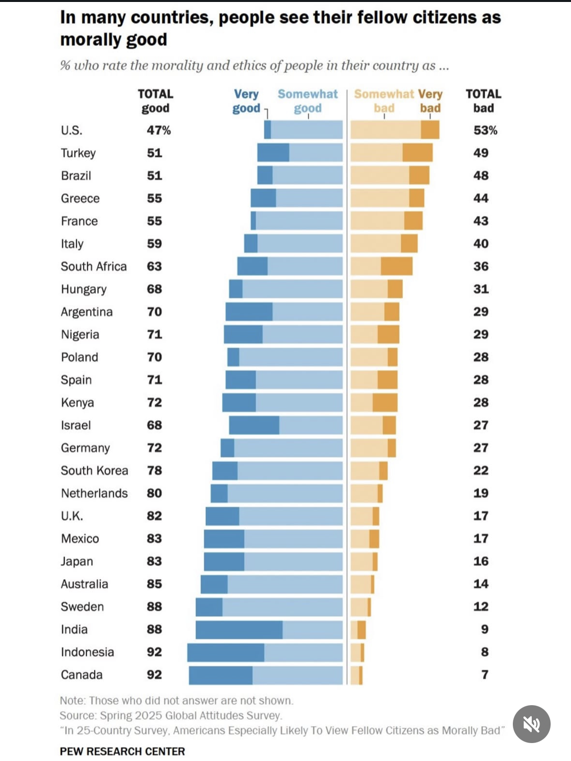
Both graphs are shared from the Instagram account “wehavethedata” but show original sources.
What do you notice?
Let’s write some alternative text descriptions.
Your questions
- “Can we talk a little more about aesthetics? Expectations or taboos?”
- “Can we talk more about established evaluation methods or research studies that formally compare the effectiveness of different visualizations?”
Aesthetics
As with everything, opinions are mixed.
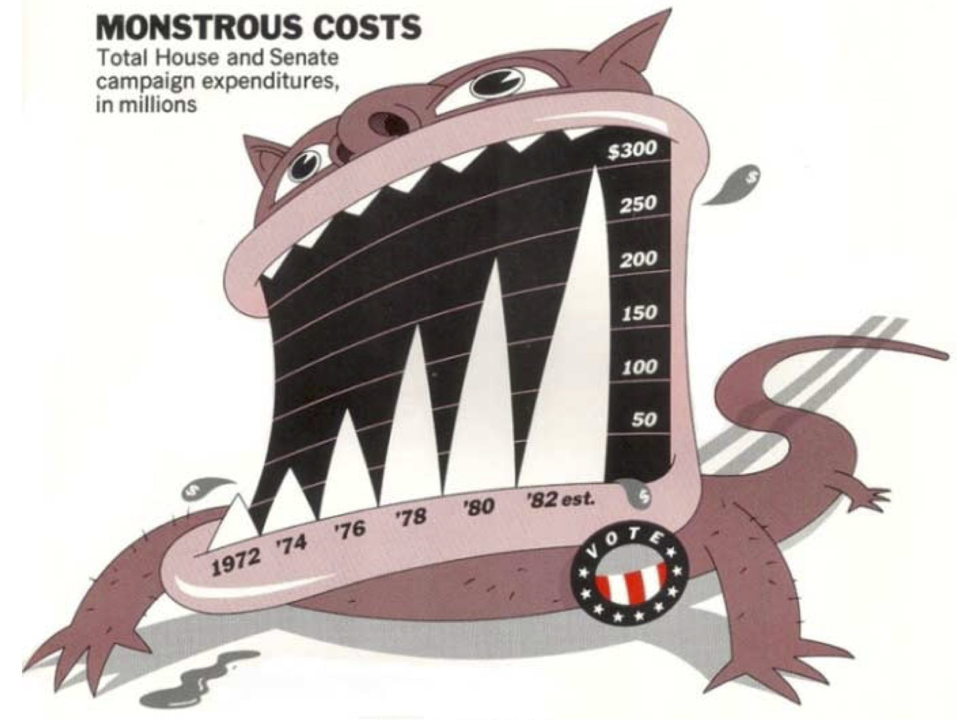
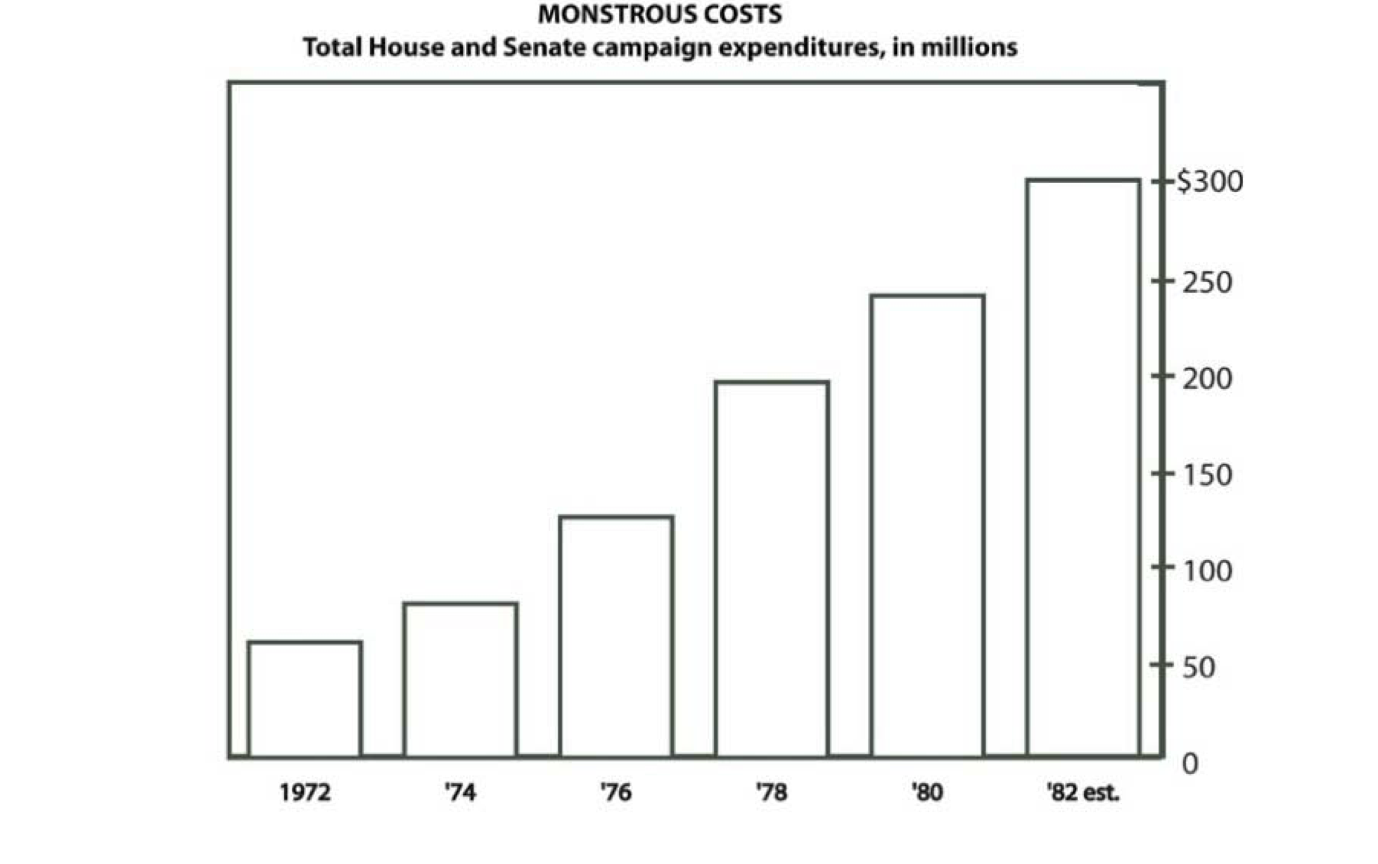
“Decoration” might make graphs more memorable1, but at what cost(s)?
The research
Bateman et al. (2010)1
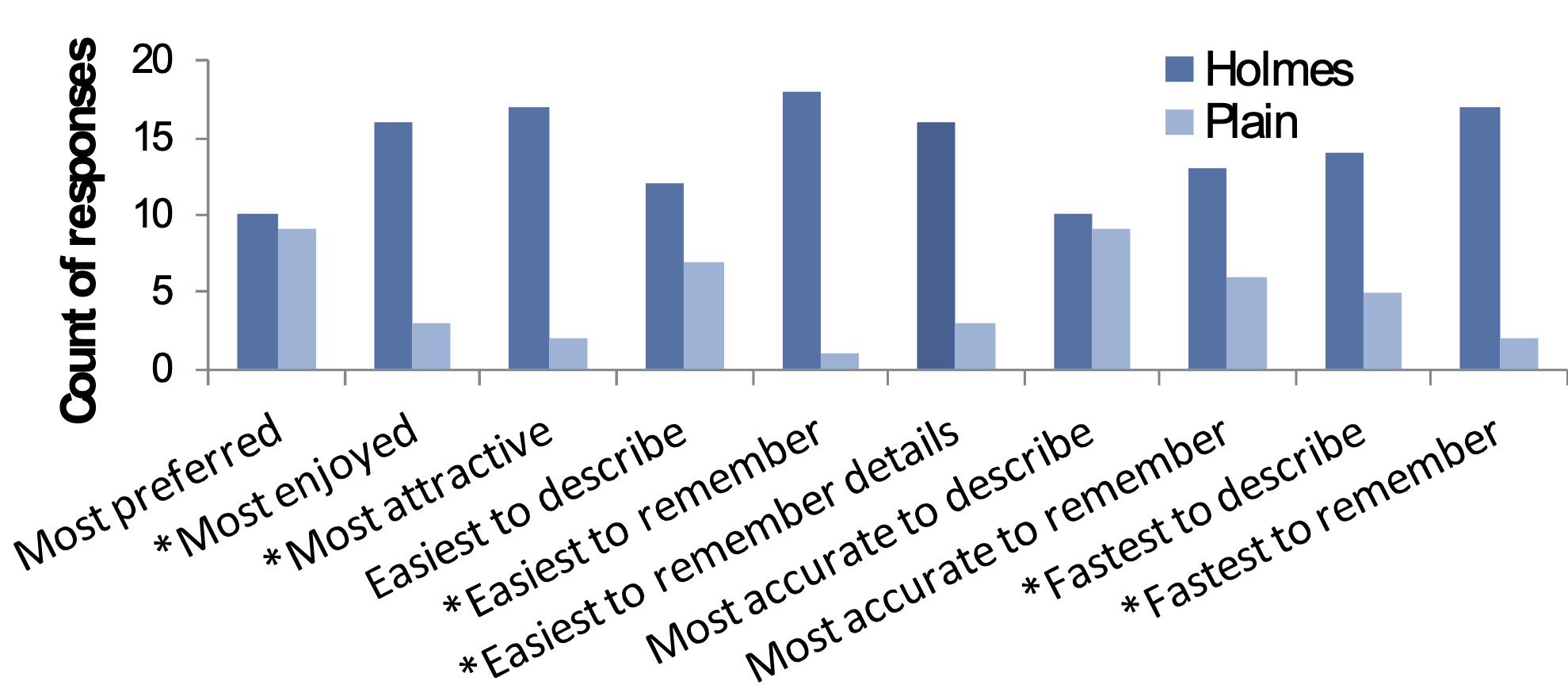
conducted an experiment that compared embellished charts with plain ones, and measured both interpretation accuracy and long-term recall
They were interested in the accuracy of interpretation and long-term recall. They found
- accuracy in describing the embellished charts was no worse than for plain charts, and
- their recall after a two-to-three-week gap was significantly better.
This calls into question an older “rule” against “chartjunk”.
Gaze tracking research on graphics
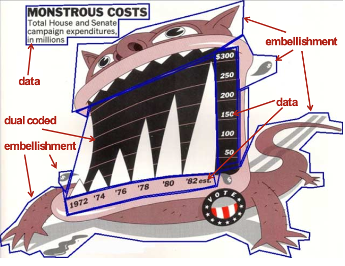
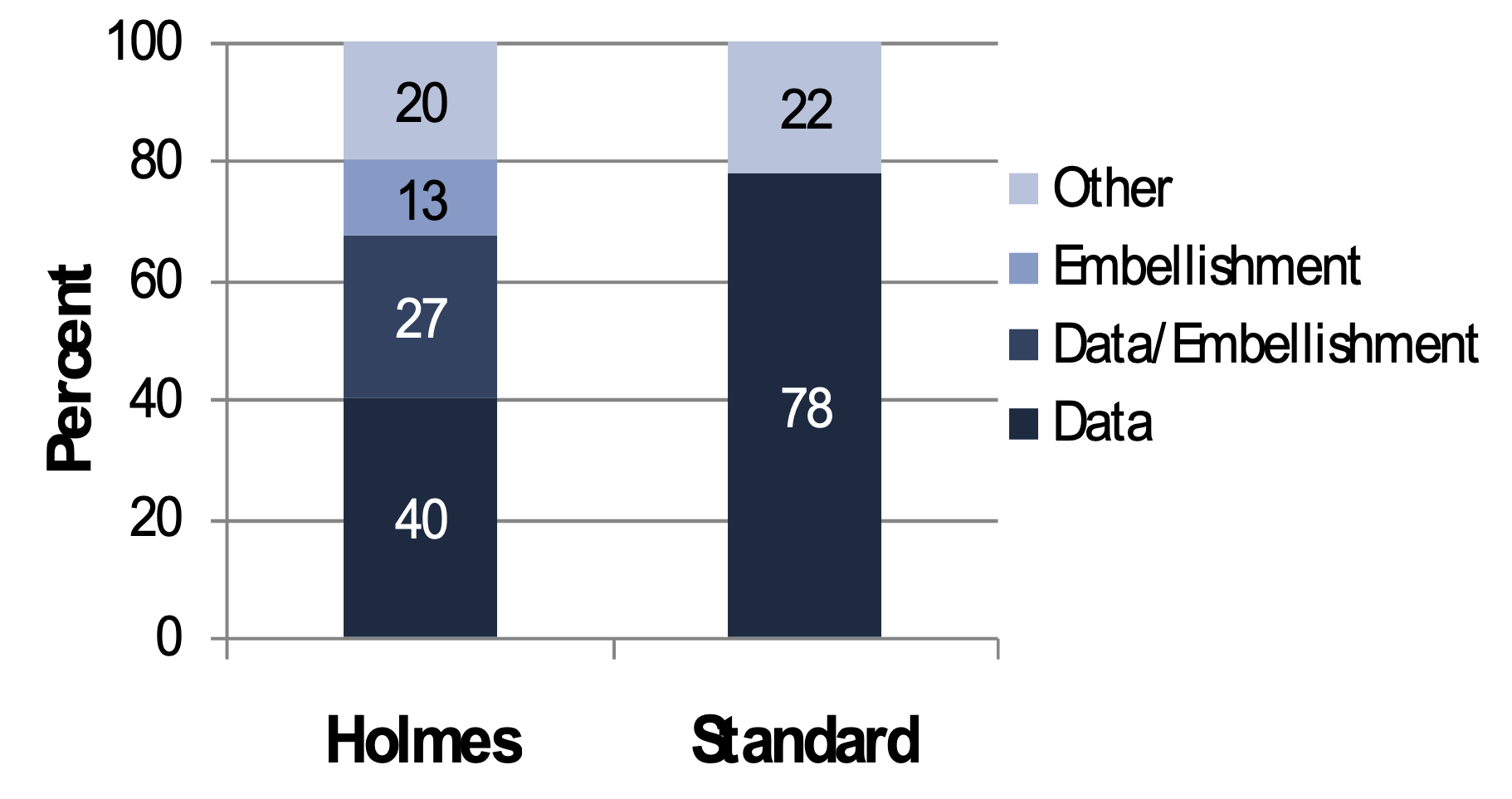
Used “gaze tracking” to determine how much time users spent looking at different components.
Gaze tracking data (I)
Participants spent less time looking at “data” in the embellished graph.
Is there anything we might change about this graph?
Gaze tracking data (II)
Participants spent less time looking at “data” in the embellished graph.
Is there anything we might change about this graph?
Other aesthetic considerations
Strong imagery is claimed to introduce bias in interpretation, but biases can be introduced in visually-unembellished charts as well (e.g., colors, orderings)
The authors even call for more research,
it seems clear that there is more to be learned about the effects of different types of visual embellishment in charts.
Other aesthetic recommendations
Some journals prohibit most table line separators (vertical or horizontal) aside from separating the table header.
To minimize distraction many experts recommend minimizing gridlines in graphics.
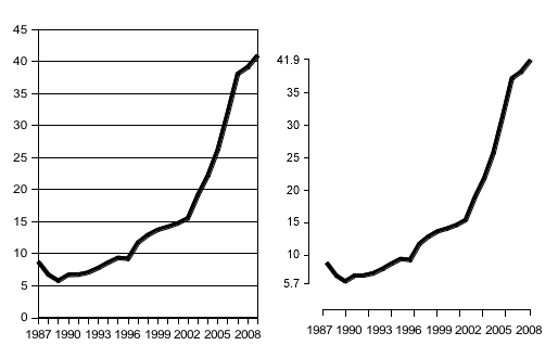
Some authors1 recommend not connecting axes that don’t start at the origin.
What do you notice? What do you wonder?
What type of graph should I make?
How we make and interact with graphs is a subject of surprisingly active research1.
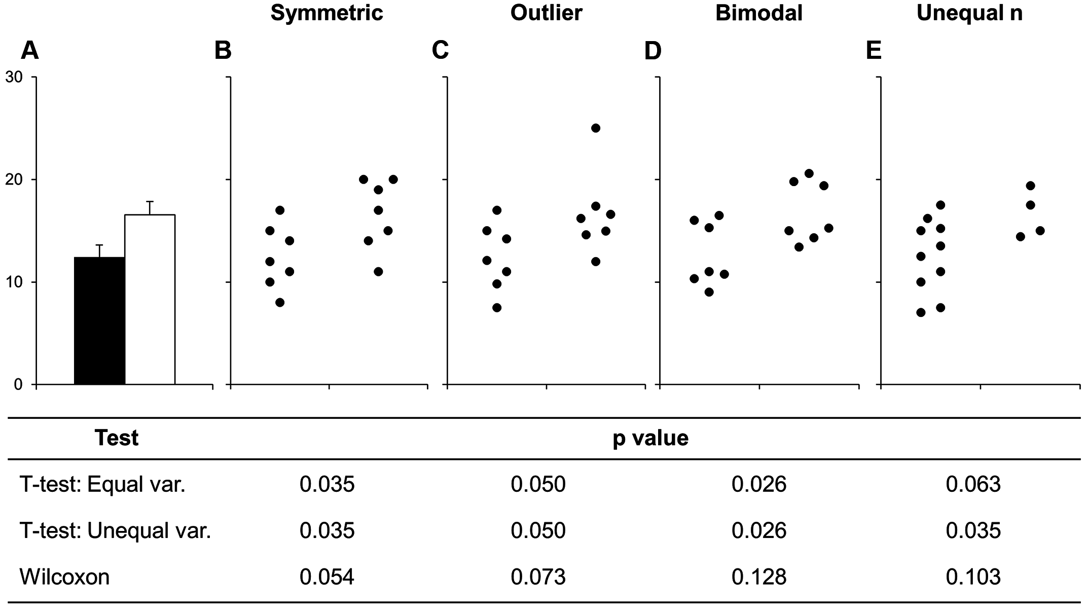
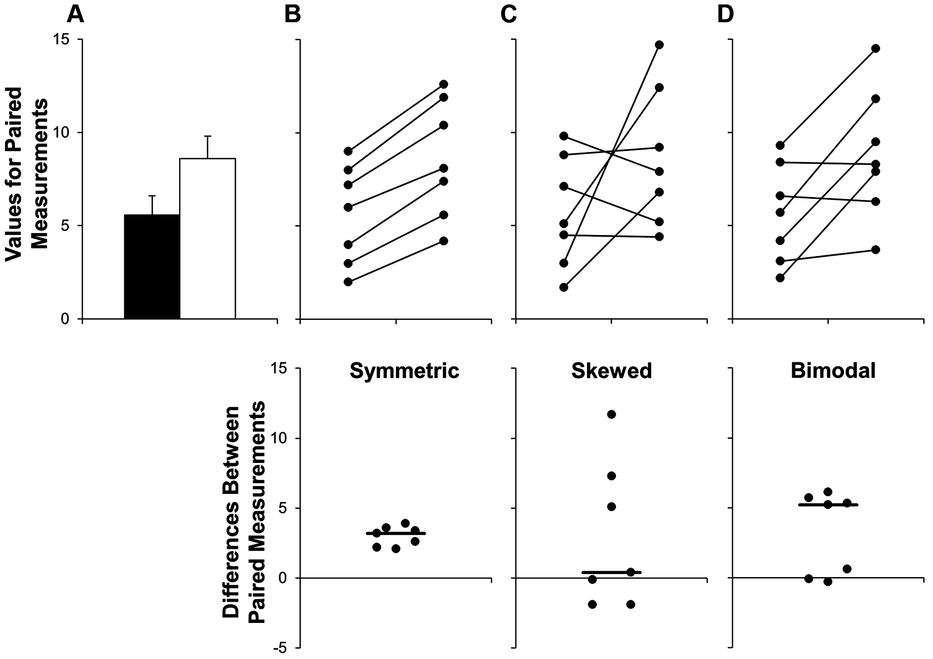
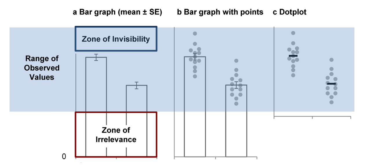
Recent work has raised awareness about the need to replace bar graphs of continuous data with informative graphs showing the data distribution.
Bar graphs
- should display counts or proportions across discrete categories, and
- should not be used to present summary statistics for continuous data.
Datasets with many different distributions may have the same summary statistics.
Visit this link, though not strictly about bar graphs, to explore more.
Lines are better than bar graphs?
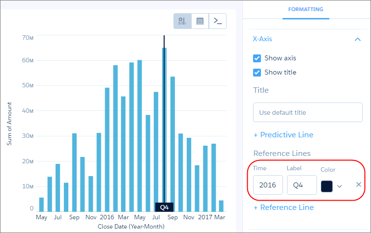
Often bar graphs are used to show time series data, instead we should use line graphs.
Literature against bar graphs
Bar graphs are critisized across recent literature and should really only be used for
- count or proportion data,
- with respect to distinct categories.
Otherwise consider
- line plots,
- boxplots,
- dot plots, or
at minimum overplot to show raw data superimposed on bars.
How do we assess the quality of a graph?
The answer to this one is tricky: “It depends.”
There are (as outlined above) certain very common practices that we should avoid.
Beyond that, generally, review examples from
- contemporary books,
- expert blogs or essays, or
- relevant academic or journalism articles.
Remaking graphs
We have seen a few “not so good” examples today.
Let’s attempt to extract data and remake the graphs.
Assessing graphs for accessibility
There are specific tools for assessing graphs with respect to accessibility.
This is an important, different, and technically very precise assessment.
We can look at Chartability for one (important) perspective.
while a highly trained auditor may be able to casually evaluate an artifact in as little as 30 minutes or even hold heuristics in mind as they are doing their own creative work, those new to auditing may take anywhere between 2 and 8 hours to complete a full pass of Chartability.