Balancing simplicity with detail? So many trade-offs.
More dashboards, more interactivity.
Choosing graph types
A common refrain is “use familiar graph types”, but sometimes we are familiar with bad things.
Literature review: Best practice principles for graph design from NSW Health (2006) makes a variety of literature-supported recommendations.
Use common graphs with which all readers are likely to be familiar: for example, line and bar graphs, pie charts and scatter plots.
But, pie charts
are fine for “part-to-whole judgments involving comparison of one proportion of an item to its whole”
“never for part-to-part judgments involving a decision of what proportion a smaller value is of a larger”
So, familiar doesn’t always mean effective.
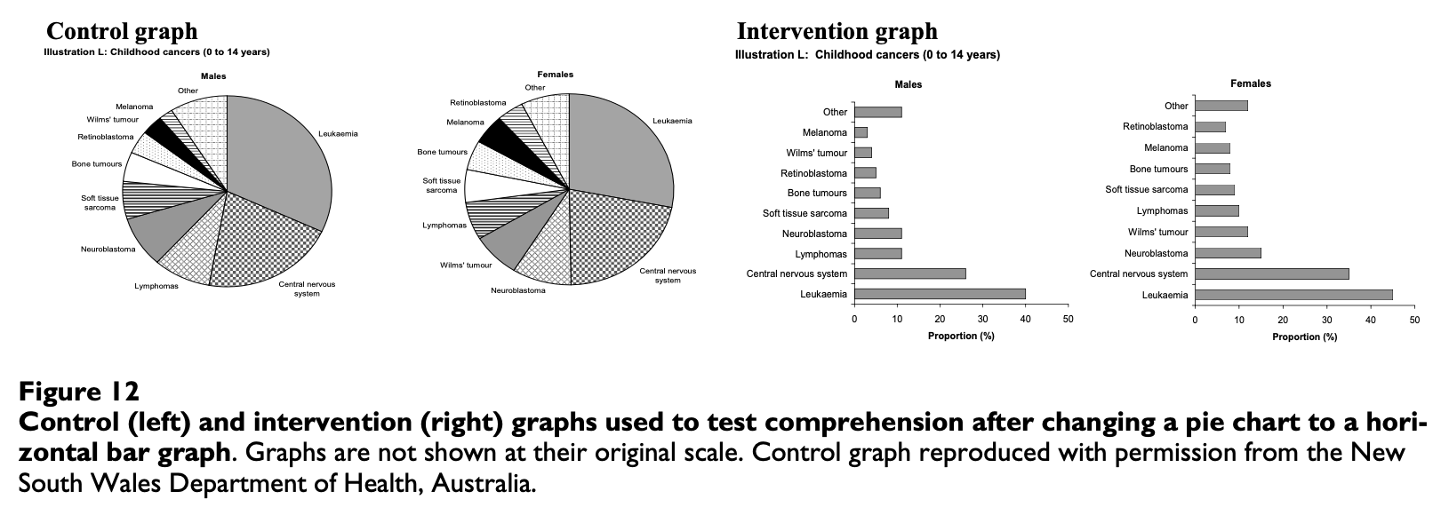
Simplicity without sacfificing detail
Figure 1: Pies or bars.
… 97% for a task identifying the largest category in a pie chart. Interventions producing the greatest improvement in comprehension were: changing a pie chart to a bar graph (3.6-fold increase in correct point reading)
But what choice do we have?
Take a look at the interactive chart selector tool for matching different kinds of graph types to different combinations of data types at Data to Viz
Stylish alternatives to pie charts
Figure 2: A sample pictogram for fake food consumption data
All the same powerful features of geom_waffle() are available to geom_pictogram() (including faceting/etc) but you should use them carefully, sparingly, and wisely. Pictures can help tell a data story but pictures can also distract from the data story.