Exponential growth
Read in the data exponential.csv, give it a brief inspection, and make a plot that shows all three trials plotted against time. This could be done
column-by-column, or
all at once with matplot().
<- read.delim ("./data/exponential.csv" , header = T, sep = ',' )head (dat)#> time trial1 trial2 trial3 #> 1 0 10 10 10.0000 #> 2 1 10 20 5.0000 #> 3 2 10 40 2.5000 #> 4 3 10 80 1.2500 #> 5 4 10 160 0.6250 #> 6 5 10 320 0.3125
A closer look
Now plot just the first two rows. You can do this within the plot by putting a 1:2 in the first rows position of the data frame.
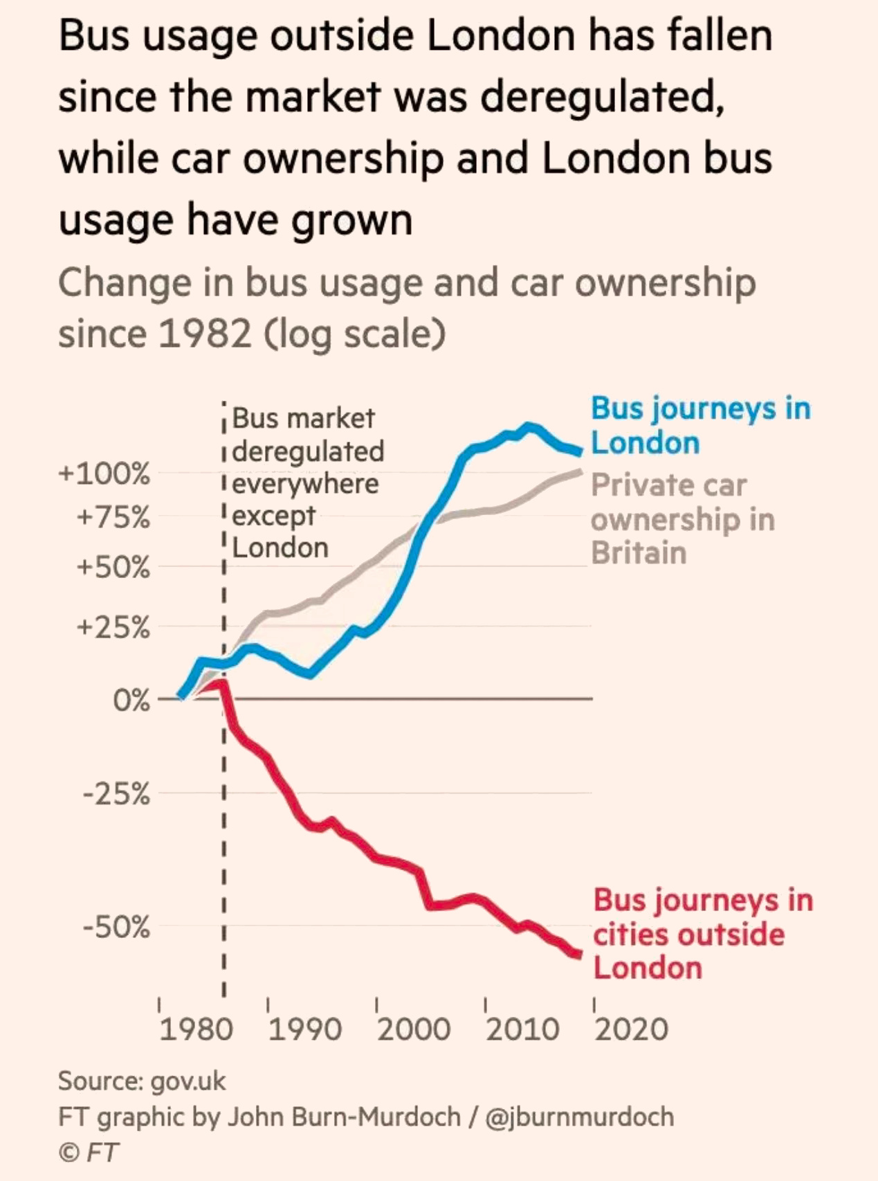
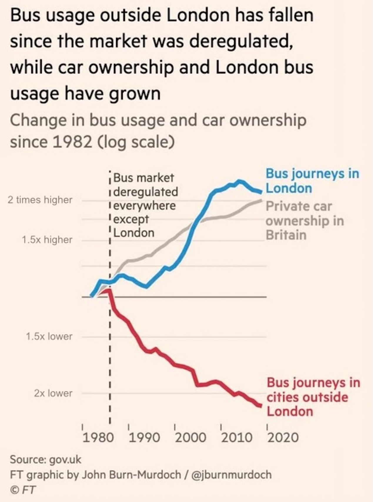
As measured by space, how much attention is given to halving versus doubling?
Is this fair?
Properties of growth
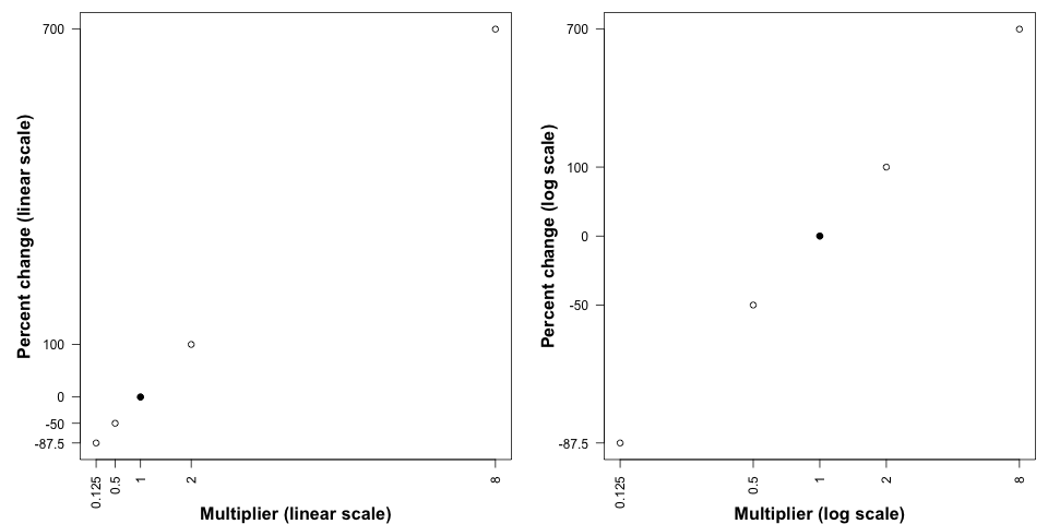
Suppose we are interested in “percent change” as a metric.
700%
8
100%
2
0%
1
-50%
\(\frac{1}{2}\)
-87.5%
\(\frac{1}{8}\)
Which is “more important” doubling or halving?
How should each change be represented in a graph?
Re-analysis Goals
Graph all three columns of the data in exponential.csv, first on linear scale and next on a log scale.
Observe how the use of vertical space draws attention to the “action” in the data. In other words, “what do you notice?”
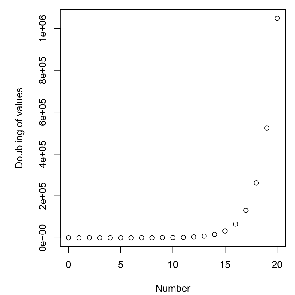
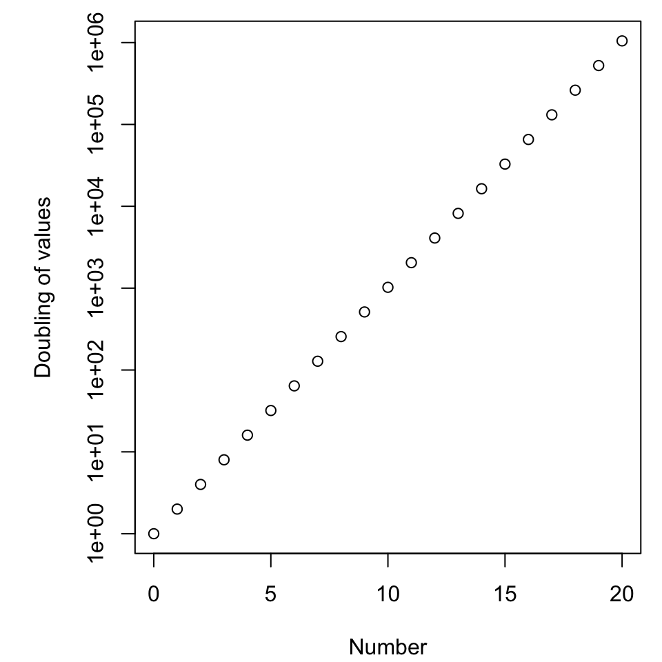
Dealing with ugly
The default R axes are not necessarily pleasing.
par (mar = c (4.1 , 5.1 , 0.8 , 0.8 ))<- 0 : 20 plot (x, 2 ^ (x), ylab = "Doubling of values" , xlab = "Number" )
As it is, few things will change that.
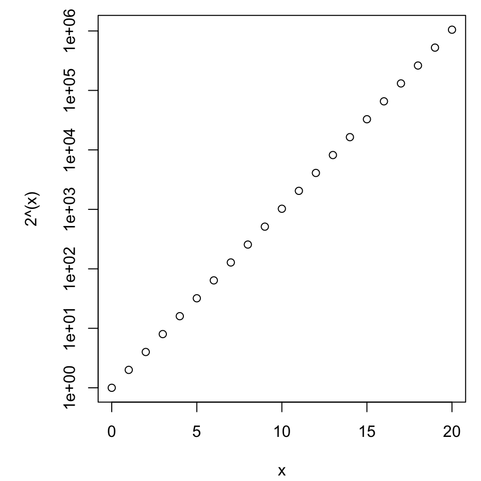
Changing the scale
The default R axes are not necessarily pleasing.
par (mar = c (4.1 , 5.1 , 0.8 , 0.8 ))<- 0 : 20 plot (x, 2 ^ (x), ylab = "Doubling of values" , xlab = "Number" , log = 'y' )
New questions
What to plot, what to label?
Do we plot the logarithm and have a “nicer” axis?
Do we plot the raw data and have more complex axis?
Regardless of choice, how do we make it user-friendly and “nice” aesthetically?
Improving aesthetics
Suppress axes with axes = F, but invite them back with the axis() command.
You’ll have to ask and answer
“where are the ticks?”,
“what are their labels?”, and
“what is the vertical axis label?”.
Fortunately we do not have to worry about the horizontal axis (here representing “time”) because that pretty much only makes sense on a linear scale.
par (mar = c (4.1 , 5.1 , 0.8 , 0.8 ))<- 0 : 20 plot (x, 2 ^ (x), log = 'y' )
A good rule of thumb
To illustrate value use a linear scale, to inspect rate of change use a log scale.
Consider the log-transformation of \(y = ae^{bt}\) which becomes \(\ln(y) = \ln(a) + bt\) . (Verify this.)
For convenience we use the natural logarithm, but the rules work the same for any other choice of base.
This means the underlying exponential parameter \(b\) is emphasized as the slope when graphed on the log scale.
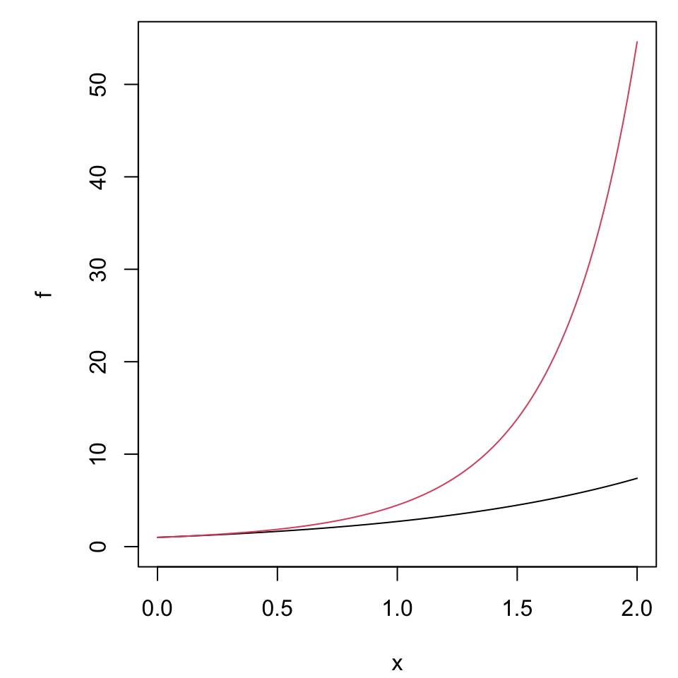
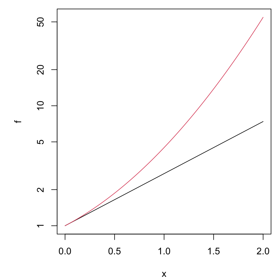
Comparing values or growth rates
<- function (x)exp (x)<- function (x)exp ((1 + 0.5 * x)* x)par (mar = c (4.1 , 5.1 , 0.8 , 0.8 ))plot (f, xlim = c (0 , 2 ), ylim = c (0 , g (2 )))plot (g, xlim = c (0 , 2 ), col = 2 , add = T)
<- function (x)exp (x)<- function (x)exp ((1 + 0.5 * x)* x)par (mar = c (4.1 , 5.1 , 0.8 , 0.8 ))plot (f, xlim = c (0 , 2 ), ylim = c (1 , g (2 )), log = 'y' )plot (g, xlim = c (0 , 2 ), col = 2 , add = T, log = 'y' )
Other summaries
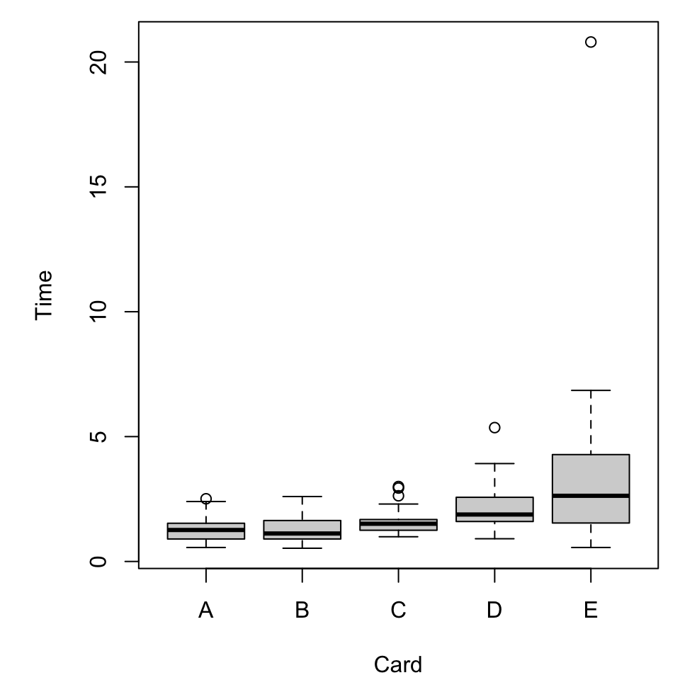
Recall the “preattentive pop-out” data stored in cards.csv.
<- read.delim ("./data/cards.csv" , header = TRUE , sep= ',' )<- na.omit (dat)head (dat)#> User Card Time #> 1 hs12 A 1.28 #> 2 hs12 B 1.57 #> 3 hs12 C 1.51 #> 4 hs12 D 1.65 #> 5 hs12 E 6.65 #> 6 br13 A 0.66
What vizualizations are relevant?
Boxplots
A basic boxplot, as we’ve seen, comes pretty quickly.
par (mar = c (4.1 , 5.1 , 0.8 , 0.8 ))boxplot (Time ~ Card, dat)
What does it mean?
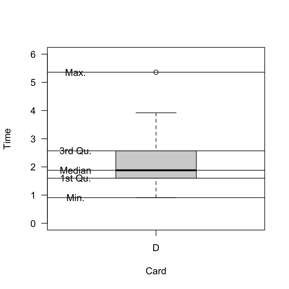
Properties of a boxplot
It might help to know what in our data is reflected in the plot.
summary (dat[dat$ Card== "D" , "Time" ])#> Min. 1st Qu. Median Mean 3rd Qu. Max. #> 0.910 1.600 1.880 2.109 2.570 5.360
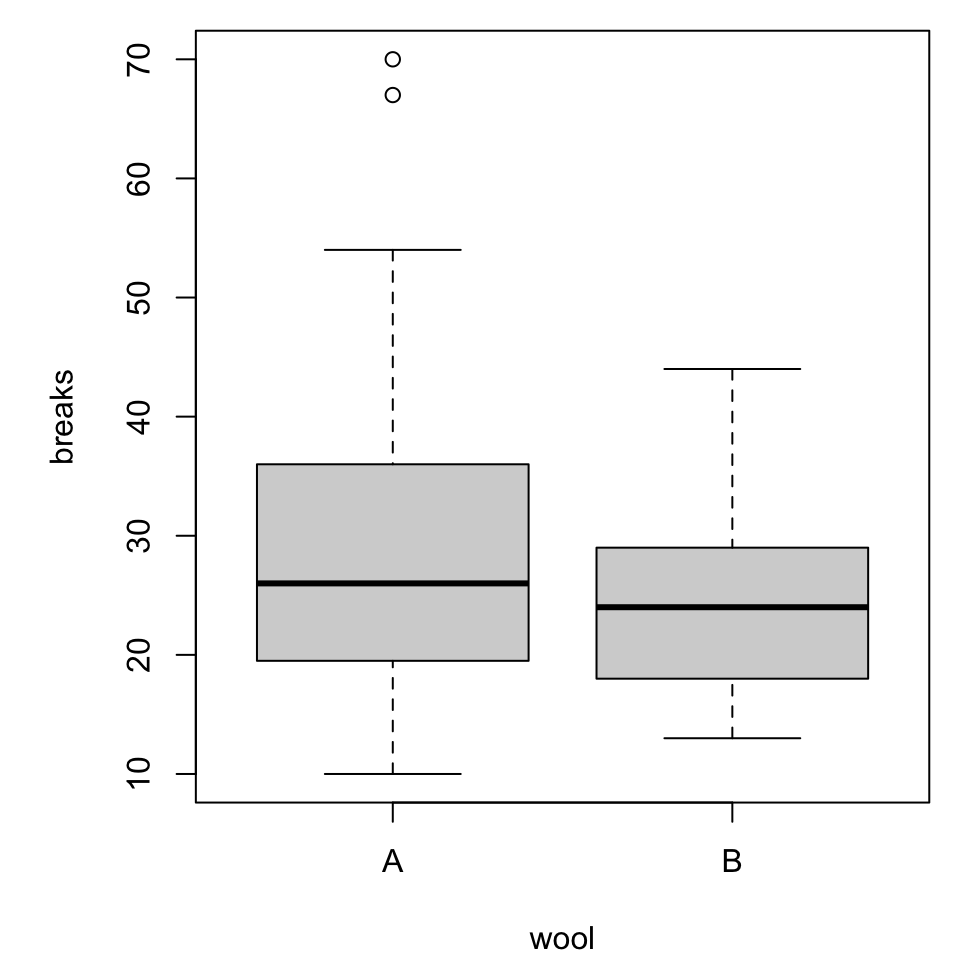
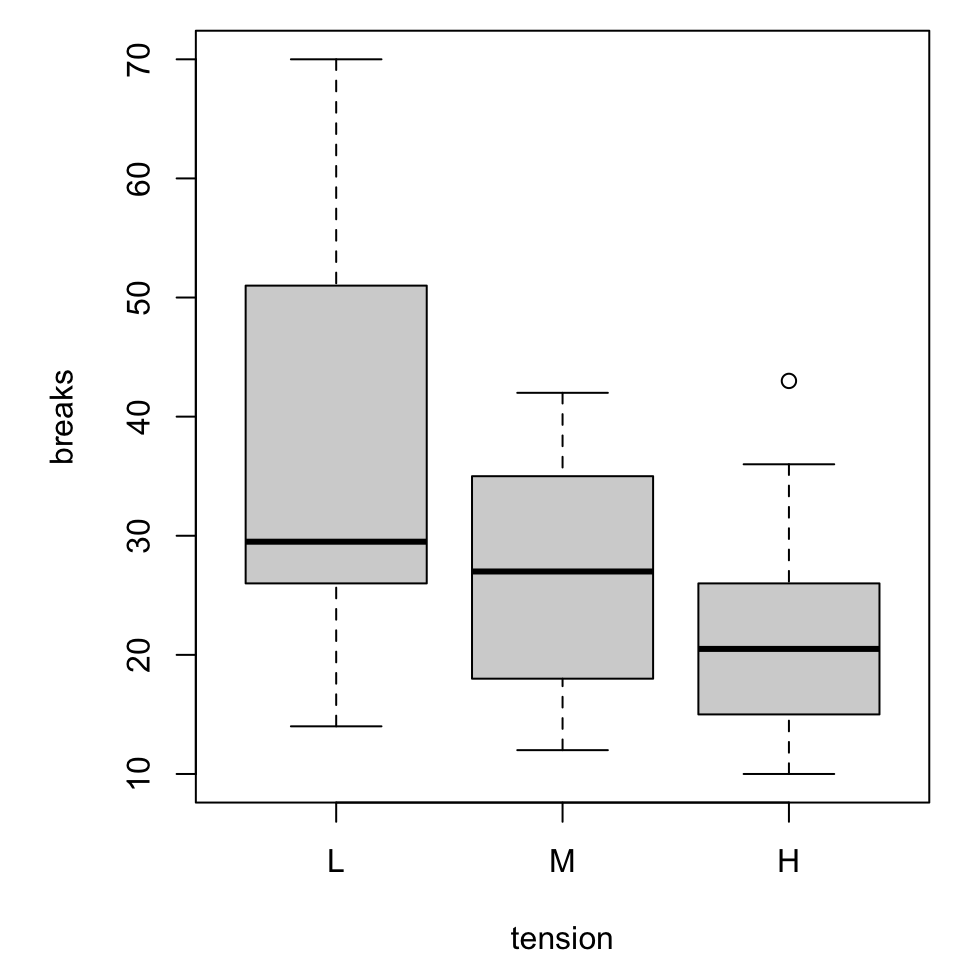
More categorical variables
For simplicity we will switch to a built-in dataset, warpbreaks. Use ?warpbreaks to view its description and citation.
Roughly, it contains columns
breaks the number of breaks per length of yarnwool the type of wool (A or B)tension the weaving tension (L, M, H)
summary (warpbreaks)#> breaks wool tension #> Min. :10.00 A:27 L:18 #> 1st Qu.:18.25 B:27 M:18 #> Median :26.00 H:18 #> Mean :28.15 #> 3rd Qu.:34.00 #> Max. :70.00
Multiple boxplots
par (mar = c (4.1 , 5.1 , 0.8 , 0.8 ))boxplot (breaks ~ wool, warpbreaks)
par (mar = c (4.1 , 5.1 , 0.8 , 0.8 ))boxplot (breaks ~ tension, warpbreaks)
Combined boxplot
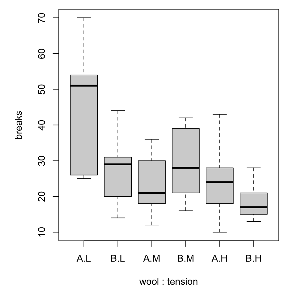
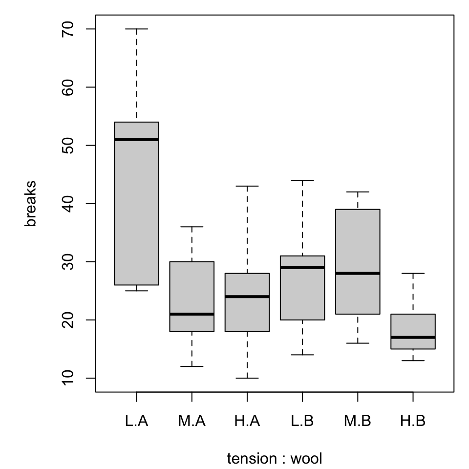
Notice that the order of specifying the variables matters!
par (mar = c (4.1 , 5.1 , 0.8 , 0.8 ))boxplot (breaks ~ wool* tension, warpbreaks)
par (mar = c (4.1 , 5.1 , 0.8 , 0.8 ))boxplot (breaks ~ tension* wool, warpbreaks)
Annotating boxplots
We could experiment with
replacing the variable codes with meaningful labels
coloring or shading the boxes in helpful ways
There are some interesting features that emerge.
Try specifying two or three colors for the second set of boxplots.
Do the colors appear in a helpful manner?
Extending boxplots
“Recently” boxplots (circa 1977) have evolved into violin plots (circa 1997).
Violin plots show the “shape” of the data.
We will revisit the idea with ggplot.
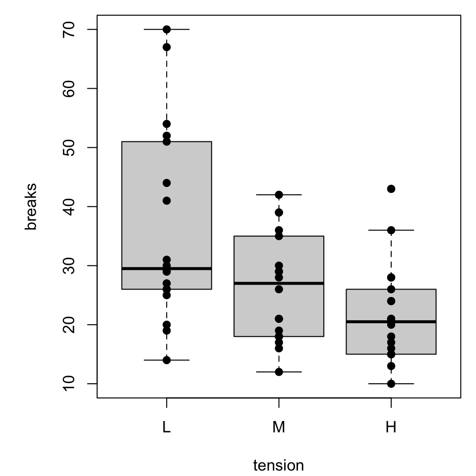
More simply, boxplots can be overplotted with dots.
Boxplot with dots
par (mar = c (4.1 , 5.1 , 0.8 , 0.8 ))<- boxplot (breaks ~ tension, warpbreaks)points (breaks ~ tension, warpbreaks, pch = 19 )
Since many of the dots might overlap, we might be interested in incorporating horizontal jitter to alter the readability
Things get a little slippery here.
tension and wool are categorical, so it might take a bit of scratchwork to determine sensible, numerical input values.It would be reasonable to create auxilliary variables that are numerical analogs (i.e., L “=” 1, M “=” 2, …).
Histograms
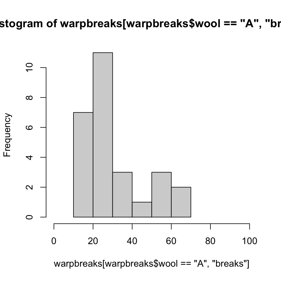
The boxplot easily shows some major summary statistics. Sometimes we want more resolution.
<- hist (warpbreaks[warpbreaks$ wool == "A" , "breaks" ], xlim = c (0 , 100 ))
A few comments:
The main title, provided for free based on arguments provided, is ugly.
“Frequency” on the vertical axis means “count”, we get that by specifying freq = TRUE (or nothing).
For a probability “Density” we set freq = FALSE. This scales the graph to an AUC of one.
Saving the result to hst (NOT “hist”) allows us to peek at the numerical properties.
Why an AUC of one?
It is possible to “smooth” a histogram by computing a “kernel density estimate”, analogous to an empirically-generated “probablity density function”.
The density() command is worth some independent investigations if it it interests you.
density (warpbreaks[warpbreaks$ wool == "A" , "breaks" ], from = 0 , to = 100 )#> #> Call: #> density.default(x = warpbreaks[warpbreaks$wool == "A", "breaks"], from = 0, to = 100) #> #> Data: warpbreaks[warpbreaks$wool == "A", "breaks"] (27 obs.); Bandwidth 'bw' = 5.733 #> #> x y #> Min. : 0 Min. :3.000e-09 #> 1st Qu.: 25 1st Qu.:1.851e-03 #> Median : 50 Median :6.585e-03 #> Mean : 50 Mean :9.956e-03 #> 3rd Qu.: 75 3rd Qu.:1.551e-02 #> Max. :100 Max. :3.152e-02
That could be
inspected as is,
plotted with plot(), or
superimposed on an earlier histogram by using plot(..., add = T).