Data Visualization and Exploration
Deploying content
Tools
Not strictly “Data Visualization and Exploration”, but some of what goes in to it and some of where it goes after.
- GitHub is a collaborative tool.
- Websites make results visible.
Not everything is a dashboard
You may be interested in sharing “content” so others can view it.
- interactive (i.e., “Shiny”) content should be deployed to a Shiny server
- static content (e.g., blogs or websites, graphs or data visualizations, non-interactive “dashboard” pages) can be deployed to any web server, GitHub makes this free1 and relatively easy2
GitHub
GitHub is a website and interface to Git.
Git is a “version control system”, it (among many other things)
- saves intentional backup versions of projects,
- allows users to compare differences between versions,
- allows a user to restore a previous version as a backup.
It is an alternative to "Final_paper_draft_final_final_done (copy).pdf".
Unlike typical cloud storage (e.g., Dropbox, Google Drive, OneDrive), which
- save backup versions of files,
- allow users to restore specific file backups, but not entire projects.
A big difference is that cloud software runs in the background, git requires interaction.
Typical experiences
You work on something in your office. Then you,
Dropbox
- save your work regularly1
- go home.
- decide to check your work.
- open your Dropbox folder (or page).
- see that your work is there.
- do something new, save it.
- go back to work the next day.
- changes from night before are there.
GitHub
- “commit” and “push” those changes to GitHub at the end of the day.
- go home.
- decide to check your work.
- “Pull” changes from GitHub to computer.
- see that your work is there.
- do something new, then “commit” and “push” changes to GitHub.
- go back to work the next day.
- pull changes from night before and get back to work.
GitHub as a collaborative platform
Allows for collaboration and user-contributed suggestions.
For example, suppose you were interested in an R package I was developing (but I was afraid you might break it), you might
- create a “fork”, your own copy for tinkering,
- do something great with it and introduce a new feature,
- share it back with me and request that I accept your work.
Now you are a contributor. Maybe I invite you to help manage and give you more trust and responsibility.
GitHub as a web server
While built for hosting versioned copies of source code, GitHub now
- hosts repositories of data like datasets,
- hosts websites, like our course page, as well as
- simplifying certain tasks like editing, publishing, and collaborating.
It changes often. New, useful features are regularly added, along with their documentation.
Exploring this fully is a class, task, or hobby of its own.
Voluntary activities
Everything that follows (for a while at least) is voluntary, but recommended.
Some of these steps are tedious to figure out on your own, though documentation and support continues to improve.
If you are interested, feel free to work along. If not, feel free to use class time to work on your final project.
GitHub website and server
If you care to, create an account at GitHub.
Think carefully about your username
- this could be the basis of your website address. (i.e.,
<username>.github,io), but - you can change this later - as long as the desired name is still available.
Connecting your1 computer
The simplest path seems to be described here.
There is quite a bit of effort to get started (hence trying it together with the support of others), but after that, things generally work smoothly.
Quarto
Visit quarto.org (Getting started) and install Quarto CLI (Command Line Interface).
After this we will need to use the “Terminal” program (either “Terminal” in Mac, the “Command Prompt” in Windows, or “Terminal” window in RStudio). For simplicity let’s try the RStudio terminal window. A few commands are useful.
| Command | Use/Notes |
|---|---|
| pwd | Present Working Directory (shows where you are on the computer) |
| cd | Change Directory (to the “home” directory) |
| cd .. | Change Directory (to one level “up”) |
| cd folder/subfolder | Change Directory (to a folder called “folder” and a named “subfolder”) |
| ls | List (list directory contents) |
Publishing with quarto
Visit quarto.org (GitHub Pages).
Key steps:
- Edit
_quarto.ymlfile renderandpushto GitHub (now that it has been connected)publish
These steps are done back and forth between your Terminal window and the corresponding GitHub page in your browser.
Back to DVE
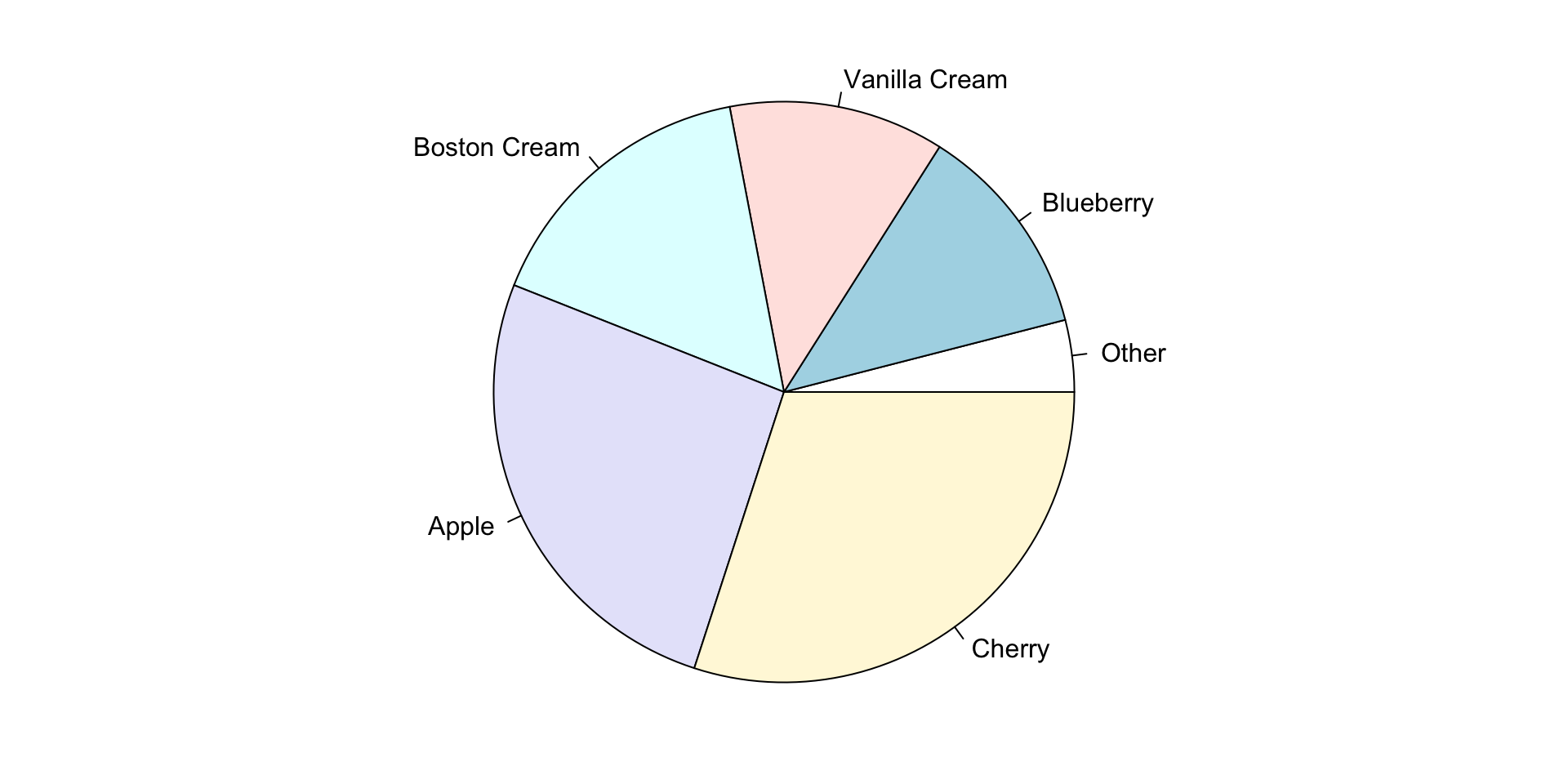
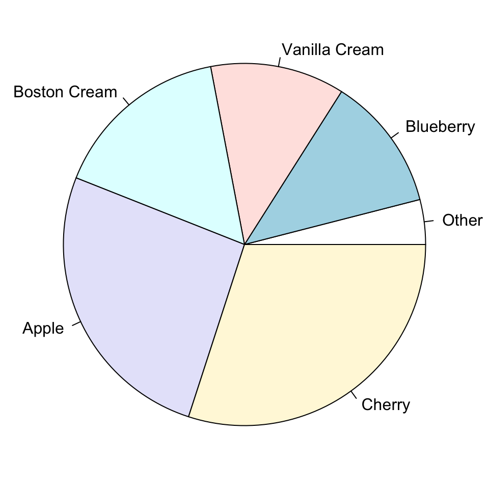
Other charts
You may be familiar with pie charts or donut charts.