Data Visualization and Exploration
Conclusion: Reprise, Rehash, Refresh
Final!
One update that makes things better for all of us.
Due to a great idea from you all, the “two-minute speed presentation” format has been swapped for a “small group (small) poster presentation session”.
- There will be a posted timeline for submission (earlier in that day).
- I will print color infographics for each of you.
- In 2-3 rounds, we will circulate around the room listening to presentations.
- You may not see everyone, but you will at least get to spend more time with those you do.
Peer assessment (as an audience member) will be part of the experience (details coming soon).
Hosting on GitHub Pages (1/2)
It was mostly a disaster trying to link RStudio and GitHub.
This might work.
In RStudio,
- Go to “File” > “New Project …”. Choose “New Directory”.
- Choose “Quarto Website” from the list.
- When prompted type “
.github.io” in the “Directory Name” box, check the “Create a git repository” and “Open a new session” boxes.
In GitHub Desktop,
- Choose either “File” > “Add local repository” or from the left-hand navigation pane, choose “Add Existing Repository…” from the arrow next to the search box that says “filter”.
- Uncheck “Keep this code private” (it is a webpage, we want people to see it).
- Click “Publish”.
Hosting on GitHub Pages (2/2)
In RStudio,
Open the “index.qmd” file and click “Render”.
In the RStudio terminal (or any comparable tool set to the right directory), enter “quarto publish gh-pages”.
- If you’ve done this before you’ll be prompted to overwrite anything there.
- If you haven’t, you’ll be prompted to connect your GitHub account. The website password works as does a PAT (Personal Authentication Token).
On GitHub,
- Go to the repository and under “Settings” > “Pages”, choose “gh-pages” under the “Branch” dropdown.
- Leave the second checkbox set to “/(root)”.
- Go to the repository and under “Settings” > “Pages”, choose “gh-pages” under the “Branch” dropdown.
Within a few minutes you should have a webpage.
After this point, you should be able to publish all changes using “quarto publish gh-pages”. This publishes the web content to the “gh-pages” branch, where the browser will find it.
Colors
In addition to the color vision simulator in ImageJ (FIJI), this color palette finder is one of many nice interactive tools on https://r-graph-gallery.com.
Consider using color and style and not referring exclusively to color in text (e.g., “the red curve is steeper than the blue curve”). You could,
- Directly label the curves with text-based annotation (e.g., base R
text()or ggplotgeom_text()). - Use a (partially) redundant style like dashing or dotting of the curve (e.g., “the dashed red curve is steeper …”).
Fonts
Fonts are kind of a nightmare.
- Topical expert Kieran Healy has approximately 3,500 words on this known hard problem.
- What’s disturbing is that his post is very recent, which means that for a variety of reasons, this is still a hard problem.
Who cares?
- the journal/publisher might care
- you or collaborators might care (wouldn’t it be nice if the fonts in the visualization matched those of the caption and text?)
Postprocessing images
Sometimes content is required in “vector graphics format” (e.g., .pdf, .svg) other content in “bitmap format” (e.g., .jpg, .png).
The previous blog highlights a bunch of problems and their problematic solutions.
Often graphs are “postprocessed” with software like Inkscape, Gimp, ImageMagick, or Adobe Illustrator ($$$).
With these you might
- replace font families or sizes across the figure,
- edit text or positioning, or
- other things sometimes too subtle to code.
File output
So far I have recommended just right-clicking on your visualization from within the .html output and saving it (or marginally worse, screenshotting the .pdf).
But, there are a variety of save/export options.
ggsave()pdf() ... dev.off()(orbmp(),png(),jpeg(),tiff()for bitmap files, the...represents the graph content, regardless of how complicated it may be. What’s nice about this, as demonstrated is that you could do multiple graphs as pages in a single pdf.)dev.copy2eps()(an “encapsulated postscript file”, this does the copying after the graph is made)
What’s outright annoying about this is the way that different file formats assume height and width are measured (e.g., pdf() measures in inches, png() in pixels).
Sometimes we need a .pdf and a .png for different purposes (e.g., a .pdf for a paper and a .png for a website). This is what drew attention to fonts in the referenced blog post].
Plotting systems
We have used base R and ggplot for our graphing. For special visualizations (i.e., maps) there are a variety of special tools which often require a great deal of configuration (e.g., configuring accounts to access data).
There are other packages and languages available - while the implementation and syntax will vary, the underlying goals remain the same.
Open RStudio, create a new quarto document, and let’s do some coding.
The tinyplot package
A nice tool that lies sort of at the interface of base R and ggplot is tinyplot.
The downloaded binary packages are in
    /var/folders/cv/57f7pbds3y7_pq476q9b438r0000gn/T//RtmpKcU0Sk/downloaded_packages
… it is perhaps understandable that even avid R users can overlook the base R graphics system. This is unfortunate, because base R offers very powerful and flexible plotting facilities. The downside of this power and flexibility is that base R plotting can require a lot of manual tinkering.
Aside: Tinkering is the fun part?
Basic graphs
Users should generally be able to swap out a valid
plot()call fortinyplot()/plt()without any changes to the expected output.

Looks the same.
iris data
This isn’t much different from base R syntax, but does a little more - a “free” legend.
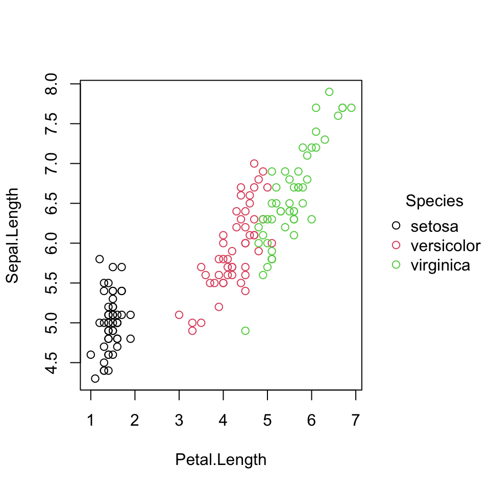
tinyplot() gives a nice legend.
It can also accept additional arguments for
- the
palette =(e.g., “dark”, “tableau”) pch =(e.g., 16, 19)grid = TRUE(unlike.qmdcode chunk headers, these are capitalized as in R)
In tinyplot() the | (“pipe”) operator is used for grouping (here color by biological species). The | syntax is used for other interpretations of grouping in packages like lme4.
Changing plot types
Making and interpreting graphs
While planning this last set of slides I’ve thought both
“We’ve done so much!”
and
“There’s still so much more to do!”
We have built up quite a bit of code for a variety of useful graph types.
One variable at a time
To explore and visualize data from one variable we can,
tabulate counts of values of a categorical variable, whether the values are ordered (e.g., grade levels) or not (e.g., footwear type), the counts could be shown as
- simple tables
- plotted as bar or lollipop charts (despite their popularity, there is no
geom_lollipop()! But, you can use the code below)
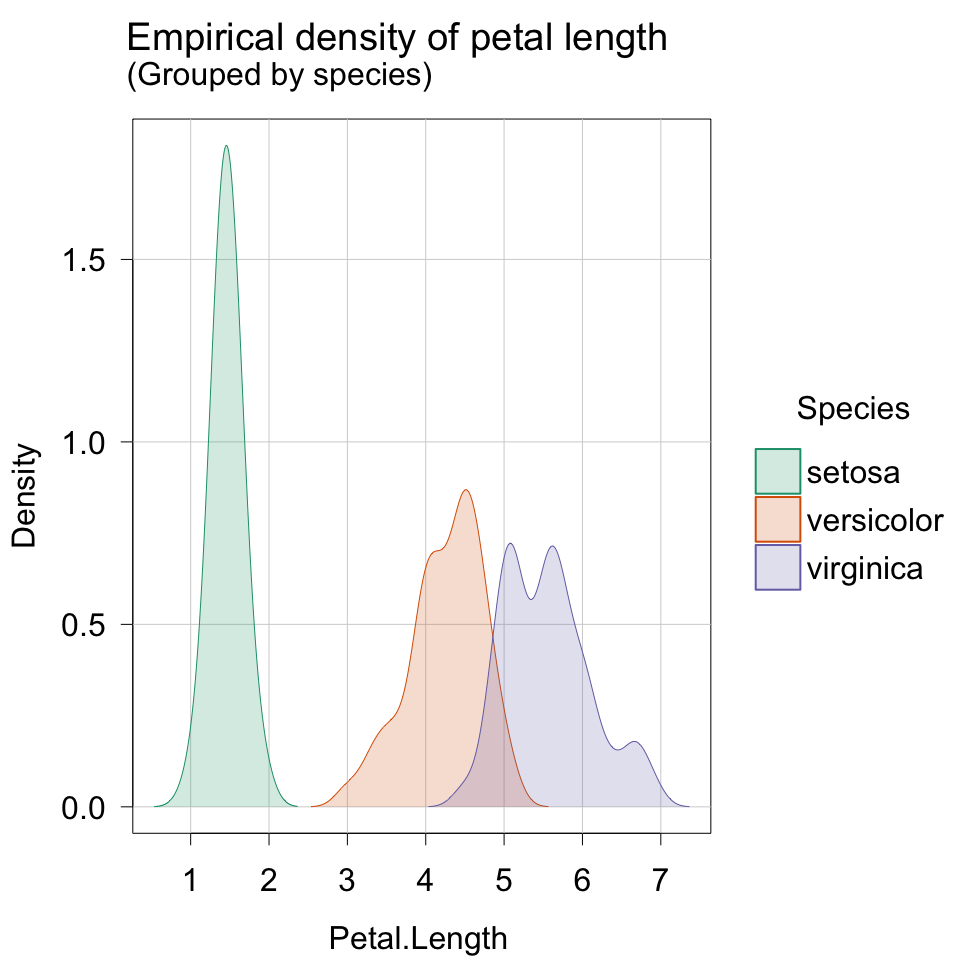
create histograms or density plots for a numerical variable
Showing relationships
Scatter or line plots are useful for showing relationships between two numerical variables (e.g., values over time, or relationships between two variables).
Boxplots (and their endless variants) or bar (or column) graphs can be used to illustrate how numeric values vary within and between categories.
Recall,
- the boxplot shows the standard five-point summary across values within on group, but also the pattern of those changes across groups.
- any of these plots could and should be sensibly ordered (e.g., increasing or decreasing) if the categories being compared do not have a natural numerical order
Critique
Generally speaking, good use of R (base, tinyplot, ggplot) prevents many of the flaws that make popular graphs “bad”. We haven’t really practiced “interpretation” of existing graphs,
- partly due to the need for discipline-specific knowledge,
- partly due to the emphasis on coding and debugging.
As an example of a broad and thorough critique, take a look here for pretty in-depth critiques of “bad” graphs and some rather specific “rules”.
Our focus has largely been on preparing “good” (or at least often “better”) graphs, which idealy preempts some of the critique (so long as the data has been handled carefully).
Animation
Just for fun. See next slide for the results.
```{r}
#| eval: false
dat <- read.delim("./data/inat-brief.csv", header = TRUE, sep = ",")
dat$year <- as.numeric(substr(dat$observed_on, 1, 4))
p <- ggplot(data = subset(dat, species_guess %in% c("Canada Goose")), mapping = aes(x = longitude, y = latitude, color = species_guess)) + geom_point(alpha = 0.75)
p2 <- p + transition_time(year) +  labs(title = "Year: {floor(frame_time)}")
animate(p2, renderer = ffmpeg_renderer())
```
Animation
Thanks
Whether or not you felt like you had a choice, thanks for your collective patience this semester.
Hopefully this gives you the confidence to explore and create.
PS. I was blown away by your comments and interpretations of the Gallery visit. If anyone is interested in sharing their impressions, I’d be happy to take anonymized submissions and host them on the class page.