The “gg” in ggplot stands for “grammar of graphics”.
Grammar is what elevates single words to complex statements.
We probably learned grammar in language class.
We might not understand what it has to do with computer programming, specifically the production of statistical graphs.
From OED (online),
“… basic or formal principles, elements, or rules of a particular subject or activity; the study of these…”
ggplot
The advent of ggplot is somewhat of a philosophical shift (and divide) among relevant “scientists”.
From Hadley Wickham (2010),
The grammar of graphics takes us beyond a limited set of charts (words) to an almost unlimited world of graphical forms (statements).
The rules of graphics grammar are sometimes mathematical and sometimes aesthetic.
The catch
To develop grammar skills, you need the relevant vocabulary.
In my experience, ggplot has quite a bit of a “vocabulary overhead”.
There are things I can (now) do easily in “base R” that take (me) quite a bit of effort in ggplot.
Some of you, with admittedly more ggplot experience than I sought out, probably have the exact opposite feelings.
Layering
The idea of “layering” is central to the implementation.
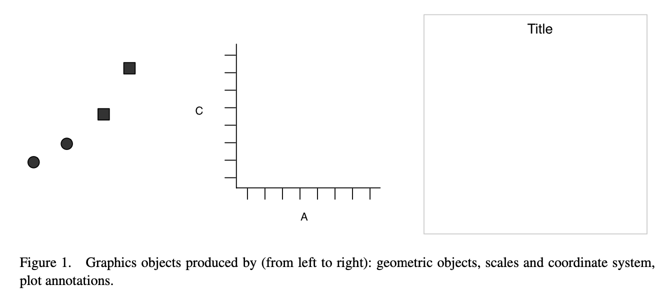
In this framework, a plot is the
data and its “geometry” (i.e., points, lines, bars),
scales and coordinate systems (i.e., how those points, lines, and bars are measured or compared), and
plot annotations.
These ideas are nothing new, but they are emphasized and implemented a bit differently.
ggplot visualized
Shamelessly excerpted from H. Wickham (2010).
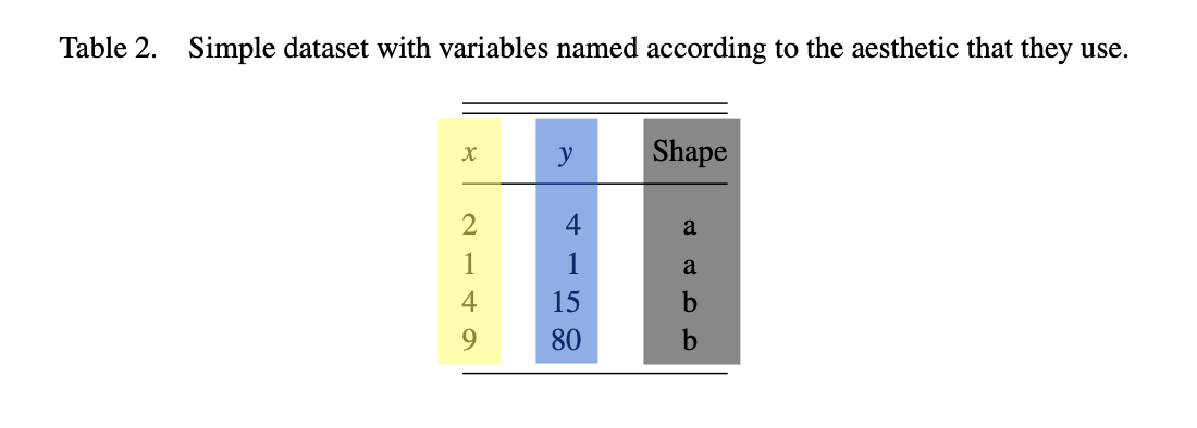
Figure 1: A screenshot of a “raw” dataset.
Figure 2: A screenshot of a “derived” dataset.
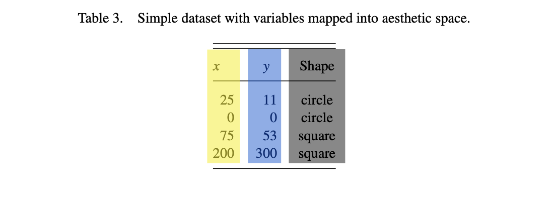
Figure 3: A screenshot of a “rescaled” dataset with plot aesthetics.
Figure 4: (left) Data produced as styled points. (middle) Labeled axes. (right) A titled box.
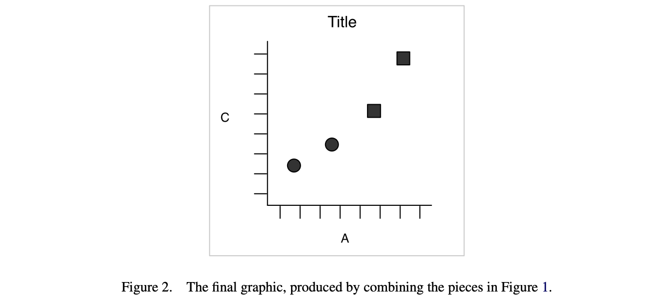
Figure 5: Data produced as styled points on abeled axes, titled with a box. Also an external caption.
Assessment
Personally I find it confusing to think of the points (and their shapes) as separate from, in fact in some real sense, prior to the consideration or construction of axes!
Both things can change in a flash, imagine sketching a quick graph by hand before realizing you should change the axes.
It’s not a big deal to stop and reassess, and nothing really changes, just the aesthetics.
Aside
You could almost as easily think of the difference between “a” and “b” values of the original variable \(D\) or the graphics “shape” parameter being represented as colors.
That said, shape is more easily distinguished from aspects of color, so a safer choice in general.
Additionally,
academic journals still often charge more for color figures,
even though color figures are rarely printed these days.
In fact, few such things are printed these days.
But here the emphasis on accessibility is most important.
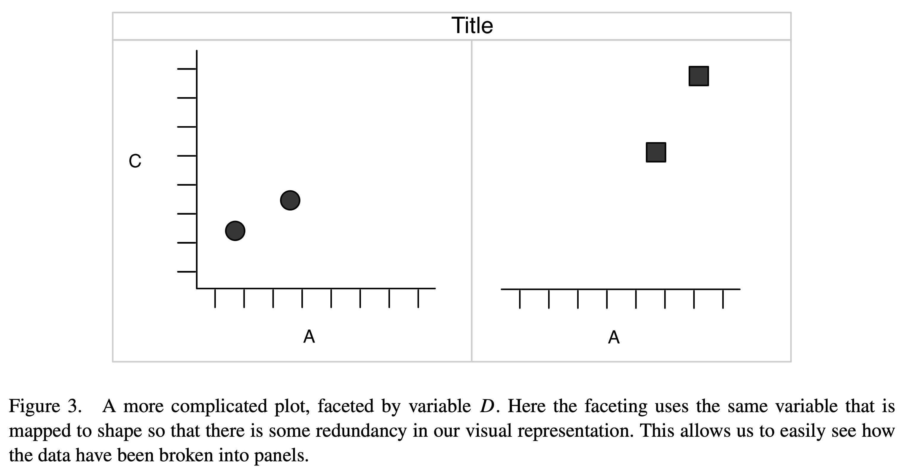
Faceting
Occasionally it is useful to break up a plot over some repeated unit for clarity or emphasis.
This is referred to as faceting. In addition to the choice of point symbol shown in Figure 5, the data for separate groups could be pulled into separate (but otherwise identical) axes, with the point symbol remaining distinct for emphasis.
Figure 6: Data produced as styled points on labeled axes, titled with a box, but most importantly each variable value is shown on one of a series of repeated plots. Also an external caption.
Visual summary
Again, those figures were pulled from Hadley Wickham’s “A Layered Grammar of Graphics” (2010).
With possibly less work than it took to copy, paste, and edit those figures, as well as to make the acknowledgement in the slides and narration, we could have recreated most of that using “base R” (and soon ggplot()).
Give both a try.
Rubber meets road
People argue bitterly, and defensively, about their choice of tools.
Personally, I feel more powerful in “base R” (I can get away with this, maybe at the starts of your careers you should embrace more cutting-edge tools?). At the end of the day, the more you know the better.
A strength that one user identifies of one system, is the biggest weakness identified by another.
I have occasionally used a power drill when I should have turned a screw with a screwdriver. (that ended poorly)
Likewise, I have occasionally only had the screwdriver (or a butter knife) handy, and made use of that when I would have preferred something more powerful. (that was annoying, but ultimately surprisingly satisfying)
Which is the butter knife, the screwdriver, the power drill?
Entering ggplot
This is like learning a new language, just as the introduction to R has possibly been.
Through practice, I can think about and do more things (in base R), with
fewer specific commands,
more flexible options,
occasional guesswork and mistakes (increasing rapidly with difficulty), and
a careful inspection of the input and output.
Moving to ggplot, our specific language is going to explode, specifically in terms of vocabulary.
Components of ggplot
The main components (Wickham, 2010) of “layered grammar” (i.e., ggplot) are roughly,
data and aesthetic mappings
geometric objects
scales, and
facet specification.
Additionally,
statistical transformations, and
the coordinate system.
Practice data
Ensure that the copy of the data/ directory is beside this file before rendering.
We have used a few datasets, with combinations of different variable types.
Our card data had personal “identifiers” with measured time amounts associated with categorical information.
In terms of aesthetics, restrict to thinking of only the choice of variable names from the data and possibly some distinguishing feature of the plot (e.g., shape, size, color, style) assigned from an additional variable.
“data and aesthetics”
We begin with ggplot() being given some data or possibly data and the aesthetics (variables and possibly some scheme for annotation). Any of the following work.
Verify these in ggplot then recreate them/it in base R.
Other combinations
Some rather helpful combinations are possible. Try some of the following,
Alter the aesthetics by using Animal then Mass to modify the appearance of the
shape = ...
color = ... (or col)
size = ...
Some combinations simply do not make much sense, or at least don’t add much value.
A little more control
Here, this is over the top, but specifying col = ... to emphasize values of a third variable can be useful in general.
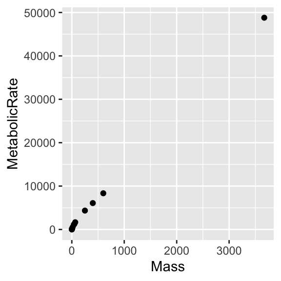
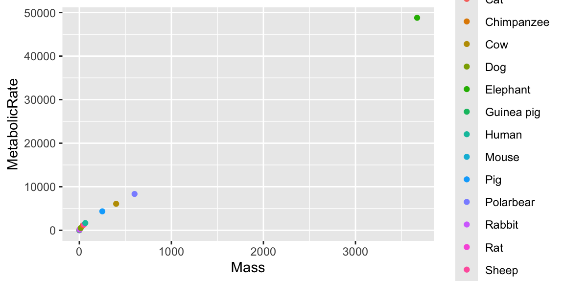
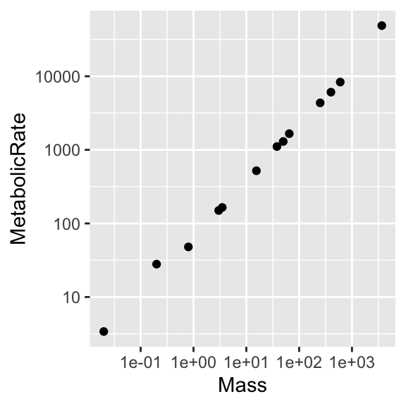
ggplot(dat, aes(Mass, MetabolicRate, col = Animal)) +geom_point()
Figure 8: Unflattering version of the Mouse-Elephant Curve with unnecessary color, on linear scales.
You could specify shape = ... (\(\approx\)pch = ...), but here there are too many possible values for Animal (called levels), and we run out of shapes.
“geometric objects”
This refers to the types of graphs that can be produced from the given data.
for points,
base R syntax
ggplot analog
pch = ...
shape = (category)
cex = ...
size = (category or number)
col = ...
color = (category or number)
for lines, and
base R syntax
ggplot analog
lty = ...
linetype =
lwd = ...
linewidth = ...
col = ...
color (category or number)
options for other plot types as well.
Pause
There are a variety of related commands geom_path(), geom_line(), and geom_step() which apply to specific situations and have sensible defaults.
As you encounter the help files, you might see things like stat = "identity" appear.
Additionally, some plot types are the visuals most associated with certain statistical output - these pairings are often defaults.
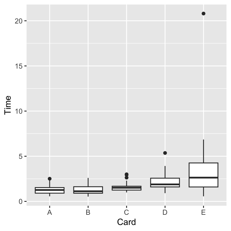
A boxplot illustrates the five-point summary.
A histogram illustrates a counts (or frequencies) of binned observations.
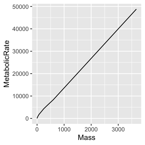
Line plot
To avoid option conflicts, it is probably best to keep aes() simple until the geometry is selected or to spesify within the geometry itself.
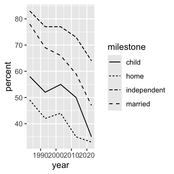
Figure 9: A version of the mouse elephant curve as a connected line graph.
Using values of Animal (or Mass) to with some of the relevant mapping options like color =, shape =, or (new) linewidth = or linetype = throws (rather helpful) warnings since some those don’t make sense for this type of graph or data.
Try it.
“scales and coordinate systems”
There is more to say about “graph types”, but before leaving this dataset, let’s improve the rendering of the “Mouse-Elephant Curve”.
Admitting my weakness (preference) for “base R”, I will say that I enjoy the fact that some of the more “hands-on” programming often helps me feel like I’ve gotten a better sense of the data itself.
In that sense I feel like I pay a bit more attention to the project, as opposed to perhaps racing through and feeling like I am done before I am.
“facets”
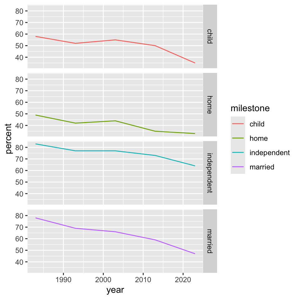
We can separate panels by a given variable using facet_grid().
ggplot(dat, aes(year, percent, color = milestone)) +geom_line() +facet_grid(vars(milestone), scale ="fixed")
Figure 13: A faceted version of the milestones of adulthood graphs as connected line graphs.
“facets” (II)
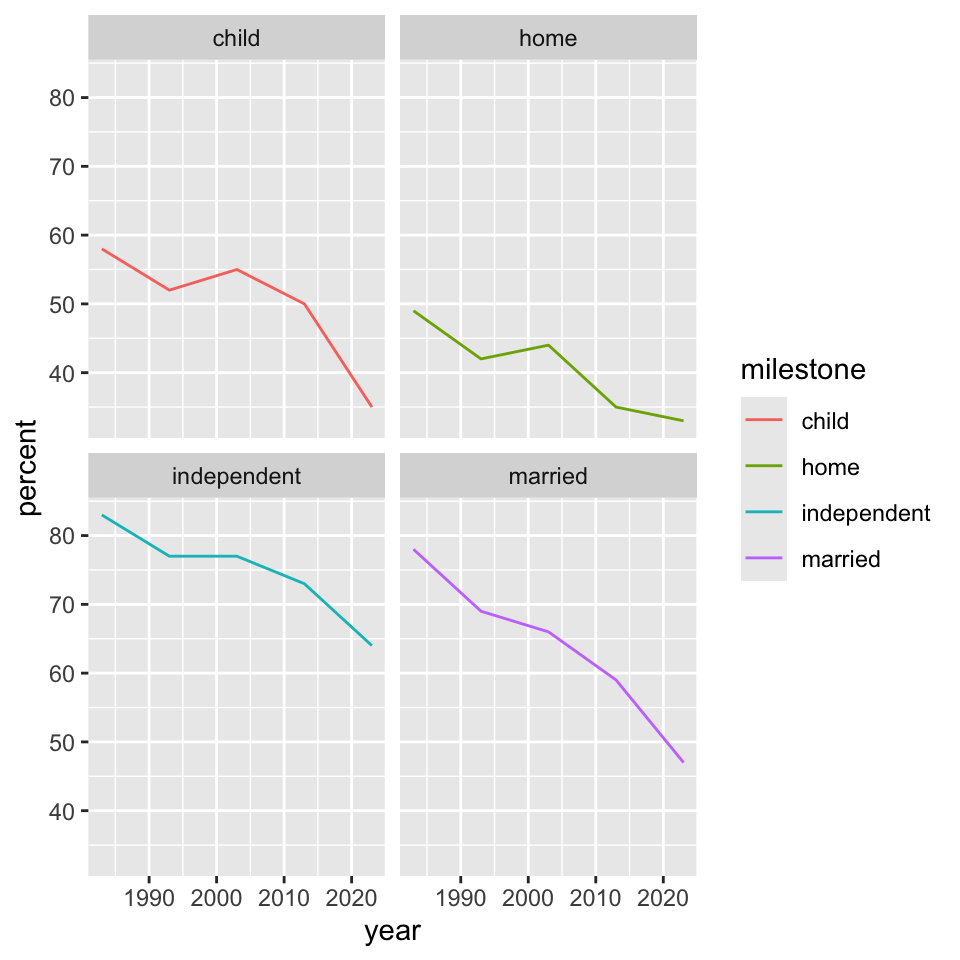
Interestingly, with slightly different syntax, facet_wrap() does something similar.
ggplot(dat, aes(year, percent, color = milestone)) +geom_line() +facet_wrap(~milestone, scale ="fixed")
Figure 14: A faceted version of the milestones of adulthood graphs as connected line graphs.
These are sometimes called “small multiples” where the structure of the graph is repeated but the content changes in a clear and consistent way from panel to panel.
Other plot types?
We can explore a few other plot types using our third small dataset.
dat <-read.delim("./data/cards.csv", header = T, sep =',')dat <-na.omit(dat)
There’s nothing wrong with using this small, “simple” dataset. The na.omit() line simply removes some incomplete rows from our raw data.
Layer on related visualizations ... + geom_violin(color = "red") and ... + geom_jitter(color = rgb(0, 0, 1, alpha = 0.5)).
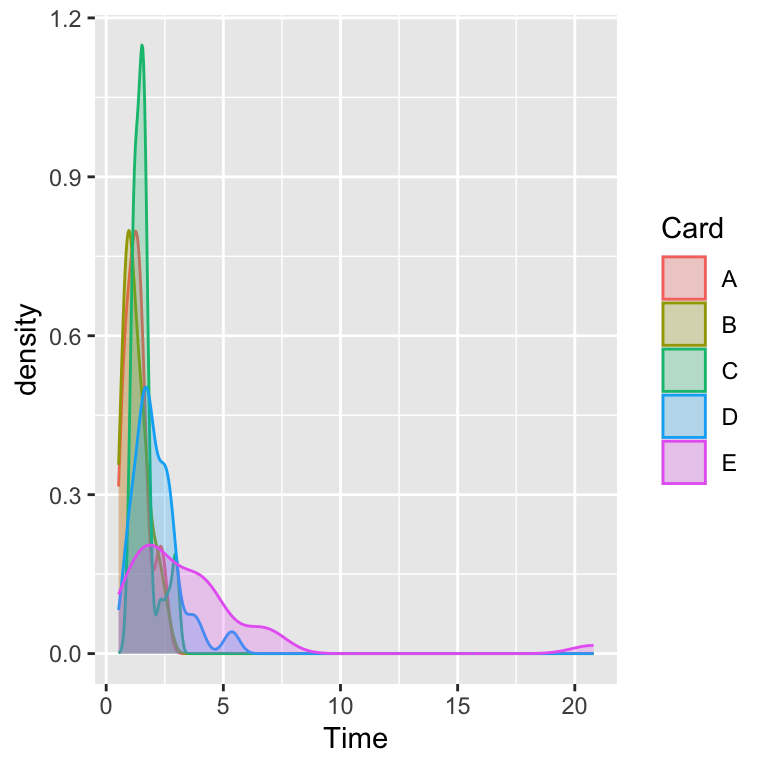
Densities
The “violin” plot shows some of the features of an empirical (kernel) density.
The density plot is essentially a smoothed histogram, which itself is a higher resolution version of a boxplot, which itself is a visual of the five-number summary.
ggplot(dat, aes(Time, grouping = Card, fill = Card, color = Card)) +geom_density(alpha =0.25)
Figure 16: A boxplot of our card dataset.
“plot annotation”
The only other helpful thing to consider at this point would be to use
... +labs(x = ..., y = ..., title = ..., subtitle = ...)