Histograms and Densities
This is more difficult than it may seem.
- but more from a conceptual (“how”) perspective, and
- less form a technical (implementation) perspective
Histograms
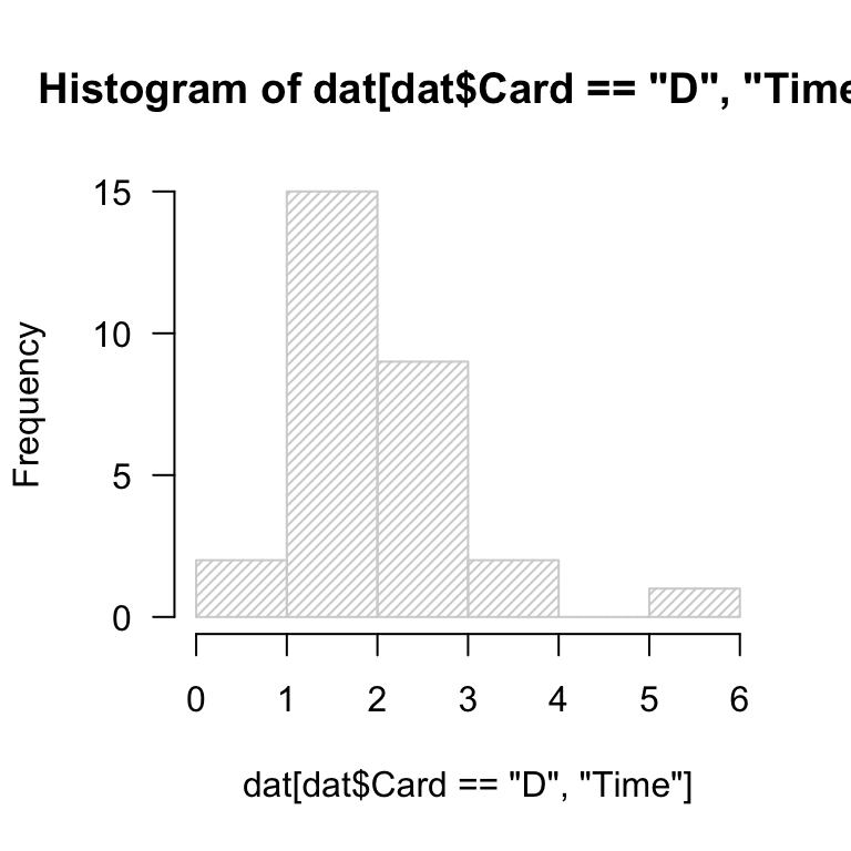
Read in the data cards.csv.
- generate the default histogram of
Time values for the Card == "D" subset.
- experiment with
breaks = ... to set the number of “bars”.
dat <- read.delim("./data/cards.csv", header = T, sep = ',')
hst <- hist(dat[dat$Card == "D", "Time"], las = 1, density = 30, breaks = 5)
Adding content
Layer on data from any other card (A-C) by using add = T and specifying a color.
What do you notice about the rendering of the histograms? Are you satisfied?
hst <- hist(dat[dat$Card == "D", "Time"], las = 1, density = 30, breaks = 5)
Layering many histograms
In general, this makes more than a couple histograms very difficult to read and interpret.
It is recommended that you use filled density plots to compare multiple distributions.
More on that later.
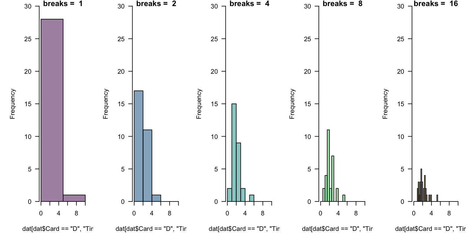
Deep challenges
In general, there is no “right number” of “bins” (or “cells”) to display.
This takes experimentation. Which below is “best”? What might help you decide?
par(mfrow = c(1, 5), mar = c(4.1, 5.1, 0.8, 0.8), yaxs = 'i')
for(i in 0:4){
  hist(dat[dat$Card == "D", "Time"], xlim = c(0, 10), ylim = c(0, 30), las = 1,
       breaks = 2^i, main = paste("breaks = ", 2^i), col = hcl.colors(5, alpha = 0.5)[i+1])
}
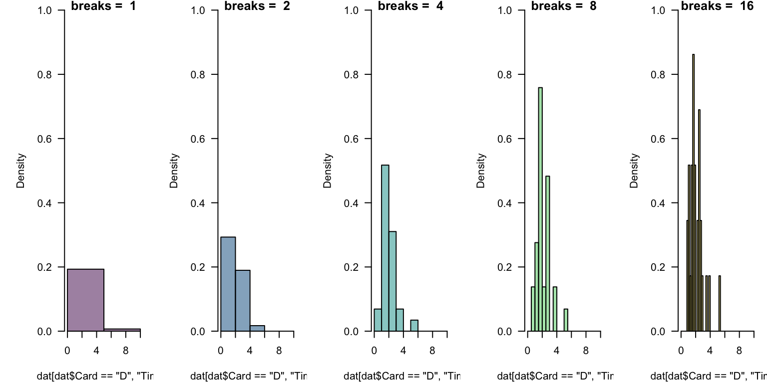
Challenges Revisited
This takes experimentation. Which below is “best”?
par(mfrow = c(1, 5), mar = c(4.1, 5.1, 0.8, 0.8), yaxs = 'i')
for(i in 0:4){
  hst <- hist(dat[dat$Card == "D", "Time"], xlim = c(0, 10), ylim = c(0, 1), freq = FALSE,
              las = 1, breaks = 2^i, main = paste("breaks = ", 2^i),
              col = hcl.colors(5, alpha = 0.5)[i+1])
  }
Parameterizing breaks
The breaks = ... is quite flexible, but works in occasionally mysterious ways.
One argument breaks = n passes that number to an underlying function and asks for n + 1 points that delimit n bins.
One nice options is to define equally-spaced ranges using the colon operator or seq(from = ..., to = ..., length = ...).
Challenge breaks
Using any subset of the card data, experiment with various ways of implementing breaks discussed previously.
Comment on what this “tells you” about the data or how it might help you “tell others”!
Motivation for histograms
A great deal of statistical practice is related to assumptions of “normality”.
Histograms are a classic tool for the visual assessment of normality and can give evidence of other properties.
Use the code below to generate 100 sampled values from a normal distribution with mean \(\mu = 2\) and standard deviation \(\sigma = 1\).
Then, add a histogram. Finally, repeat the sampling process and histogram visualization.
rn <- rnorm(n = 100, mean = 2, sd = 1)
Details, details
It really doesn’t matter which logarithm you use in transformation, each has merits.
- it is generally easier for people to think (i.e., read an axis), written in powers of 10
- it is mathematically nice to use the natural logarithm
Label your axis carefully.
Today is the 35th day of 2025. Notice \(\ln(35) \approx 3.555\), and \(\log(35) \approx 1.544\).
These mean that \(e^{3.555} \approx 35\) and \(10^{1.544} \approx 35\).
- Both are fine ways to say “\(35\)”.
- They differ by a “change of base”.
One implication is that if we report “log”-transformed data, we need to be specific about which base.
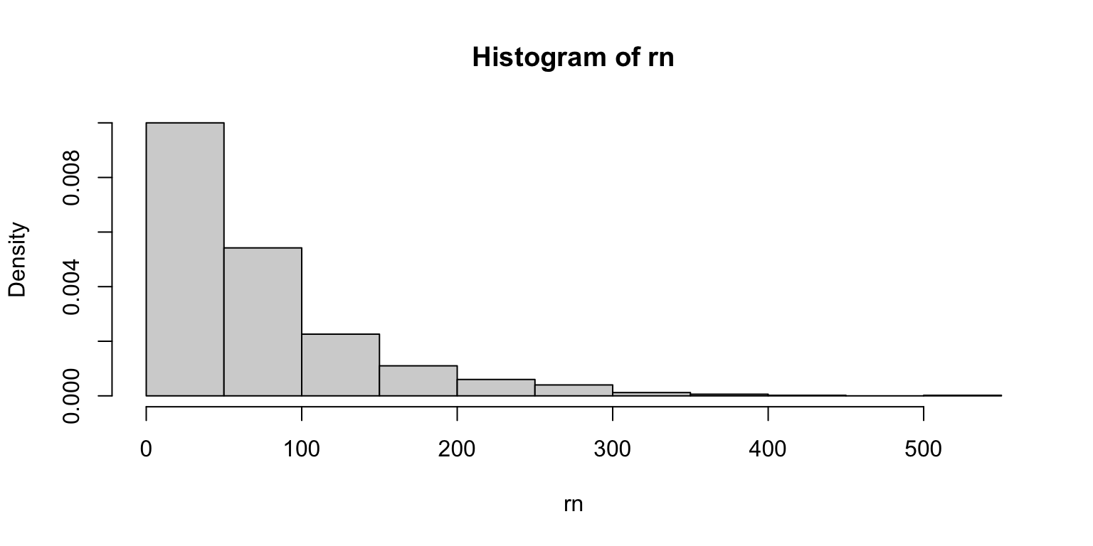
Weibull distribution “shape” parameter
Separately, generate random values and histograms for shape = 1/2, 1, 2.
Try to assess the role of shape.
rn <- rweibull(1000, shape = 1, scale = 70)
hst <- hist(rn, freq = FALSE)
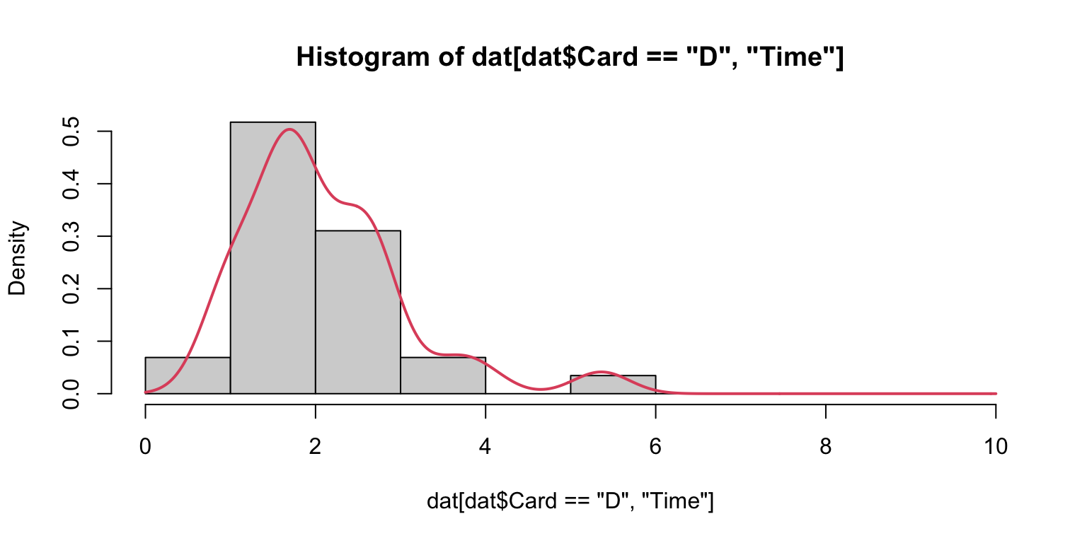
Histograms and densities
A common visual “test” of data properties is to overlay a density upon its histogram.
hist(dat[dat$Card=="D", "Time"], breaks = 0:10, freq = FALSE)
lines(density(dat[dat$Card=="D", "Time"], from = 0, to = 10, na.rm = T),
      col = 2, lwd = 2)
Histograms and densities
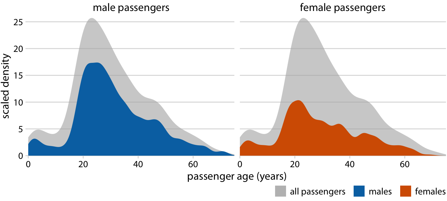
As mentioned, it is “best” to layer filled-density plots, rather than histograms.
That said, just like hist() has a variety of defaults choices, so does density().
Experiment with density(..., bw = ...) by choosing values for the “bandwidth”. Use your experiments to learn about what this argument does.
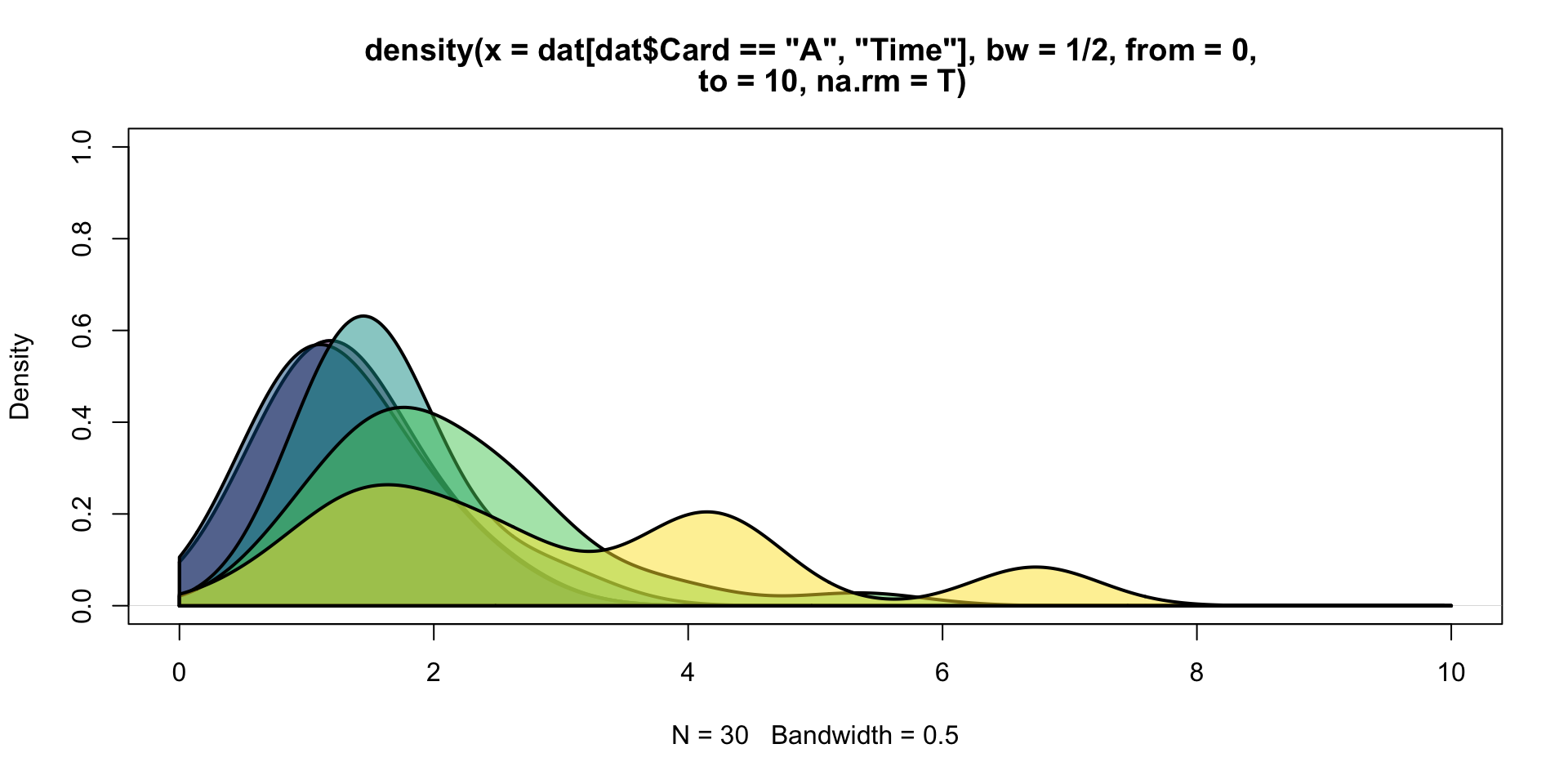
Layering densities
cols <- hcl.colors(5, alpha = 0.5)
plot(density(dat[dat$Card=="A", "Time"], from = 0, to = 10, na.rm = T,
             bw = 1/2), col = cols[1], lwd = 2, ylim = c(0, 1))
for(i in 1:5){
  den <- density(dat[dat$Card==LETTERS[i], "Time"], from = 0, to = 10,
                 na.rm = T, bw = 1/2)
  polygon(c(den$x, rev(den$x)), c(0*den$y, rev(den$y)), col = cols[i], lwd = 2)
}
Applications of layered densities