Data Visualization and Exploration
Introduction and foundation
Explore
This is a neglected, underappreciated, or outright mistrusted step.
It is important for the
- assurance of data quality
- understanding of the data itself
- generation of new ideas
Not to be confused with “fishing” or “snooping”, especially if you are a consultant trying to learn about data you’ve been assigned.
This is a sandbox of ideas1. What type of
- variation occurs within my variables?
- covariation occurs between my variables?
Play, but take notes - document your work.
“preattentive pop-out”
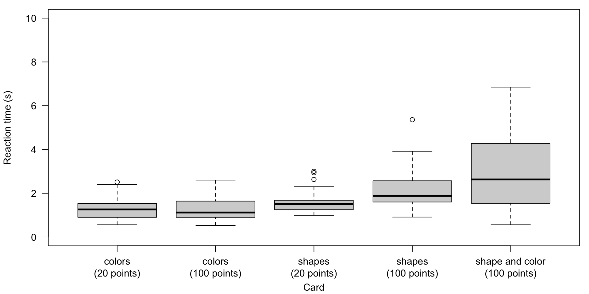
1.) Find two partners. Take out one cell phone and set it to Stopwatch mode.
2.) Take a packet of cards, letter side up.
3.) When ready flip a card, immediately start the timer, and press stop as soon as you find the blue dot.
4.) Open the spreadsheet to the Colors tab.

5.) Generate a personal code using your initials and birth day (of month). Enter data as follows.
| User | Card Letter | Time |
|---|---|---|
| … | … | … |
| sl22 | A | 0.63 |
| … | … | … |
5.) Pause until everyone has contributed.
Visualization
We just played a “game” that required you to perform a visual task. Data visualization implies an expectation of visual ability.
Be aware of the abilities of yourself, others, and how they may or may not differ.
Neither mathematics nor statistics are known for their accessibility to blind or low-vision users.
Visualization of our own perception
Figure 4 shows how the time to identify the target varies with changes to the complexity of the presentation.
William Playfair’s “balance of trade”
One of the first modern data visualizations.
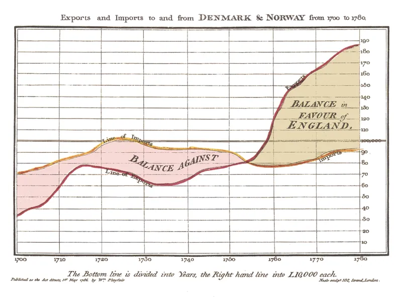
What do you notice?
John Snow’s “cholera map”
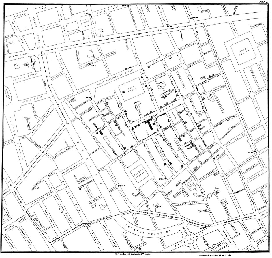
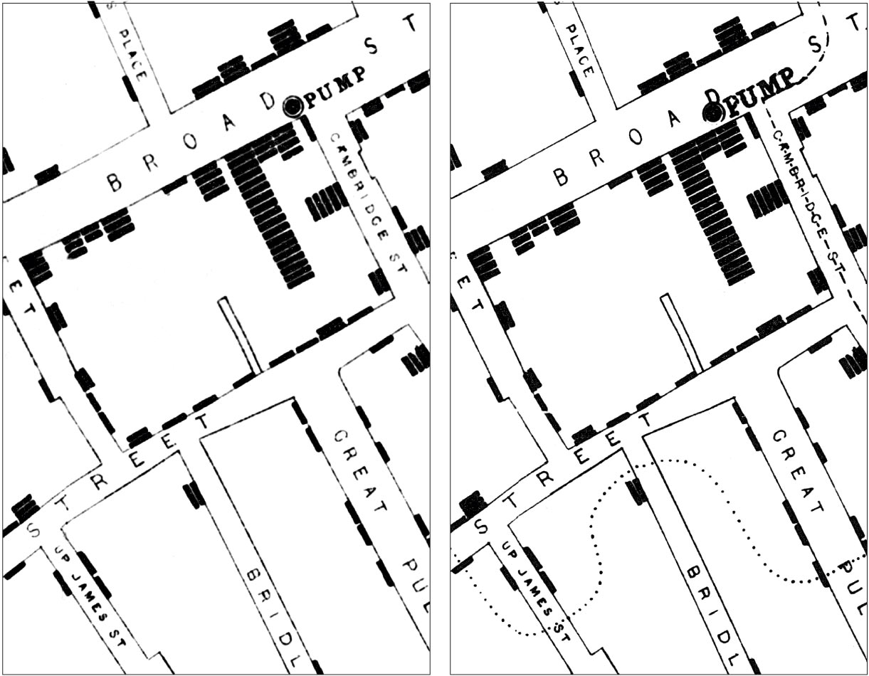
What do you notice?
Florence Nightingale’s “causes of mortality”
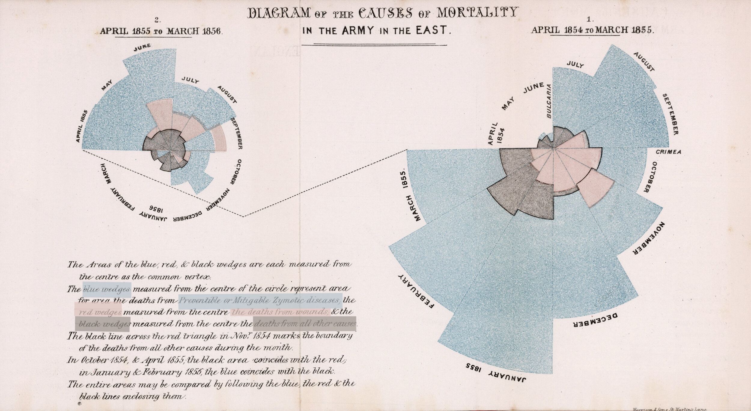
What do you notice?
“causes of mortality” (transcribed)
Note
The Areas of the blue, red, & black wedges are each measured from the centre as the common vertex. The blue wedges measured from the centre of the circle represent area for area the deaths from Preventable or Mitigable Lymotic diseases; the red wedges measured from the centre the deaths from wounds; & the black wedges measured from the centre the deaths from all other causes. The black line across the red triangle in Nov. 1854 marks the boundary of the deaths from all other causes during the month. In October 1854 & April 1855; the black area coincides with the red; in January & February 1855, the blue coincides with the black The entire areas may be compared by following the blue, the red & the black lines enclosing them.
Minard’s “Napoleon’s invasion”
Widely recognized as an all-time best data visualization …
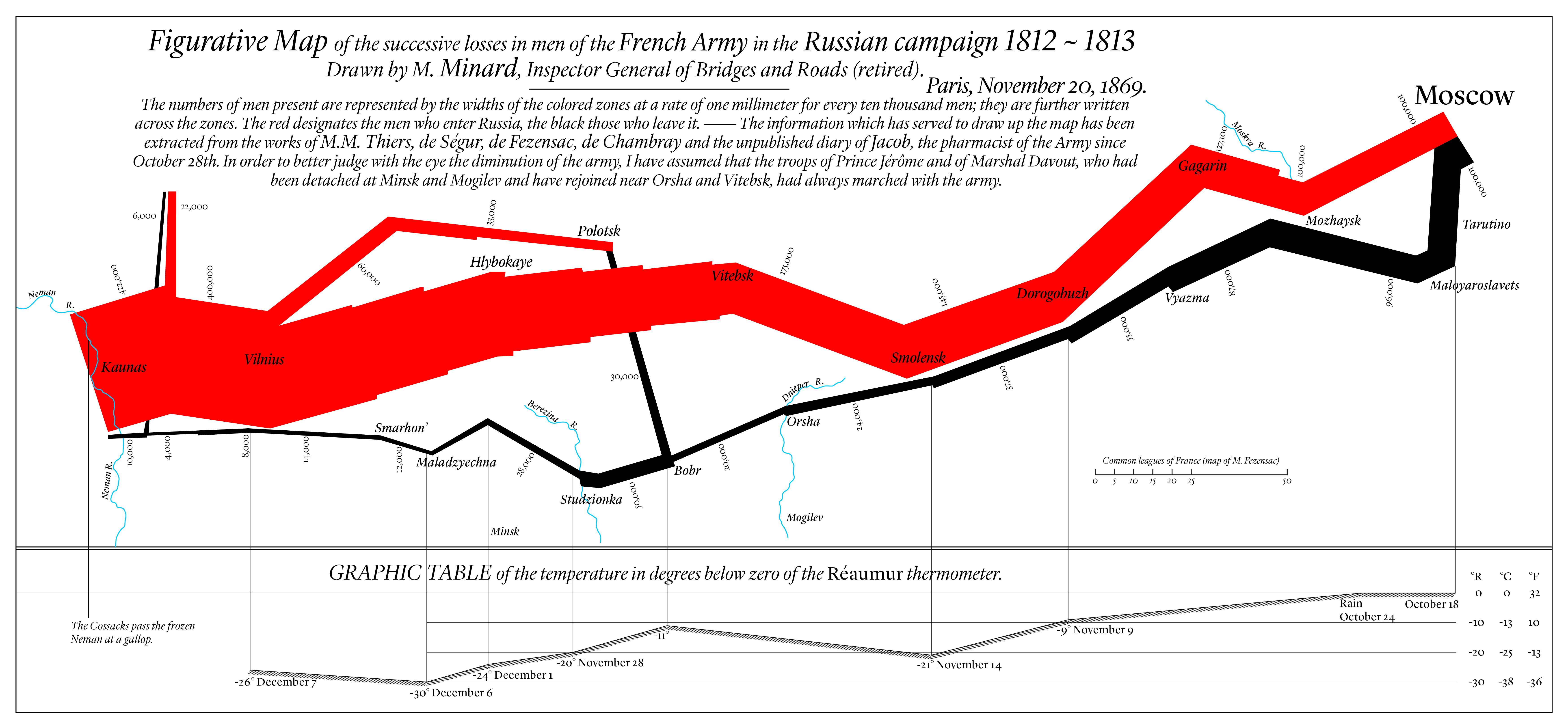
… but, one any of us are not ever likely to recreate ourselves.
What do you notice?
Minard’s original text (translated)
Note
Figurative Map of the successive losses in men of the French Army in the Russian campaign 1812 ~ 1813
Drawn by M. Minard, Inspector General of Bridges and Roads (retired) Paris, November 20, 1869.
The numbers of men present are represented by the widths of the colored zones at a rate of one millimeter for every ten thousand men; they are further written across the zones. The red designates the men who enter Russia, the black those who leave it. - The information which has served to draw up the map has been extracted from the works of M.M. Thiers, de Ségur, de Fezensac, de Chambray and the unpublished diary of Jacob, the pharmacist of the Army since October 28th.
In order to better judge with the eye the diminution of the army, I have assumed that the troops of Prince Jérôme and of Marshal Davout, who had been detached at Minsk and Mogilev and have rejoined near Orsha and Vitebsk, had always marched with the army.
In short, C’est la Bérézina.
W.E.B. DuBois’ “Freemen and slaves”
![Visualization of the *[p]roportion of freemen and slaves among American Negroes*. The free population is a small proportion from 1790 to 1860. From 1860 to 1870, the free population exapands to the full population.](./figures/dubois-free-slave.jpg)
What do you notice?
Note
Chart prepared by Atlanta University students for the Negro Exhibit of the American Section at the Paris Exposition Universelle in 1900 to show the economic and social progress of African Americans since emancipation.
W.E.B. DuBois’ “Conjugal condition”
![Visualization of the *[c]onjugal condition of American Negroes according to age periods*. For every ten year age bracket, males and females are stratified by _single_, _married_, _widowed_.](./figures/dubois-conjugal-condition.png)
What do you notice?
Note
Chart prepared by Atlanta University students for the Negro Exhibit of the American Section at the Paris Exposition Universelle in 1900 to show the economic and social progress of African Americans since emancipation.
A glimpse at banana trade
How does this compare to the examples we’ve just reviewed?
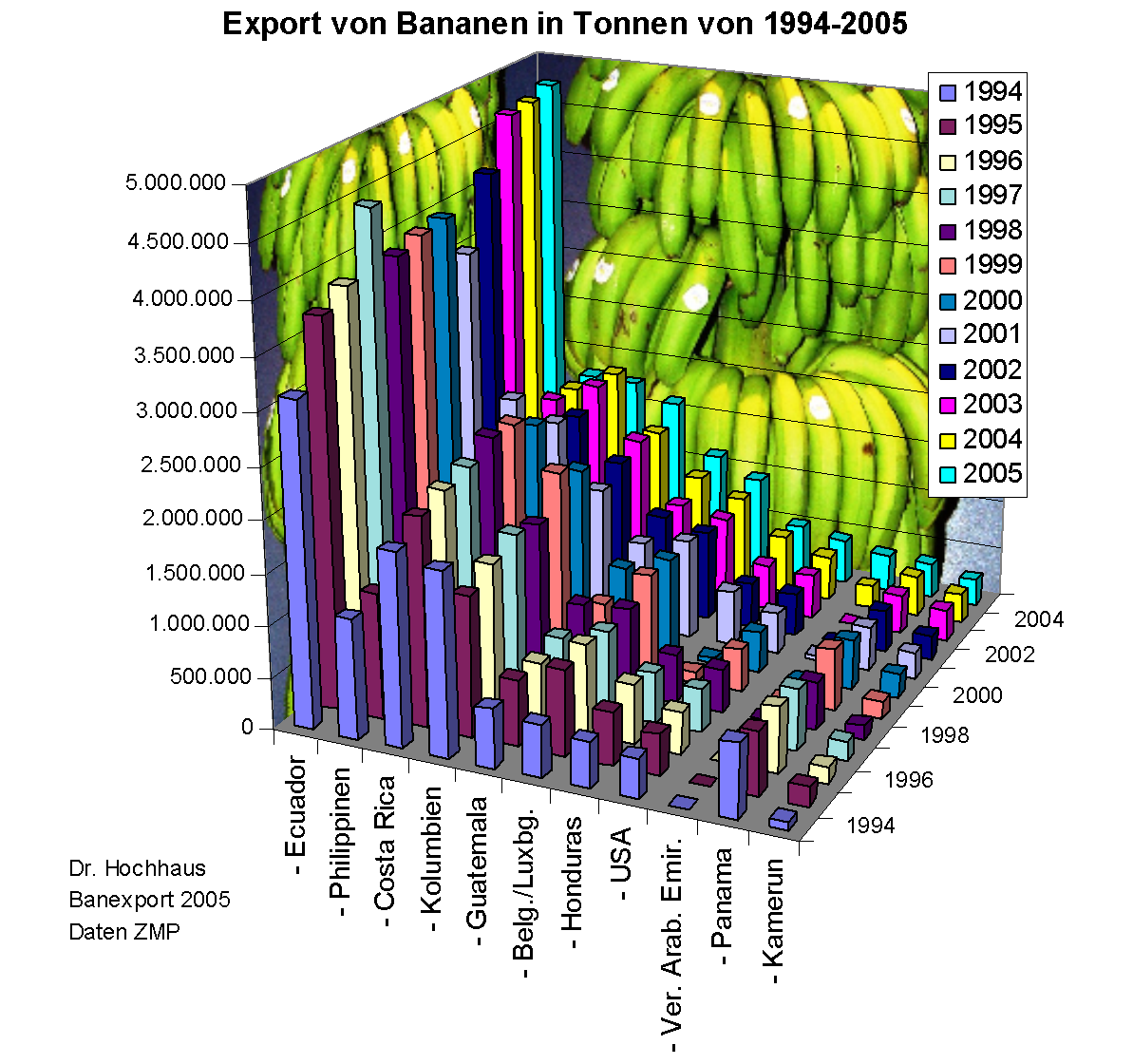
What do you notice?
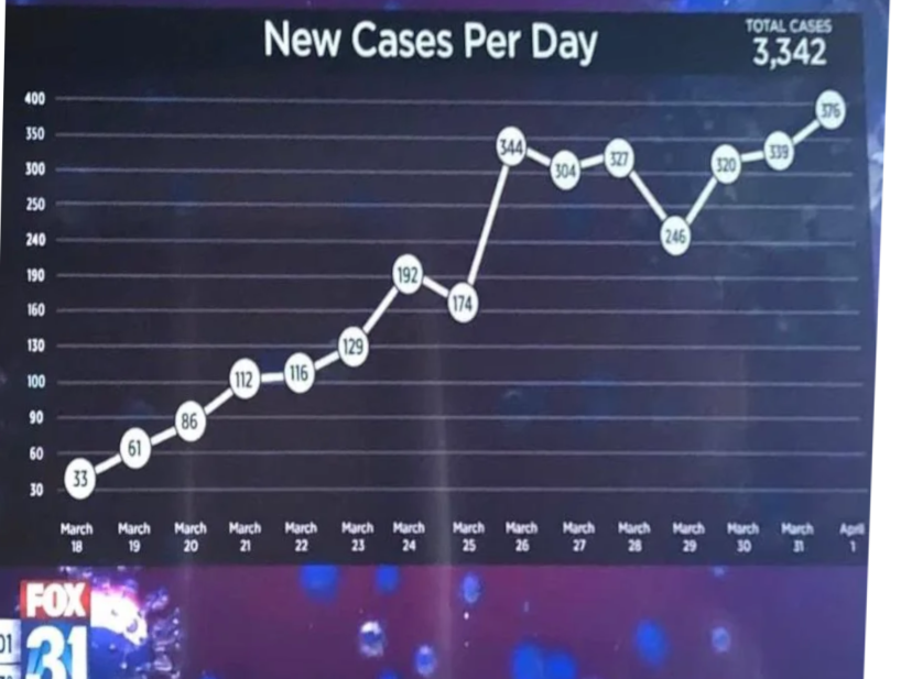
A bar chart
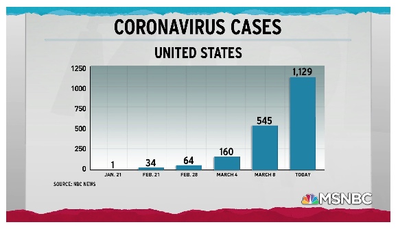
Equal spacing between bars minimizes the passage of time.
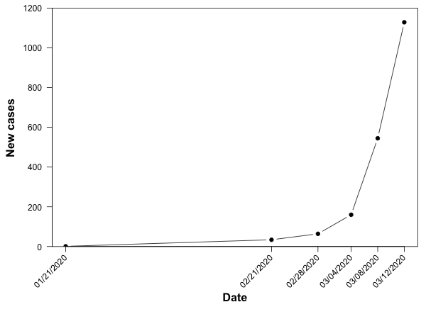
A line graph
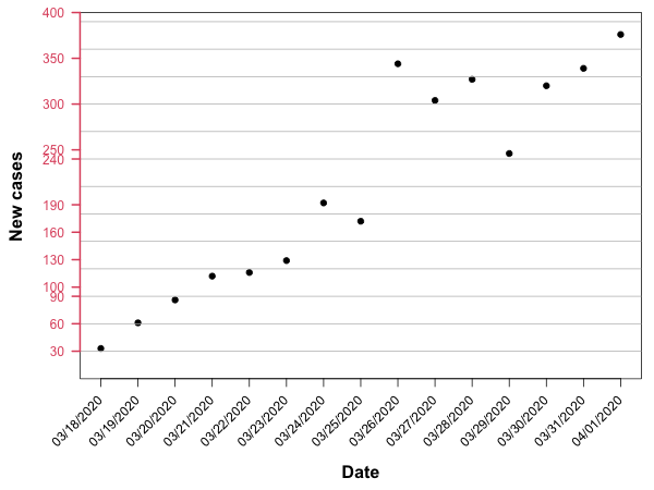
Vertical axis markings in red were originally shown as being equally spaced across the axis.
A grouped bar chart
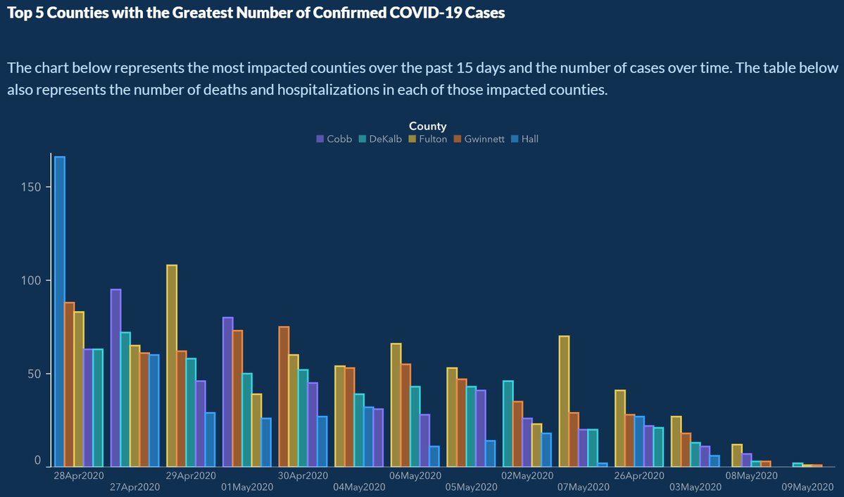
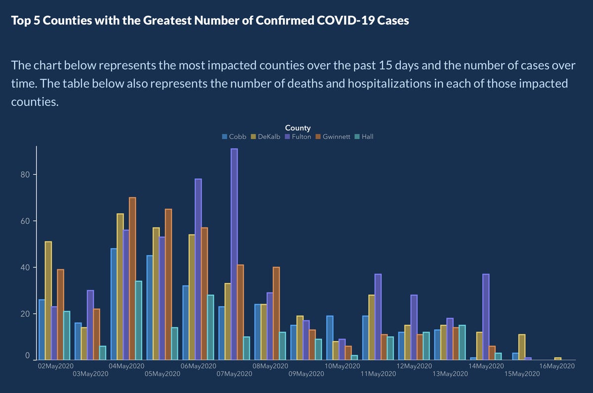
Groups have been ordered consistently and time is showed chronologically.
A shaded line chart
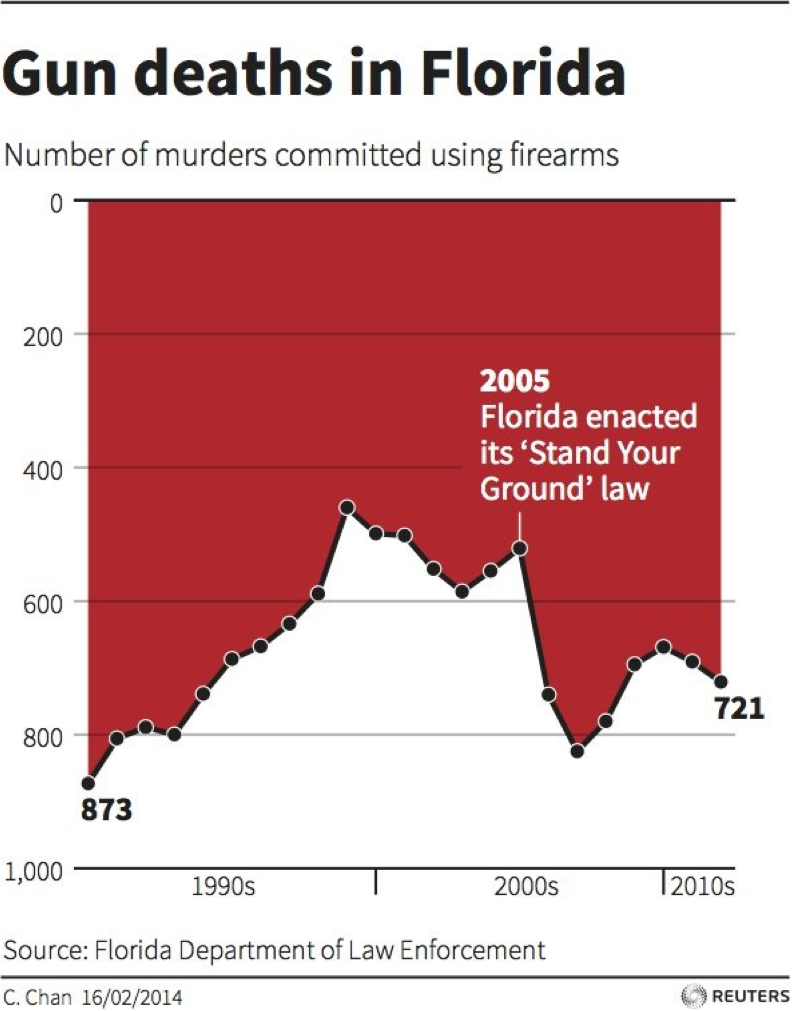
- What is your first reaction?
- What do you wonder?
- What could you do to improve the presentation?
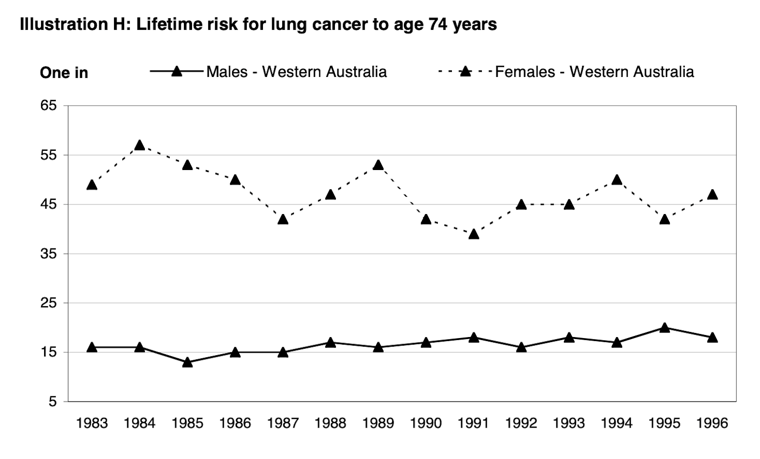
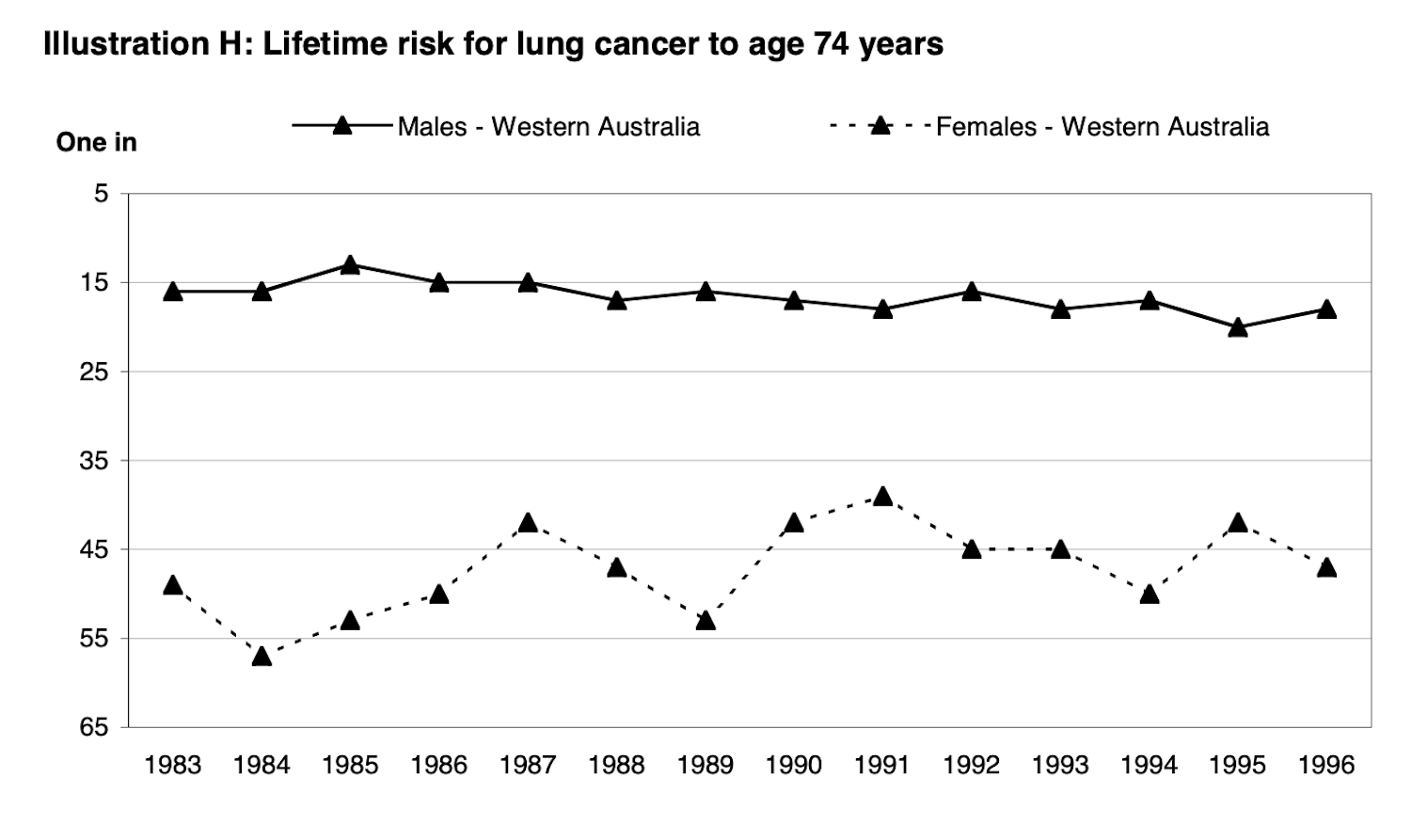
Paired line graphs
A connected line graph showing lifetime lung cancer risk for Australian males and females (from NSW Department of Health, July 2006).
Paired line graphs
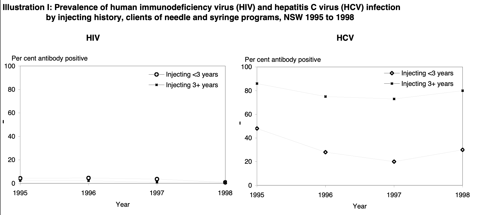
Prevalence of human immunodeficiency virus (HIV) and hepatitis C virus (HCV) infection by injecting history, clients of needle and syringe programs, NSW 1995 to 1998 (from NSW Department of Health, July 2006).
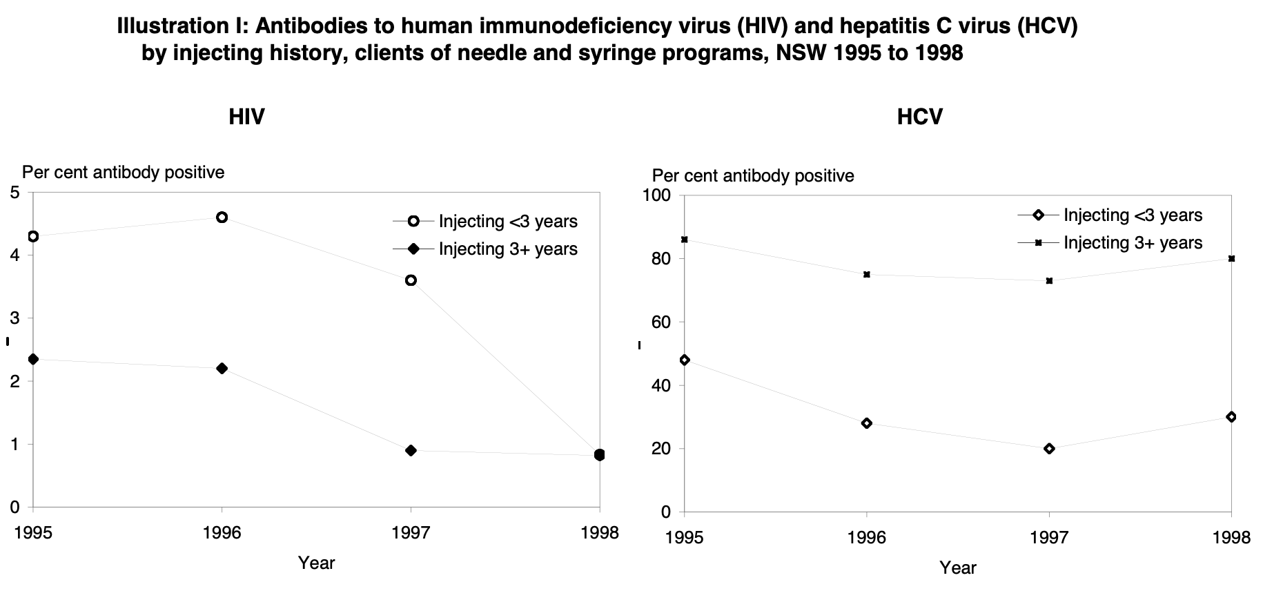
Paired line graphs
Prevalence of human immunodeficiency virus (HIV) and hepatitis C virus (HCV) infection by injecting history, clients of needle and syringe programs, NSW 1995 to 1998 (from NSW Department of Health, July 2006).
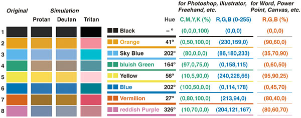
Colors
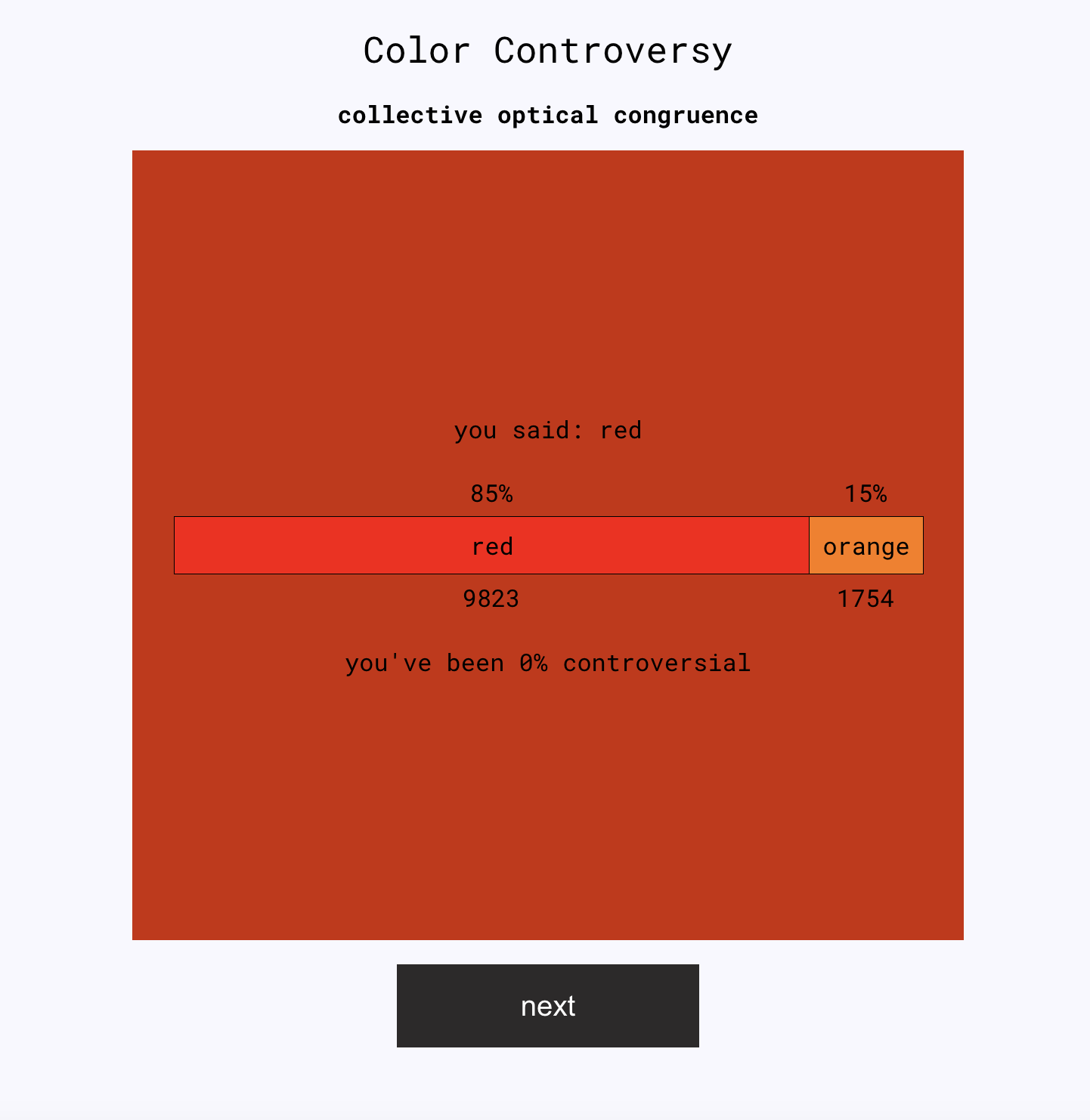
We will experiment with perception of color and record some pseudoanonymous data.
Click the color you feel best represents the sample
Open the shared spreadsheet (https://bit.ly/42kMq0O)
Using your assignd rows in the Colors tab, begin selecting colors and recording results. Enter data as suggested.
| User | Color selected | Color alternate | Percent in agreement | “Controversy” score |
|---|---|---|---|---|
| … | … | … … | … | |
| sl22 | red | orange | 85 | 0 |
| … | … | … | … | … |
Color data
Next week we will use the color data to perform some visualization tasks.