Mapmaking
It’s a map, how much more is there to say?
Turns out, a lot.
Maps are “familiar”.
But, can be misleading.
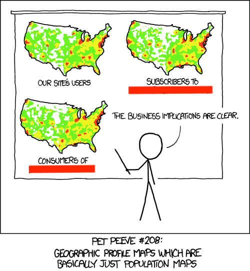
Don’t forget about colors (1/4)
Don’t forget about colors (2/4)
Don’t forget about colors (3/4)
Don’t forget about colors (4/4)
Maps
There are a variety of tools available, but a lot of new, discipline-specific terminology to grapple with.
We will look at a few tools, but, depending on your needs, a reasonable approach is to
start with an online tutorial,
reproduce the results, and
slowly modify the input data (and variable names) to match your current needs.
If you find a good tutorial, use it, share it, comment on it, and ideally archive it so it is more likely to be available to future use.
Simple map
To make simple maps, the packages "maps", "mapproj", and "mapdata" may be useful, but , "mapdata" is no longer current.
We will start “simple”, perhaps disappointingly simple, because this gets quite complicated quite quickly!
options (repos= structure (c ("https://cloud.r-project.org" , "http://www.stats.ox.ac.uk/pub/RWin" ), .Names = c ("CRAN" , "CRANextra" )))if (! "maps" %in% names (installed.packages)){install.packages ("maps" )}
The downloaded binary packages are in
    /var/folders/cv/57f7pbds3y7_pq476q9b438r0000gn/T//RtmpZPzQYG/downloaded_packages
if (! "mapproj" %in% names (installed.packages)){install.packages ("mapproj" )}
The downloaded binary packages are in
    /var/folders/cv/57f7pbds3y7_pq476q9b438r0000gn/T//RtmpZPzQYG/downloaded_packages
if (! "mapdata" %in% names (installed.packages)){install.packages ("mapdata" )}
The downloaded binary packages are in
    /var/folders/cv/57f7pbds3y7_pq476q9b438r0000gn/T//RtmpZPzQYG/downloaded_packages
## for basic mapping library (maps)library (mapproj)## for too many other things to list library (ggplot2)
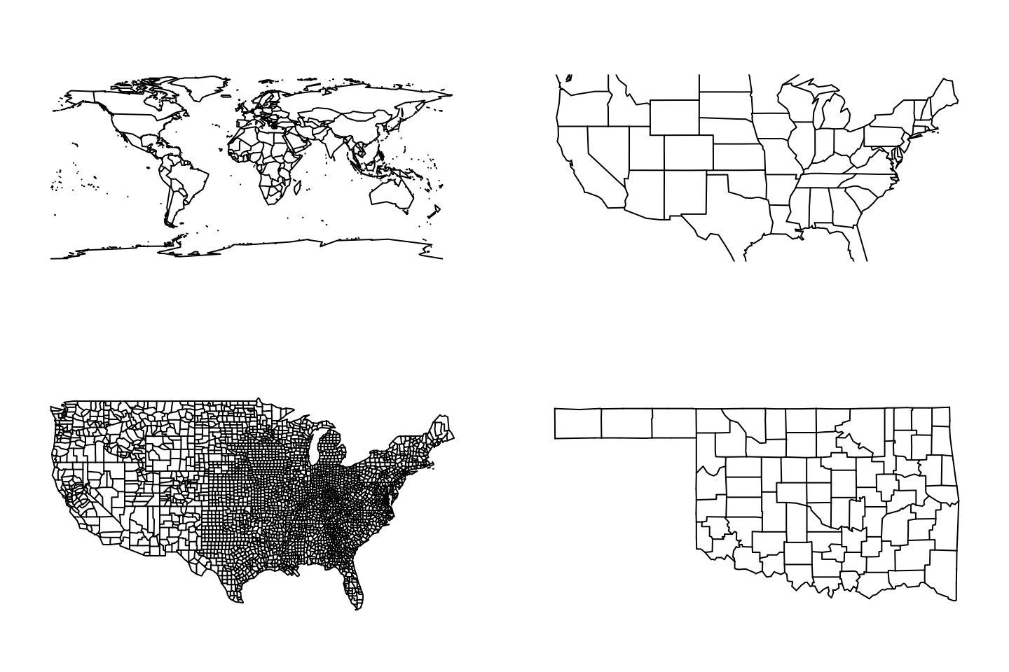
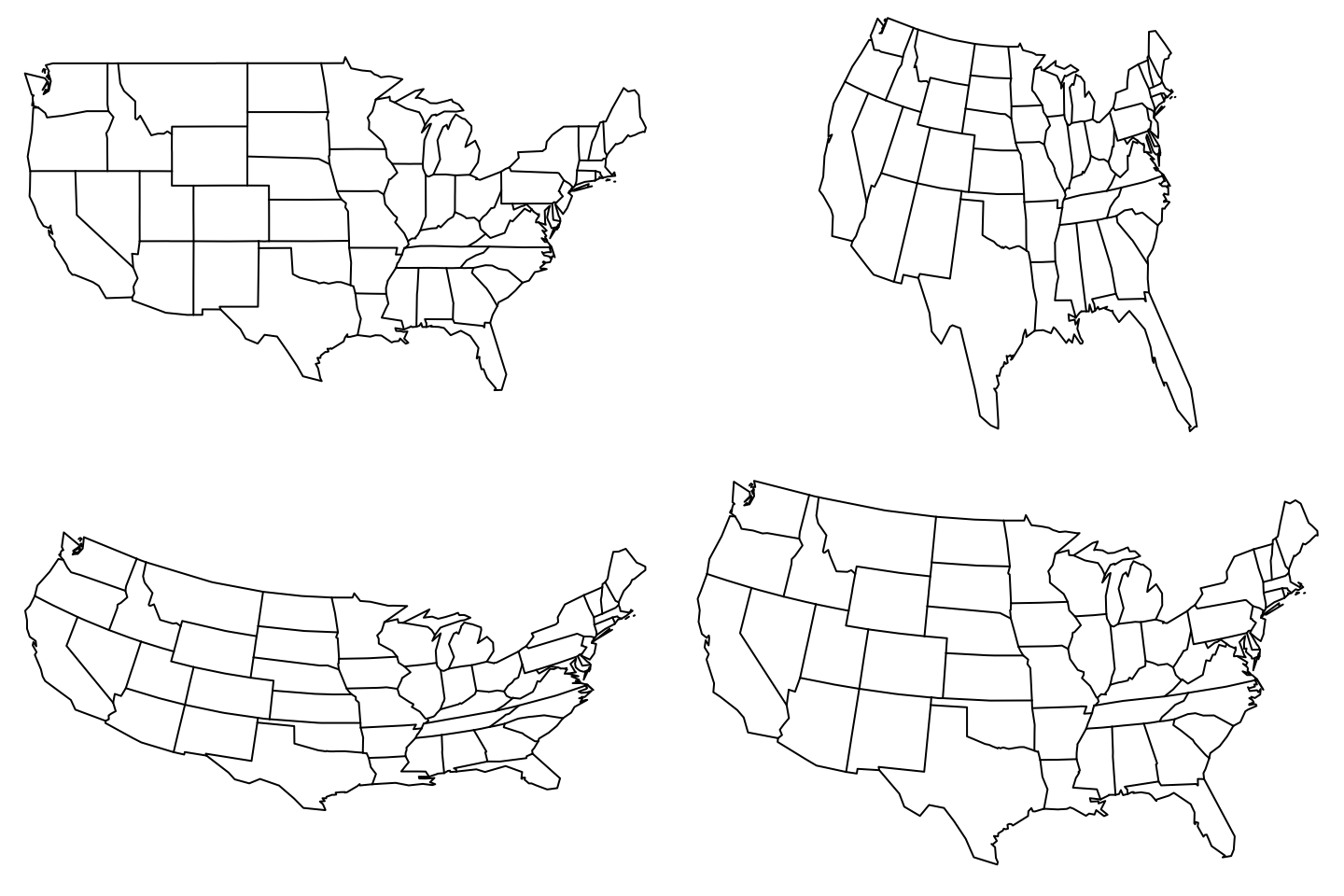
A series of maps
From a world map, to a US state map, to a US county map, to an Oklahoma county map.
par (mfrow = c (2 , 2 ), mar = rep (0 , 4 ))map ()map (database = 'state' )map (database = 'county' )map (database = 'county' , region = 'oklahoma' )
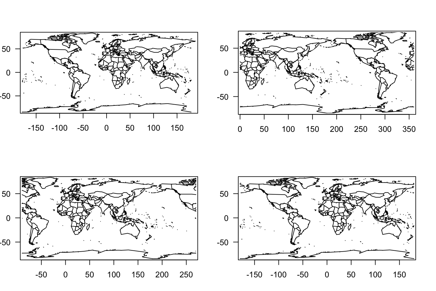
That’s a wrap!
We can change the center of the map by specifying a 360-degree wrapping. In a world map, numbers must represent the full 360-degree range of longitudes.
par (mfrow = c (2 , 2 ), mar = rep (0 , 4 ))map (); map.axes (las = 1 )map (wrap = c (0 , 360 )); map.axes (las = 1 )map (wrap = c (- 90 , 270 )); map.axes (las = 1 )map (wrap = c (- 180 , 180 )); map.axes (las = 1 )
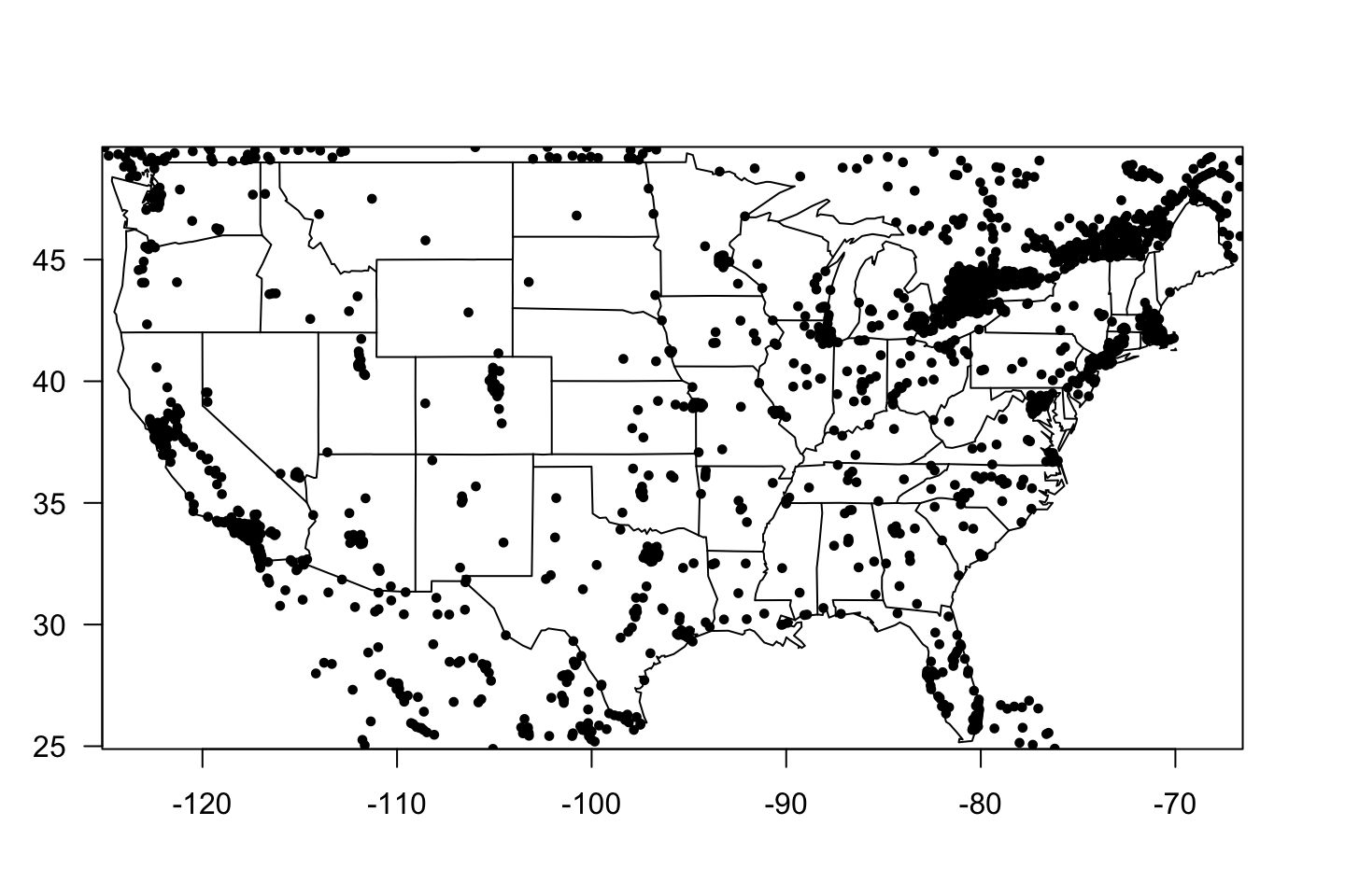
Map annotation
map (database = 'state' )map.axes (las = 1 )map.cities (pch = 19 )
Map “calculations”
<- map (database = 'state' , fill = TRUE , plot = FALSE )area.map (m, ".*virginia" )area.map (m, c ("West Virginia" , "Virginia" ))
West Virginia      Virginia
     6.515311     10.547939
area.map (m, c ("West Virginia" , "Virginia" ))
West Virginia      Virginia
     6.515311     10.547939
Sum to 17.06325.
Terminology
Below the color scheme is rather uninformative, but as we learn why we might color maps, we can make it more useful.
chloropleth - regions of maps colored or shaded by value (quantity or intensity)
map ('state' , resolution = 0 , fill = TRUE , col = hcl.colors (50 ))
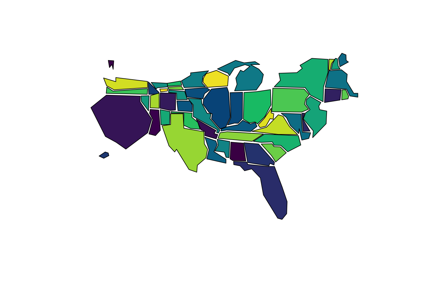
cartograms - regions scaled (in size) by value (here area)
map ('state.carto' , resolution = 0 , fill = TRUE , col = hcl.colors (50 ))
Chloropleths vs Cartograms
Chloropleths can be misleading.
At first glance, we conflate area with importance.
Choice of geographic boundary can hide or inflate patterns.
Cartograms can be confusing.
They represent space, but aren’t “maps”.
May require more accompanying text to guide interpretation.
Map projections
See https://en.wikipedia.org/wiki/List_of_map_projections among other good sources.
par (mfrow = c (2 , 2 ), mar = rep (0 , 4 ))map (database = "state" , projection = "mercator" )#; map.axes(las = 1) map (database = "state" , projection = "gnomonic" )#; map.axes(las = 1) map (database = "state" , projection = "orthographic" )#; map.axes(las = 1) map (database = "state" , projection = "albers" , par= c (39 , 45 ))#; map.axes(las = 1)
Computation on maps
Suppose we were interested in extracting simple data from maps.
We will get warnings as these are not true areas (making round things flat).
<- map (database = 'state' , fill = TRUE , plot = FALSE )area.map (m)area.map (m, ".*virginia" )area.map (m, c ("West Virginia" , "Virginia" ))
West Virginia      Virginia
     6.515311     10.547939
All things considered
Not all “spatial” data needs to be shown as a map!
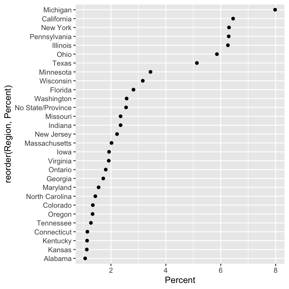
<- read.delim ("./data/drink-names.csv" , header = TRUE , sep = ' \t ' )<- dat[- 1 , ]ggplot (data = subset (dat, Percent > 1 ), mapping = aes (x = Percent, y = reorder (Region, Percent))) + geom_point ()
Data on maps
Suppose we wanted to color states by their response rate in the “pop”-“soda”-“coke” survey.
We will use a US-“standard” Albers map projection.
Turns out due to the complexity of map data, this is very challenging in base R.
To ggplot
We will begin with map_data() a ggplot2 function.
<- map_data ("state" )head (usStates, n = 2 )
       long      lat group order  region subregion
1 -87.46201 30.38968     1     1 alabama      <NA>
2 -87.48493 30.37249     1     2 alabama      <NA>
What is all of that stuff?!?
To ggplot
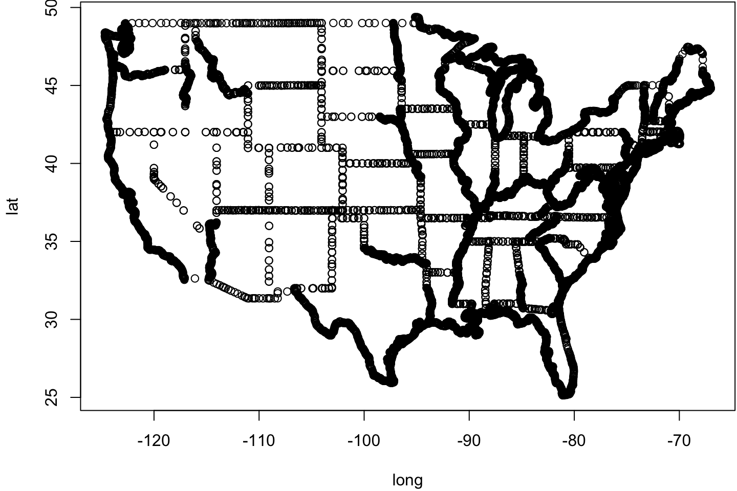
Having read the data, we can make a plain old “base R” plot.
par (mar = c (4.1 , 4.1 , 0.1 , 0.1 ))plot (usStates[, c ("long" , "lat" )])
A map is just a bunch of lines.
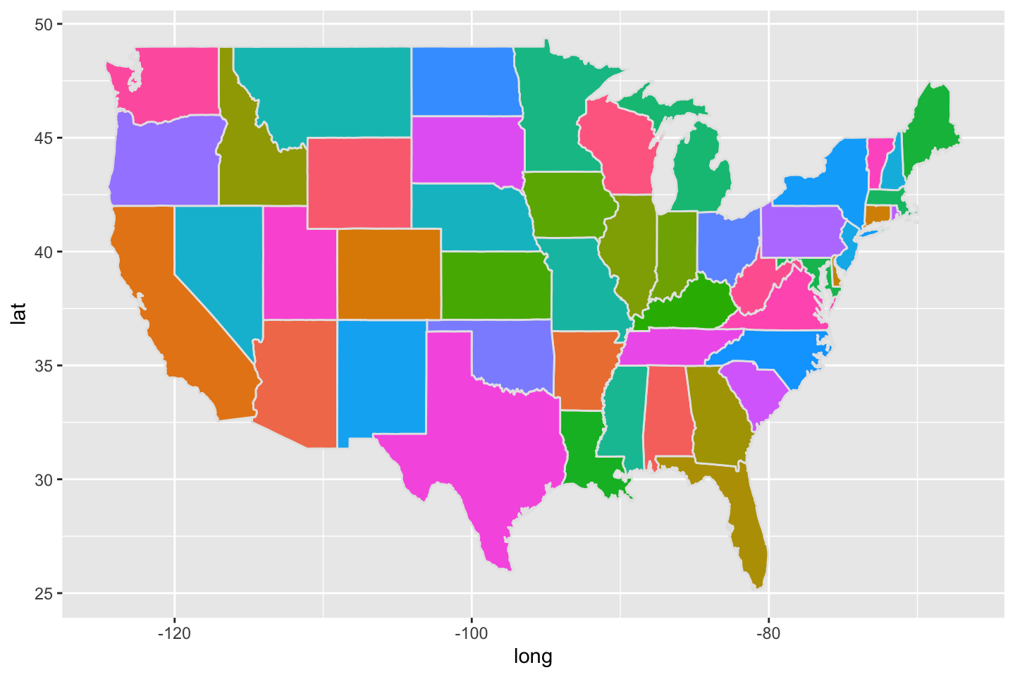
Coloring regions
Below there is no rationale to the color scheme.
ggplot (data = usStates, mapping = aes (x = long, y = lat, group = group, fill = region)) + geom_polygon (color = "gray90" ) + guides (fill = FALSE )
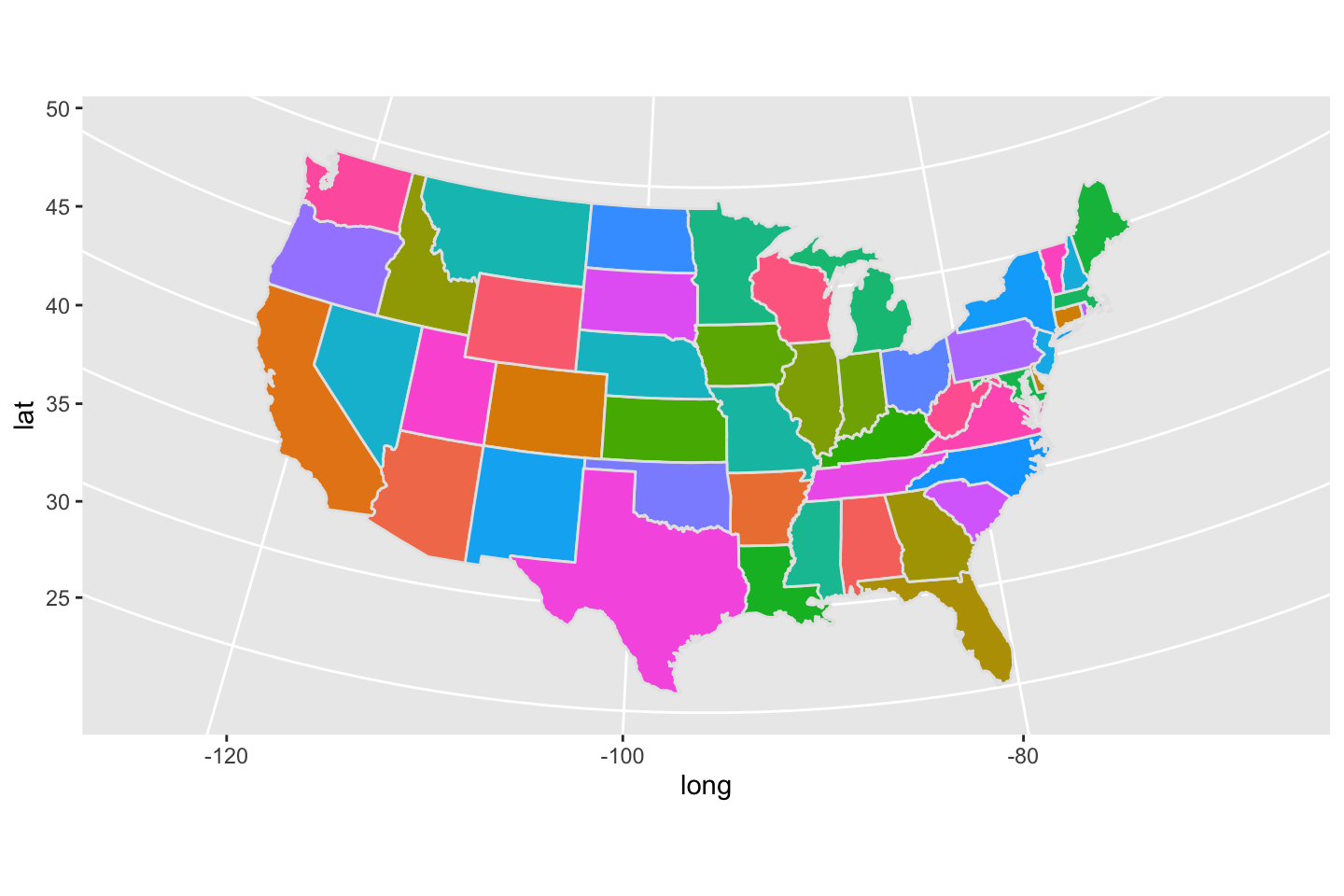
Improving projection
Below there is no rationale to the color scheme.
ggplot (data = usStates, mapping = aes (x = long, y = lat, group = group, fill = region)) + geom_polygon (color = "gray90" ) + coord_map (projection = "albers" , lat0 = 39 , lat1 = 45 ) + guides (fill = FALSE )
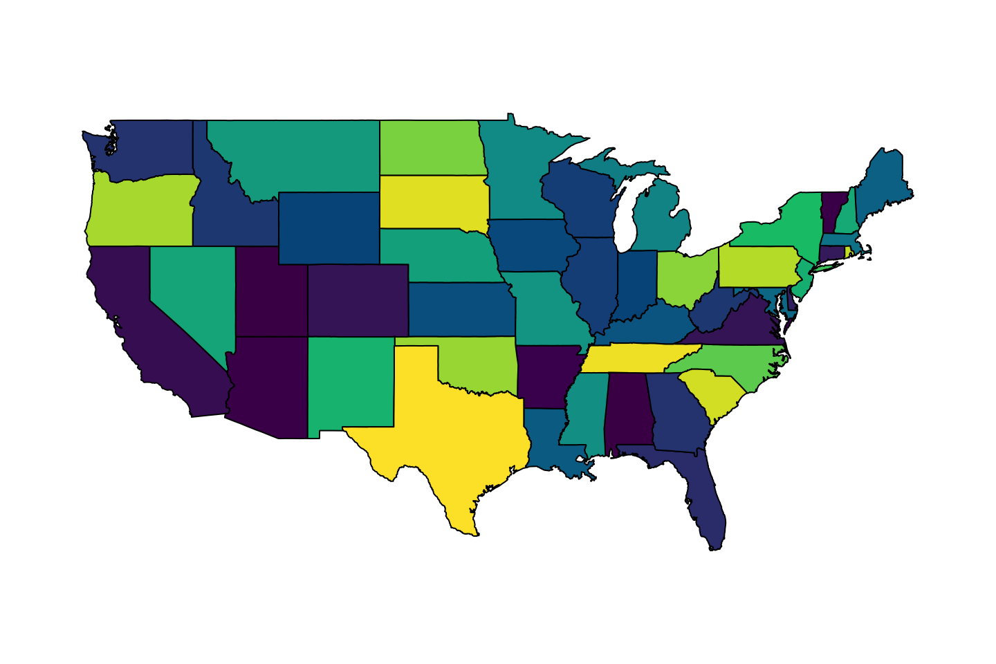
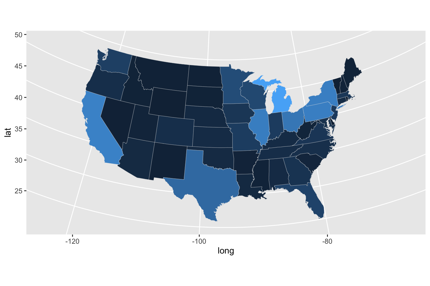
Coloring by a data value
Below there is no rationale to the color scheme.
$ Region <- tolower (dat$ Region)<- merge (usStates, dat, by.x = "region" , by.y = "Region" )ggplot (data = usStates, mapping = aes (x = long, y = lat, group = group, fill = Percent)) + geom_polygon (color = "gray90" , linewidth = 0.1 , show.legend = TRUE ) + coord_map (projection = "albers" , lat0 = 39 , lat1 = 45 ) + guides (fill = FALSE )
Binned percents as colors
We can bin percents in to one-percent-width bins. It is worth exploring what cut() does out of context of this application.
$ bin <- as.numeric (cut (usStates$ Percent, c (0 , 1 , 2 , 3 , 4 , 5 , 100 )))ggplot (data = usStates, mapping = aes (x = long, y = lat, group = group, fill = bin)) + geom_polygon (color = "gray90" , linewidth = 0.1 , show.legend = TRUE ) + coord_map (projection = "albers" , lat0 = 39 , lat1 = 45 ) + guides (fill = FALSE )
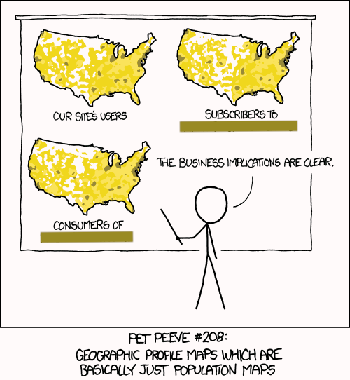
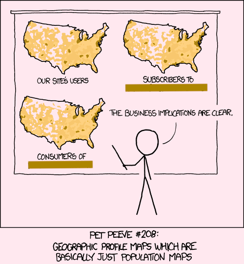
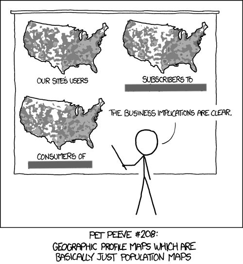
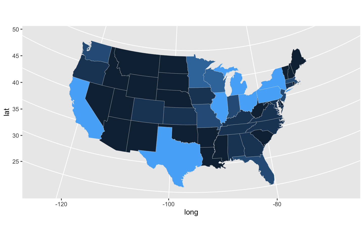
Back to our comic…
ggplot (data = usStates, mapping = aes (x = long, y = lat, group = group, fill = Total)) + geom_polygon (color = "gray90" , linewidth = 0.1 , show.legend = TRUE ) + coord_map (projection = "albers" , lat0 = 39 , lat1 = 45 ) + guides (fill = FALSE )
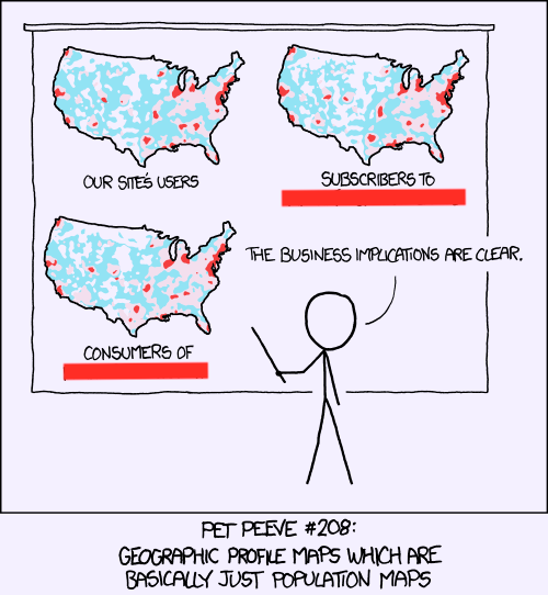
Back to our comic…
ggplot (data = usStates, mapping = aes (x = long, y = lat, group = group, fill = bin)) + geom_polygon (color = "gray90" , linewidth = 0.1 ) + coord_map (projection = "albers" , lat0 = 39 , lat1 = 45 ) + guides (fill = FALSE )
Challenges
Create new variables to represent the choice of beverage vernacular (e.g., fraction “pop”).
Search the internet for similar regional datasets (US or abroad).
Compute the state centroid (manually or cleverly) and plot the percent to respond.
Consider faceting by beverage type (might require work).
Figure out the darn legend bar.