dat <- read.csv("./data/noro.csv", header = TRUE, sep = "\t")Data Visualization and Exploration
Dashboard Content
Norovirus outbreak data
In class we used US CDC data (for more details see https://www.cdc.gov/norovirus/php/reporting/norostat-data-table.html) on norovirus outbreaks to generate sample graphs for a dashboard. The graph was basic and lacking style. You were asked to sketch or describe changes that you would our would like to know how to make. The unit of measurement is “outbreak”, not necessarily indicative of the number of individual cases.
The sample graph shown in class has been slightly modified by in-class requests. The graph in Figure 1 now has side-by-side panels, a shared vertical axis label, and modified axes between panels. In the right-hand panel, beginning-of-week dates are printed every third week, compared to the left-hand panel that has tick marks every week and prints whatever dates “fit”. If anything, the axis counting by 25 should probably be paired with the lower-value data, but again this was a demonstration of how axis() works, more than an example of a “good graph” itself.
par(mfrow = c(1, 2), mar = c(6.1, 4.1, 0.8, 0.8), xaxs  = 'i', yaxs = 'i')
plot(dat$Yrs_2024_25, ylim = c(0, 250), pch = 19, type = 'o', cex = 0.5, las = 1, xlab = "", ylab = "", axes = F)
mtext("Week", side = 1, line = 5, font = 2)
mtext("Norovirus Outbreaks", side = 2, line = 3, font = 2)
axis(2, at = seq(0, 225, by = 25), las = 1)
axis(1, at = seq(1, 52, by = 1), dat$Week[seq(1, 52, by = 1)], las = 3, srt = 45)
plot(dat$Yrs_2020_21, ylim = c(0, 250), pch = 19, type = 'o', cex = 0.5, las = 1, col = "gray", las = 1, xlab = "", ylab = "", axes = F)
mtext("Week", side = 1, line = 5, font = 2)
#mtext("Norovirus Outbreaks", side = 2, line = 3, font = 2)
axis(2, las = 1)
axis(1, at = seq(1, 52, by = 3), dat$Week[seq(1, 52, by = 3)], las = 3, srt = 45)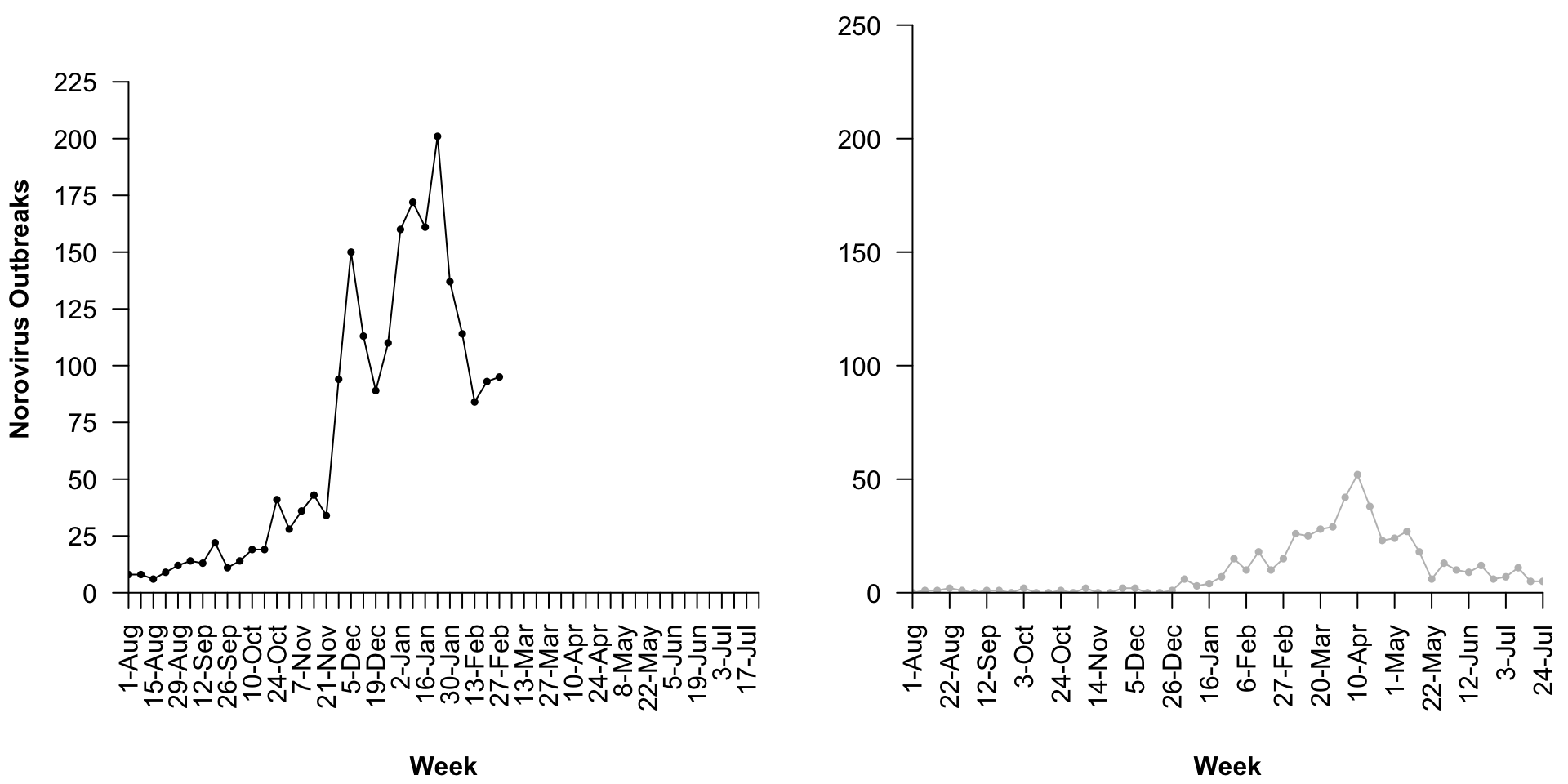
With this as motivation or inspiration, what changes would you make to the graph? Share these by email (text or sketch) as a pdf, png, or jpg file and we will “workshop” these suggestions in class next week.