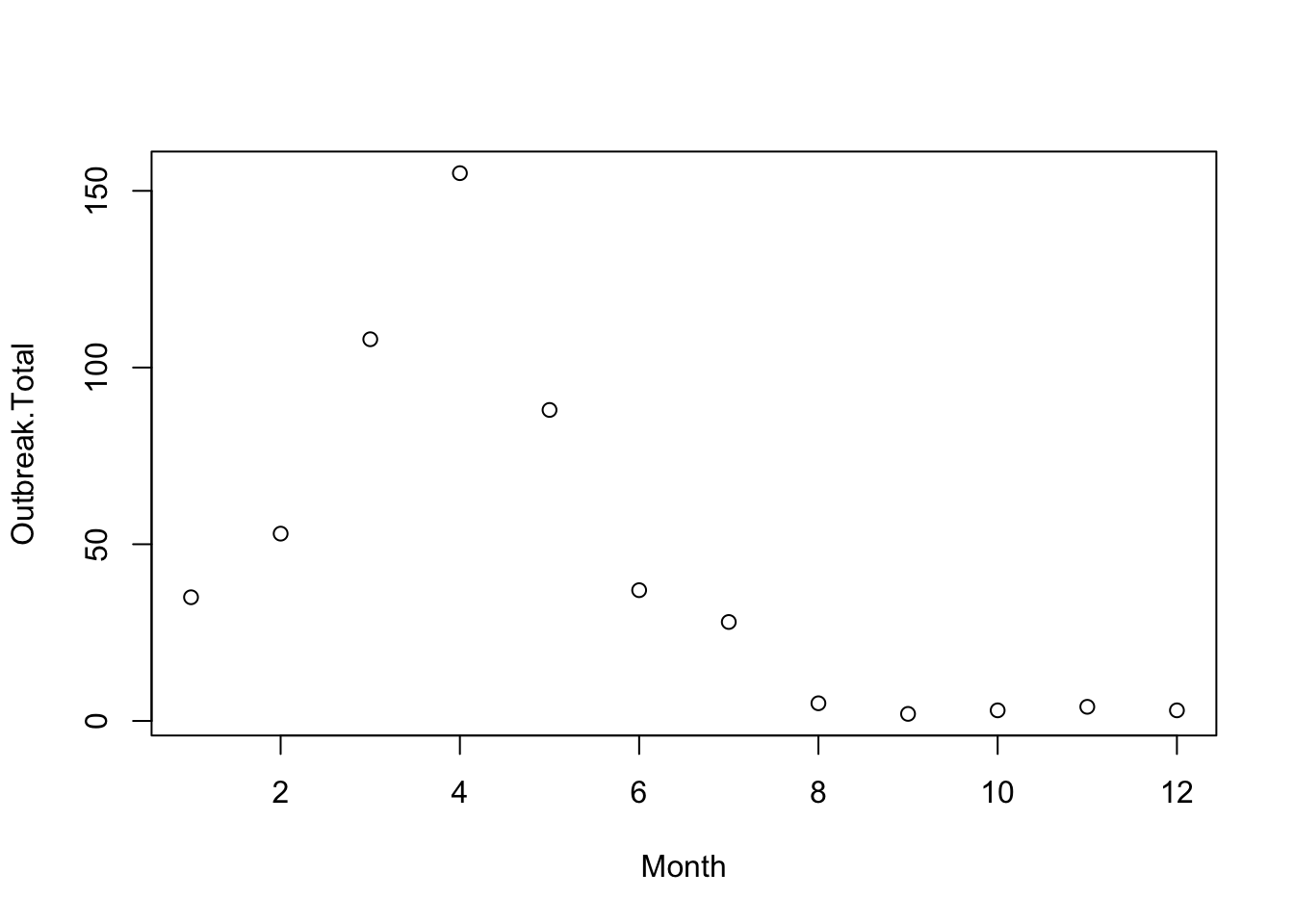
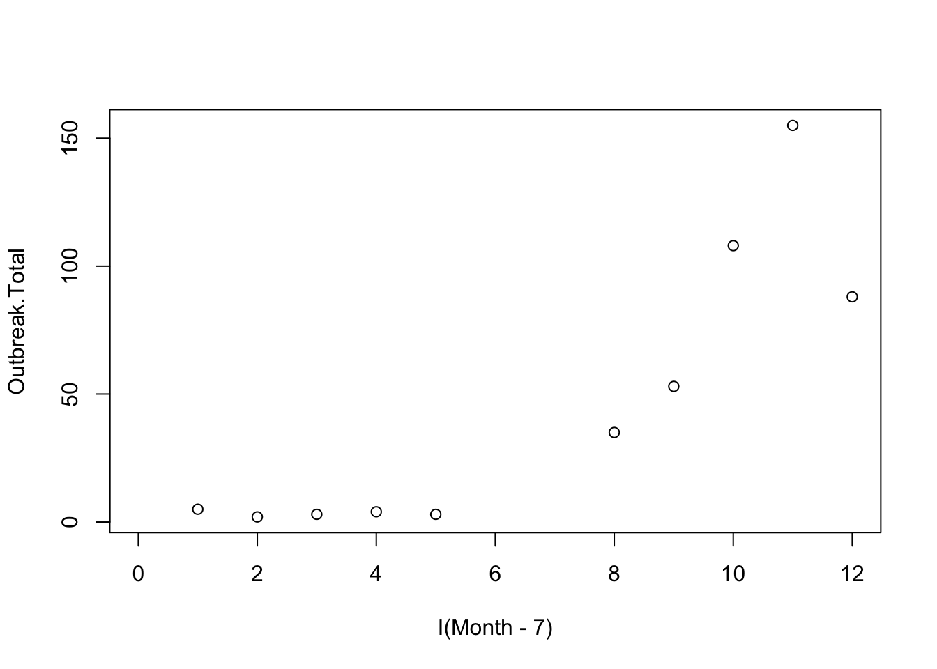
There were some concerns about the axis labeling with respect to time. This turns out to be relatively complicated, but interesting. For those of you that wanted data-wrangling, this is a very good problem. As it turned out, one “fix” introduced more, and perhaps even more confusing, complications. This is left unfinished to offer a challenge.
This graph, while well-intentioned is deceptive. Our data starts on August 1, 2020 (i.e., “month 8”) and ends on July 20-something, 2021 (i.e., “month 1”). These months are presented deceptively (“1” corresponds to year 2021, but the “8” is from year 2020).
agg <-aggregate(dat2$Outbreaks, by =list(dat2$Month), sum)agg
Aggregating by month name is perhaps more problematic as time is ordered alphabetically.
dat2$Month2 <-months(dat2$Date)agg2 <-aggregate(dat2$Outbreaks, by =list(dat2$Month2), sum)agg2
     Group.1   x
1      April 155
2     August   5
3   December   3
4   February  53
5    January  35
6       July  28
7       June  37
8      March 108
9        May  88
10  November   4
11   October   3
12 September   2
I would probably compute a “fake” time variable that corresponds to months within this weird variant of August - July year.