if(!"mapdata"%in%installed.packages()){install.packages("mapdata")}Maps
April 14, 2026 (II)
Map-making
There are a variety of tools, within and external to R. Some cost money, others are free. We will all too briefly look at three mechanisms: base1/elder R functions, ggplot2 functions, and leaflet. We will show some caution and give up and move on when the time seems right. To get started we will attempt to load, or first install a few packages. One in particular, mapdata, is out of date and no longer maintained. Most importantly this will be a place to relatively simply explore basic map ideas. We will will move on pretty quickly.
We load the packages, including ggplot2, if not somewhat prematurely.
library(maps)
library(mapproj)
library(mapdata)
library(ggplot2)
In class we examined each line of Figure 1 in isolation, but show the final result here to save space.
par(mfrow = c(2, 2), mar = rep(0, 4))
map()
map(database = "state")
map(database = "county")
map(database = "county", region = "oklahoma")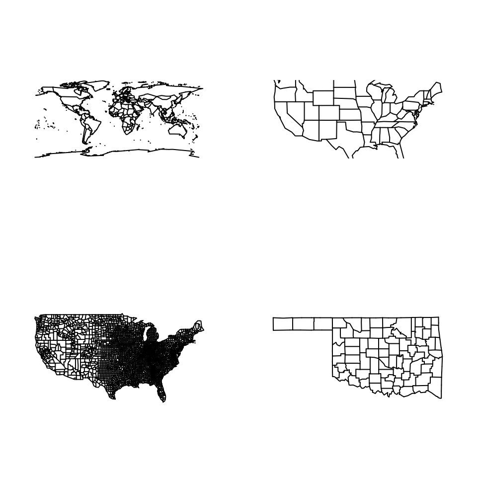
Presumably this is only useful at the World map-scale, but you can set the borders of the map so long as the total coverage is \(360^{\circ}\).
par(mfrow = c(2, 2), mar = rep(0, 4))
map(); map.axes(las = 1)
map(wrap = c(0, 360)); map.axes(las = 1)
map(wrap = c(-90, 270)); map.axes(las = 1)
map(wrap = c(-180, 180)); map.axes(las = 1)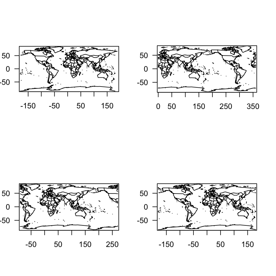
Using the location of the Oklahoma State Capitol Building, in Figure 3 we annotate the map with a black dot, mainly to show the compatibility with base R graphing features. The coordinates of its location were converte from \(\text{D}^\circ\text{M}'\text{S}"\) to $ + + $, with a good guess on the sign having looked at the results of map.axes(las = 1) and interpreting “W” as negative signed.
map(database = "county", region = "Oklahoma"); map.axes(las = 1)
points(-(97 + 30/60 + 11/3600), 35 + 29/60 + 32/3600, pch = 19)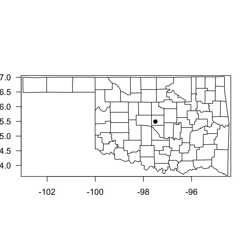
Drink data
Given those basic maps, and though curious, we avoided making filled chloropleth or cartogram maps, deferring to something more easily done with ggplot2.
dat <- read.delim("../data/drink-names.csv")
head(dat)
Region pop soda coke other Total Percent
1 Total 157659 164145 58490 21120 401414 100.00
2 Alabama 153 582 2849 665 4249 1.06
3 Alaska 324 636 60 92 1112 0.28
4 Alberta 2185 69 55 48 2357 0.59
5 American Samoa 8 11 1 40 60 0.01
6 Arizona 586 2799 437 174 3996 1.00dat <- dat[-1, ]
head(dat) Region pop soda coke other Total Percent
2 Alabama 153 582 2849 665 4249 1.06
3 Alaska 324 636 60 92 1112 0.28
4 Alberta 2185 69 55 48 2357 0.59
5 American Samoa 8 11 1 40 60 0.01
6 Arizona 586 2799 437 174 3996 1.00
7 Arkansas 154 347 1442 80 2023 0.50Having read in survey data for preferred beverage nomenclature, we make a quick plot in
ggplot(dat, mapping = aes(x = Percent, y = Region)) + geom_point()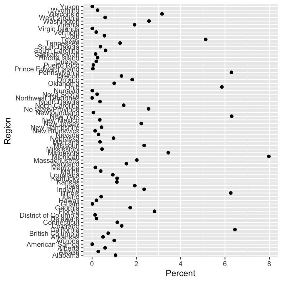
ggplot(data = subset(dat, Percent > 1), mapping = aes(x = Percent, y = Region)) + geom_point()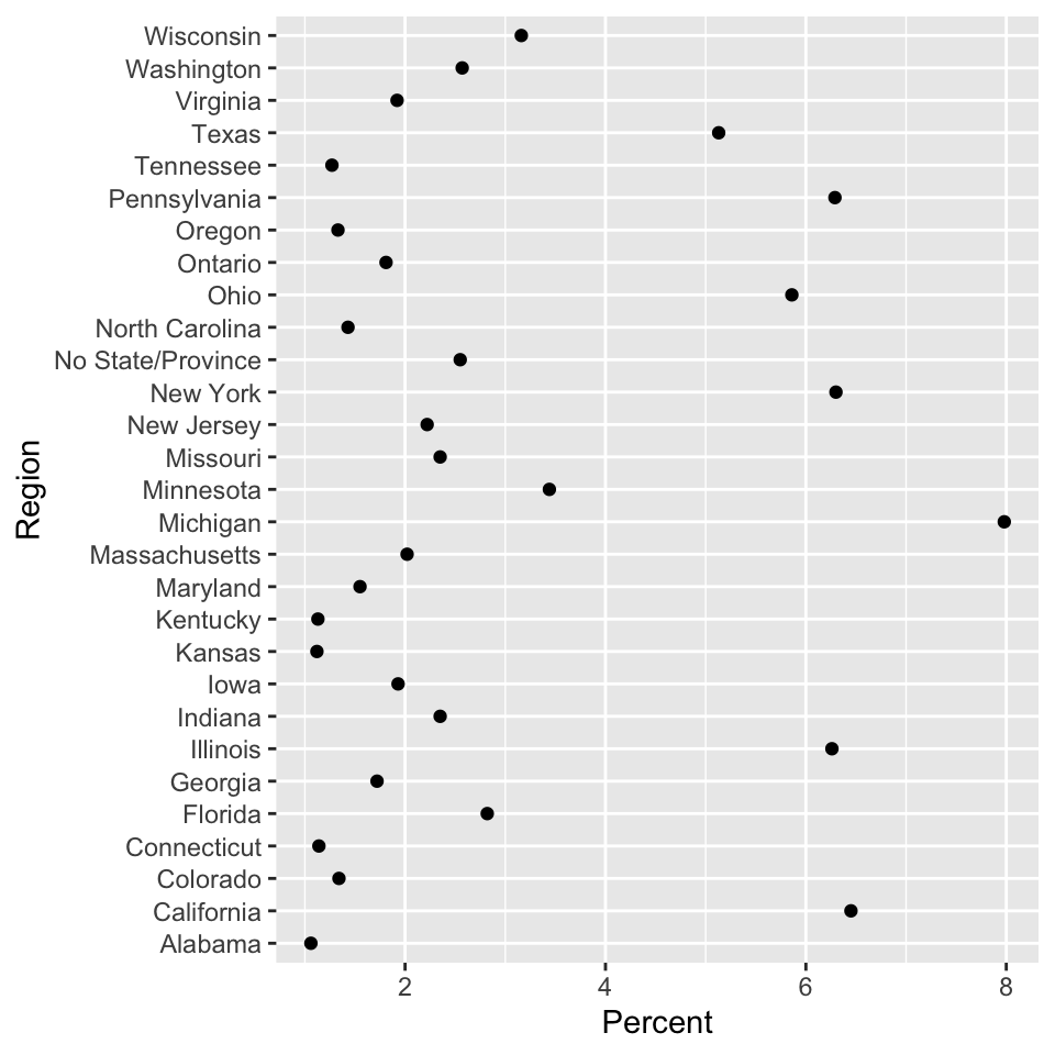
Finally, in Figure 6 the region labels are ordere from highest to lowest in terms of percent. While it’s harder to infer geographic relationships, it is easier to identify regions with similar values.
ggplot(data = subset(dat, Percent > 1), mapping = aes(x = Percent, y = reorder(Region, Percent))) + geom_point()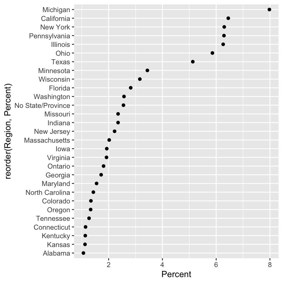
While the idea above was that not all data with a spatial interpretation need be shown spatially, we will now combine that value data with map data to generate informative color schemes. First we load the map data using the ggplot2 function map_data().
usStates <- map_data("state")
head(usStates, n = 2)
long lat group order region subregion
1 -87.46201 30.38968 1 1 alabama <NA>
2 -87.48493 30.37249 1 2 alabama <NA>head(usStates) long lat group order region subregion
1 -87.46201 30.38968 1 1 alabama <NA>
2 -87.48493 30.37249 1 2 alabama <NA>
3 -87.52503 30.37249 1 3 alabama <NA>
4 -87.53076 30.33239 1 4 alabama <NA>
5 -87.57087 30.32665 1 5 alabama <NA>
6 -87.58806 30.32665 1 6 alabama <NA>head(usStates[usStates$region == "michigan", ]) long lat group order region subregion
6193 -90.41273 46.55855 23 6215 michigan north
6194 -90.37836 46.56428 23 6216 michigan north
6195 -90.31534 46.59293 23 6217 michigan north
6196 -90.28096 46.61584 23 6218 michigan north
6197 -90.20075 46.63303 23 6219 michigan north
6198 -90.13772 46.64450 23 6220 michigan northThe data stored in usStates contains latitude, longitude, group, order, region (i.e., ‘state name’), and subregion. All points are plotted in Figure 7. A neat opportunity would be to add col = group or col = order.
plot(lat ~ long, usStates, pch = 19, cex = 0.1)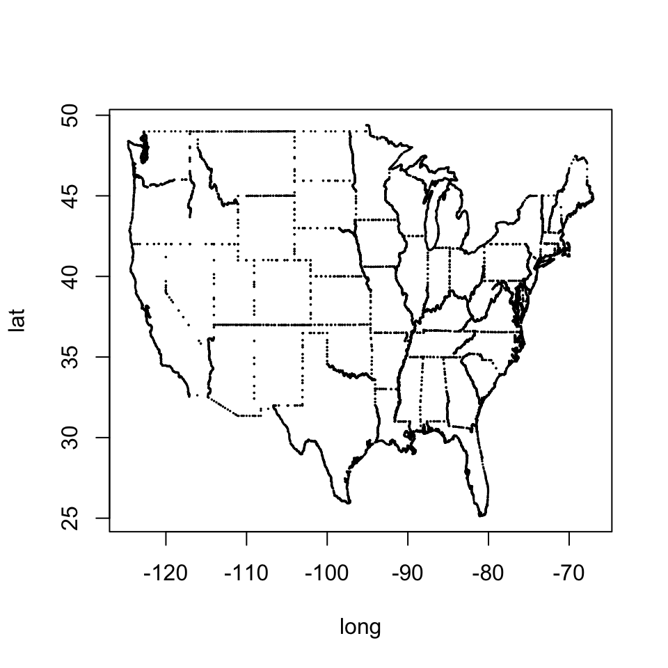
At this point we make the transition to ggplot2 graphics. In this case the last line guides(fill = "none") supresses the bringing of the state-by-state color legend. Later, when color becomes more meaningful we will have to remember to remove that. Removing the referenced line above from the code prints a surprising legend with a finely-resolved color palette.
ggplot(data = usStates,
       mapping = aes(x = long, y = lat,
       group = group, fill = region)) +
       geom_polygon(color = "gray90") +
       guides(fill = "none")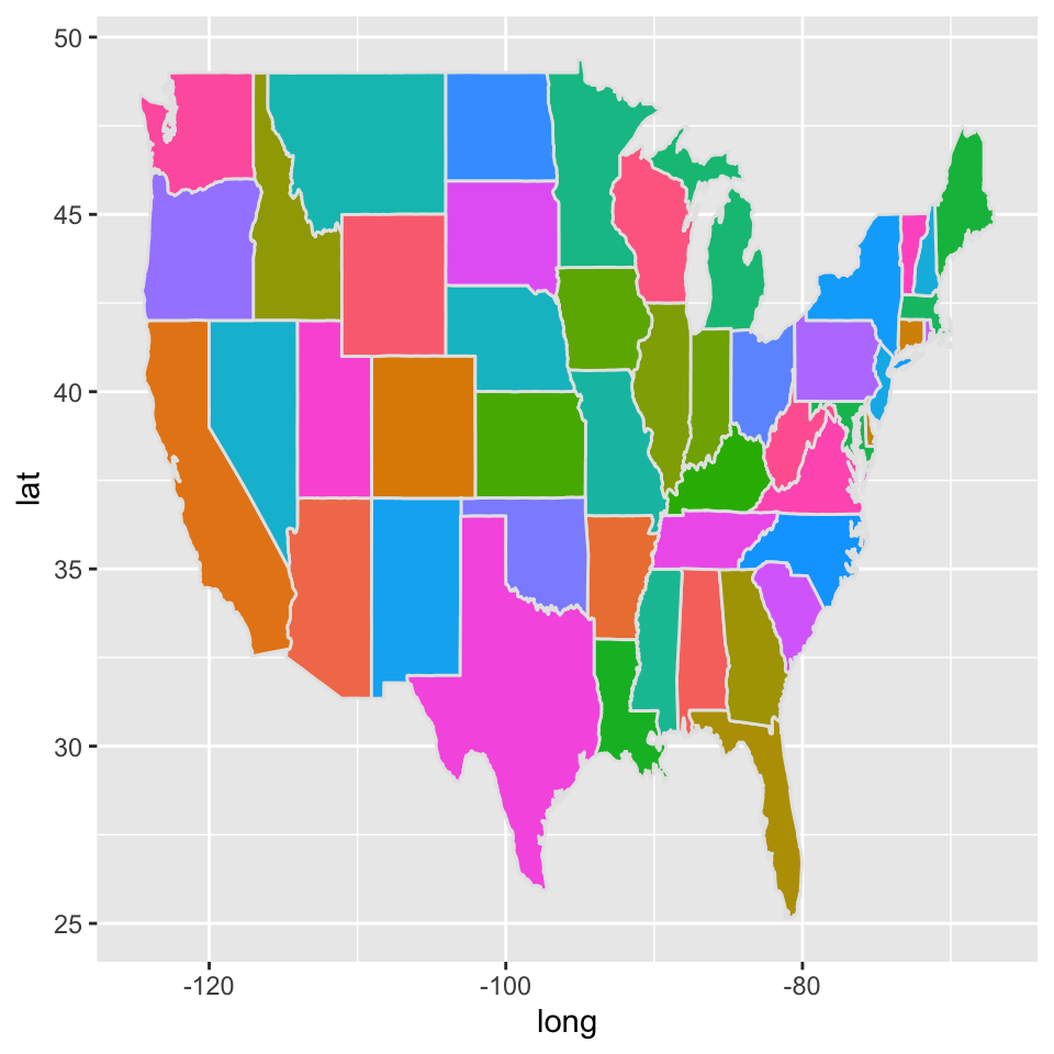
ggplot(data = usStates,
  mapping = aes(x = long, y = lat,
  group = group, fill = region)) +
  geom_polygon(color = "gray90") +
  coord_map(projection = "albers", lat0 = 39, lat1 = 45) +
  guides(fill = FALSE)
Warning: The `<scale>` argument of `guides()` cannot be `FALSE`. Use "none" instead as
of ggplot2 3.3.4.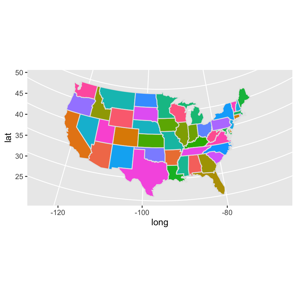
Things start to get more interesting with a rationale for coloring states (or relevant regions) with colors indicative of another variable as in Figure 10. This can certainly be done with tidyverse syntax, perhaps even more easily, but I will use base R commands for this because that is way easier for me. We first convert the state names in the survey data to lowercase (note the corresponding variable name Region remains uppercase). Then with merge we tack the survey results on, state-by-state, repeating rows as necessary. From this, in Figure 10, we can derive color schemes from values of the numerical variables.
dat$Region <- tolower(dat$Region)
usStates <- merge(usStates, dat, by.x = "region", by.y = "Region")
ggplot(data = usStates,
  mapping = aes(x = long, y = lat,
  group = group, fill = Percent)) +
  geom_polygon(color = "gray90", linewidth = 0.1, show.legend = TRUE) +
  coord_map(projection = "albers", lat0 = 39, lat1 = 45)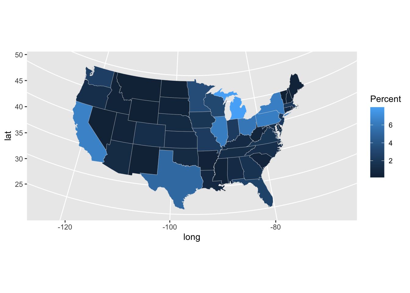
There are a lot of colors in the interior states which are only slightly different shades. We can bin values using the cut() function and color by these binned values. With fewer values and shades to resolve visually, the bigger differences should be clearer, as demonstrated in Figure 11. It would be worth reducing the complexity of the cutpoints to c(0, 2, 4, 6, 100). With our earlier work we could certainly improve or remove some of the labels or change the color scheme.
usStates$bin <- as.numeric(cut(usStates$Percent, c(0, 1, 2, 3, 4, 5, 100)))
ggplot(data = usStates,
  mapping = aes(x = long, y = lat,
  group = group, fill = bin)) +
  geom_polygon(color = "gray90", linewidth = 0.1, show.legend = TRUE) +
  coord_map(projection = "albers", lat0 = 39, lat1 = 45)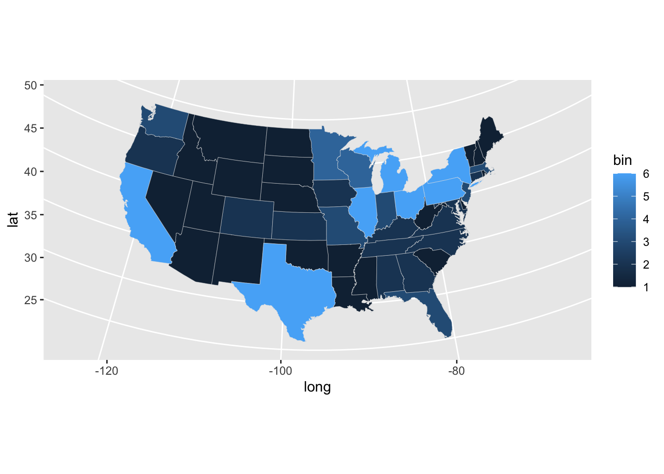
Footnotes
I guess really “base” in terms of older graphics platform.↩︎