Hodge-podge

April 14, 2026

Just a quick look at some graph styling options in base R. This is perhaps the worst combined graph we could make, shown in Figure 1, but each component demonstrates some useful part.

par(bg = "gray30")
plot(1:25, pch = 1:25, col = hcl.colors(25, palette = "viridis"), bg = "red", lwd = 2, cex = 1.5, axes = FALSE)
axis(2, at = seq(0, 25, by = 5), col = "white", col.axis = "white", las = 1)
axis(1, at = seq(0, 25, by = 5), col = "white", col.axis = "white")
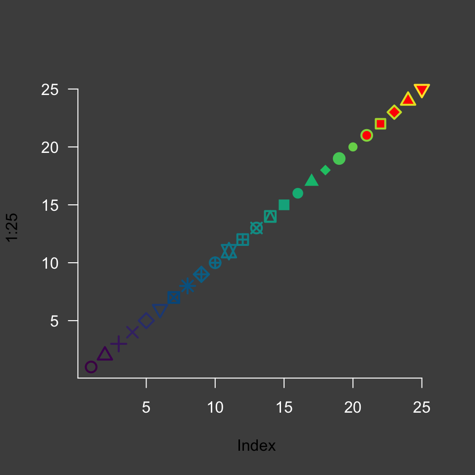
A line of 25 points shown each with a different symbol in colors that fade from purple to blue to green to yellow. The yellow symbols are filled with red. Everything is shown on a medium gray background with white axes, ticks, and labels. The graph is truly a nightmare but is meant to show the flexibility of individual plotting components.
Figure 1: A plot of the first numerically-generated plotting symbos and line colors from the viridis palette. A few symbols, those shown with red fill, accept a background fill and outline color.