Based on a few past projects, I made a fake dataset describing hypothetical animal captures and a few relevant variables. According to the variable names, we are interested in disease status, body measures (mass and length), life history characteristics (sex and age), along along with typical experimental data (id, site, transect), and metadata (date and notes). In itself it contains no particularly interesting features, but it does demonstrate a variety of data entry inconsistencies and our reasonable responses to them. Feeling nostalgic, we will do this in a very hands on way using only base R commands. You could certainly do this with tidyverse commands, but I have personally ever only done one such task faster with tidyverse commands that I could with base R commands. More importantly I like the hands-on, iterative, investigative nature of this. I find it a good way to learn.
dat <-read.csv("../data/fake_data.csv", header =TRUE, sep =",")head(dat)
        date    id    sex      age               site transect   notes mass
1 01/13/2025 anim1   Male juvenile Martin Nature Park        A         24.4
2 01/15/2024 anim2 Female    adult      plunkett park        A         20.7
3 07/13/2025 anim3 Female       A? Martin Nature Park        A         22.1
4 01/15/2024 anim4   Male juvenile         Mitch Park        A         19.8
5 01/15/2024 anim5 Female       A?         Mitch Park        B escaped 29.3
6 01/15/2024 anim6   Male    adult         Mitch Park        A         21.1
    length disease
1 177.4698       0
2 193.6316       1
3 191.0409       1
4 137.6869       0
5 218.5889       1
6 178.2634       1
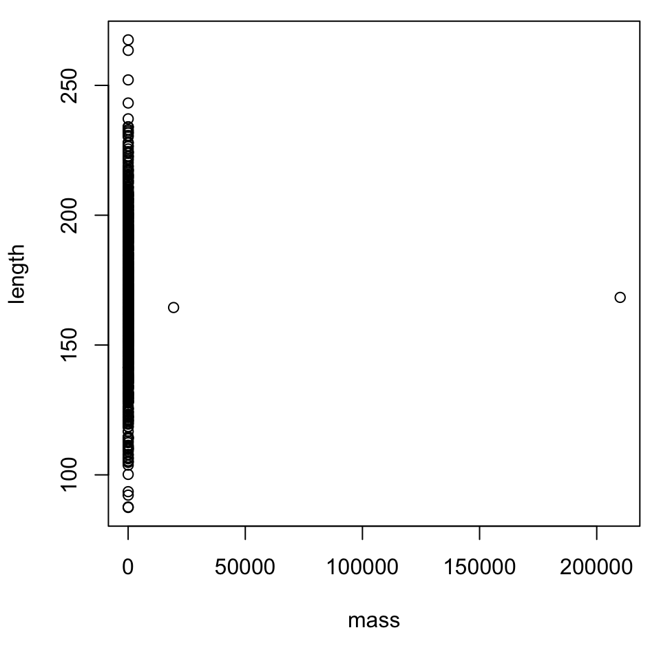
We could use summary()1 which often generates nice tabular or numerical summaries, column-by-column as appropriate, but noticing a couple columns of numbers, we will make a scatter plot. Generating the data, I had the idea for mass first and I calculated length from it with some randomness. Looking back, it might make more sense to mass as a function of length, but no one complained, so we carry on.
Figure 2: A scatterplot of length against height for simulated small mammals.
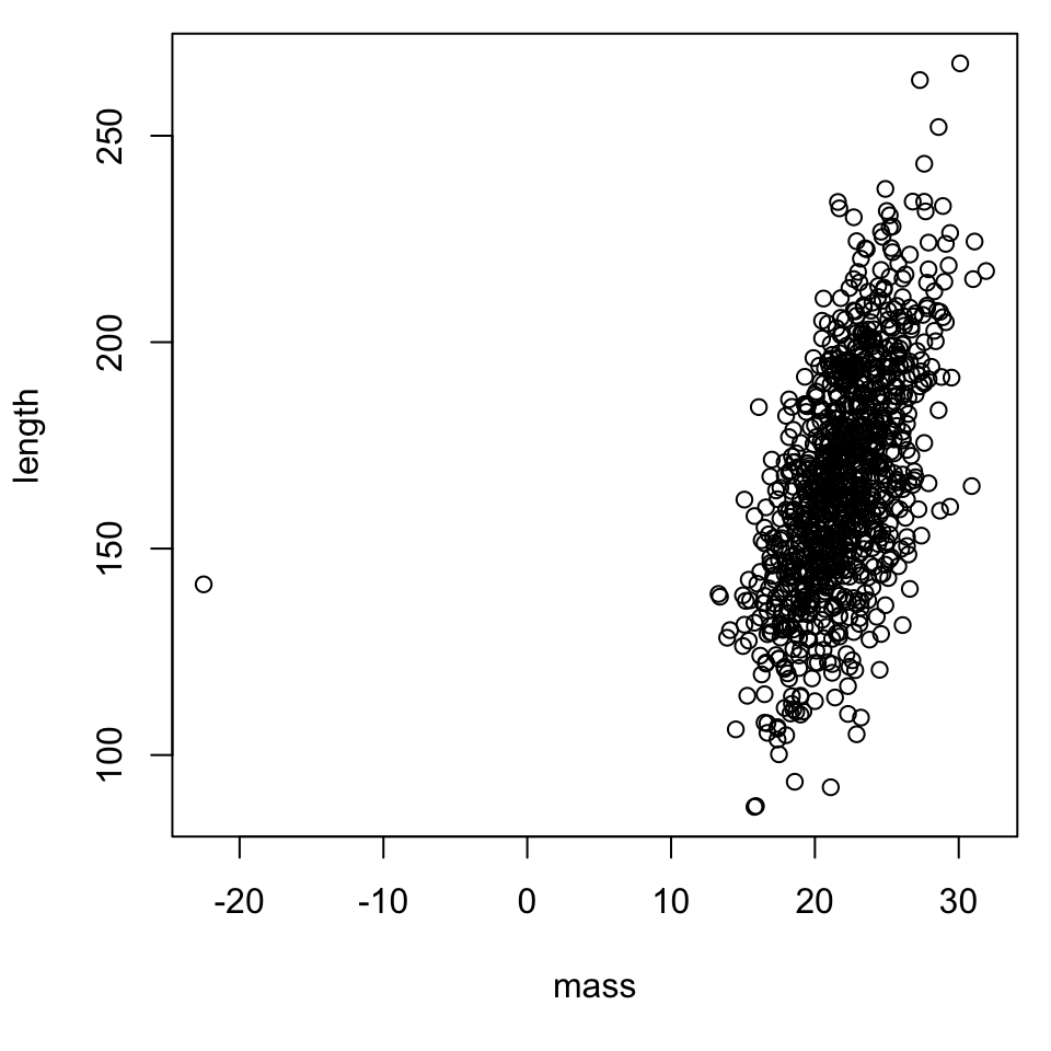
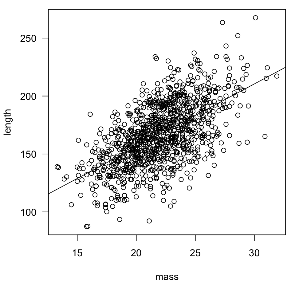
Noticing the range of values of the bulk of the data, it seems reasonable and safe to exclude the negative value, though likely a typo, and the two large values, likely typos or miscalculations (e.g., a unit error). It would probably be safe to flip the negative sign, but in all cases best to review field notes or other raw data sources. To aid with comparing to original sources, we can first look at the rows corresponding to the negative or large entries, but testing which row numbers satisfy the given logical condition. By request we added a trend line using abline(lm(...)) the compatibility of the syntakx of plot(...) and lm(...) is convenient. Though this is compact, A nice alternative is to store (mod <- lm(length ~ mass, dat)), then plot (abline(mod))) the model output. This means the model output can be inspected in greater detail.
dat[!(dat$mass <40& dat$mass >0), ]
          date      id  sex   age               site transect notes     mass
523 07/13/2025 anim523 Male adult         Mitch Park        B          -22.5
526 01/13/2025 anim526 Male adult Martin Nature Park        B        19400.0
601 07/13/2025 anim601 Male    A? Martin Nature Park        A       210000.0
      length disease
523 141.3426       9
526 164.4454       1
601 168.3455       1
dat <- dat[dat$mass <40& dat$mass >0, ]#dim(dat)par(mar =c(5.1, 4.1, 0.8, 0.8))plot(length ~ mass, dat, las =1)abline(lm(length ~ mass, dat))
Figure 3: A scatterplot for the edited data set.
We might be interested in sex differences so tabulate the entries to see how they are encoded. It is a mess, we have abbreviations and all sorts of capitalizations. Imagine each member of a field team entering data each night into separate copies of a template. At the end of the week they merge their edited spreadsheets together, but realize that a few have made unique notation decisions. Sample inconsistencies are found in the table, and in this case are relatively unambiguous and can be found and replaced with a nice search. These are not the only entries and this sex, like many other variables, sometimes can not readily be assessed or assigned a value for a variety of reasons.
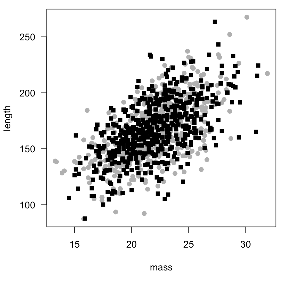
Though a little more work is required, as unfolds below, Figure 4 shows a reasonable plot of length against mass for male and female rodents.
par(mar =c(5.1, 4.1, 0.8, 0.8))plot(length ~ mass, dat, subset = sex =="Male", pch =19, col ="gray", las =1)points(length ~ mass, dat, subset = sex =="Female", pch =15, col ="black")
Figure 4: A scatterplot for length against mass for male and female rodents.
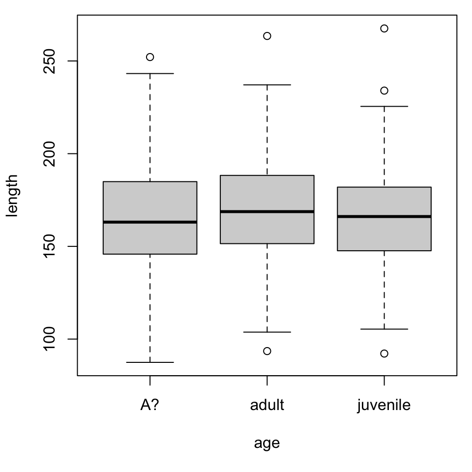
You could expect various measures of body size to vary with age or “stage class”, but that potential relationship was not built in to the fake data simulation. So, the result in Figure 5 is clear, but uninteresting. Knowing that I wanted to make a box plot to show the role of a categorical variable, I mistakenly chose disease as the response, but the graph is confusing and unhelpful. Make that change and think abou the new result in contrast to the one below.
Figure 5: A boxplot for length against mass for male and female rodents.
Despite uninteresting graphs, we did learn about an odd encoding of A?. Again consider someone might be recording data separately for some reason, so the notational inconsistency arises. Because this seems a little more ambiguous, we will make a duplicate column age2 to edit. Suppose we checked with our collaborator or with the raw data ourselves and decide that the encoding had a clear, but unproblematic, originand can easily be fixed.
So far we have tested for values in a list or against single values, but we can also use grep to search for patterns within columns. Because of the way certain characters are interpreted, to search for a question mark we use the pattern\\?. We migth have expected a clear connection to the comments, but there was not really a pattern in the data itself. No notes to explain this encoding of age.
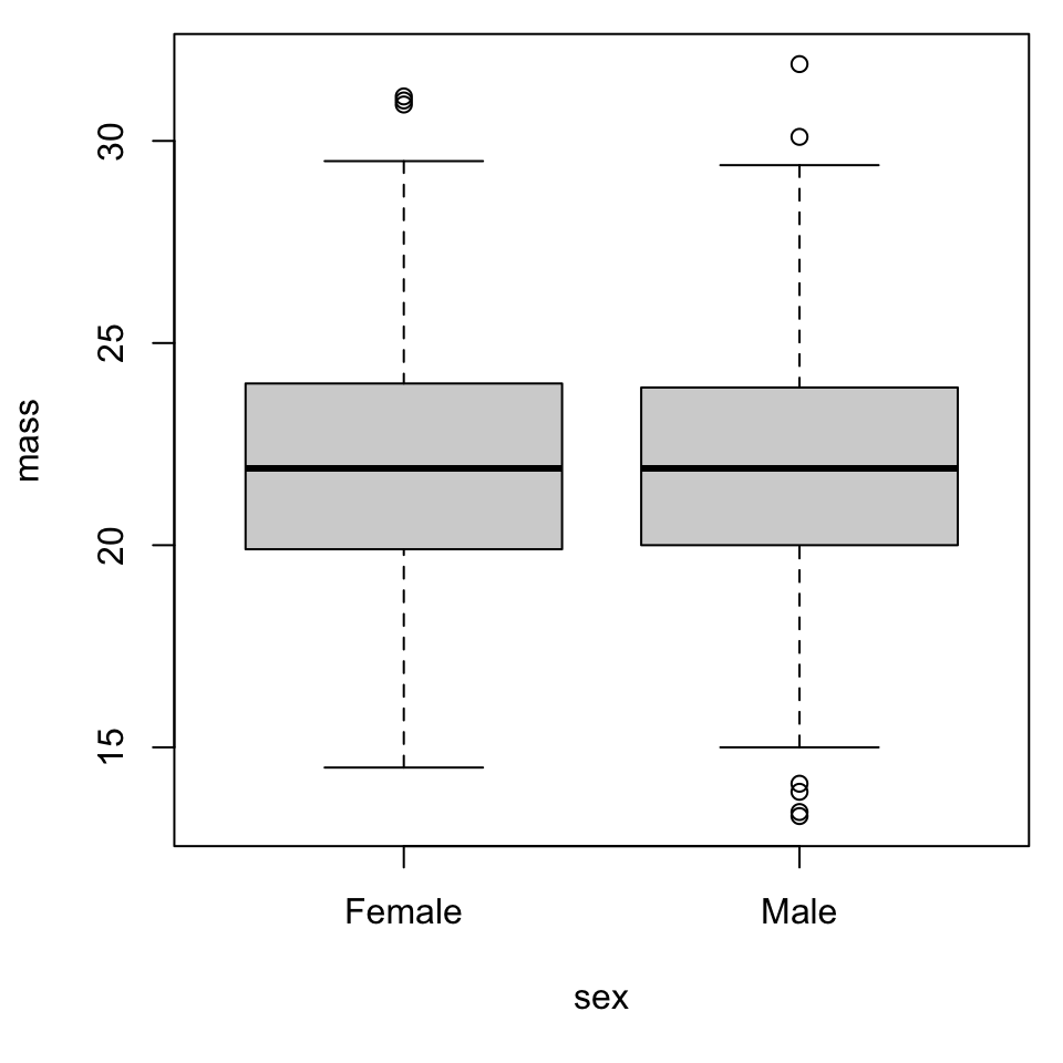
Figure 6: A boxplot for mass against sex for male and female rodents.
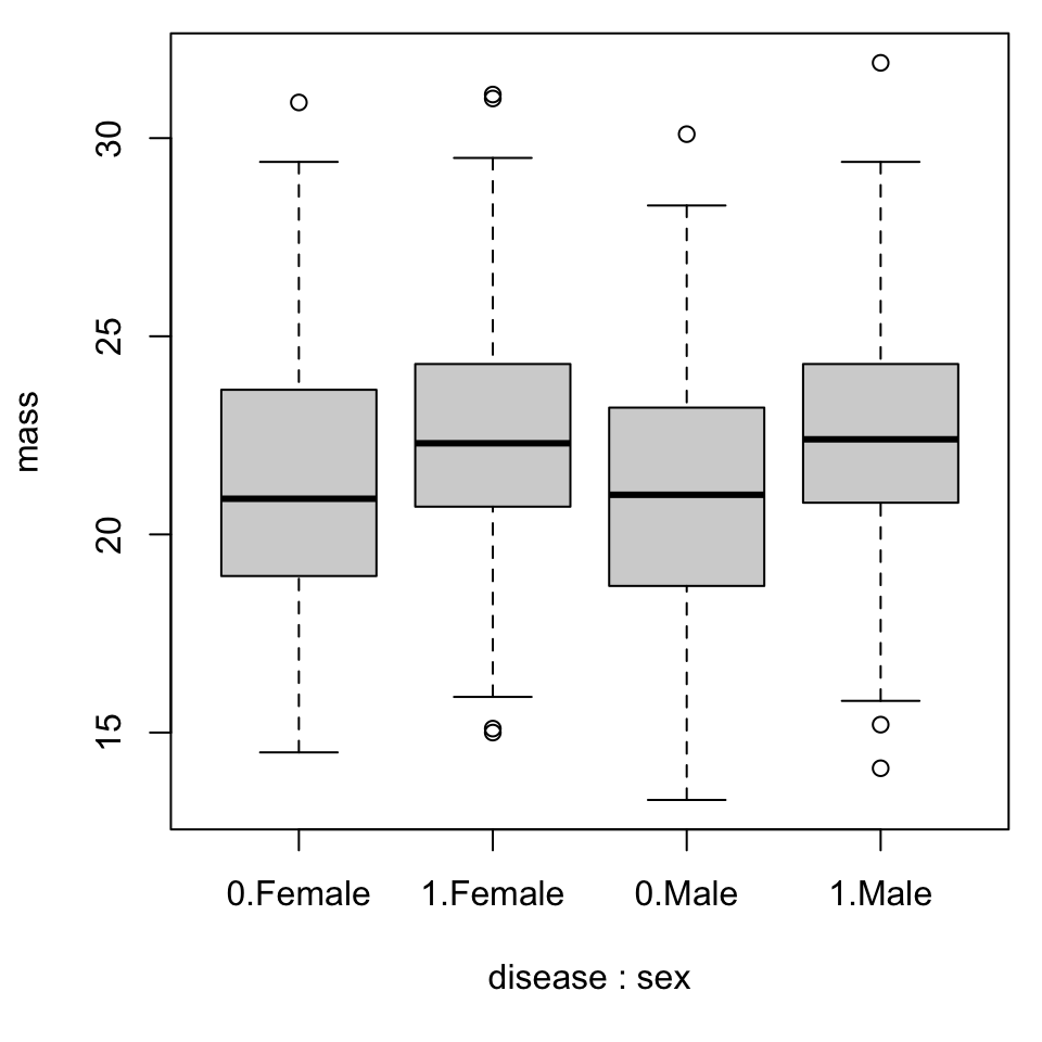
We can explore the potential effect of interactions by changing the right-hand side of the formula to include a second categorical variable. By Figure 7, there is no clear evidence for a relationship. Switching the order of the interaction from disease*sex to sex*disease changes the ordering of the terms along the axis and for some it might make sense to specify colors.
Figure 7: A boxplot for mass against disease status for male and female rodents.
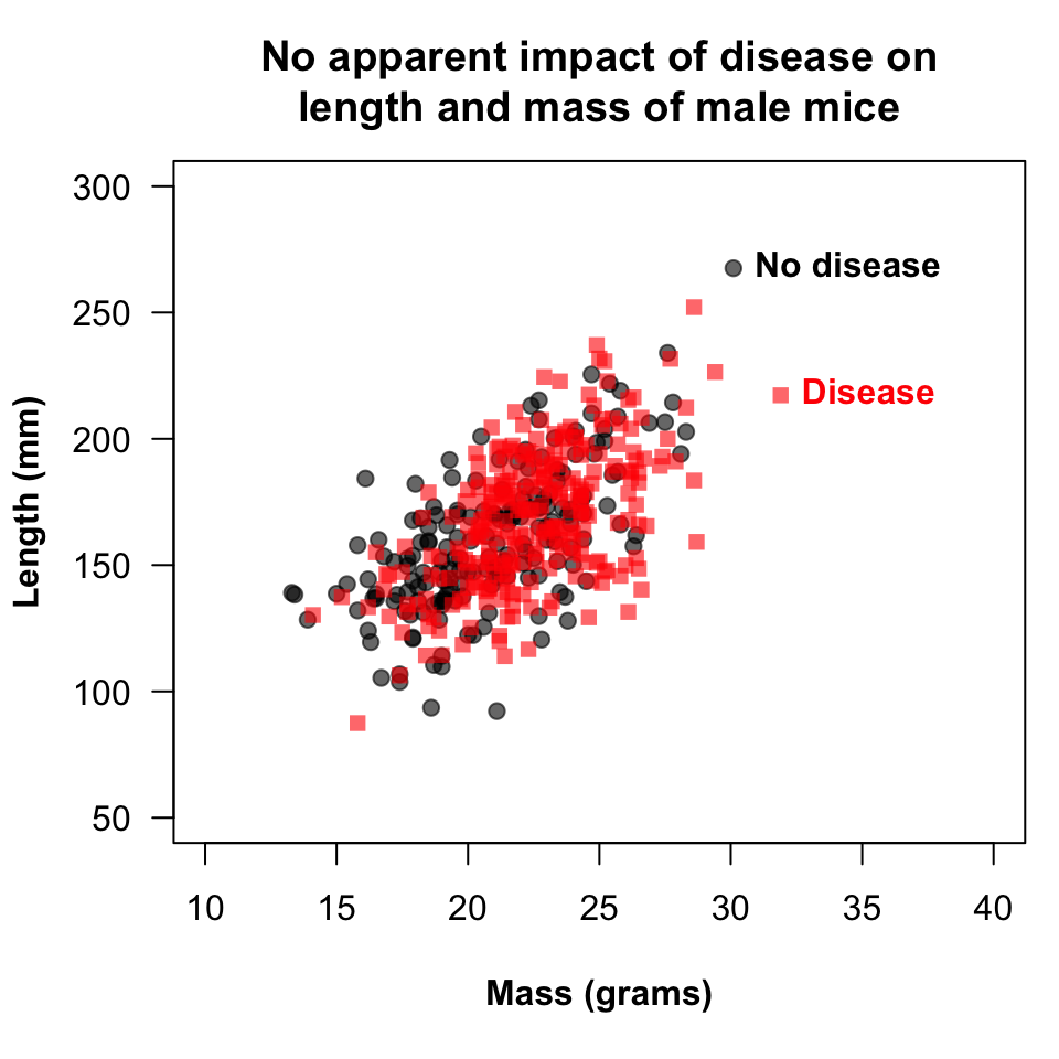
Now we get serious. In the most substantial update to the code from class, the plotting symbol for diseased individuals was set to pch = 15, this to compensate for relatively-low contrast. A nice touch, with a slightly more complicated layout could put boxplots summarizing the distribution in the margins. In an update to class work, for the ability to edit its transparency, gray has been encoded as rgb(0, 0, 0, alpha = 0.6). It took some work convincing, but we have added a strong and convincing title - even if the message itself is rather weak. In favor of a legend, we have labeled one point corresponding to the maximum value for each variable with a color-coded label for disease status.
par(mar =c(5.1, 4.1, 3.8, 0.8))plot(length ~ mass, dat, subset = (sex =="Male"& disease ==0), xlim =c(10, 40), ylim =c(50, 300), xlab ="Mass (grams)", ylab ="Length (mm)", pch =19, col =rgb(0, 0, 0, alpha =0.6), las =1, font.lab =2)points(length ~ mass, dat, subset = (sex =="Male"& disease ==1), pch =15, col =rgb(1, 0, 0, alpha =0.6))title(main ="No apparent impact of disease on\nlength and mass of male mice")#legend("bottomright", c("No disease", "Disease"), pch = 19, col = c("gray", rgb(1, 0, 0, alpha = 0.5)))## find longest healthy male and labelmaxl <-max(dat[dat$sex =="Male"& dat$disease ==0, "length"])text(dat[dat$sex =="Male"& dat$disease ==0& dat$length == maxl, c("mass", "length")], "No disease", pos =4, font =2)## find heaviest diseased male and labelmaxm <-max(dat[dat$sex =="Male"& dat$disease ==1, "mass"])text(dat[dat$sex =="Male"& dat$disease ==1& dat$mass == maxm, c("mass", "length")], "Disease", pos =4, font =2, col =rgb(1, 0, 0))
Figure 8: A scatterplot of length against mass with resepct to disease status for male rodents.
To close, we will look at creating a variable derived from the comments containing a particularly important word, phrase, or code. This is a bit risky since comments can be coded erratically or with slowly-evolving emphasis or conventions, but under the right circumstances it can be effective.
table(dat$notes)
                       dead       escaped rambling rant         ticks
          600           107           105            38           147
Even with this small data set, hours later there is much more that could be done. We could calculate Julian dates for ease of graphing or computation. This data has no repeated captures of individuals, but you could calculate a growth rates or graph values over time.
Additionally, we could use aggregate() to calculate totals, means, or any other statistical quantity with aggregate(dat$<var>, by = list(dat$<var1>, dat$<var2>), mean). There are a few syntactic approaches to this, each with benefits, but it is a convenient way to tabulate summaries. We could tabulate capture totals and plot totals changing over time.
Lastly, we could use merge() to merge additional covariates from a separate data set containing one or more shared variables. The variable names can be different, but the entries must match (e.g., merge(x, y, by.x = "<var.x>", by.y = "<var.y>")). The command takes a variety of other options about which rows to keep or toss, this is an area where tidyverse command might be especially helpful. But if in the cleaning stage, whatever tool helps you best learn about various features of the data is the best tool. There might be incentive to outsource this step to some sort of artificial intelligence, but data privacy issues could be of some concern as is the loss of specific insight or general learning opportunity. If nothing else, think of it like a useful puzzle.
Footnotes
This is the last time I will mention this, “or tidyverse equivalents”.↩︎