Having wrangled some data (suggesting reasonable corrections to examples of typical recording inconsistencies), we can rather quickly regerate our base R graph in ggplot(). With that in hand we can apply ggplotly() to introduce some interactivity. To do so, we load two libraries.
library(ggplot2)library(plotly) ## may need `install.packages("plotly")` first
Attaching package: 'plotly'
The following object is masked from 'package:ggplot2':

    last_plot
The following object is masked from 'package:stats':

    filter
The following object is masked from 'package:graphics':

    layout
Though we had not fully cleaned the data, we can still work with the columns we did clean.
dat <-read.delim("./data/fake_data_cleaned.csv", header =TRUE, sep =',')head(dat)
        date    id    sex      age               site transect   notes mass
1 01/13/2025 anim1   Male juvenile Martin Nature Park        A         24.4
2 01/15/2024 anim2 Female    adult      plunkett park        A         20.7
3 07/13/2025 anim3 Female       A? Martin Nature Park        A         22.1
4 01/15/2024 anim4   Male juvenile         Mitch Park        A         19.8
5 01/15/2024 anim5 Female       A?         Mitch Park        B escaped 29.3
6 01/15/2024 anim6   Male    adult         Mitch Park        A         21.1
    length disease     age2 ticks
1 177.4698       0 juvenile     0
2 193.6316       1    adult     0
3 191.0409       1    adult     0
4 137.6869       0 juvenile     0
5 218.5889       1    adult     0
6 178.2634       1    adult     0
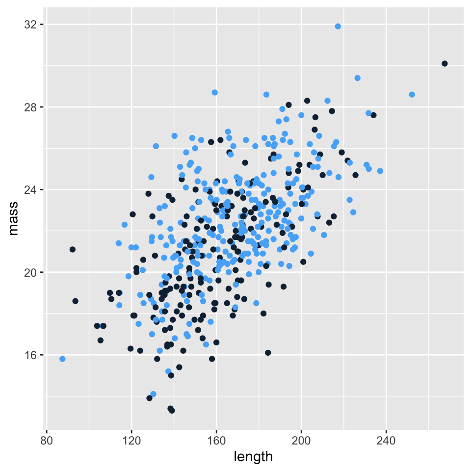
It probably makes sense to relate mass to length, so we will switch the order of the dependence from last time. Points in Figure 1 will be colored with respect to disease staus, and since there are only two statuses, no disease (a zero) and disease (a one), we will have two colors. Last time we calculated locations for direct labels; this time we will rely on the interactivity of plotly (or more specifically ggplotly()).
p <-ggplot(data =subset(dat, sex =="Male"), mapping =aes(x = length, y = mass, color = disease)) +geom_point() +theme(legend.position="none")p
Figure 1: A scatterplot of mass against length for male rodents.
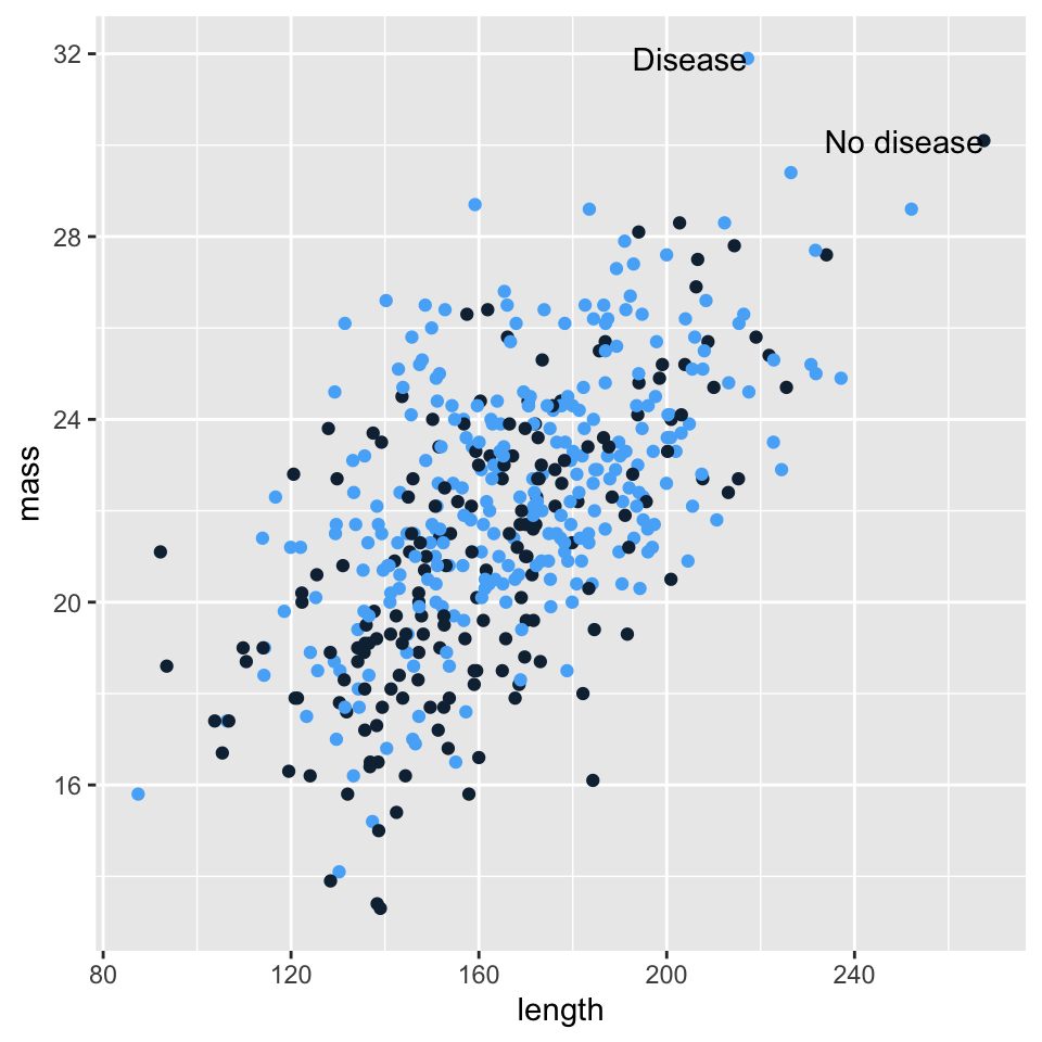
Before introducing interactivity, we can attempt direct labeling of a few key points.
p.ann <-ggplot(data =subset(dat, sex =="Male"), mapping =aes(x = length, y = mass, color = disease)) +geom_point() +## geom_dl() gives a pretty unsatisfying labeling## directlabels::geom_dl(aes(label = disease), method = "smart.grid") +annotate("text", x =max(dat[dat$disease ==0, "length"]), y = dat[dat$length ==max(dat[dat$disease ==0, "length"]), "mass"], label ="No disease", hjust ="right") +annotate("text", x = dat[dat$mass ==max(dat[dat$disease ==1, "mass"]), "length"], y =max(dat[dat$disease ==1, "mass"]), label ="Disease", hjust ="right") +theme(legend.position ="none")p.ann
Figure 2: A scatterplot of mass against length for male rodents.
The labeling above was a decent amount of work for a fairly mediocre result. Instead we will apply ggplotly() to the original graph. Shown in Figure 3, we should consider removing the colored background, grid lines, formalizing the axes labels. A strong title like “Mass increases with body length in small mammals” paired with a subtitle “No influence of disease status” should give a convincing overview of the details to come in the plot.
ggplotly(p)
Figure 3: A scatterplot of mass against length for male rodents.
You were challenged to create a bar plot for relevant variables. We have a very basic example in Figure 4. I would rather not see the space below zero in the plot window, but I would have rather made this plot with base R anyway.