par(mfrow = c(2, 2), mar = c(4.1, 5.1, 1.6, 0.8), xaxs = "i", yaxs = "i")
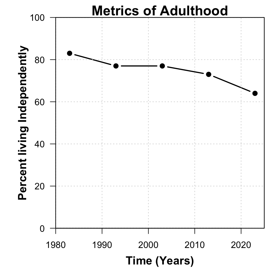
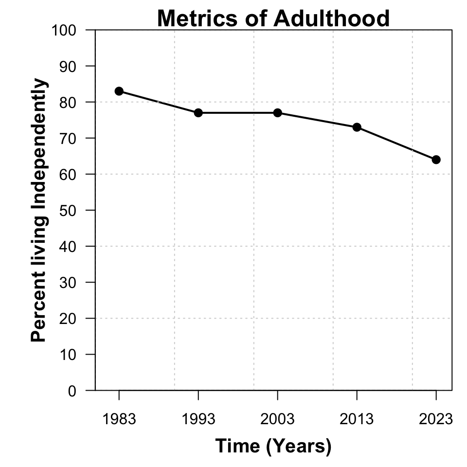
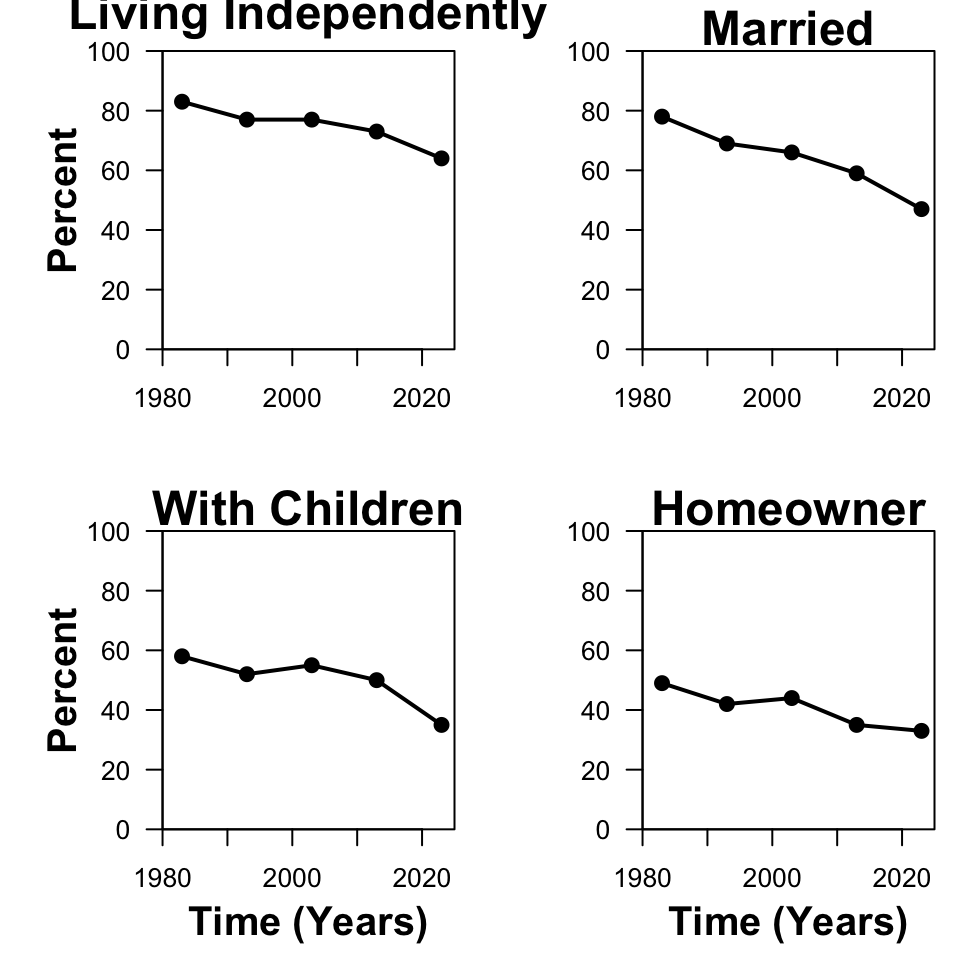
plot(percent ~ year, dat, subset = milestone == "independent", type = 'o', xlim = c(1980, 2025), ylim = c(0, 100), las = 1, xlab = "", ylab = "", lwd = 2, pch = 19)
mtext("Percent", side = 2, line = 2.5, font = 2, cex = 1.25)
mtext("Living Independently", side = 3, line = 0.5, font = 2, cex = 1.5)
plot(percent ~ year, dat, subset = milestone == "married", type = 'o', xlim = c(1980, 2025), ylim = c(0, 100), las = 1, xlab = "", ylab = "", lwd = 2, pch = 19)
mtext("Married", side = 3, line = 0, font = 2, cex = 1.5)
plot(percent ~ year, dat, subset = milestone == "child", type = 'o', xlim = c(1980, 2025), ylim = c(0, 100), las = 1, xlab = "", ylab = "", lwd = 2, pch = 19)
mtext("Time (Years)", side = 1, line = 2.5, font = 2, cex = 1.25)
mtext("Percent", side = 2, line = 2.5, font = 2, cex = 1.25)
mtext("With Children", side = 3, line = 0, font = 2, cex = 1.5)
plot(percent ~ year, dat, subset = milestone == "home", type = 'o', xlim = c(1980, 2025), ylim = c(0, 100), las = 1, xlab = "", ylab = "", lwd = 2, pch = 19)
mtext("Time (Years)", side = 1, line = 2.5, font = 2, cex = 1.25)
mtext("Homeowner", side = 3, line = 0, font = 2, cex = 1.5)