We start by looking at some features of graph axes and scaling. Notice that we are making no attempt to “clean up” axis labels. Review previous notes for examples of that consideration.
Exponential growth and decay
Read in the data in exponential.csv stored in the folder data/.
Use the code chunk below as a start. Code chunks can be lengthy or brief.
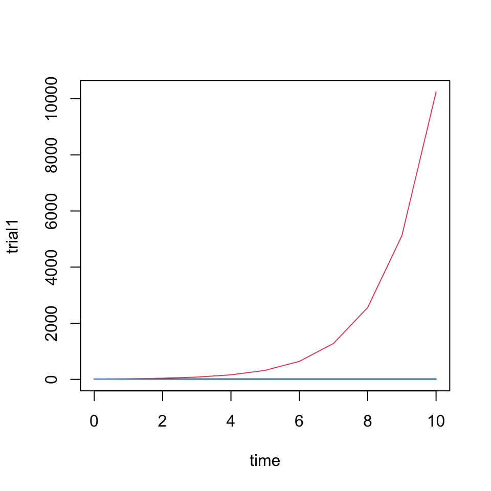
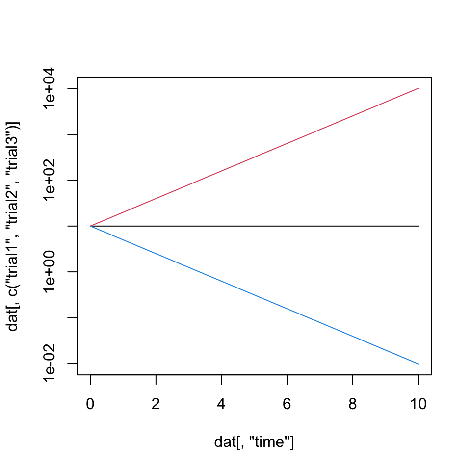
The construction of Figure 1 plots one “trial” then layers remaining trials one at a time using lines() with relevant plotting options. Using type ='l' within lines is redundant but harmless.
dat <-read.delim("./data/exponential.csv", header =TRUE, sep =',')head(dat)
ymax <-max(dat[ , 2:4])plot(trial1 ~ time, dat, type ='l', ylim =c(0, ymax))lines(trial2 ~ time, dat, type ='l', col =2)lines(trial3 ~ time, dat, type ='l', col =4)
Figure 1: A plot of exponential data made by manually plotting each data series.
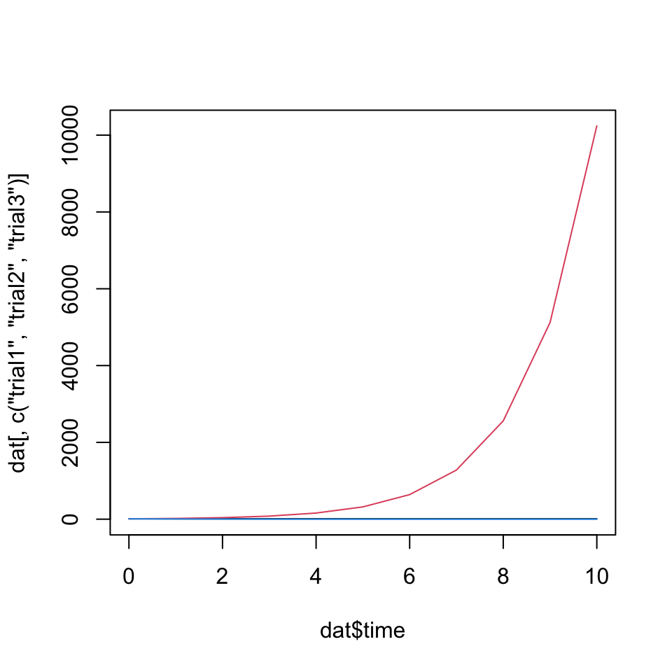
We can recreate the plot in one line using matplot() in Figure 2. Similar to above matlines() or matpoints() could be used to add multiple data series to an existing plot.
matplot(dat$time, dat[, c("trial1", "trial2", "trial3")], type ='l', col =c(1, 2, 4), lty =1)
Figure 2: A plot of exponential data made using matplot() to plot three curves simultaneously.
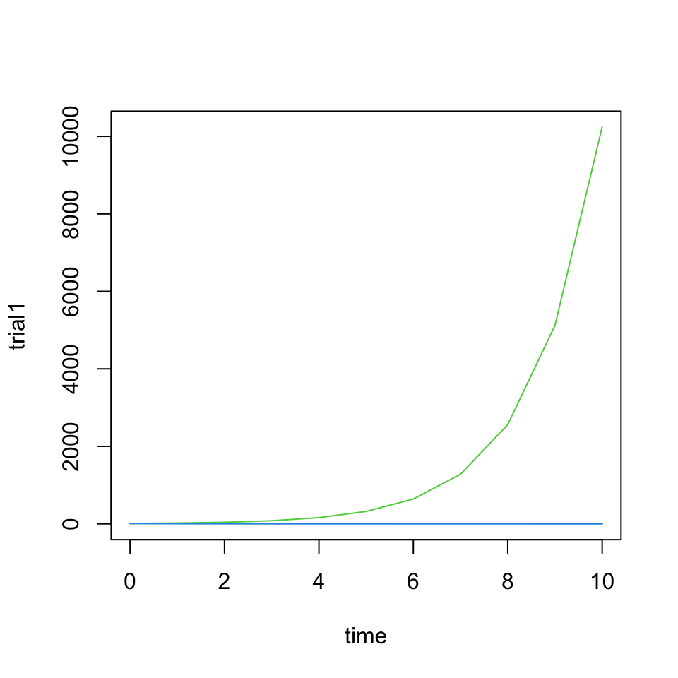
In an often convenient approach, especially for exploratory graphs, in Figure 3 additional series are plotted within a for loop over the column numbers. It would also work to use for(col %in% c("trial2", "trial3")) and replace the i with col. Typically we would put the instructions of the for() loop within curly braces, but since this line is simple we can be brief.
plot(trial1 ~ time, dat, type ='l', ylim =c(0, ymax))for(i in3:4)lines(dat[ , c(1, i)], lty =1, col = i)
Figure 3: A plot of three trials of data on a linear vertical axis made using lines().
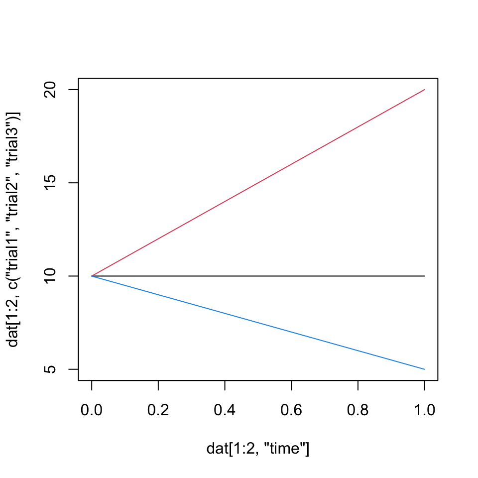
You may have noticed the notation [ , ...] above. The unspecified contents before the comma is interpreted as “all rows”. To restruct this, we can specify “only the first two rows” with the syntax below, dat[1:2, ...], used to generate #fig-subset-data.
Figure 4: A plot of a few rows for three trials of data on a log vertical axis made using matplot() to plot three curves simultaneously.
Just like we can specify output columns by number or name, we can do this for the input column as well. This wors well because we can put logic in that first position and select subsets of the data while graphing.
matplot(dat[, "time"], dat[, c("trial1", "trial2", "trial3")], type ='l', col =c(1, 2, 4), lty =1, log ='y')
Figure 5: A plot of three trials of data on a log vertical axis made using matplot() to plot three curves simultaneously.
Simple exponential growth
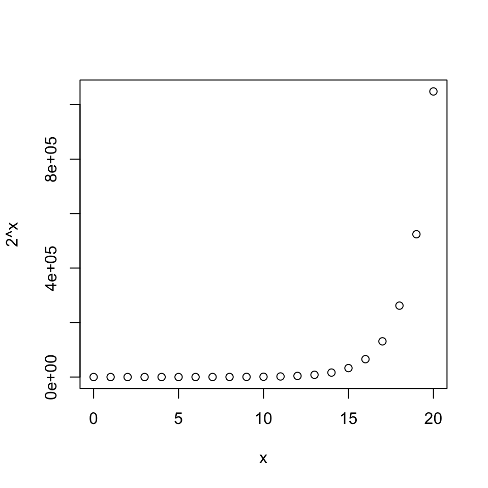
Now we will explore the distasteful default axes that arise in certain circumstances. The default vertical axis in Figure 6 is aesthetically bad and hard to interpret.
x <-0:20plot(x, 2^x)
Figure 6: A raw plot of exponential data with default axes.
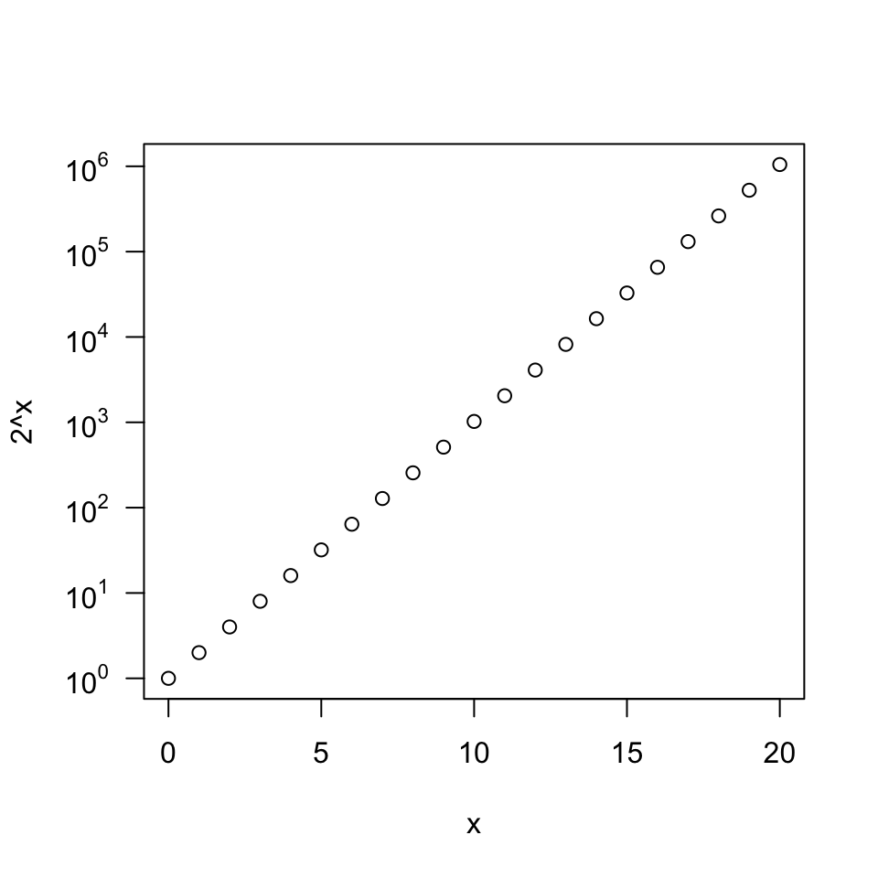
Switching to a log scale in the vertical ('y') direction for Figure 7, we can begin to customize the appearance. This is a pretty slick approach (again with a for() loop) that calculates the numerical position of the tick mark and prints it as a displayed, not numerically-calculated, power of ten. The same would work for powers of 2, or whatever other scale may make sense.
x <-0:20plot(x, 2^x, axes =FALSE, log ='y')axis(1)for(i in0:6)axis(2, at =10^i, labels =substitute(10^k, list(k = i)), las =1)box()
Figure 7: A plot of exponential data shown on a log scale with powers of ten axis.
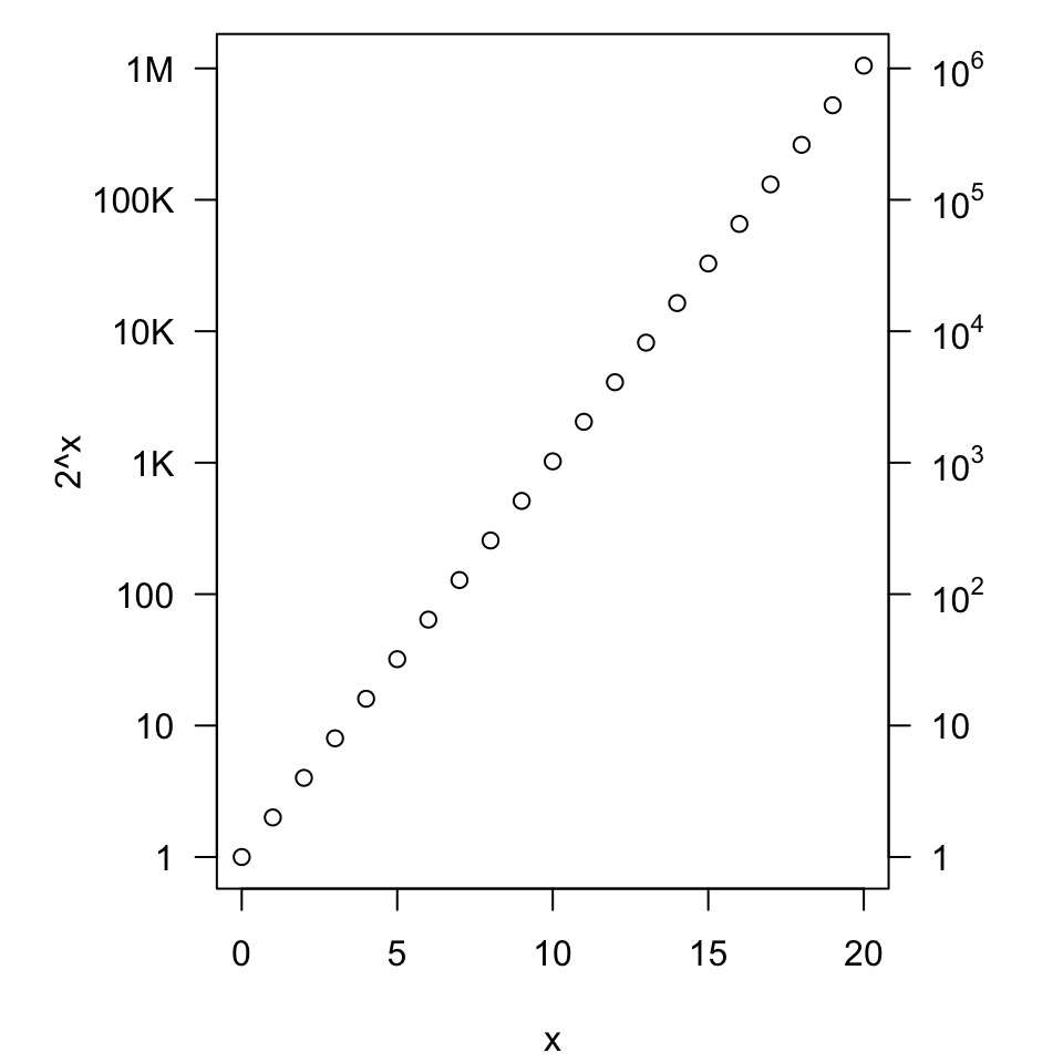
While there is certainly no need for a second vertical axis, Figure 8 shows that we can supply arbitrary text-based labels at the pre-calculated positions given in at = .... The expression() command is used so that the powers of ten are not calculated, but simply printed.
par(mar =c(4.1, 5.1, 0.8, 4.1))x <-0:20plot(x, 2^x, axes =FALSE, log ='y')axis(1)labs <-c("1", "10", "100", "1K", "10K", "100K", "1M")axis(2, at =10^(0:6), labels = labs, las =1)labs2 <-c("1", "10", expression(10^2), expression(10^3), expression(10^4), expression(10^5), expression(10^6))axis(4, at =10^(0:6), labels = labs2, las =1)box()
Figure 8: A plot of exponential data shown on a log scale with heavily annotated axes.
Alternatively, as in Figure 9, we could plot the logarithm of the data on a linear scale instead of the data on a log scale. Here we see the vertical axis tick labels are the corresponding power of ten from the logarithm. So each step indicates an increase by a power of ten. This has to be clearly articulated in the vertical axis label or main title and accompanyinng text. It would be wise to rewrite a nicer label ?plotmath shows some possibilities.
plot(x, log(2^x, base =10))
Figure 9: A plot of log-transformed exponential data on a linear scale.
Boxplots and histgrams
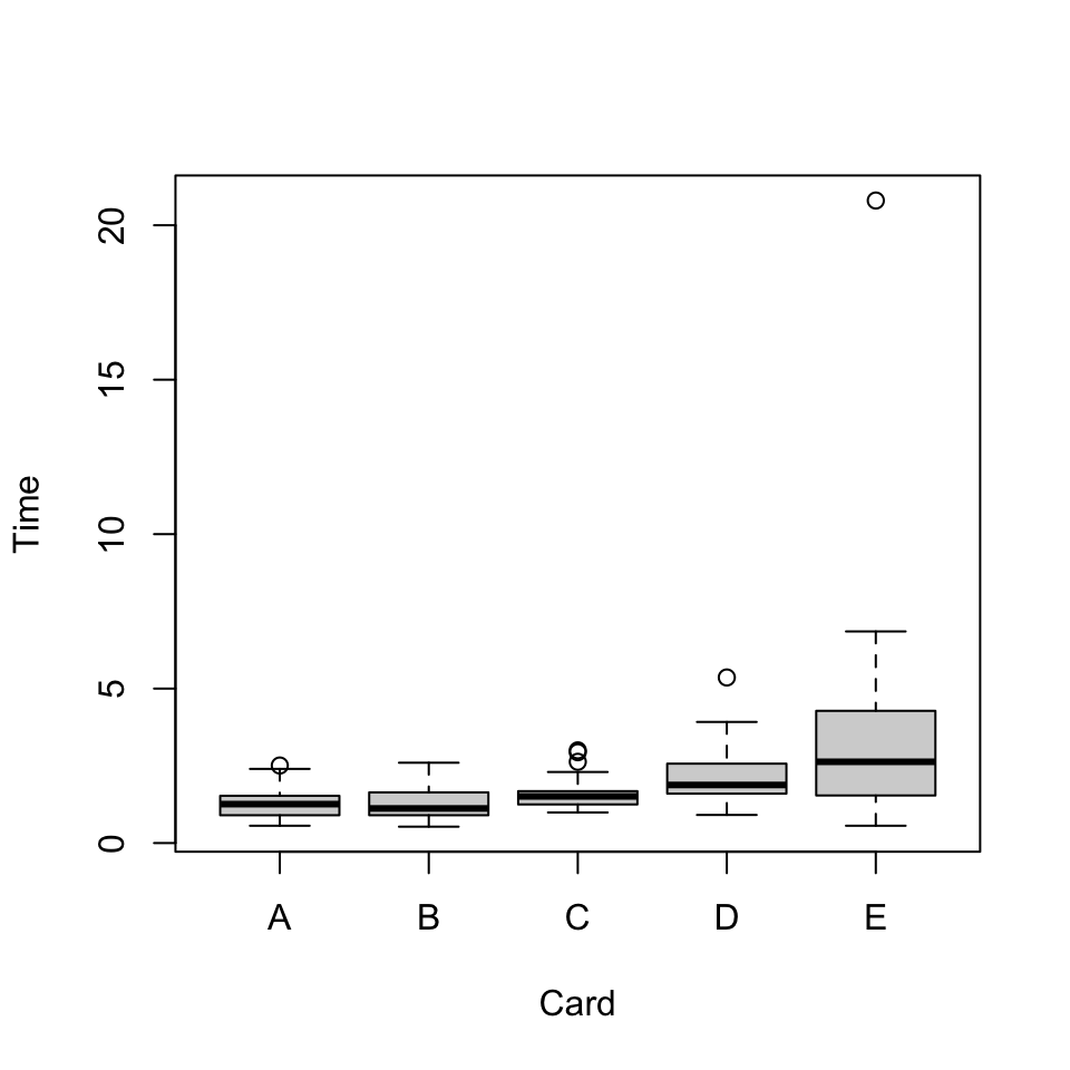
Below we read in the data in card.csv and make a simple boxplot in Figure 10. You can use the terms boxplot and box plot interchangably, but I will stick with boxplot because that matches the command name and encourages some consistency.
dat <-read.delim("./data/cards.csv", header =TRUE, sep =',')head(dat)
  User Card Time
1 hs12    A 1.28
2 hs12    B 1.57
3 hs12    C 1.51
4 hs12    D 1.65
5 hs12    E 6.65
6 br13    A 0.66
boxplot(Time ~ Card, dat)
Figure 10: Boxplot of reaction time by card pattern.
Suppose we were most interested in “summary statistics” of the response times for interactions with card “D”.
summary(dat[dat$Card =="D", "Time"])
   Min. 1st Qu.  Median    Mean 3rd Qu.    Max.    NA's
  0.910   1.600   1.880   2.109   2.570   5.360       3
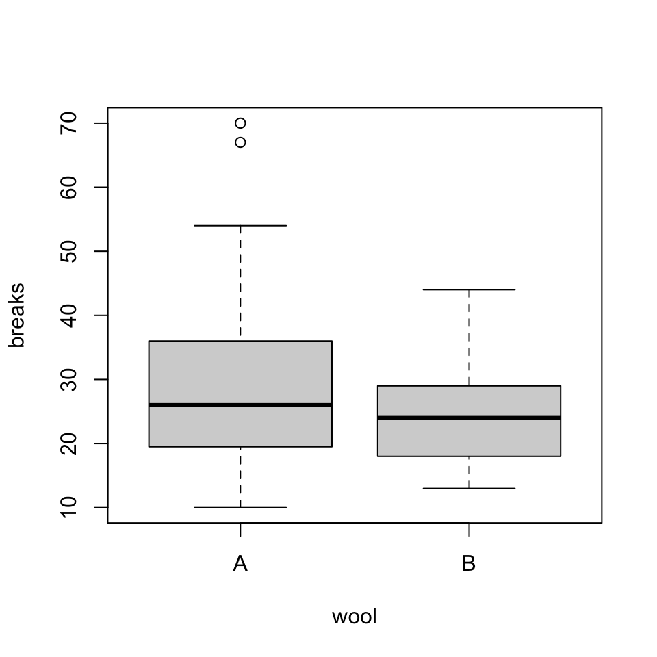
To look at other data, we will use the preloaded warpbreaks dataset which describes the occurrences of breakages of wool yarn under certain industrial settings. A boxplot showing breakages with respect to wool “type” is shown in Figure 11.
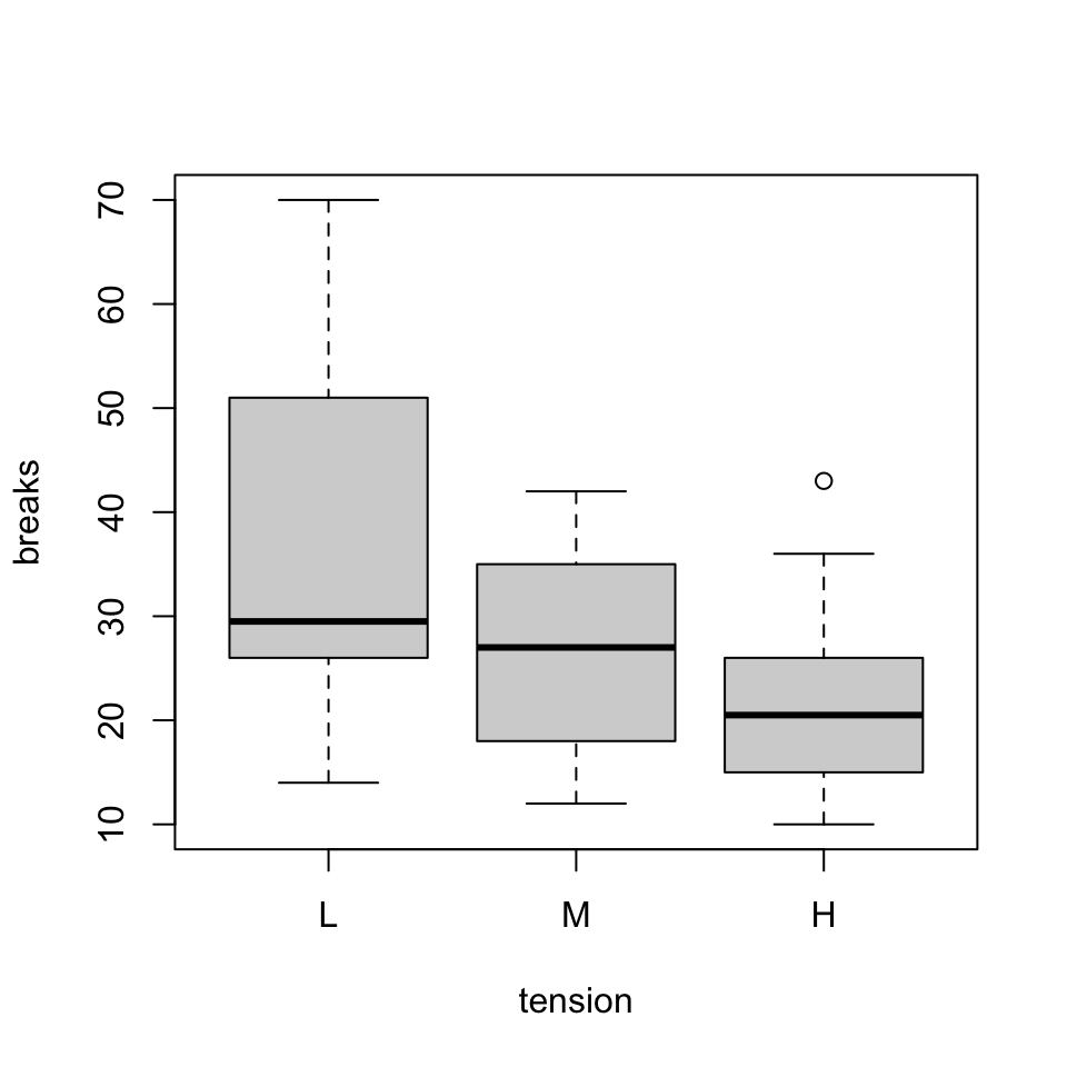
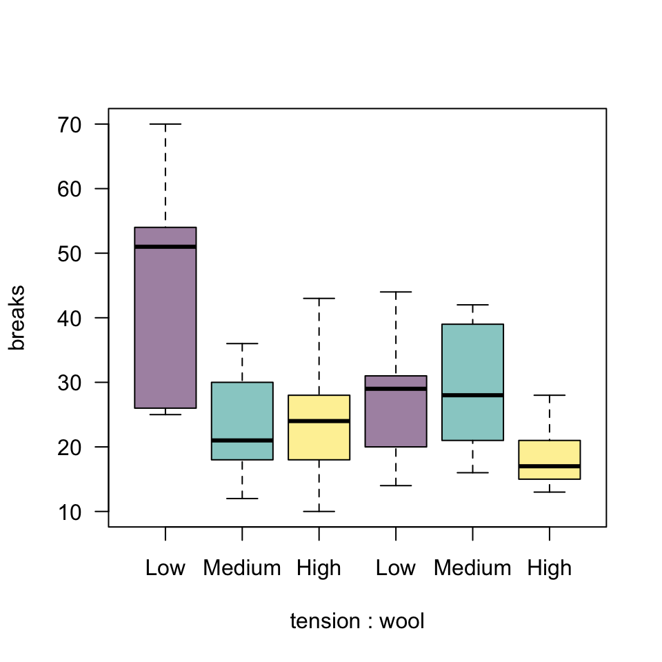
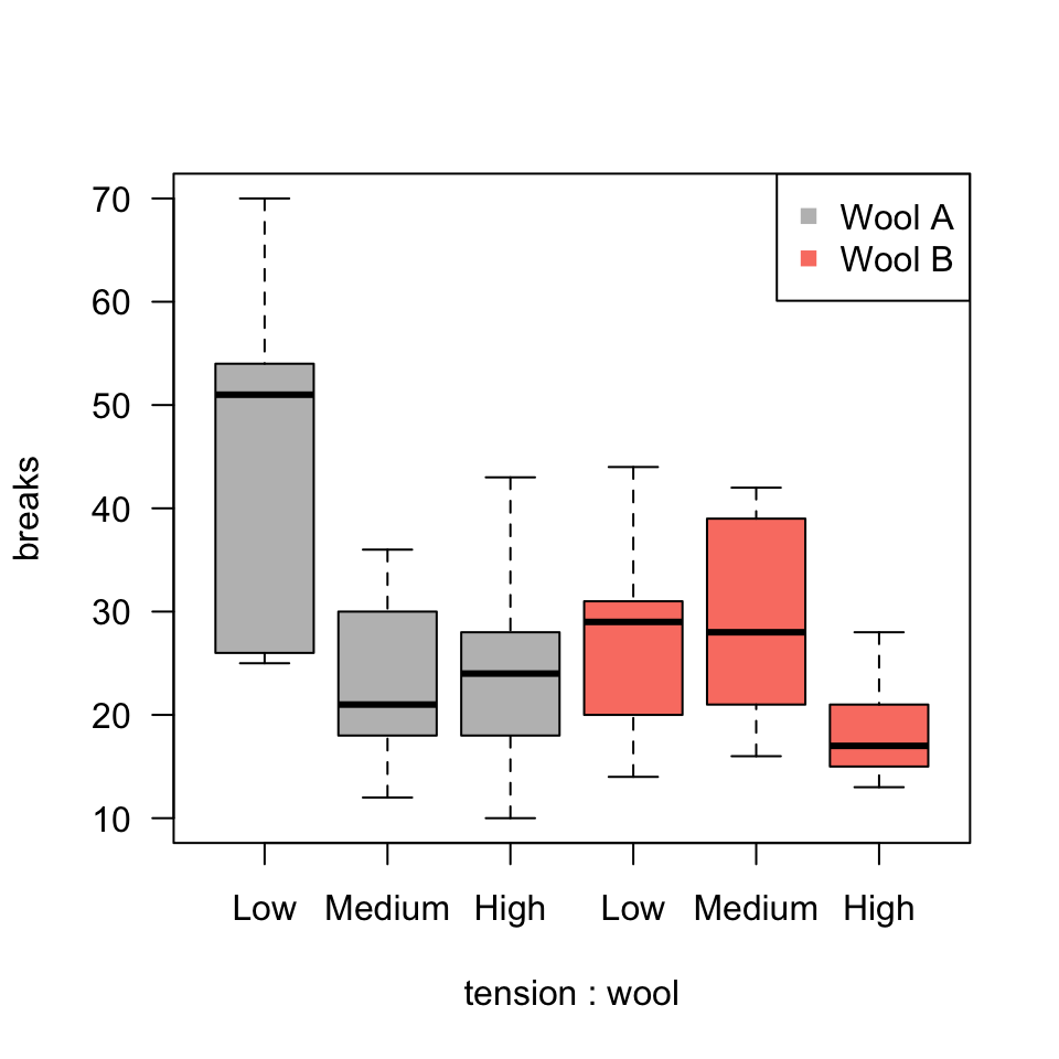
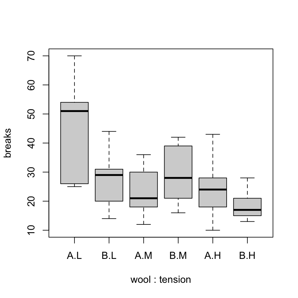
Since both play a role, it makes sense to inspect their interaction. The order with which we specify this affects the ordering of the groups on the horizontal axis, as in Figure 13 and Figure 15, which both follow. This suggests many possibilities for how we style the graph. For example, we could group tensions or wool types by color, or a combination of color for one and label for the other. These plots are equally “good” but the deciding factor in how we choose to present this might be guided by the statistical results we intend to communicate.
boxplot(breaks ~ tension*wool, warpbreaks, col =hcl.colors(3, alpha =0.5), axes =FALSE)axis(2, las =1)axis(1, at =1:6, labels =c("Low", "Medium", "High", "Low", "Medium", "High"), gap.axis =0)box()
Figure 13: Boxplot of breaks by wool and tension, colored and labeled by tension setting. We need to address how to best represent the two wool types.
In Figure 14, we attempt some customization using colors by wool type with a representative legend.
boxplot(breaks ~ tension*wool, warpbreaks, col =c(rep("gray", 3), rep("salmon", 3)), axes =FALSE)axis(2, las =1)axis(1, at =1:6, labels =c("Low", "Medium", "High", "Low", "Medium", "High"), gap.axis =0)legend("topright", c("Wool A", "Wool B"), col =c("gray", "salmon"), pch =15)box()
Figure 14: Boxplot of breaks by wool and tension, colored by wool type.
Finally, in Figure 15, we reverse the order of the specification of factors in the command and notice that the order of the grouping of the plots has changed.