Please excuse errors or share then so that they can be corrected. In particular to simplify code as much as possible, most graphs have “raw” axes labels or main plot titles (when created by the plotting function). This should contain at least one example of fully annotated plot of various kinds.
Histograms
Read in the data in cards.csv stored in the folder data/.
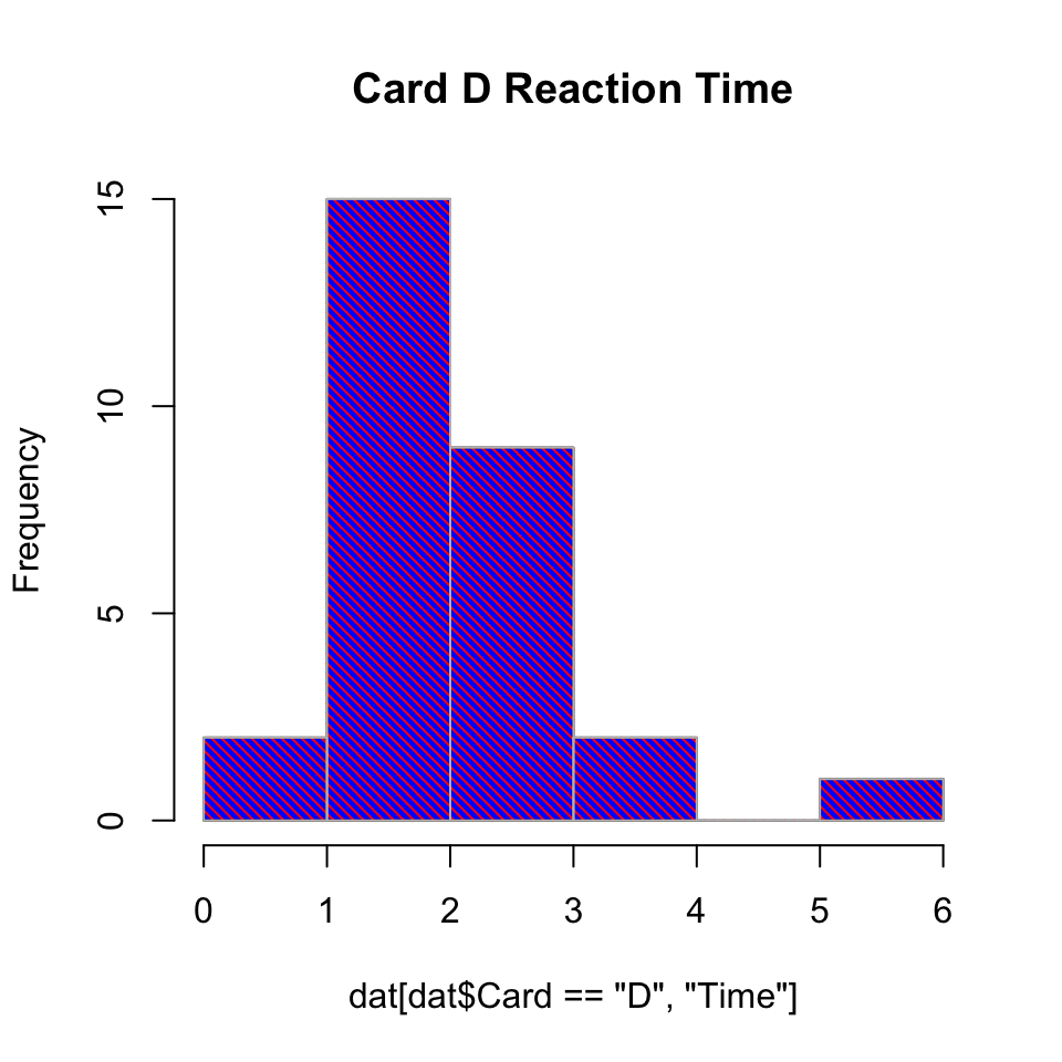
In Figure 1, we create a basic histogram at first, but then attempt some pretty flashy styling. There could be reasons for this level of ornamentation, but in general we don’t yet have a great need for on this particular graph.
dat <-read.delim("./data/cards.csv", header =TRUE, sep =',')hist(dat[dat$Card =="D", "Time"], col ="blue", main ="Card D Reaction Time")hist(dat[dat$Card =="D", "Time"], density =30, angle =-45, col ="red", border ="gray", lwd =2, add = T)
Figure 1: Basic histogram of card data.
Layering
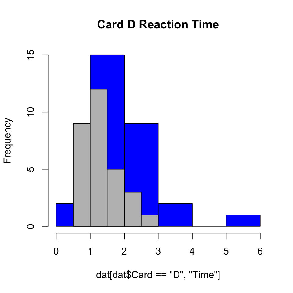
By default, histograms do not always “layer” nicely. In Figure 2, we see that the bins are of unequal width which makes the interpretation a bit unnatural.
hist(dat[dat$Card =="D", "Time"], col ="blue", main ="Card D Reaction Time")hist(dat[dat$Card =="A", "Time"], col ="gray", add = T)
Figure 2: Basic histogram of card data.
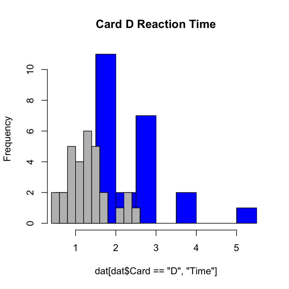
Setting breaks = 10 doesn’t necessarily help with alignment. In fact, Figure 3 is a somehow seemingly worse version of Figure 2.
hist(dat[dat$Card =="D", "Time"], col ="blue", main ="Card D Reaction Time", breaks =10)hist(dat[dat$Card =="A", "Time"], col ="gray", add = T, breaks =10)
Figure 3: Basic histogram of card data.
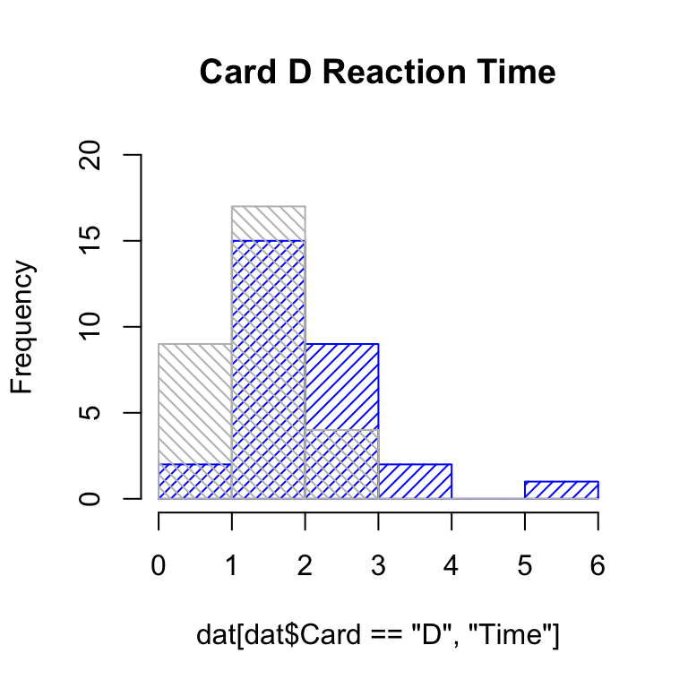
Fortunately we can set the breaks as ranges of values, as shown in Figure 4, where each number is a consecutive endpoint (or breakpoint). With hashed lines, we can easily see overlap, though this can get somewhat visually distracting.
hist(dat[dat$Card =="D", "Time"], ylim =c(0, 20), col ="blue", density =20, angle =45, main ="Card D Reaction Time", breaks =0:6)hist(dat[dat$Card =="A", "Time"], col ="gray", density =20, angle =-45, breaks =0:6, add = T)
Figure 4: Basic histogram of card data.
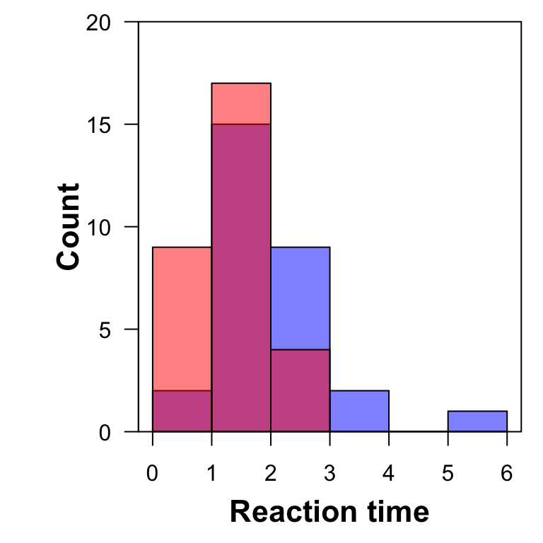
A nicer approach, as in Figure 5, is to use transparency. It would be good to add a legend to reflect the colors, but aside from that, there’s little to complain about here. The colors and overlap make it clearer in the interpretation that this is not a stacked bar graph.
par(mar =c(4.1, 5.1, 0.8, 0.8), yaxs ="i")hist(dat[dat$Card =="D", "Time"], ylim =c(0, 20), col =rgb(0, 0, 1, alpha =0.5), main ="", breaks =0:6, xlab ="", ylab ="", las =1)mtext("Reaction time", 1, line =2.5, font =2, cex =1.35)mtext("Count", 2, line =2, font =2, cex =1.35)hist(dat[dat$Card =="A", "Time"], col =rgb(1, 0, 0, alpha =0.5),breaks =0:6, add = T)box(col ="black")## add legend## experiment with freq = FALSE (affects both graphs and ylim)
Figure 5: Basic histogram of card data.
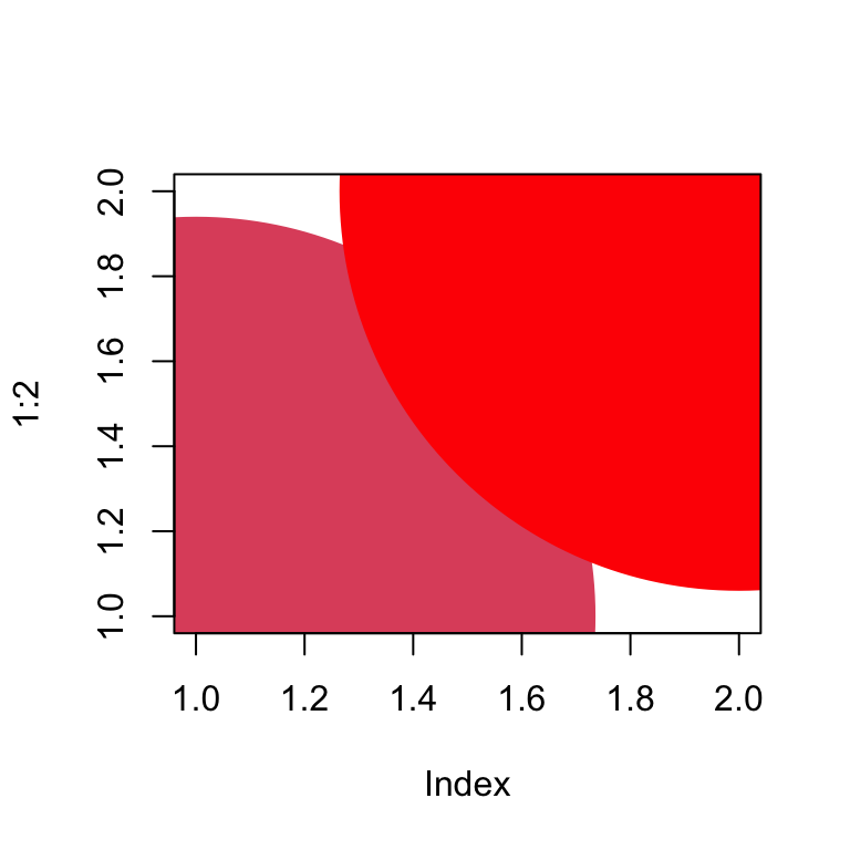
Since we weren’t sure about the interpretation of colors, it is worth briefly mentioning, and illustrating in Figure 6, that the color “red” is slightly differently as a “numbered color” and a “named color”.
plot(1:2, pch =19, cex =50, col =c(2, "red"))
Figure 6: Two oversized points in shades of red.
Assessing normality-ish
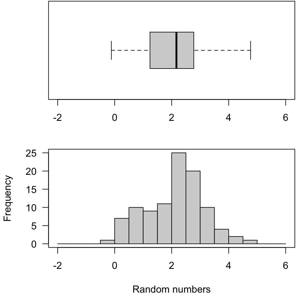
There are formal tests, but often looking at plots is a way to assess normality. In Figure 7, we have a horizontally-rendered boxplot in the “margin” of our histogram. Done with a slightly nicer layout, this could give quite compelling information. Setting the seed is a nice feature here. This allows us to reproduce data and graphs.
set.seed(020425)rn <-rnorm(n =100, mean =2, sd =1)## summary(rn)par(mfrow =c(2, 1), mar =c(4.1, 4.1, 0.1, 0.1))boxplot(rn, horizontal=T, xlab ="", ylim =c(-2, 6))hist(rn, breaks =seq(-2, 6, by =0.5), main ="", xlab ="Random numbers", las =1)box()
Figure 7: Histogram of values from a normal distribution.
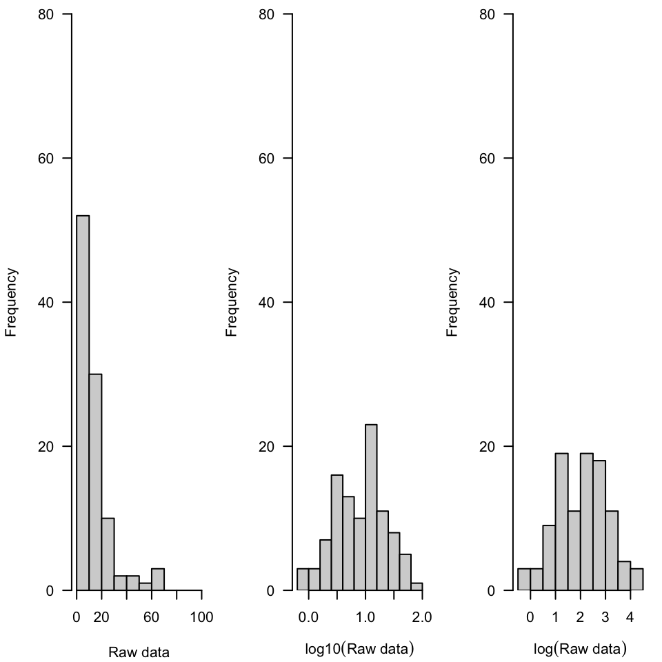
Now we look at crude histgrams of lognormally-distributed numbers on a natural scale as well as base-10 and base-3 log-transformed. The raw data is not normally-distributed, but each log transformation appears symmetric so it would be reasonable to pursue analysis on log-transformed data using techniques that require normality. It should be noted that both analysis and interpretation could be complicated. For example, we are no longer talking about mass, but \(\log(\text{mass})\). The choice between bases of logarithm doesn’t really matter, but log base-10 is likely easier for people to interpret (as powers of 10).
rn <-rlnorm(n =100, mean =2, sd =1)## boxplot(rn)par(mfrow =c(1, 3), yaxs ="i", mar =c(4.1, 4.1, 0.8, 0.8))hist(rn, xlim =c(0, 100), ylim =c(0, 80), las =1, main ="", xlab ="Raw data")hist(log10(rn), ylim =c(0, 80), las =1, main ="", xlab =expression(log10("Raw data")))hist(log(rn), ylim =c(0, 80), las =1, main ="", xlab =expression(log("Raw data")))
Histogram of values from a lognormal distribution, raw, log base-10 transformed and log base-e transformed.
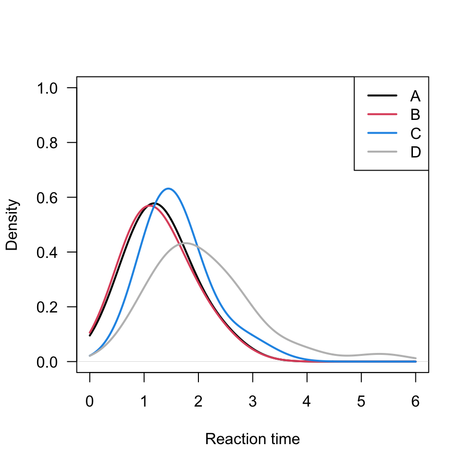
We might be interested in “smoothed histograms” or “empirical density functions”. These offer an advantage when comparing multiple sets of data. Imagine layering a third set of histogram bars to Figure 4 or Figure 5. Interpretation would suffer. Instead we could use the empirical density function as in Figure 8. Importantly, while this was not shown in class, it is perhaps a simpler start than we took. This is a bit fancier of an output than was explored in class. Here I have increased line thickness and added a legend. Since these 4 subsets have a maximum reaction time less than 6, I’ve used from = 0 and to = 6 as the density “cutoffs”.
plot(density(dat[dat$Card =="A", "Time"], na.rm =TRUE, from =0, to =6, bw =0.5), ylim =c(0, 1), main ="", las =1, lwd =2, xlab ="Reaction time")lines(density(dat[dat$Card =="B", "Time"], na.rm =TRUE, from =0, to =6, bw =0.5), col =2, lwd =2)lines(density(dat[dat$Card =="C", "Time"], na.rm =TRUE, from =0, to =6, bw =0.5), col =4, lwd =2)lines(density(dat[dat$Card =="D", "Time"], na.rm =TRUE, from =0, to =6, bw =0.5), col ="gray", lwd =2)legend("topright", c("A", "B", "C", "D"), col =c(1, 2, 4, "gray"), lwd =2)
Figure 8: Smoothed empirical density functions for cards A-D, with bw = 0.5.
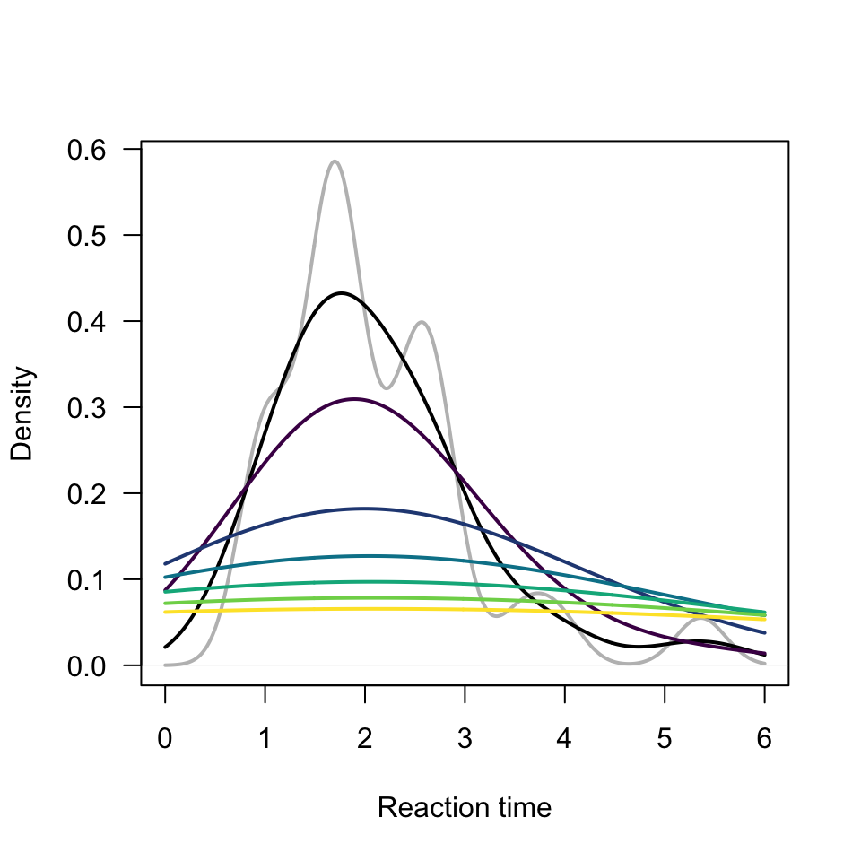
To understand what role bw plays, we can look at a few sample graphs. In Figure 9, we look at the role that bw plays in the appearance of the histogram. What passes the “vibe check”? We want to see “something”, but not “everything”. In this case, the chooise of bw = 0.5 (black) or bw = 1 (dark purple) are probably best. Algorithmic details aside, the shorter bandwidth makes the graph too “bumpy” while the larger bandwidths (really bw = 2 through bw = 6 are too “flat”).
plot(density(dat[dat$Card =="D", "Time"], na.rm =TRUE, from =0, to =6, bw =0.25), col ="gray", lwd =2, main ="", xlab ="Reaction time", las =1)lines(density(dat[dat$Card =="D", "Time"], na.rm =TRUE, from =0, to =6, bw =0.5), col ="black", lwd =2)for(i in1:6)lines(density(dat[dat$Card =="D", "Time"], na.rm =TRUE, from =0, to =6, bw = i), col =hcl.colors(6)[i], lwd =2)
Figure 9: Histogram of reaction times for card A-D.
Warning: Things may fall apart here
In Figure 10 we show some poorly rendered histograms of a rather neat dataset. The Weibull distribution contains as a special case the exponential distribution (shape = 1). Other choices of shape change the overall (umm) “shape” of the distribution most notably the speed of the initial decline or the size of the tail. While this distribution is fascinating, you don’t have to “understand it”, we are mainly concerned with the samples from each parameterization as “fake data”.
Initially though, this suffers the problem of unequal break sizes, partly due to the range of numbers produced. From some experimentation, breaks are set to occur at every 50 – between 0 and 3250, inclusive. Note, the upper limit has been calculated using the maximum of all values. With quite a bit of inspection, you could convince yourself that the “red” graph exhibits exponential decay, the “gray” graph exhibits decay initially faster but ultimately slower than exponential decay, and that the “blue” graph exhibits decay initially slower but ultimately faster than exponential decay. This is almost certainly not obvious at this point. Changing scale to a smaller number might help. I have prior experience with this family of curves, so just happen to find it interesting. Roughly gray represents “constant rate of breakage (death or failure)”, blue represents relatively less failure early on, but more eventually, and red the opposite - more failure early on, but less eventually.
Figure 10: Histogram of values from a few Weibull distributions.
We can extract some information from the histograms and try again. In Figure 11, this time limiting the vertical axis and truncating the horizontal even more extremely. It should be clear that the sequencing of overlapping bars becomes difficult, manipulating line density and angle could help, but at some point we really might need to try other tools.
Figure 11: Histogram of values from a few Weibull distributions.
Densities
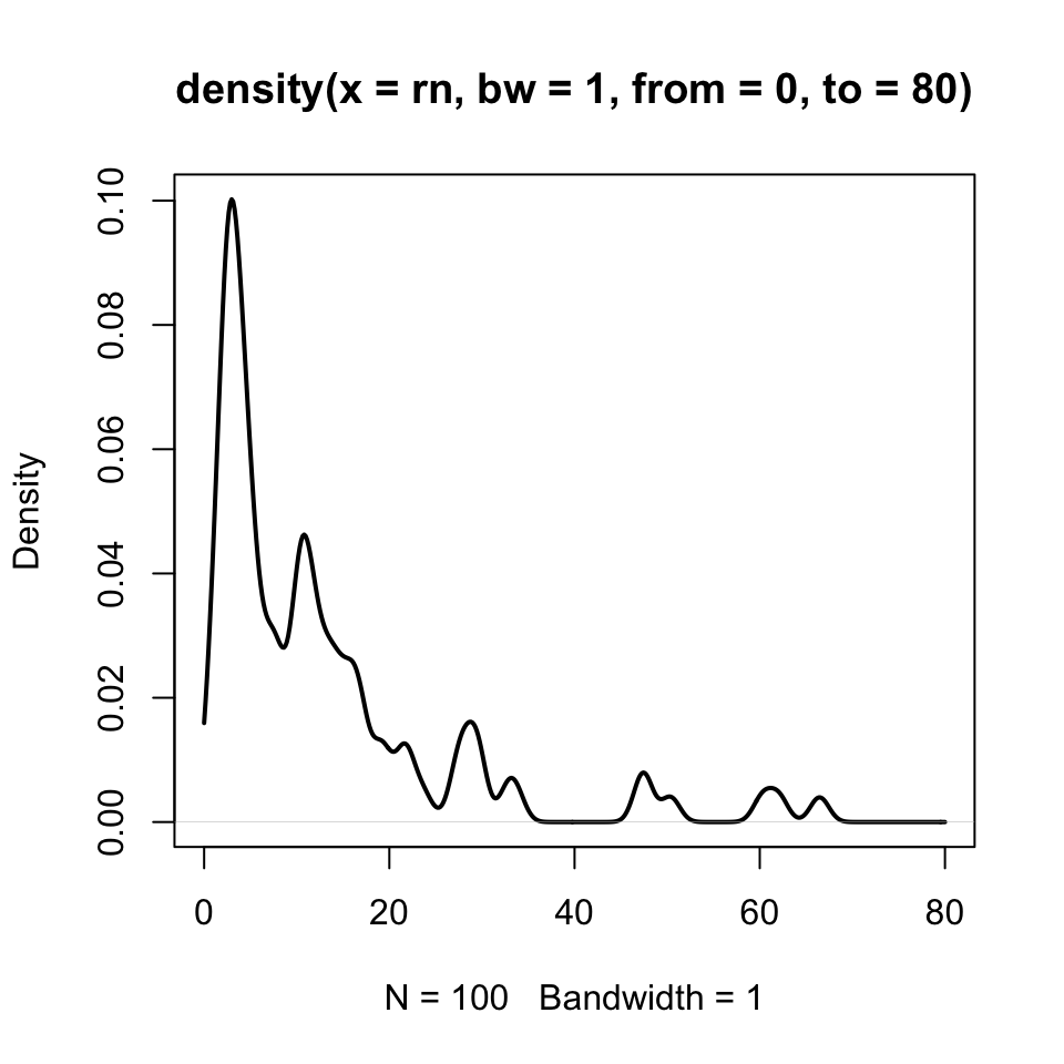
One such tool is the smoothed empirical density. We look at a sample from the lognormal data before attempting to gain traction on the cursed Weibull data. In Figure 12, we have our raw lognormal data and a density (i.e., “smoothed histogram”) with a bandwidth (bw) set to 1. Bandwidth plays a role analogous to “bin size” in a histogram.
plot(density(rn, from =0, to =80, bw =1), lwd =2)
Figure 12: Smoothed density plot of lognormally-distributed numbers.
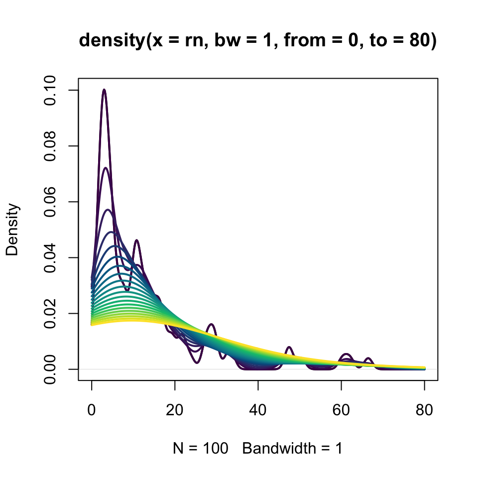
Since we experimented with breaks and setting the bin size or location, we might expect to do the same here. For the same data, we increase the bandwidth as colors brighten from violet to yellow in Figure 13. The darker (violet) curves trace the changes with greater flexibility. As the bandwidth grows (and color brightens towards yellow), the histogram becomes smoother. Though the computations are different, many fine breaks in a histogram appear like a small bandwidth density; few coarse breaks in a histogram appear like a large bandwidth density. This would be sort of like looking at high vs low resolution images, perhaps in a high resolution image, some of the content is dust, noise, or artifact, while in a lower resolution image, some of the content is blur.
plot(density(rn, from =0, to =80, bw =1), lwd =2)for(i in1:20)lines(density(rn, from =0, to =80, bw = i), col =hcl.colors(20)[i], lwd =2)
Figure 13: Smoothed density plot of lognormally-distributed numbers with variable bandwidths.
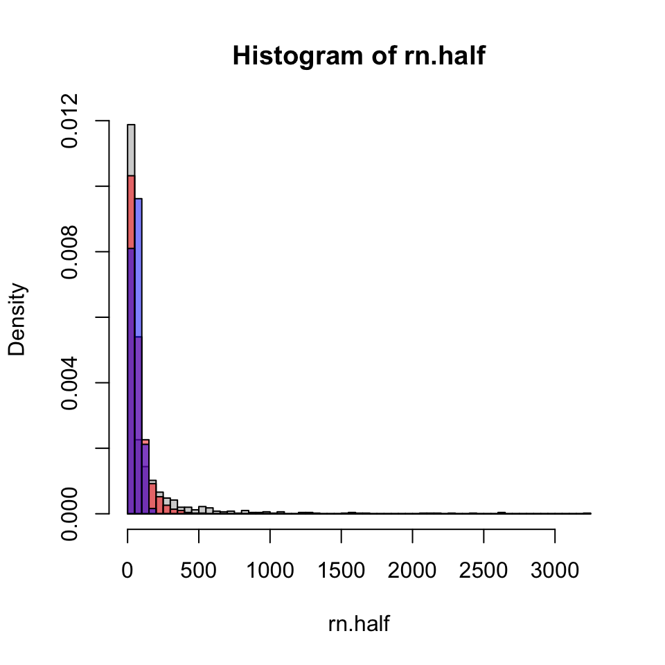
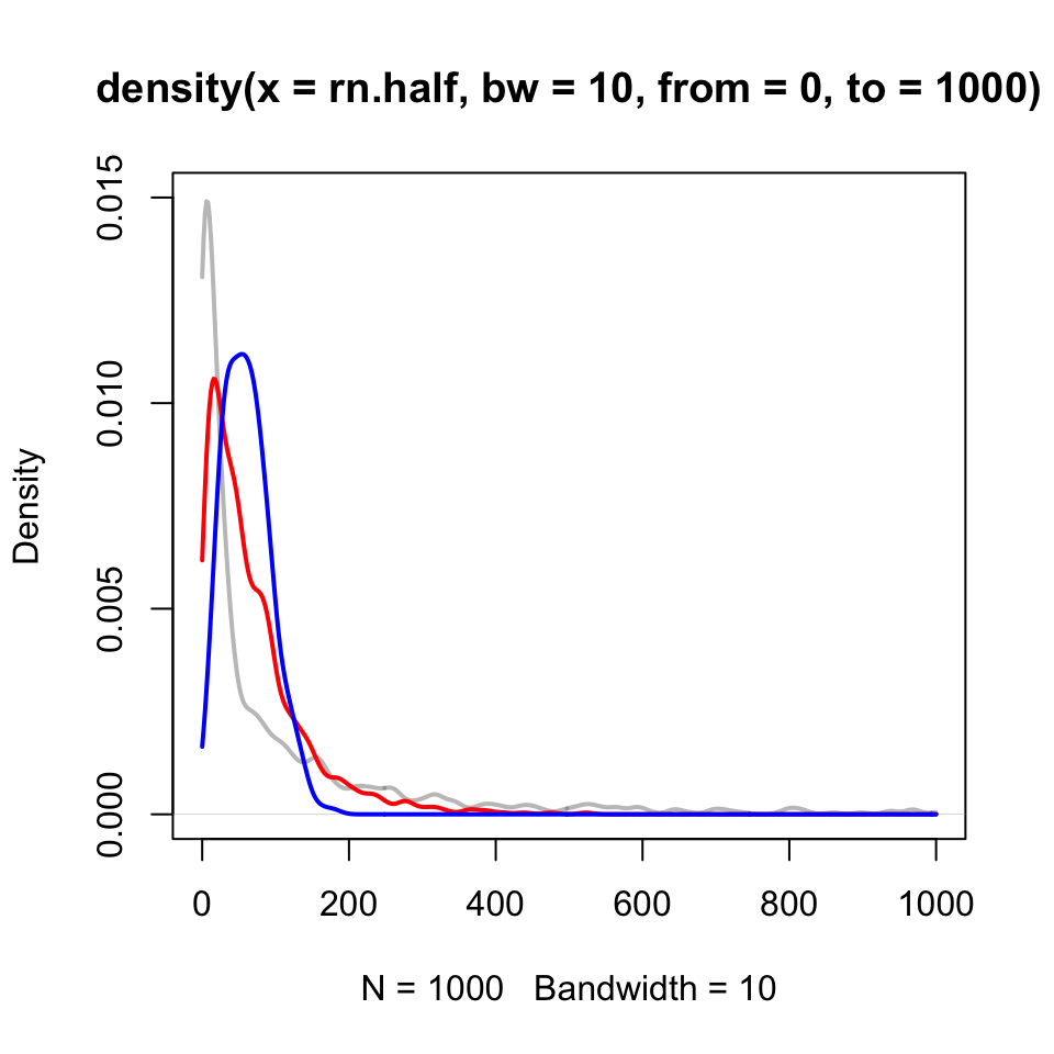
Density plots can be sort of tricky at their boundaries. In Figure 14, all of the densities feature a sort of “hook” at the left, even though for two of the three the expectation is more like exponential decay. You may notice here, though, that the gray has a “fatter tail” (i.e., more probability at larger values than the others), that is to be expected. Additionally the pronounced “bump” in the blue curve is authentic.
plot(density(rn.half, from =0, to =1000, bw =10), col =gray(0.5, alpha =0.5), lwd =2, ylim =c(0, 0.015))lines(density(rn.one, from =0, to =1000, bw =10), col =rgb(1, 0, 0, alpha =1), lwd =2)lines(density(rn.two, from =0, to =1000, bw =10), col =rgb(0, 0, 1, alpha =1), lwd =2)
Figure 14: Smoothed density plot of three sets of Weibull-distributed data.
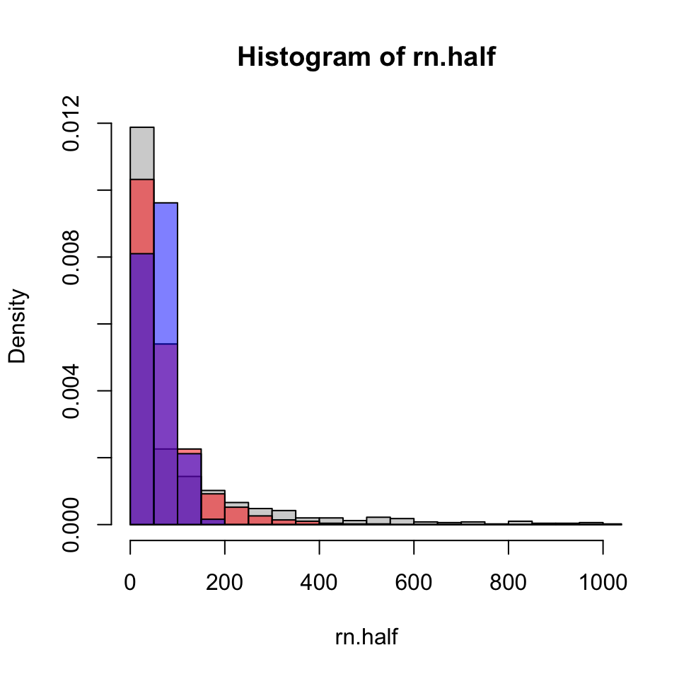
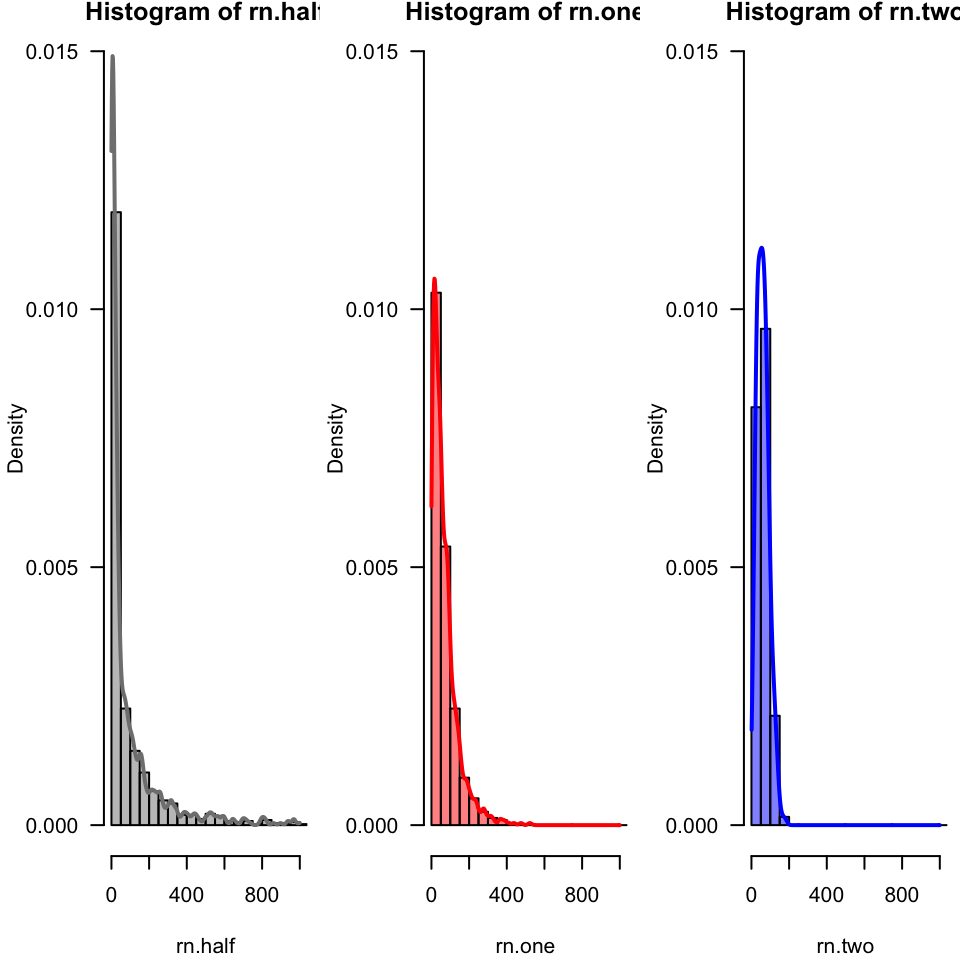
Comparing densities to histograms for this more complicated data. Consider the red as representing “exponential decay” the others have fairly distinct shapes by contrast - “gray” has a much larger tail, and “blue” has a much smaller tail with more of a “bump”.
par(mfrow =c(1, 3), mar =c(4.1, 4.1, 0.8, 0.5))hist(rn.half, col =gray(0.5, alpha =0.5), freq =FALSE, breaks = (0:xmax)*50, ylim =c(0, 0.015), las =1, xlim =c(0, 1000))lines(density(rn.half, from =0, to =1000, bw =10), col =gray(0.5, alpha =1), lwd =2, ylim =c(0, 0.015))hist(rn.one, col =rgb(1, 0, 0, alpha =0.5), freq =FALSE, breaks = (0:xmax)*50, ylim =c(0, 0.015), las =1, xlim =c(0, 1000))lines(density(rn.one, from =0, to =1000, bw =10), col =rgb(1, 0, 0, alpha =1), lwd =2)hist(rn.two, col =rgb(0, 0, 1, alpha =0.5), freq =FALSE, breaks = (0:xmax)*50, ylim =c(0, 0.015), las =1, xlim =c(0, 1000))lines(density(rn.two, from =1, to =1000, bw =10), col =rgb(0, 0, 1, alpha =1), lwd =2)
Figure 15: Smoothed density plot of three sets of Weibull-distributed data, each superimposed on a histogram.
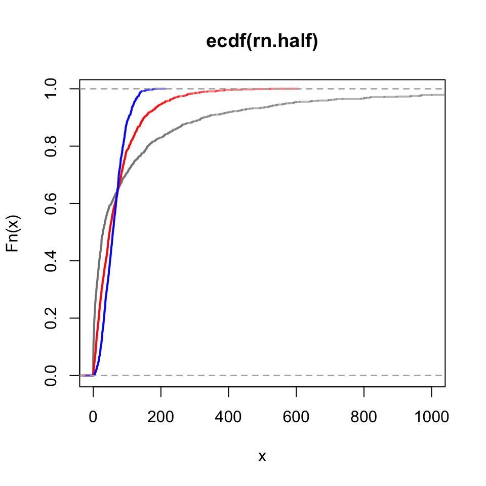
The empirical cumulative distribution function acts at the area under the curve of its corresponding density. Again using “red” as a reference, notice how the blue area initially accumulates more slowly, but then suddenly more quickly. Contrast that pattern with “gray”.
plot(ecdf(rn.half), pch =NA, col =gray(0.5, alpha =0.5), xlim =c(0, 1000), lwd =2)lines(ecdf(rn.one), col =rgb(1, 0, 0, alpha =0.5), lwd =2)lines(ecdf(rn.two), col =rgb(0, 0, 1, alpha =0.5), lwd =2)
Figure 16: Emprirical cumulative distribution function plots of Weibull-distributed numbers.
Tables
We can look briefly at some table commands that work especially well for summaries of categorical data. For simplicity we will use the warpbreaks data.
We can generate a table that shows the frequencies of entrie occurring in “wool”.
table(warpbreaks$wool)
 A  B
27 27
We can repeat this using the “bracket method” for extracting variables.
table(warpbreaks[, "wool"])
 A  B
27 27
Using bracket notation can be especially useful to make two-dimensional tables.