library(ggplot2)Class 7 notes
Transition to ggplot
dat <- read.delim("./data/mouse.csv", header = TRUE, sep = ',')
head(dat)
Animal Mass MetabolicRate
1 Mouse 0.02 3.4
2 Rat 0.20 28.0
3 Guinea pig 0.80 48.0
4 Cat 3.00 150.0
5 Rabbit 3.50 165.0
6 Dog 15.50 520.0Depending on subsequent choice, the aes(...) can go in a variety of places in the plotting command. Below it could go after dat in ggplot(), it ocould go inside geom_point(), or before or after it. Depending on the placement and additional arguments about aesthetic preferences (e.g., shape, size, linewidth, color, …), it gives certain plot geometries necessary information or other plot geometries conflicting adn prohibitive information.
ggplot(dat) + geom_point(aes(x = Mass, y = MetabolicRate))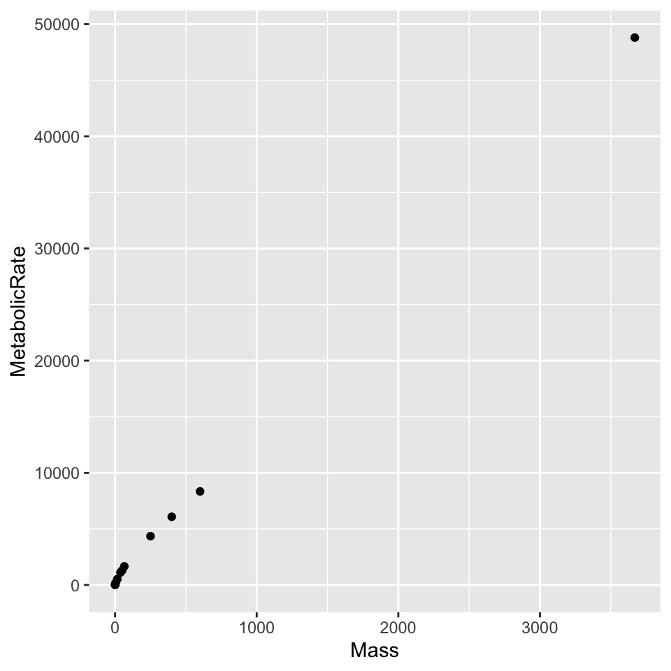
I will only show a few examples, but a variety of good (or not so good) configurations are possible. For example, with many values of a categorical variable automating point shape is ill-advised. Shape aesthetics set for a scatterplot conflict with the requirements of a line plot, the reverse is true for line styles.
ggplot(dat, aes(x = Mass, y = MetabolicRate, color = Mass)) + geom_point()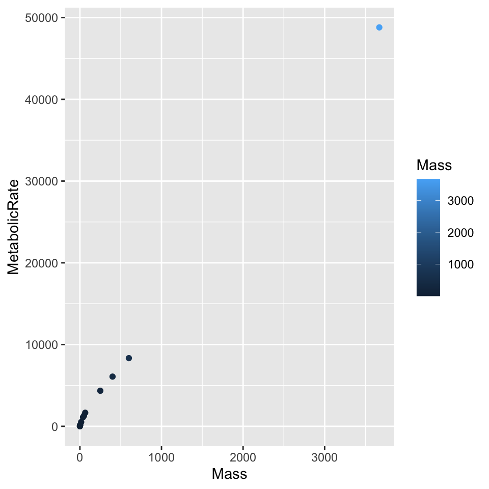
For a relatively simple plot, we can superimpose a basic scatterplot on the underlying connected line plot.
ggplot(dat, aes(x = Mass, y = MetabolicRate)) + geom_line() + geom_point()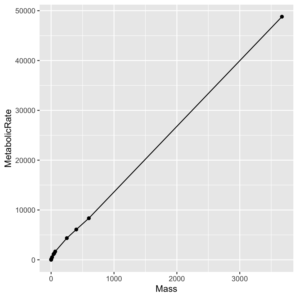
Below since color was specified early in the plotting, it conflicts with a superimposed geom_line() which can’t plot differently-colored lines for each data series - this data only has one point per series. To superimpose geom_line() we hae to give it a fixed color. Notice that the points take their color from the initial aes() specification. In ggplot it takes separate functions for each axis, unlike within base R where axis() itself is quite flexible.
ggplot(dat, aes(x = Mass, y = MetabolicRate, color = Animal))  + geom_line(color = "black") +
  geom_point() + scale_x_log10() + scale_y_log10()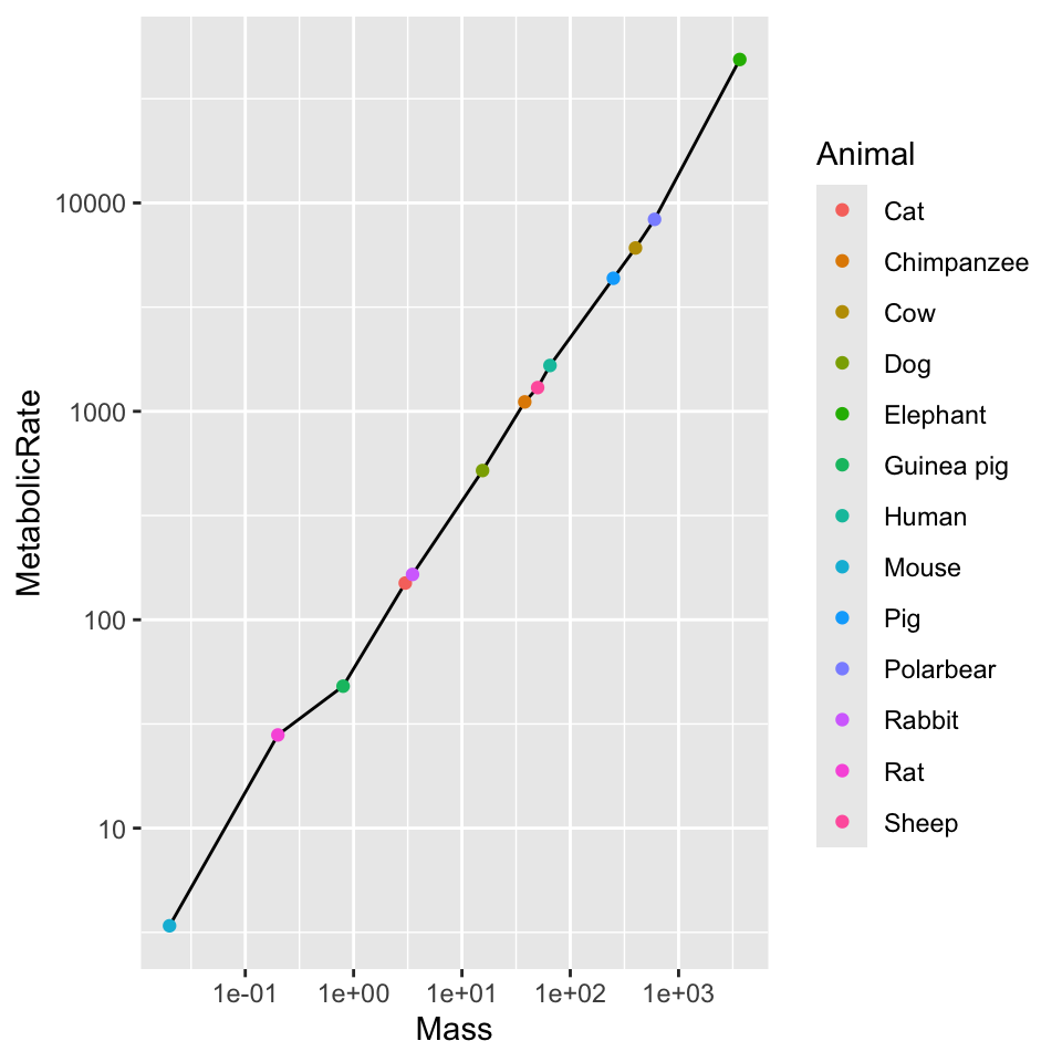
Milestones of adulthood
Using the “Milestones of adulthood” data, we can illustrate a variety of reasonable tasks with a relatively simple dataset.
dat <- read.delim("./data/milestone.csv", header = TRUE, sep = ',')
head(dat)
milestone year percent
1 independent 1983 83
2 independent 1993 77
3 independent 2003 77
4 independent 2013 73
5 independent 2023 64
6 married 1983 78A connected line plot, with lines for each milestone series, is a reasonable first step. Choosing both a color and line type using the value of a variable is probably a bit over-the-top, but there’s nothing inherently bad. Specifying the linetype is probably “better” than specifying the color alone, but the combination is nice.
ggplot(dat) + geom_line(aes(x = year, y = percent, color = milestone, linetype = milestone))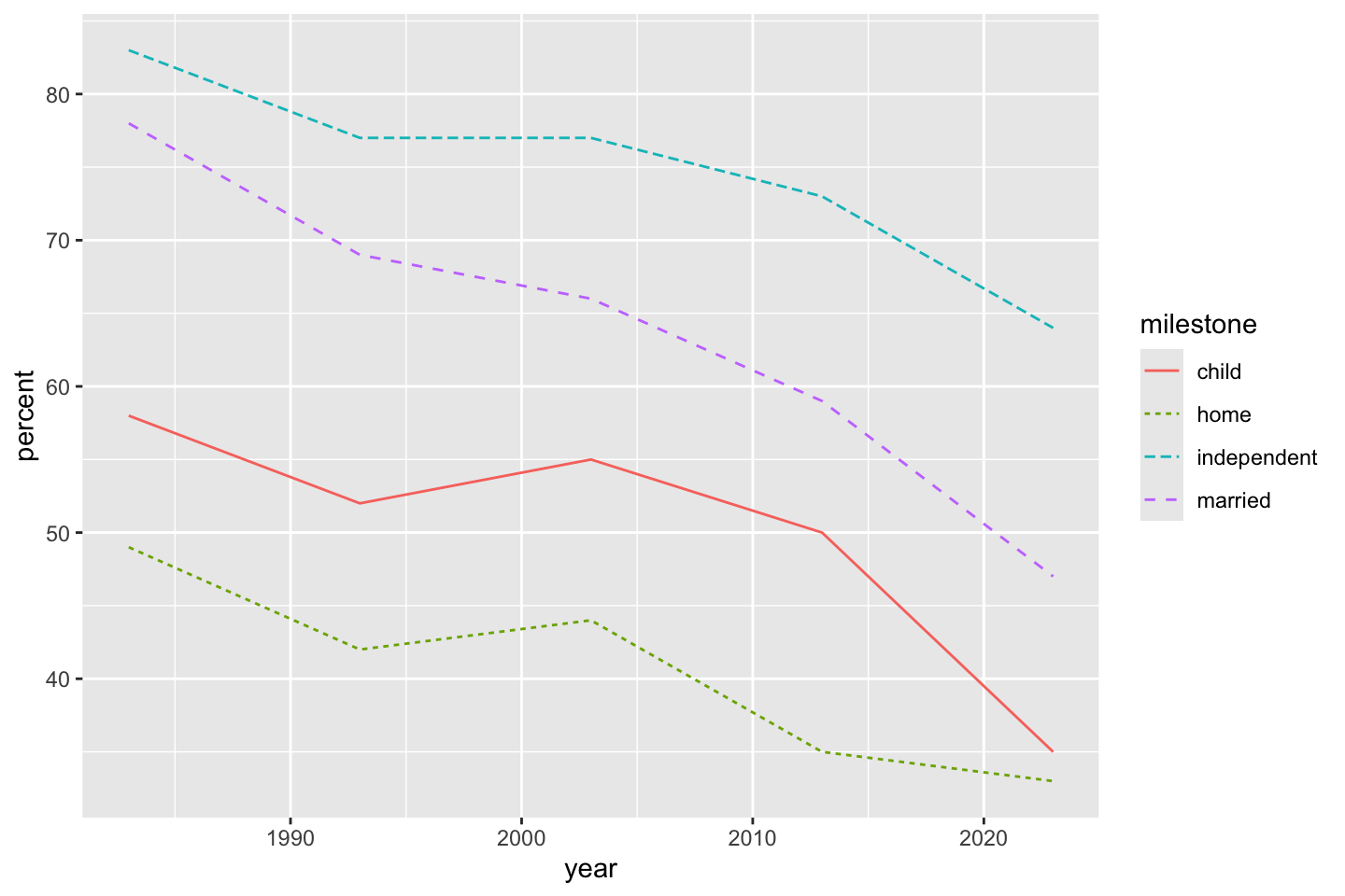
You might notice that the line order, coincidentally, is different from the (alphabetical by milestone) legend order. There are a few ways to do this, first is what I thought of during class. We choose all of the milestone variable entries present in the year 1983. These happen to be in decreasing order as is (I may have done this when creating the original dataset, but I can’t actually remember if this is more than luck).
The variable nms stores the four entries of milestone that happen to correspond to their decreasing order in 1983. This means, according to that order, legend items can be made to match graph items. Changing this to 2023 would order by the last entry, with not much more work, you could order by mean, slope, or some other calculation. The important part is that once we have a desired order (even one entered manually), we can set that order as the levels for a factor.
The levels argument essentially restricts the allowable values of the original variables to those in given as argument. Adding "puffin" is silly, but harmless, becuase it will be dropped from the legend since it doesn’t occur in the data. Omitting an actual entry in dat$milestone as a possible level will turn all occurrences of that entry in the variable to NA - essentially saying that the omiotted value isn’t allowed in the variable. For experience, compare the result with nms[1:3] to the result with c(nms, "puffin"). It may help to reread the original data between experiments.
table(dat$year)
1983 1993 2003 2013 2023
   4    4    4    4    4
nms <- dat[dat$year == 1983, "milestone"]
dat$milestone <- factor(dat$milestone, levels = c(nms, "puffin"))
head(dat) milestone year percent
1 independent 1983 83
2 independent 1993 77
3 independent 2003 77
4 independent 2013 73
5 independent 2023 64
6 married 1983 78Now that the entries have been ordered by there corresponding numerical order in 1983, the legend will print in order with the order of the plotted lines.
Since shape and color were specified in geom_point(), to add geom_line() it seems best to redefine the aesthetic. This is because shape from the point geometry has no analog in teh line geometry.
ggplot(dat) + geom_point(aes(x = year, y = percent, shape = milestone, color = milestone)) + geom_line(aes(x = year, y = percent, color = milestone))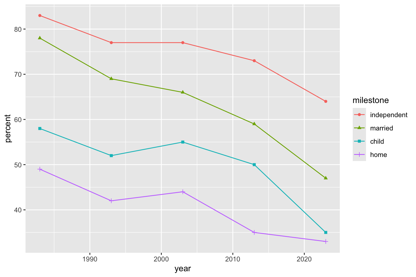
If for some reason we don’t like, want, or need shapes and colors, but still want to distinguish between milestone values, we can make “small multiples” plots using facets. First facet_grid() (by milestones) makes a “ribbon” of graphs. Experimenting with scale = "free" or scale = "fixed" is illuminating.
ggplot(dat) + geom_line(aes(year, percent, linetype = milestone)) + facet_grid(vars(milestone), scale = "free")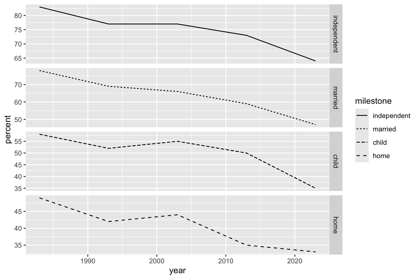
The fixed scale preserves axes across graphs even if panels cover different ranges of output.
ggplot(dat) + geom_line(aes(year, percent, linetype = milestone)) + facet_grid(vars(milestone), scale = "fixed")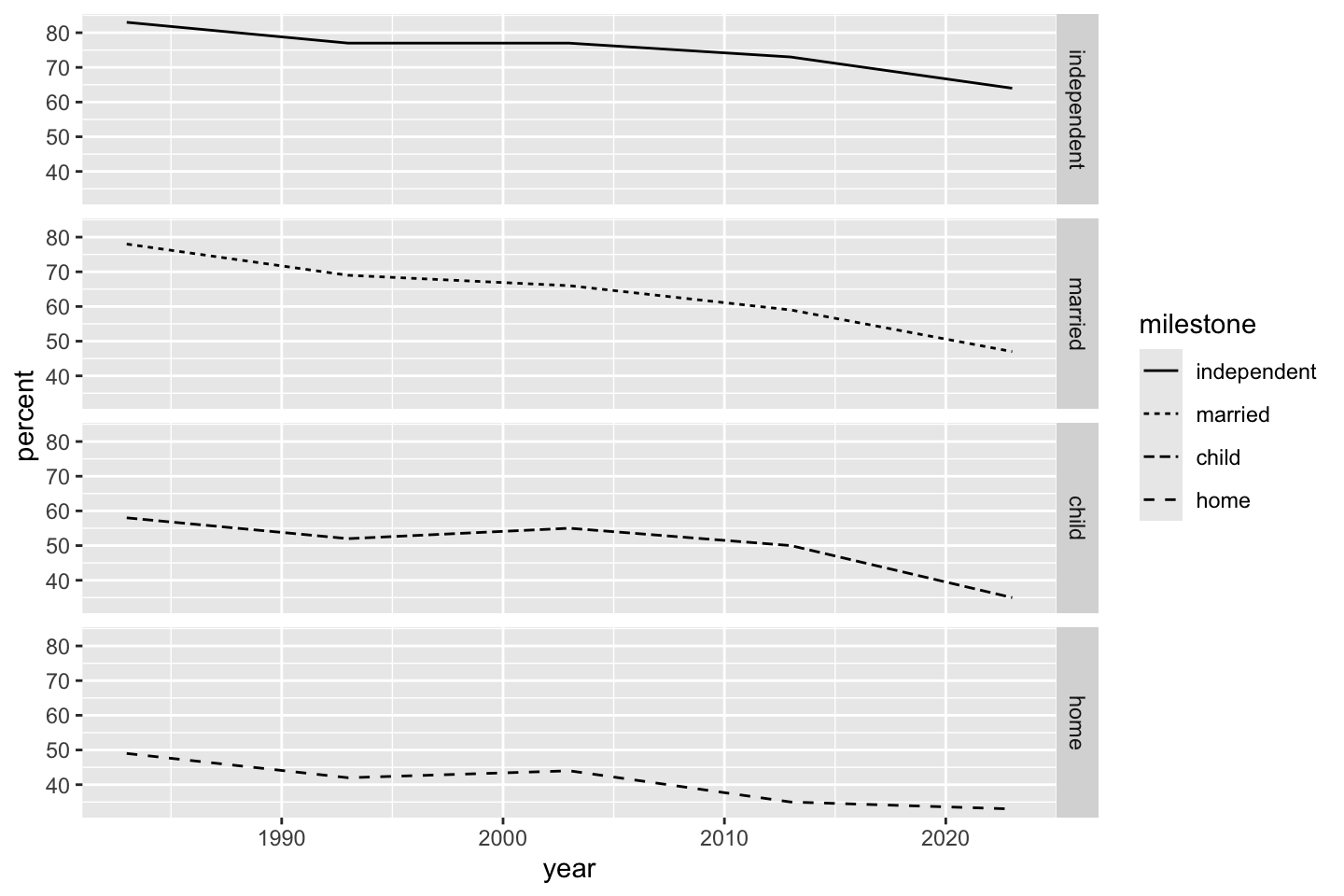
fixed or uniform vertical axes across all panels.
Instead of facet_grid() which produces “ribbons”, we can use facet_wrap() which converts the layout to a grid. If we neglect any additional aesthetics, the resulting plot maximizes plot space in favor of a legend. The facet labels give the relevant information of the legend.
ggplot(dat) + geom_line(aes(year, percent)) + facet_wrap(~milestone, scale = "fixed")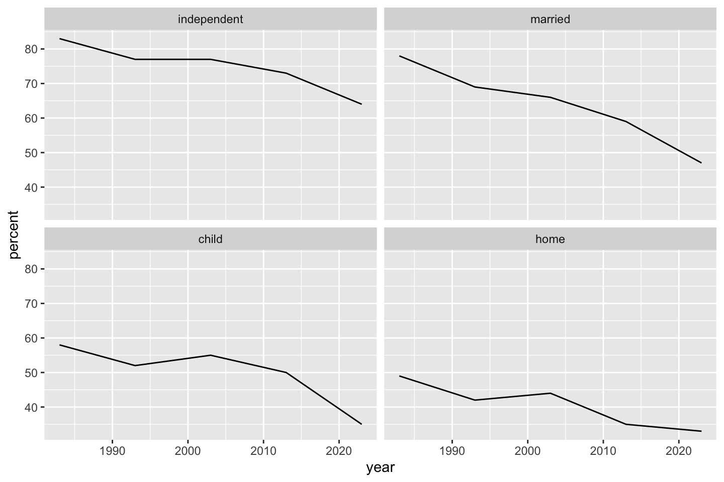
facet_wrap().
Since I am a sucker for base R, the same basic graph is possible by layering with a for() loop. I am a proponent of this becuase the process is instructive (for me). Additionally more complicated things can be done per layer by executing multiple steps iwthin the loop (e.g., printing tables, summaries, or statistical results). Since we identifed milestone as a factor earlier (to order the lines and legend), we need to process it a bit more carefully for the legend, stripping some of the extra informative formatting away using as.vector. This last step makes the entries in ms suitable as axis labels. Using par() you could pretty easily make the graph have nicer margins. Ironically, using par and chagning lines() to plot(), you could quickly mimic faceting.
ms <- unique(dat$milestone)
plot(percent ~ year, dat, subset = milestone == ms[1], type ='l', ylim = range(dat$percent))
for(i in 2:length(ms))lines(percent ~ year, dat, subset = milestone == ms[i], lty = i)
legend("topright", as.vector(ms), lty = 1:4)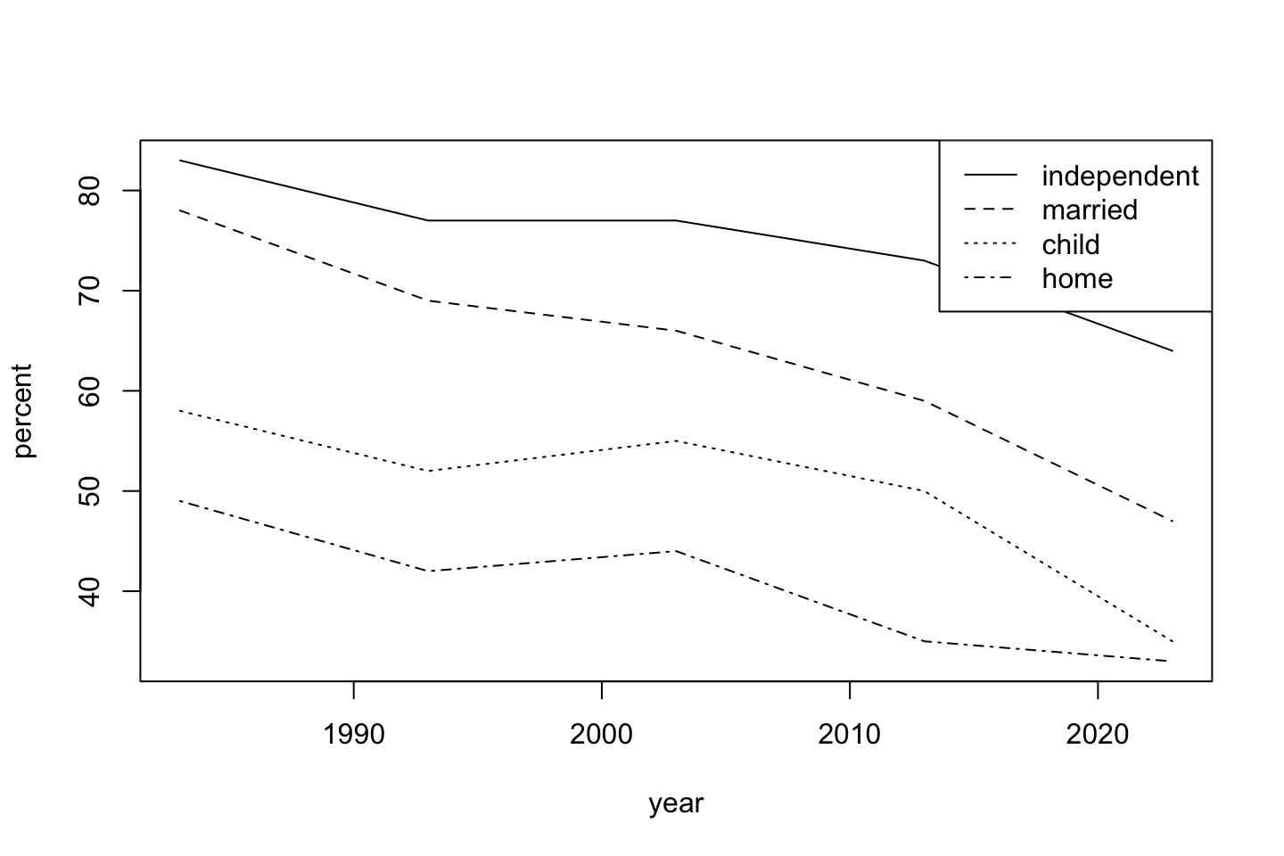
With our cards data we can make a boxplot. Depending on which version of the data you have, you may want to open it in a spreadsheet program and manually edit some of the extra content (it should just have rows of the personal identifier, the card, and the reaction time). Since there were some weird things in the raw data, na.omit() eliminates a few problematic entries.
Card data - new data, new plot
You may have needed to move this data from an earlier folder during class. It is included with the file that contains this code. An earlier version had some extraneous, irregularly-shaped data from scratchwork. Remove that using a spreadsheet program or download the updated file.
dat <- read.delim("./data/cards.csv", header = T, sep = ',')
dat <- na.omit(dat)
We probably do not want this many layers in general, but we can add a colored boxplot with “jittered” raw data (with geom_jitter()) or we could add a “violin plot” (smoothed mirrored density with geom_violin()) or a “dot plot” (a slightly more organized approach to “jitter” with geom_dotplot()).
ggplot(dat, aes(Card, Time, color = Card)) + geom_boxplot() + geom_jitter(alpha = 0.25)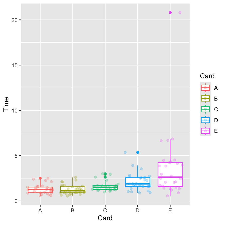
facet_wrap().