library(ggplot2)Class 8 notes
Experiments in ggplot
Load the package.
iNaturalist data
This is a great source of data, with a somewhat intricate query process. This is just a subset of observations I pulled from a previous dataset for our use. Even at that, there is a lot to consider.
dat <- read.delim("./data/observations-526962.csv", header = TRUE, sep = ',')
head(dat, n = 2)
id uuid observed_on_string observed_on
1 30415 0190c343-7958-475c-a5d5-ca2f19334389 2011-08-14 2011-08-14
2 118923 df66bb53-2827-4739-a13f-f4cf90fba966 2012-08-21 2012-08-21
time_observed_at time_zone user_id user_login user_name
1 Central Time (US & Canada) 2125 greenmother GM
2 Central Time (US & Canada) 2125 greenmother GM
created_at updated_at quality_grade license
1 2011-09-08 04:42:13 UTC 2022-11-13 03:10:54 UTC research
2 2012-09-03 15:43:15 UTC 2017-08-10 05:26:50 UTC research
url
1 http://www.inaturalist.org/observations/30415
2 http://www.inaturalist.org/observations/118923
image_url sound_url
1 https://static.inaturalist.org/photos/53028/medium.jpg
2 https://static.inaturalist.org/photos/169792/medium.JPG
tag_list
1
2 Meleagris gallopavo
description
1 Turkey Vulture at Lake Arcadia
2 I was on my way out to the sticks and there they were. I was surprised to see so many in an area so populated.
num_identification_agreements num_identification_disagreements
1 3 0
2 2 0
captive_cultivated oauth_application_id place_guess latitude
1 false NA Lake Arcadia Oklahoma 35.64837
2 false NA Oklahoma, US 35.66077
longitude positional_accuracy private_place_guess private_latitude
1 -97.37045 NA NA NA
2 -97.37657 38586 NA NA
private_longitude public_positional_accuracy geoprivacy taxon_geoprivacy
1 NA NA open
2 NA 38586 obscured open
coordinates_obscured positioning_method positioning_device species_guess
1 false Turkey Vulture
2 true Wild Turkey
scientific_name common_name iconic_taxon_name taxon_id
1 Cathartes aura Turkey Vulture Aves 4756
2 Meleagris gallopavo Wild Turkey Aves 906A subset of birds
Below we’ve subset the data to look at two randomly chosen bird species and their pattern of occurrence in Oklahoma County, OK. In reality it may be of greater interest to choose species after browsing a table of occurrences.
tab <- table(dat$common_name)
tab <- tab[order(tab, decreasing = TRUE)]
c(head(tab), tail(tab))
Mallard Canada Goose Great-tailed Grackle
462 373 351
Northern Cardinal American Robin Great Blue Heron
348 301 262
Stilt Sandpiper Upland Sandpiper Virginia Rail
1 1 1
Western Sandpiper Whooper Swan Willow Flycatcher
1 1 1 Interestingly, combining head() and tail() we can determine commonly and less commonly encountered species. By chance alone we chose the Northern Cardinal (\(n_\text{obs} = 348\)) and the Canada Goose (\(n_\text{obs} = 373\)), two of top four species listed in the data, each representing about 3\% of total observations. Using commands such as tab[tab >10] shows the species with more than ten observations (131 total species).
tab2 <- table(tab)
tab2 <- tab2[order(tab2, decreasing = TRUE)]
tab2
tab
1 2 3 5 4 7 8 9 11 12 6 23 15 30 44 51 60 93 98 10
62 29 25 15 14 11 7 6 6 6 4 4 3 3 3 3 3 3 3 2
16 18 19 22 24 26 27 31 35 37 42 54 61 71 72 78 85 125 139 236
2 2 2 2 2 2 2 2 2 2 2 2 2 2 2 2 2 2 2 2
13 14 20 21 25 28 29 32 34 36 38 41 43 47 49 50 55 56 57 59
1 1 1 1 1 1 1 1 1 1 1 1 1 1 1 1 1 1 1 1
69 74 75 79 80 81 82 83 87 88 96 100 110 124 128 132 133 137 141 145
1 1 1 1 1 1 1 1 1 1 1 1 1 1 1 1 1 1 1 1
146 154 171 172 176 198 201 241 262 301 348 351 373 462
1 1 1 1 1 1 1 1 1 1 1 1 1 1 The previous table is useful to understand overall patterns. Of all recordings, 62 different species were recorded only once. That is 20\% of the data being represented by at most a single observation.
With that understanding, we now color the points of two familiar species, which happen to be among the most common, with a color generated from their common_name entry. Using the transparency provided by alpha = 0.5 ensures that you can get a sense of overlap in locations where many observations are made.
p <- ggplot(data = subset(dat, subset = common_name %in% c("Northern Cardinal", "Canada Goose")) ) + geom_point(aes(latitude, longitude, color = common_name), alpha = 0.5)
p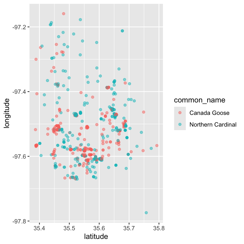
Using labs() we can quickly stylize the axes labels and provide a title and subtitle.
p <- p + labs(x = "Latitude", y = "Longitude",
              subtitle = "iNat observations", title = "Birds in Oklahoma County, OK, USA")
p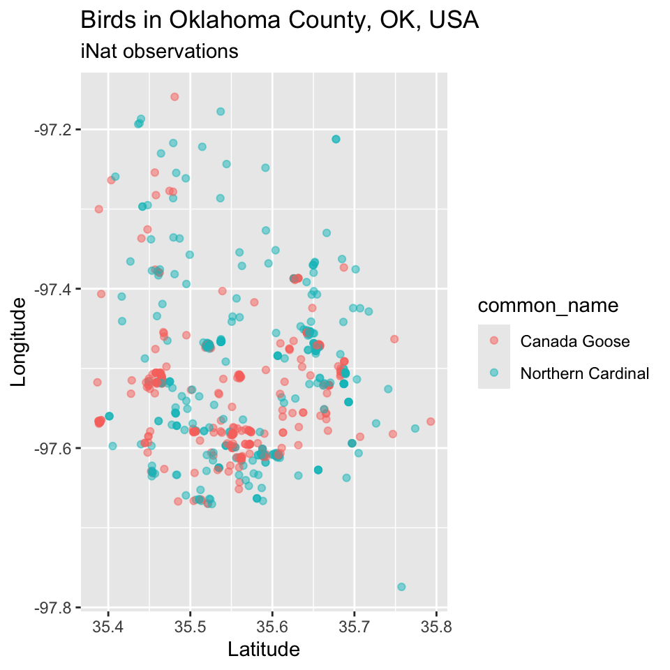
As a proof of concept, we show that we can label points by the text of their common_name entries. The code for geom_label() “works”, but this is very slow to render – it requires drawing a label “box” for each point and a printing its corresponding label. These sort of “screen output” tasks can be very slow.
p <- p + geom_text(mapping = aes(x = latitude, y = longitude, label = common_name), hjust = 0)
# + geom_label(mapping = aes(x = latitude, y = longitude, label = common_name))
p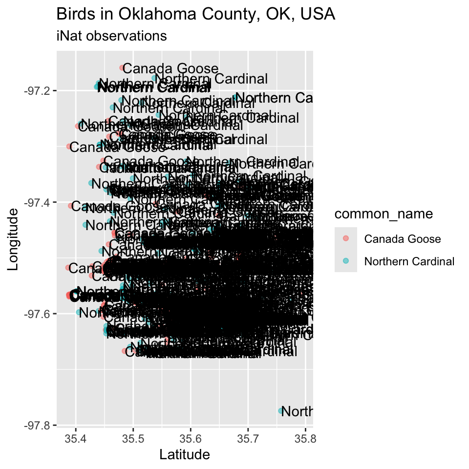
Olympic athlete data
Just like labeling all spatial locations of bird observations is possible, but not that useful – at least for the most common of birds, giving colored symbols for every Olympic sport is a visually-challenging task. Applying additional knowledge, it is reasonable to group sports by some meaningful characteristics. Below is a sample approach for grouping Olymipic sports by some shared characteristic. Of course if a classification scheme existed already, we could read it in and merge it. But, making and recording decisions is a valuable part of exploration.
dat <- read.delim("./data/athletes.csv", header = TRUE, sep = ',')
head(dat)
id name nationality sex date_of_birth height weight
1 736041664 A Jesus Garcia ESP male 1969-10-17 1.72 64
2 532037425 A Lam Shin KOR female 1986-09-23 1.68 56
3 435962603 Aaron Brown CAN male 1992-05-27 1.98 79
4 521041435 Aaron Cook MDA male 1991-01-02 1.83 80
5 33922579 Aaron Gate NZL male 1990-11-26 1.81 71
6 173071782 Aaron Royle AUS male 1990-01-26 1.80 67
sport gold silver bronze info
1 athletics 0 0 0
2 fencing 0 0 0
3 athletics 0 0 1
4 taekwondo 0 0 0
5 cycling 0 0 0
6 triathlon 0 0 0 dat$group <- dat$sport
dat[dat$group %in% c("aquatics", "sailing", "rowing"), "group"] <- "water"
#dat[dat$group %in% c("aquatics", "sailing", "rowing"), "group"] <- "field"Bar graphs, which aren’t great to begin with, are rather hard to produce as we might like, in ggplot. There is interest in representing the accumulation of different medals by nationality (or possibly by sex and sport). I find this not the easiest to accomplish in ggplot. While “model specification syntax” (try aggregate(gold ~ nationality + sex, dat, sum)) is nice, simultaneously aggregating multiple columns is also nice. Of course, there are tools in dyplyr that help with this, but the base R commands are quite clear and powerful.
agg <- aggregate(dat[, c("gold", "silver", "bronze")], by = list(dat$nationality, dat$sex), sum)
head(agg)
Group.1 Group.2 gold silver bronze
1 AFG female 0 0 0
2 ALB female 0 0 0
3 ALG female 0 0 0
4 AND female 0 0 0
5 ANG female 0 0 0
6 ANT female 0 0 0names(agg)[1:2] <- c("nationality", "sex")
agg <- agg[order(agg$gold, decreasing = TRUE), ]Given the summarized data, we can consider graphs, likely showing how some combinations of variables explain amounts and combinations of medals. Among you there was interest in making bar graphs showing medals by nationality or scatterplots showing heights or weights, with annotation for type of sport, sex, or other category. Since there are so many nationalities and relatively many sports, using colors (or especially symbols) for those is not that helpful. Instead, you could create new variables that group nations by continent (or some other metric) or group sports by relevant descriptions (e.g., water, team, solo, field, gym).
sport.cat <- dat$sport
sport.cat[sport.cat %in% c("rowing", "sailing", "aquatics")] <- "water"
After you were satisfied, you would probably want to run table(sport.cat) to make sure you hadn’t missed any sports. Finally you could create this as a variable by adding a column to the original data dat$sport.cat <- factor(sport.cat). The name of our variable doesn’t have to match the new column we add to our data.
This requires some work and interpretation. If you had a separate dataset that listed other classifiers, you could merge that onto this dataset. It may even be the case that some sport entries contain both team and solo sports, complicating that assignment. The motivation, though, is a smaller number of distinct entries.
Pharmaceutical spending data
We read in the “drug” data from https://github.com/datasets/pharmaceutical-drug-spending.
Pharmaceutical Drug Spending by countries with indicators such as a share of total health spending, in USD per capita (using economy-wide PPPs) and as a share of GDP. Plus, total spending by each countries in the specific year.
A question was how we could identify which country had the greatest spending each year. We can aggregate spekding by year using the max function to select which spending value was the annual maximum. That doesn’t tell us where the spending occurred. We could search for our with-year maximum spending values on a spreadsheet and take notes, or we could merge original data back to this, matching year and spending, and study the years.
#label: data-drug
dat <- read.delim("./data/drug.csv", header = TRUE, sep = ',')
head(dat)
LOCATION TIME PC_HEALTHXP PC_GDP USD_CAP TOTAL_SPEND
1 AUS 1971 15.992 0.726 33.990 439.73
2 AUS 1972 15.091 0.685 34.184 450.44
3 AUS 1973 15.117 0.681 37.956 507.85
4 AUS 1974 14.771 0.754 45.338 622.17
5 AUS 1975 11.849 0.682 44.363 616.34
6 AUS 1976 10.920 0.630 44.340 622.22agg <- aggregate(dat$TOTAL_SPEND, by = list(dat$TIME), max)
agg2 <- aggregate(TOTAL_SPEND ~ TIME, dat, max)
head(agg2) TIME TOTAL_SPEND
1 1970 3353.23
2 1971 3789.72
3 1972 4207.94
4 1973 4640.77
5 1974 5320.11
6 1975 6003.89We merge original data dat onto our ‘aggregated data’ agg. Since both contain TIME and TOTAL_SPEND, we match by those to create a dataset that contains the corresponding country code (and other variable that remain in dat). If for some reason this didn’t work out, we could have used all.x to keep only data present in agg2. Or, we could have used all.y to keep unique combinations of TIME and TOTAL_SPEND present in the original data, though this would have resulted in NA values being included in the merged result.
#label: id-max-country
tmp <- merge(agg2, dat, by = c("TIME", "TOTAL_SPEND"))
head(tmp)
TIME TOTAL_SPEND LOCATION PC_HEALTHXP PC_GDP USD_CAP
1 1970 3353.23 DEU 17.002 0.971 42.897
2 1971 3789.72 DEU 16.225 1.004 48.392
3 1972 4207.94 DEU 15.851 1.032 53.476
4 1973 4640.77 DEU 15.289 1.044 58.791
5 1974 5320.11 DEU 14.881 1.094 67.371
6 1975 6003.89 DEU 14.332 1.149 76.314From here this dataset could be graphed and annotated. Becuase the original axes of Figure 4 are not that nice, we can use provided code to write powers of 10.
ggplot(tmp) + aes(x = TIME, y = TOTAL_SPEND, label = LOCATION, color = LOCATION) + geom_point() + scale_y_log10(breaks = scales::trans_breaks("log10", function(x) 10^x),
              labels = scales::trans_format("log10", scales::math_format(10^.x)))# + geom_text(hjust = 0)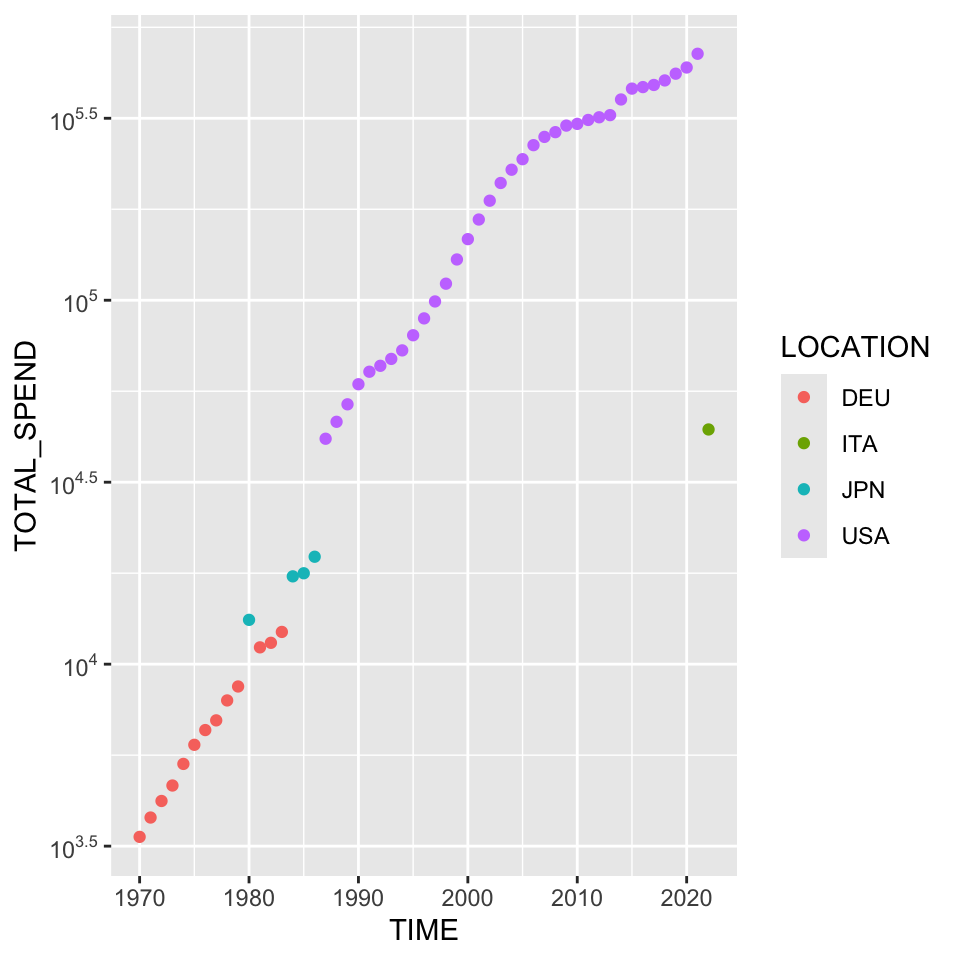
I wouldn’t make too much of the most recent, surprisingly low, year being Italy. Without looking at this too closely, it would be very reasonable to hypothesize that result is based on incomplete data. This was visible in some of our “bad graphs” from newspapers and other published sources. It’s reasonable to believe that there might be a specific way to do this without pre-calculating the maximum yearly expenses and identifying the corresponding country separately. Additionally, using a legend instead of the commented out geom_text() winds up looking quite a bit nicer.
The mouse data
Just to revisit the ideas from the iNaturalist data using a smaller dataset, we will revisit the “mouse” data. Using the optional argument check_overlap = TRUE will suppress one of any labels that are too close together to print without overlap. Using additional arguments as used in Figure 4 will result in “nicer” tick mark labels. In fact, this is pretty bad because the rightmost label reads as 1e+0 which has been truncated from 1e+04.
dat <- read.delim("./data/mouse.csv", header = TRUE, sep = ',')
ggplot(dat, aes(Mass, MetabolicRate, label = Animal)) + geom_point() + scale_x_log10(limits = c(0.01, 50000)) + scale_y_log10() + geom_text(hjust = 0, check_overlap = FALSE, nudge_x = 0.1)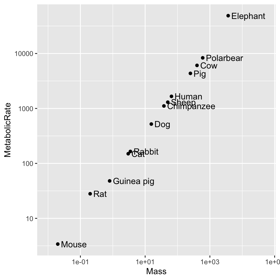
Conclusion
If you have made it this far, be sure to let me know if you’ve encountered errors replicating this or have other questions or comments.