layout(matrix(c(1, 1, 2, 1, 1, 2, 3, 3, 4), nrow = 3, ncol = 3, byrow = TRUE))
par(mar = c(4.1, 5.1, 0.8, 0.8))
plot(1:25, pch = 1:25, col = hcl.colors(25))
plot(runif(100, 0, 1))
plot(sin, xlim = c(0, 2*pi))
plot(cos, xlim = c(0, 2*pi))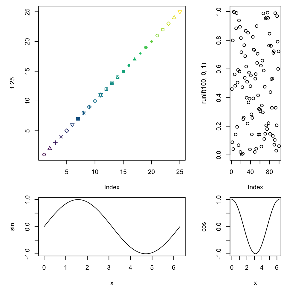
Before you run this, be sure you have a directory called “csvs/” in this folder. If you using this downloaded copy, you will. But, in future tasks to repeat the final step you would need to ensure that the folder exists. This is used to create the filenames (and paths) for the output .csv files.
Using the layout() command, we can create nice layouts. With ggplot2 you can use the package gridExtra for comparable options.
layout(matrix(c(1, 1, 2, 1, 1, 2, 3, 3, 4), nrow = 3, ncol = 3, byrow = TRUE))
par(mar = c(4.1, 5.1, 0.8, 0.8))
plot(1:25, pch = 1:25, col = hcl.colors(25))
plot(runif(100, 0, 1))
plot(sin, xlim = c(0, 2*pi))
plot(cos, xlim = c(0, 2*pi))Now we will read in the Olympics data.
dat <- read.csv("./data/athletes.csv")
head(dat)
id name nationality sex date_of_birth height weight
1 736041664 A Jesus Garcia ESP male 1969-10-17 1.72 64
2 532037425 A Lam Shin KOR female 1986-09-23 1.68 56
3 435962603 Aaron Brown CAN male 1992-05-27 1.98 79
4 521041435 Aaron Cook MDA male 1991-01-02 1.83 80
5 33922579 Aaron Gate NZL male 1990-11-26 1.81 71
6 173071782 Aaron Royle AUS male 1990-01-26 1.80 67
sport gold silver bronze info
1 athletics 0 0 0
2 fencing 0 0 0
3 athletics 0 0 1
4 taekwondo 0 0 0
5 cycling 0 0 0
6 triathlon 0 0 0 To calculate ages, we can append columns of the start date of the 2016 Rio Olympics and the participant’s julian birthday. From those we can calculate the age in days as their difference. Dividing that by 3651, we can approximate each participant’s age in years. You can probably do this a little more carefully with the lubridate package, since our current approach overlooks the existence of leap years.
dat$start <- julian(as.Date("2016-08-05", "%Y-%m-%d"))
head(dat$start)
[1] 17018 17018 17018 17018 17018 17018dat$bday <- julian(as.Date(dat$date_of_birth, "%Y-%m-%d"))
head(dat$bday)[1] -76 6109 8182 7671 7634 7330dat$age <- dat$start - dat$bday
dat$age <- dat$age/365
head(dat$age)[1] 46.83288 29.88767 24.20822 25.60822 25.70959 26.54247Just to check, it is nice to explore visualizations of the distribution of calculated ages. If nothing else this gives us to chance to rule out unreasonable values. For example, say we wrote but didn’t execute the line above dividing the age in days by 365.
par(mfrow = c(2, 1), mar = c(4.1, 5.1, 0.8, 0.1))
hist(dat$age, las = 1)
boxplot(dat$age, horizontal = T, las = 1)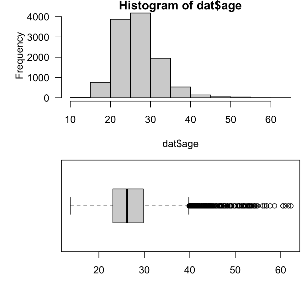
Now we can calculate, as an example of a reasonable task, the Olympians over 50 years old at the start of the games. After making that data subset (which could have been done with something like dat2 <- subset(dat, subset = age > 50)). After that we expore the corresponding nationalities and sports to make a table of their frequencies of co-occurring.
dat2 <- dat[dat$age > 50, ]
dim(dat2)
[1] 48 15head(dat2[ , c("nationality", "sport")]) nationality sport
33 MAR equestrian
56 IOA shooting
1377 ESP equestrian
2056 PLE equestrian
2232 CAN shooting
2381 COL shootingdat3 <- as.data.frame(table(dat2[ , c("nationality", "sport")]))
head(dat3) nationality sport Freq
1 ANG equestrian 0
2 ARG equestrian 0
3 AUS equestrian 4
4 BEL equestrian 1
5 BRA equestrian 0
6 CAN equestrian 0dat3 <- dat3[dat3$Freq > 0, ]After keeping only the combinations of sports and nationalities that occur, we quickly write each to a text file. There are a number of circumstances under which this exact task, or something quite structurally-similar, would be useful. These particular output files are not very interesting, but this serves still as a good example of “dynamic filenames”. You could use the same “paste a variable value” technique for labeling graphs.
dat3 <- dat3[order(dat3$Freq, decreasing = TRUE), ]
nms <- levels(dat3$nationality)
nms
[1] "ANG" "ARG" "AUS" "BEL" "BRA" "CAN" "COL" "ESP" "FIJ" "FRA" "GBR" "GER"
[13] "IOA" "LUX" "MAR" "NZL" "PAN" "PAR" "PER" "PLE" "POR" "RUS" "SUI" "SWE"
[25] "USA" "VEN"for(n in nms) write.csv(dat3[dat3$nationality == n, ], paste("./csvs/", n, ".csv", sep = ""), row.names = FALSE)overlooking leap years↩︎