Data Visualization and Exploration
what we are doing, and why: alt text
Motivation
The goal of a data visualization is to communicate.
Who are we communicating with?
In the US alone,
- \(\approx 7M\) have vision impairment
- 1M with blindness
- 4.2M aged 40 or older have uncorrectable vision impairment
- \(\approx 6.8\%\) of children have a diagnosed eye and vision condition
We want our “content” to reach an impact a wide audience.
What to do about it?
Consult the experts, ideally including direct representation of blind and visually-impaired collaborators.
Today I will highlight some “rules” aggregated from experts in these areas.
At minimum we should strive to
- minimize use of color,
- maximize contrast, and
- avoid problematic color combinations.
There certainly no true “rules” - there is much agreement about many things, but certainly not all.
A case study
What do you notice?
- How does this impact you?
- How could this impact others?
- How might this imfluence how you work?
“Do No Harm”, do more
The Urban Institute’s “Do No Harm” guide on visual accessibility is a commonly-cited resource.
Even excellent books on Data Visualization often overlook many of the issues discussed within accessibility, aside from color perception.
See W3 to learn a little more about the need for alt text across the internet.
You probably can’t write text that conveys the entire meaning of a chart. But, that doesn’t mean that you shouldn’t try. - Amy Cesal
Considerations
Image type influences what happens next
- decorative
- functional - interactive buttons (e.g., a “printer” icon)
- informative - pictures or illustrations
- text - e.g., text as handwriting or stylized font
- complex - graphs and diagrams, including familiar maps
- groups - surprisingly “star ratings”
- “maps” - e.g., clickable organizational diagrams
Complex images
Complex images such as graphs and diagrams: To convey data or detailed information, provide a complete text equivalent of the data or information provided in the image as the text alternative.
- graphs and charts
- essential diagrams and illustrations
- maps (e.g., location or weather)
These are largely what are relevant to us.
Needs for alt text
Graphs, charts, and maps are often essential to communication and to the understanding of surrounding text.
These require alt text.
- short text description (i.e., “alt text”)
- long description - the essential information that sometimes exceeds conventional or recommended length “limitations” of alt text
[alt text allows] the content and function of the image to be accessible to those with visual or certain cognitive disabilities (from WebAIM)
alt text is not a caption
An image or figure caption is visible on a webpage.
Image or figure alt text is only visible through a screen reader or other tool (html source code inspector).
Generally alt text should not be a duplicate of a figure caption.
Alt text also helps low-bandwidth users, providing a description of an image that fails to download.
Implementation
The quarto platform makes it very easy (mechanically) to add alt text with the alt-text: code block.
Embedded images (non-coded) can be easily provided alt text copied from a caption (not necessarily recommended) or included with additional options.
Either of
\, or![caption(file.png)]{#fig-file fig-alt="A description of the contents of _file.png_."}
will work.
Approaches to writing alt text
This is a complicated and evolving topic.
- Context matters (what details are relevant to the text).
- Choice of browser matters (how the text will be read).
Since context matters, you should generally not use AI to generate alt text or image descriptions.
Occasionally sources for “best practices” go out of date as technology or preference evolves.
How this (also) makes us better
Knowing that you should describe any graph you make should make you more conscious of how you make it.
How you use
- color, style,
- arrangement, and
- annotation.
Research findings
In a literature review, Canelón and Hare (2021) found that
- only 3% of data visualizations surveyed contained alt text, and
- of those only 34% described the relationship between variables.
This work motivated the recommendations that follow.
The “Four-Ingredients Model”
Based on the research just mentioned, we should aim to answer the following with alt text,
- What kind of graph is it?
- What variables are on the axes?
- What are the ranges of the variables?
- What does the appearance tell you about he relationships between variables?
What kind of graph is it?
By introducing one of many “common” graph types, you tell the reader what to expect. For example, “Line graph showing …”
Less common, more modern graph types (e.g., a Sankey diagra) might need more detailed explanation - yet, there are no current standards.
What variables are on the axes?
Describe the variable names present in the graph.
Use the varible names to make descriptions, not colors of the associated symbols, curves, or regions.
By thinking “income” rather than “red line”, we reduce the number of concepts stored (in human working memory).
What are the ranges of the variables?
Describe the range to provide and overview of the data, this gives an understanding of the scale of measurements.
Understanding axes limits adds important detail to users that create a mental model of the visualization.
What does the appearance tell you about he relationships between variables?
Answer the questions “Why am I including this visualization…?” and “What are these data saying?”.
Describe relevant quantities including the “shape” of a line
Describe key values like minima or maxima.
Describe a relevant slope.
Sample alt text
This graph contains a blue line showing monthly unemployment rates in the US and gray vertical bars showing recessions. The source of the data is the Bureau of Labor Statistics and the National Bureau of Economic Research.
If you right-click on the image and click “Inspect”, you should find the alt="..." attribute of the <img .../> tag.
Sample alt text (II)
The x-axis shows the month and year from January 1950 to June 2022. The y-axis shows the unemployment rate with a range of 0 to 16 percent. The bars extend along the entire vertical area and correspond to the 11 recessions since 1950. The unemployment rose from 4.4 percent in March 2020 to 14.7 percent in April 2020, a 10.3 percentage point change. The second-highest change was a 1.3 percentage-point change between September and October 1949.
Sample alt text (III)
The unemployment rate line typically slopes upward during recessions, though not always, and it starts to move upward before recessions begin. The longest gap between recessions was from July 2009 to January 2020, a total of 120 months.
Sample alt text (IV)
The largest month-over-month increase in the unemployment rate during this period occurred during the most recent recession in spring 2020, resulting from the COVID-19 pandemic.
Formulaic alt text (Cesal (2020))
A recent and popular recommendation is relatively straightforward.
fig-alt: "[chart type] of [data type] where [reason for the graph]."
[chart type] answers question #1 above[data type] answers question #2 above[reason for the graph] answers question #4 above- Include a link to data source in the main text, since links in alt text are not clickable.
Additional guidance (Jung et. al (2021))
From a 22-participant survey, researchers found general preferences for
- a length of 2-8 sentences,
- use of plain language over technical terms,
- objectivity (“only …” weakened the sense of objectivity)
Description of aesthetic mapping (color, shape) in alt text is optional, but may “enrich the mental picture” for some users.
Reality
This is a tough, but important, task. It’s sadly new for many of us.
In a somewhat scammy sense, alt text can improve search engine optimization (SEO), but the goal should be helping people first.
- It is accepted that any attempt at alt text is better than nothing.
- Alt text was limited to 125 characters, which is not much space. The lingering ghost of this seems to encourage brevity.
- Raw data should be made available with a link, or summaries provided as supplemental tables.
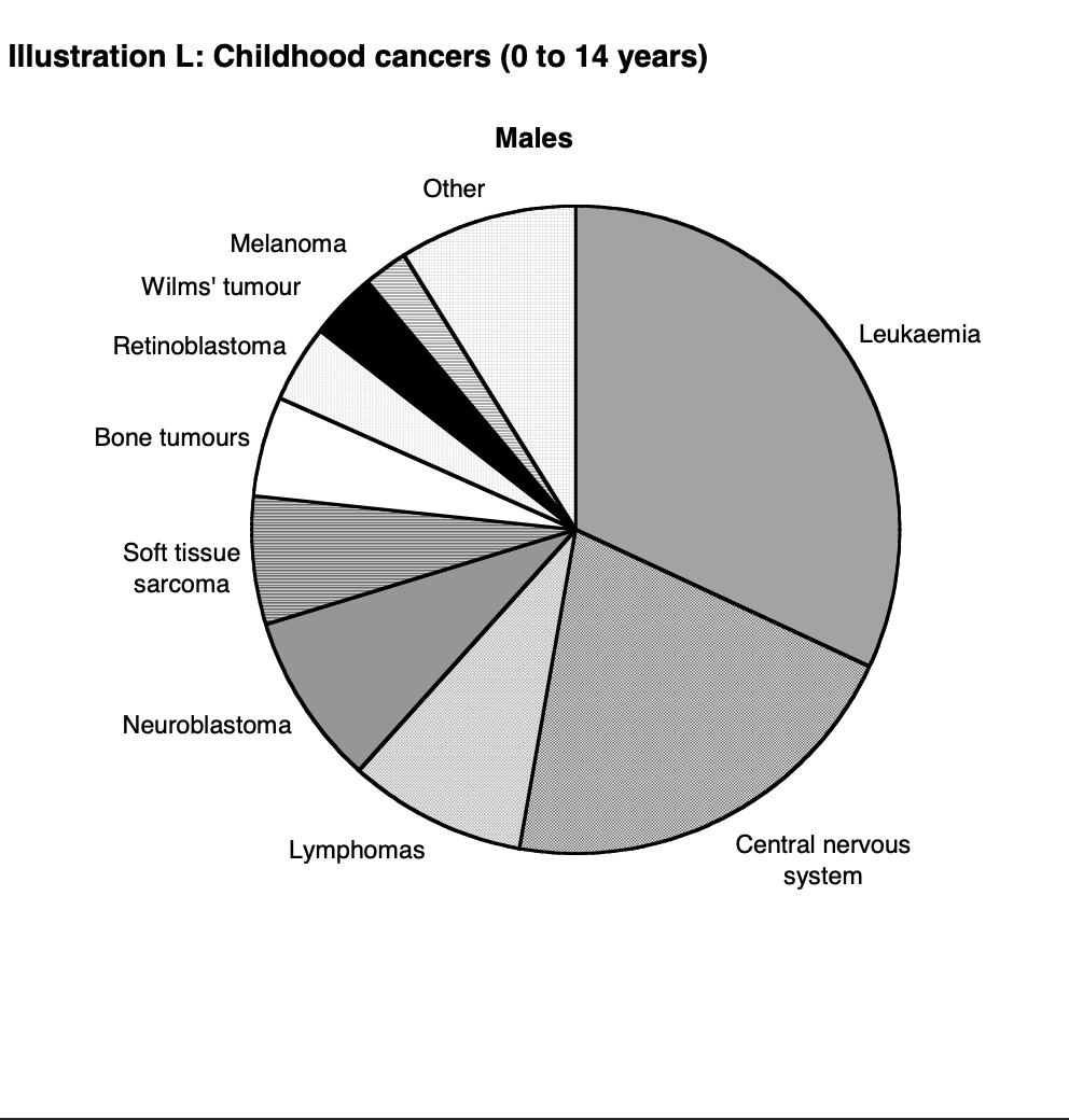
Childhood cancers
Write (or discuss) alt text for the included image.
Sample code
The previous slide was made with the code below
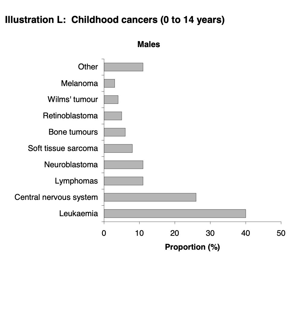{#fig-cancer-bar .lightbox width="40%" fig-alt="A horizontal bar graph showing the top ten types (top nine with all others combined) of cancers in males children. Approximate values are leukemia at 40%, central nervous system at 25%, with lymphomas and neuroblastomas at 10% each. Depending on the goals the other types could be listed."}
This could probably be replaced by a table. In decreasing order, a table would be perhaps as effective.
Advice
As you make a graph, think about what you are doing, how, and why.
Writing that down gives you a pretty good draft of alt text.
Beyond its use to others, it is probably worth writing for yourself as you go.
Consider installing the WAVE browser extension (from webAIM) to assess accessability.1
](./figures/img-dnh-recession.png)