We will look at a small dataset that shows student exam grades on the original exam and a retake for different in-semester exams over a few semesters. This data was provided by a friend trying to better understand student performance and strategies taking exams. Originally the grades were reported as decimals, but have been converted to letters by a fairly standard calculation.
dat <-read.delim("./../data/grade.csv", header =TRUE, sep =',')head(dat)
  student_code exam_no semester first_letter retake_letter
1   student_21  Exam I      S22            F             F
2   student_30  Exam I      S22            F             D
3   student_35  Exam I      S22            F             F
4   student_50  Exam I      S22            F             D
5   student_53  Exam I      S22            F             A
6   student_63  Exam I      S22            F             B
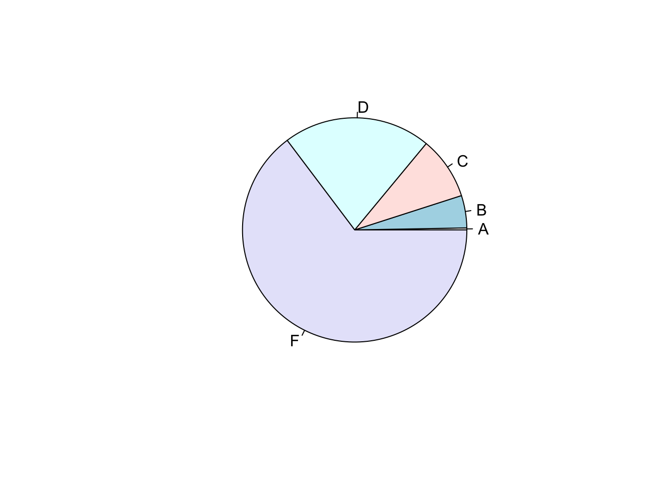
Though pie charts are generally not recommended because of issues of perception that might limit our ability to detect differences in similarly-sized wedges, or wedges oriented ad different angles. Moreover, many pie charts have too many wedges, often with illegible annotations, and unhelpful color schemes. In Figure 1, we present a simple pie chart for student letter grades on an in-class exam.
tab <-table(dat$first_letter)pie(tab)
Figure 1: Tabulating the frequencies of each letter grade (across all exams and semesters), we see the distribution suggests high rates of failure.
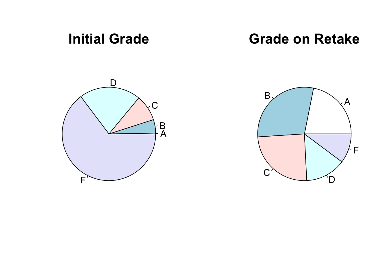
Despite wanting to distance ourselves from pie charts (for the reasons stated above: angles and wedge sizes are difficult to assess, color is often unhelpful, labels are often illegible), we do create a “double” pie chart in Figure 2 – mostly as an opportunity to show the other plotting commands (e.g.,layout() and mtext() that are useful for control and annotation).
layout(matrix(c(1,2), nrow =1))pie(table(dat$first_letter))mtext("Initial Grade", side =3, font =2, cex =1.5)pie(table(dat$retake_letter))mtext("Grade on Retake", side =3, font =2, cex =1.5)
Figure 2: Side-by-side pie charts showing the distribution of student exam grades on the initial exam and retake.
Now as bars
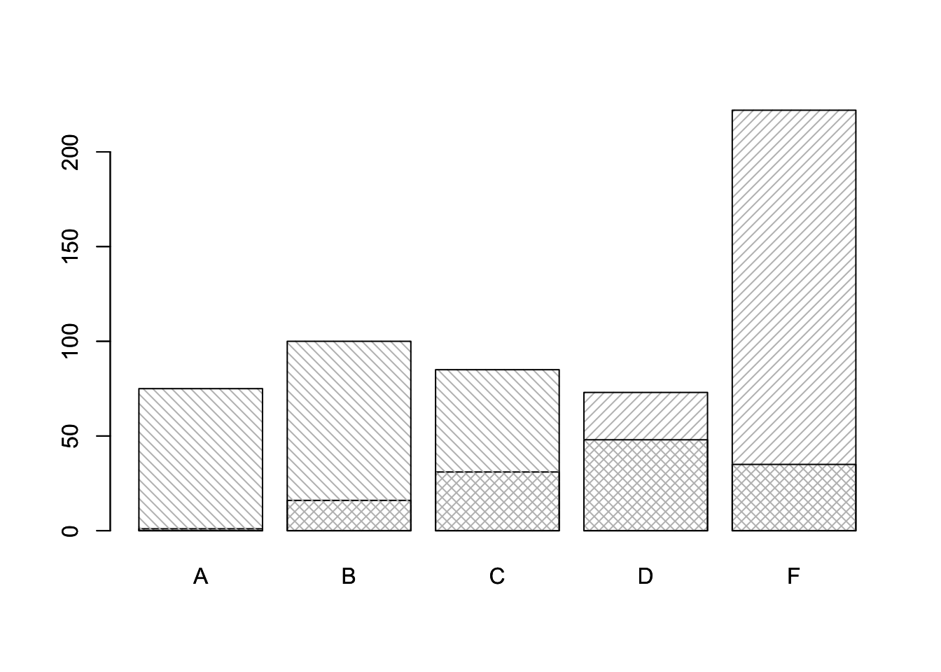
A reasonable option is to represent numbers as bar heights, as in Figure 3, rather than pie wedges, as in Figure 2. The challenge here is really how unclear it can be to
table(dat$first_letter)
  A   B   C   D   F
  1  16  31  73 222
barplot(table(dat$first_letter), density =20)barplot(table(dat$retake_letter), add =TRUE, density =20, angle =-45)
Figure 3: Overlaid bar plots with hatching used to show the exam phase - positive angle for the initial and negative angle for the initial.
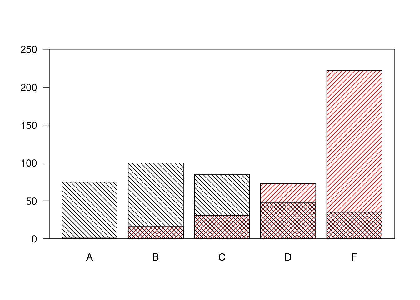
We can do some customization to help with aestheics and interporetation. These changes are shown in Figure 4, where color plays a role.
table(dat$first_letter)
  A   B   C   D   F
  1  16  31  73 222
barplot(table(dat$first_letter), density =20, las =1, col ="red", ylim =c(0, 250))barplot(table(dat$retake_letter), add =TRUE, density =20, angle =-45, col ="black", axes =FALSE)box()
Figure 4: Side-by-side pie charts showing the distribution of student exam grades on the initial exam and retake.
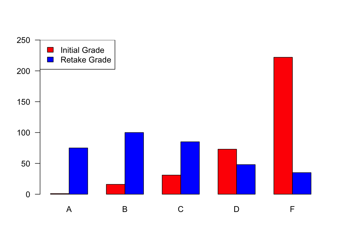
The superimposed barplots are a bit concerning: they could be superimposed or “stacked” and unless we know more or are told explicitly, there is too much left to our own interpretation. With slight manipulation of data, we can create a table that can be fed to barplot() using the beside = TRUE option. The side-by-side bars in Figure 5 help us avoid the problems of interpretation of “stacked” bars. Color is used a bit excessively here – we could use black and gray, black and white, grayscale and one color. Notice how the legend uses fill to specify the color fill of the bars, we could accomplish the same with something like pch = 15, col = ..., but we might as well use fill.
## head(dat)tab <-rbind(table(dat$first_letter), table(dat$retake_letter))row.names(tab) <-c("first", "retake")## tabbarplot(tab, ylim =c(0, 250), beside =TRUE, col =c("red", "blue"), las =1)legend("topleft", c("Initial Grade", "Retake Grade"), fill =c("red", "blue"))
Figure 5: Side-by-side bar charts showing the distribution of student exam grades on the initial exam and retake.
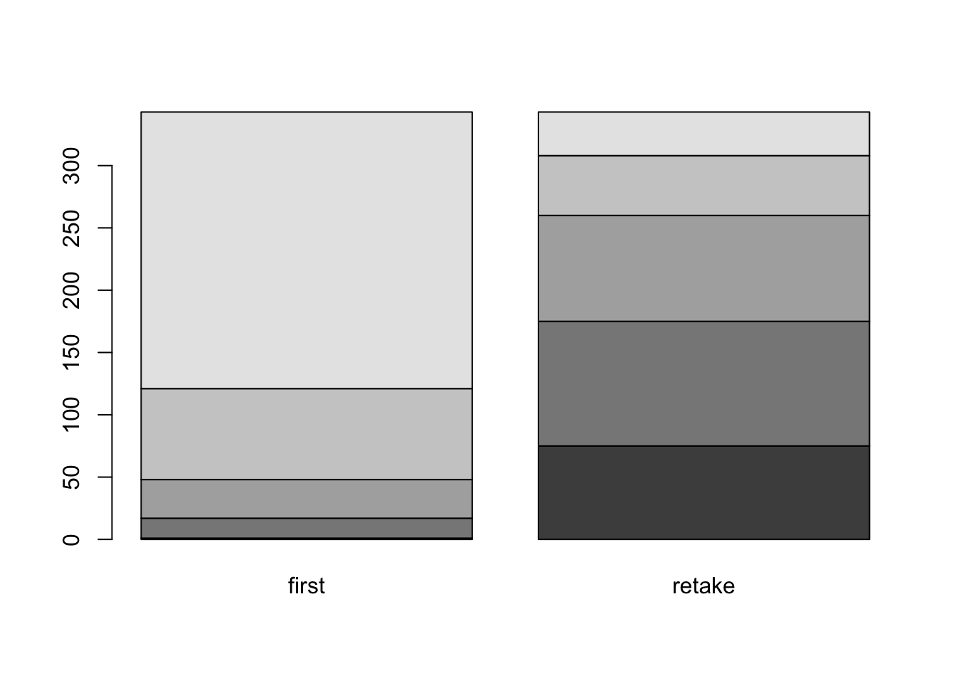
The graph above is perfectly acceptable, but notice: on one hand, it seems very familiar as an “academic” graph, on the other hand, it seems very different from the “data journalism” graphs we have studied. Notice that Figure 5 shows exam scores paired by grade. In Figure 6, we show the distribution of grades for each exam. To be honest this is not entirely useful - among other problems, it is difficult to assess the sizes of any of the bar parts that do not start at the bottom or top. It’s honestly not that easy to even assess the shades or sizes of the intermediate bars.
barplot(t(tab))
Figure 6: Earned grade frequencies within each exam setting.
Experiment with data
Try making bar plots of tabulated data using tab <- table(dat[, c("first_letter", "retake_letter")]). The referenced command creates a very different data object, which is potentially informative, but potentially confusing. Make barplots of tab and t(tab) to explore. Does either graph “make sense”? Are the frequencies in the data (from table(dat$initial_letter), for example) clearly reflected in either graph? Which is easiest to explain?
Experiment with graph formats
There could be a built-in function, somewhere, to do exactly what you want. Or, maybe your idea is so original that it’s worth building for yourself. What sort of visualization best shows the change in grade distribution between testing settings? There are a variety of possibilities, some perhaps more helpful than others.
Experiment with time
We ignored potentially interesting effects of time, both in terms of semester and test within semester. Depending on the goals that creates some rather interesting statistical opportunities. Analyses aside, how might considering those additional variables influence your visualizations.
Minard’s map, revisited, remixed
We sketched a version of this, which turned out to be not too difficult to produce with specialty packages.
Figure 7: A Sankey diagram showing the change in student grades from the initial exam (left) to the exam retake (right). The order may seem a bit puzzling. I suspect the algorithm is attempting to minimize overlap. The non-print version of this page should be interactive – I suspect you can drag and move the C grade and will notice how cluttered and unbalanced the graph suddenly feels.
Fake data generation
Sometimes it is nice to create ‘fake data’. Suppose above I knew I was going to be giving retakes to students taking tests. I wanted to decide if it was worth it. So, maybe I create a fake data set to simulate the process of giving tests. Maybe I assign the initial letter grade based on a “bell curve” (probably not a good assumption for this data)? Maybe I have an idea of how grades will change upon retest, so depending on the initial grade I devise a scheme for what I think, or hope, will happen. Maybe that’s actually easier to do with numbers than letters and I convert (just like I did) the letters to numbers. Taking a few steps back, what in the world would the pie chart look like if I used the collection of numerical scores rather than converted letter grades? Would there even be a reason to consider a pie chart?
We have already paid attention to how bar graphs should start at zero based on the ways we perceive the mapping of data values to two-dimensional area. Now we have to look at interpretation of length. This is trickier than we all like to admit and graphs, even those made for wide audiences, can be very confusing and require careful analysis to interpret. This could be where an example-driven title could steer interpretation, or a good example in supporting text.