if(!"ggplot2" %in% rownames(installed.packages())){install.package("ggplot2")}
library(ggplot2)Introduction to ggplot
0303notes
Disclaimer
These are potentially incomplete, feel free to ask questions, make requests, or offer suggestions for content or otherwise.
ggplot
Now we move on to ggplot21. The first line will test whether or not ggplot2 has been installed. If it is not in the list of installed package names, ! negates the result of the text and we can install the package. If it is installed, ! negates that (to FALSE) and skips the installation. Then the package can be loaded. This is one of my favorite R “tricks” and is really useful for ensuring relatively smooth operation when sharing files between computers or users. Sometimes installing the package will prompt some intervention (e.g., setting a repository, verifying dependencies). Other times installing a package will fail, but this one is pretty popular and less likely than others to break betweek upgrades or updates. So it is nice to avoid needless installation of packages6[Also, AI is know to hallucinate package names. These packages have been exploited by hackers. It is a good idea to go to a trusted source or an otherwise well-known developer to download packages.].
We will read in a very small data set that contains Mass and MetabolicRate for different types of Animal. This data is often used to generate the “Mouse-Elephant Curve”, used to illustrate Kleiber’s Law (metabolic scaling with body mass). I believe that I digitized this data from a reproduced source using an obsolete Mac app called GraphClick or more recently using the R package digitize. Similar data sets are available online and recent reproductions include many other animal groups.
In class we discussed how these data play the role of the “derived” data, you could imagine other columns in the data set which are irrelevant to the current visualization.
dat <- read.delim("mouse.csv", header = TRUE, sep = ",")
head(dat)
Animal Mass MetabolicRate
1 Mouse 0.02 3.4
2 Rat 0.20 28.0
3 Guinea pig 0.80 48.0
4 Cat 3.00 150.0
5 Rabbit 3.50 165.0
6 Dog 15.50 520.0ggplot(dat) + geom_point() + aes(x = Mass, y = MetabolicRate)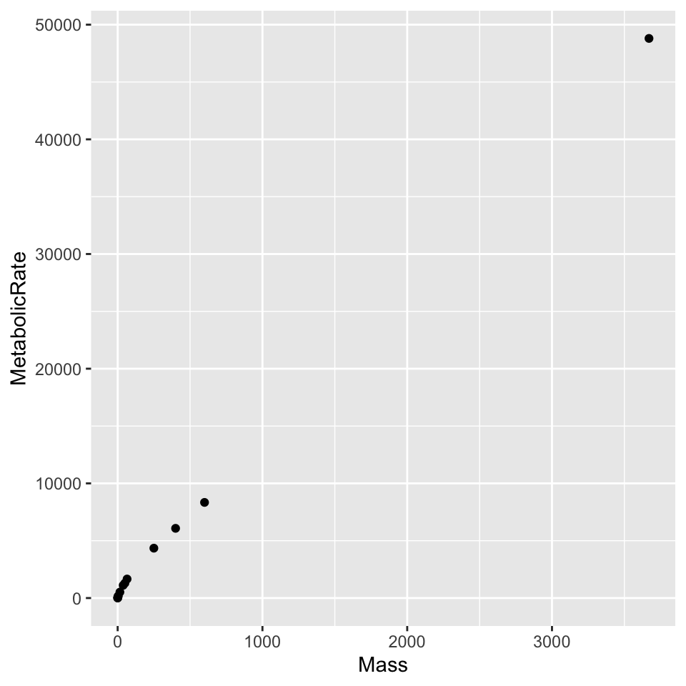
Aesthetic options include choice of shape or size (for points), color, or line type (for lines). These can be used to redundantly encode a variable in use or to illustrate the role of a third variable. Not all combinations make sense, which is worth exploring with the commented lines as motivation. Not all combinations of option and variable even at all, while some are simply unhelpful or distracting.
# ggplot(dat) + geom_point() + aes(x = Mass, y = MetabolicRate, shape = Animal)
# ggplot(dat) + geom_point() + aes(x = Mass, y = MetabolicRate, color = Animal)
# ggplot(dat) + geom_point() + aes(x = Mass, y = MetabolicRate, size = Animal)
ggplot(dat) + geom_point() + aes(x = Mass, y = MetabolicRate, size = Mass)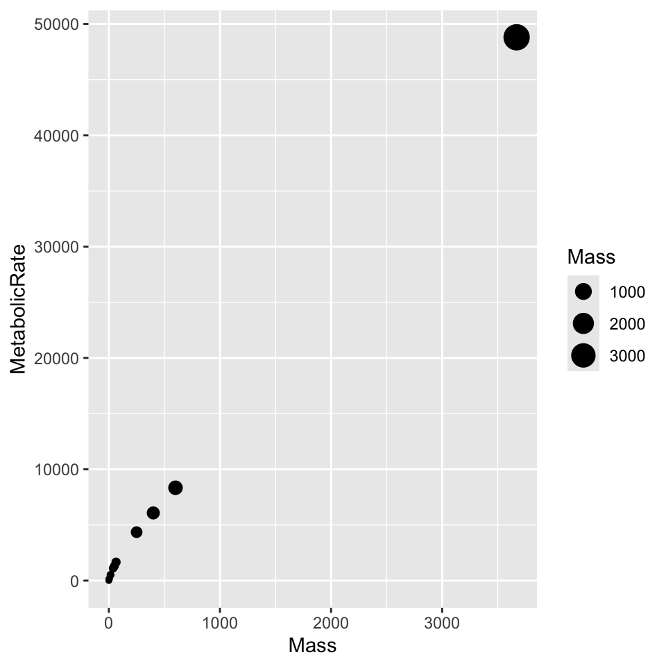
In reality we would fit a curve to these points and illustrate the fitted trend, but in some cases there could be value in connecting the points. The line segments are not especially helpful here, as they will be later in Figure 5, or any of its modifications.
ggplot(dat) + geom_line() + geom_point() + aes(x = Mass, y = MetabolicRate)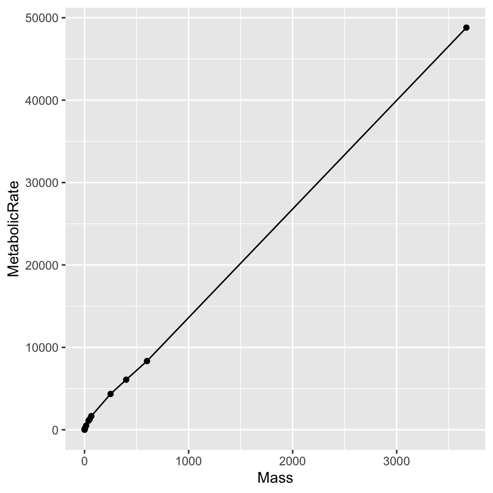
Just like we could follow plot(..., type = 'l', ...) with points(...) in base R, we can layer multiple geometries in ggplot.
ggplot(dat) + aes(x = Mass, y = MetabolicRate, label = Animal) + geom_line() + geom_point() + scale_x_log10() + scale_y_log10()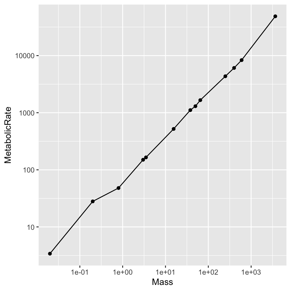
On the log-log scale, with the points nicely spaced, it would be reasonable to use geom_text() to add labels for each point using Animal. It would work a little better with the ggrepel package, but I am not installing or loading a package for that right now.
Milestones of adulthood
Now we will revisit the “milestones of adulthood” data from the early semester.
dat2 <- read.delim("milestone.csv", header = TRUE, sep = ',')
head(dat2)
milestone year percent
1 independent 1983 83
2 independent 1993 77
3 independent 2003 77
4 independent 2013 73
5 independent 2023 64
6 married 1983 78Making note of color-vision friendliness, Figure 5 exhibits fairly low contrast against a default gray background. Values range from about 2.63:1 down to 1.89:1, both of which are substandard. Using black in the remaining examples, contrast ratio between line and background improves to 17.5:1. Figure legends in the rendered document are not only relatively small font, but also low contrast; they should be made larger and darker.
ggplot(dat2) + geom_line(aes(x = year, y = percent, color = milestone, linetype = milestone))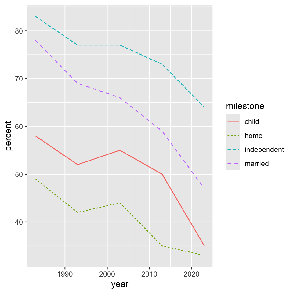
The geometry specifications geom_line(), geom_path(), and geom_step() all work slightly differently. Try each in the code used to make Figure 5 with and without specifying color and linetype. This experiment should teach you a lot about how each command is designed. Adding a layer geom_point() might help with the interpretation.
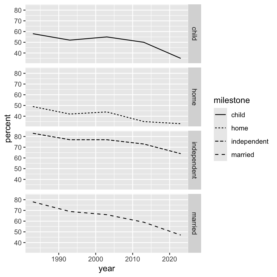
Since color is seemingly problematic from the contrast ratio perspective, we can trade out colored lines for a different plot arrangement. Faceting creates the plot in the style of “small multiples” – each subplot is labeled, eliminating the need for color and for a legend. The legend is shown but will be suppressed by using theme(legend.position="none") in Figure 8.
ggplot(dat2) + geom_line(aes(x = year, y = percent, color = milestone, linetype = milestone))
ggplot(dat2) +
  geom_line(aes(x = year, y = percent, linetype = milestone)) +
  facet_grid(vars(milestone))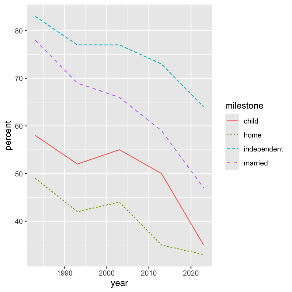
ggplot(dat2) +
  geom_line(aes(x = year, y = percent, linetype = milestone)) +
  facet_wrap(~milestone) +
  theme(legend.position="none")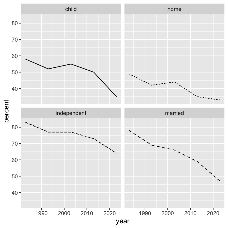
Using labs() we can overwrite the automatic axes labels, compensating for sloppy, casual, or abbreviated variable names. It is often nice to work with lowercase or abbreviated variables names. Somewhat interestingly, here the default labels don’t have to be suppressed. In base R, default labels have to be suppressed to make room for mtext()
ggplot(dat2) +
  geom_line(aes(x = year, y = percent, linetype = milestone)) +
  facet_wrap(~milestone) +
  theme(legend.position="none") +
  labs(x = "Year", y = "Percent", title = "Survey respondents achieving metrics of adulthood", subtitle = "... from a survey of... 'cite' source")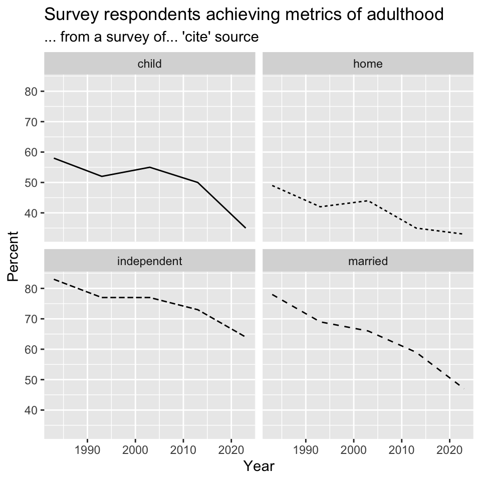
In Figure 10, make note of aes() placement and its impacts on the scope of what information from the data is available. Including mapping = aes(...) inside geom_line() restricts the scope of milestone to just that one geometry layer, specifically the label box (which we may or may not want to begin with) is drawn solid. If aes() is specified elsewhere (within ggplot() or on its own), that information is available to influence the linetype in geom_label(). Adding label = ... to the initial specification of aes(), either within ggplot() or on its own, allows us to use geom_label() with no additional arguments. This is probably a good thing since it avoids possible conflicts in the other specifications. Interestingly we didn’t know we were making labels when we began, so there would have been no reason to assume that label was an aes() argument, or at least a relevant one. Eventually you get familiar with enough configurations or borrow templates from your own past examples.
ggplot(dat2, mapping = aes(x = year, y = percent, linetype = milestone, label = percent)) +
  geom_line() +
  geom_label() +
  facet_wrap(~milestone) +
  theme(legend.position = "none") +
  labs(x = "Year", y = "Percent", title = "Survey respondents achieving metrics of adulthood", subtitle = "... from a survey of... 'cite' source")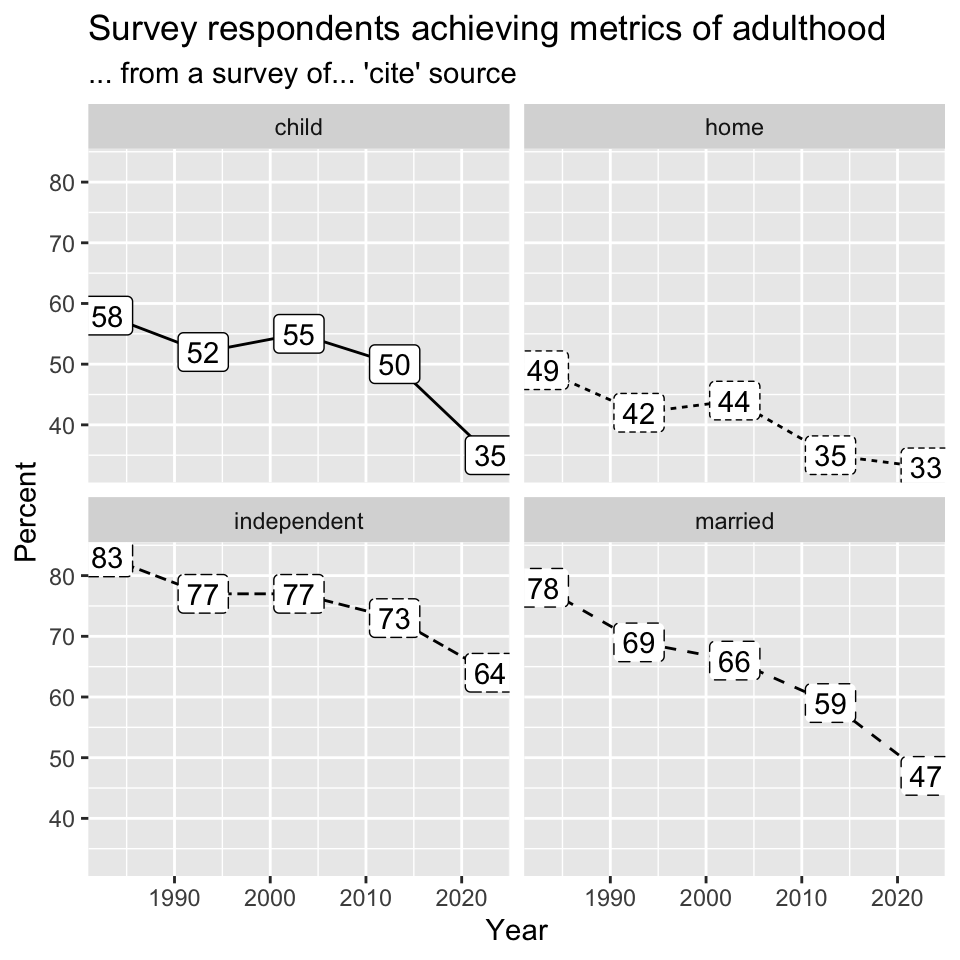
Boxplots
Concluding a quick tour of ggplot and a review of mostly familiar data, with our preattentive pop-out data we can create box plots. Situations like this are familiar, collections of numerical values within or across one or more categories or even combinations of categories. The point being, I hope you are not too bored with this data2. I think it is representative of common structure in many data sets, again thinging of it as the “derived” data set. First, we will read in the data.
dat3 <- read.delim("cards2.csv", header = TRUE, sep = ",")
head(dat3)
ID Card Time1 Time2
1 1990 A NA NA
2 1990 B NA NA
3 1990 C 3.26 NA
4 1990 D 3.25 NA
5 1990 E NA NA
6 KL05 A 1.28 0.71In Figure 11, we will create box plots to illustrate the variability within and between Card types, somewhat unnecessarily colored by Card type.
ggplot(dat3, mapping = aes(x = Card, y = Time1, color = Card)) +
  geom_boxplot() +
  geom_jitter(width = 0.25, alpha = 0.25) +
  theme(legend.position="none")
Warning: Removed 3 rows containing non-finite outside the scale range
(`stat_boxplot()`).Warning: Removed 3 rows containing missing values or values outside the scale range
(`geom_point()`).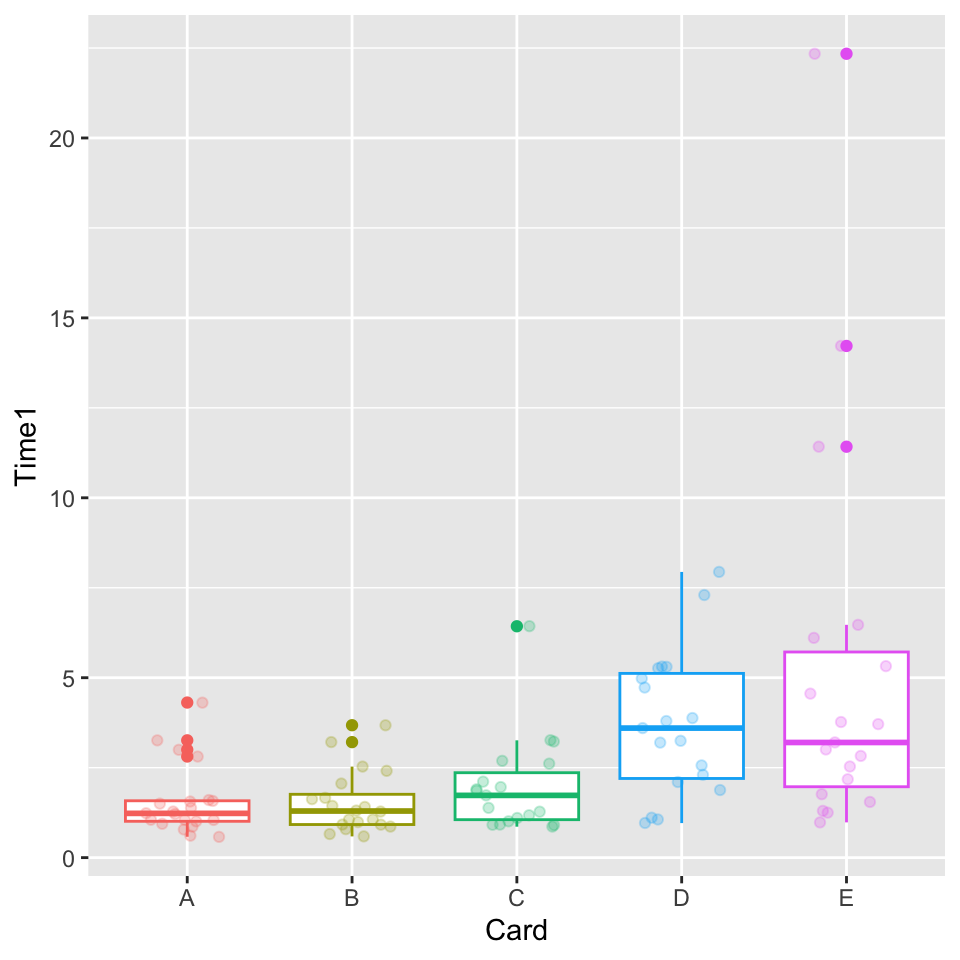
A natural followup to this is geom_violin(), these show rotated and mirrored density plots. These are recommended against by a variety of experts for a variety of compelling reasons. They show the same information twice and in a way that is less clear than a simpler plot type (a density). They are also known to make many readers uncomfortable due to sporadic resemblance to human anatomical features. It is a good idea to not alienate many members of your potential audience, given that visualization and communication are each as difficult as they are already.