Below we will make use of the command as.numeric() to force one pesky column that should be numbers to be interpreted as numbers. We have used this data before, but will briefly review and recreate some of that work, and then extend it. We’ll read the data, filter out a few problematic entries, and ensure the variable types are best.
dat <-read.delim("./../data/cards.csv", header =TRUE, sep =',')summary(dat)
      X                 Card              Time1               Time2
 Length:119         Length:119         Length:119         Min.   :0.440
 Class :character   Class :character   Class :character   1st Qu.:0.980
 Mode  :character   Mode  :character   Mode  :character   Median :1.360
                                                          Mean   :1.718
                                                          3rd Qu.:2.310
                                                          Max.   :7.650
                                                          NA's   :30
table(dat$Card)
    A  B  C  D  E
 8 23 23 22 21 22
dat <- dat[dat$Card %in%c("A", "B", "C", "D", "E"), ]table(dat$Card)
      X             Card      Time1               Time2
 Length:111         A:23   Length:111         Min.   :0.440
 Class :character   B:23   Class :character   1st Qu.:0.980
 Mode  :character   C:22   Mode  :character   Median :1.360
                    D:21                      Mean   :1.718
                    E:22                      3rd Qu.:2.310
                                              Max.   :7.650
                                              NA's   :22
dat$Time1 <-as.numeric(dat$Time1)
Warning: NAs introduced by coercion
head(dat)
     X Card Time1 Time2
1 1990    A    NA    NA
2 1990    B    NA    NA
3 1990    C  3.26    NA
4 1990    D  3.25    NA
5 1990    E    NA    NA
6 KL05    A  1.28  0.71
Making plots
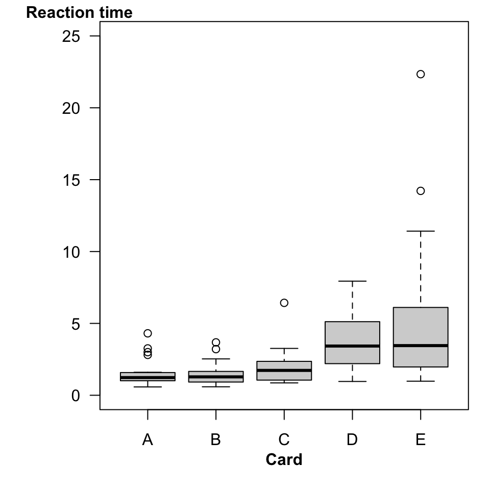
We will get started, as we have before, with a simple boxplot shown in Figure 1.
par(mar =c(4.1, 5.1, 1.1, 1.1))boxplot(Time1 ~ Card, dat, ylim =c(0, 25), las =1, xlab ="", ylab ="")mtext("Reaction time", side =3, at =0, font =2)mtext("Card", side =1, line =2, font =2)
Figure 1: A boxplot showing the variability in reaction times by card type.
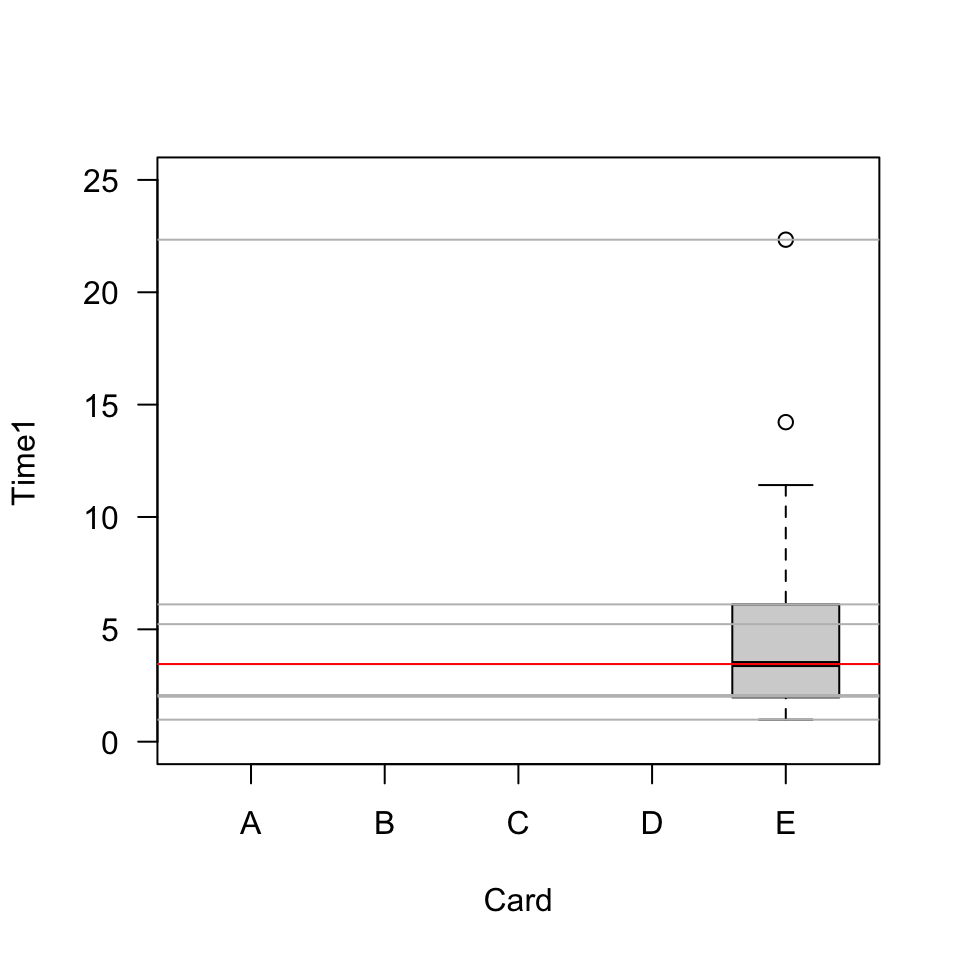
There is often confusion about the annotation of boxplots – “is the line the mean or the median?” The solid line in the box represents the median value for that group of measurements. People often want the annotation to represent the mean, or talk about it as if they do. I suspect this is because most people making box plots would rather be making bar plots and spread on a bar plot is often indicated by error bars (of some sort) around the mean. By computing the “5-number summary”, we can plot horizontal lines at those numbers. Notice the coincidence with important features of the boxplot.
#min(dat[dat$Card == "E", "Time1"], na.rm = TRUE) ## this was just to confirm the minimum value boxplot(Time1 ~ Card, dat, ylim =c(0, 25), subset = Card =="E", las =1)abline(h = tmp, col ="gray")abline(h = tmp['Median'], col ="red")
Figure 2
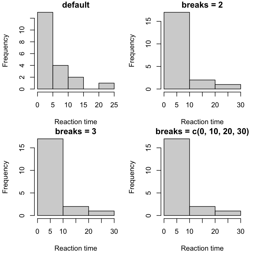
A criticism of box plots is the absence of most of the raw data (excluding outliers) and of more-detailed information about the distribution. Below we will create a few histograms and empirical density plots. Rather than attack all quantities at once, for now we will look at the distribution of a single value or “level” of the categorical variable or “factor” in the Card column.
Figure 3: Sample histograms generated with default settings and modified with the breaks option.
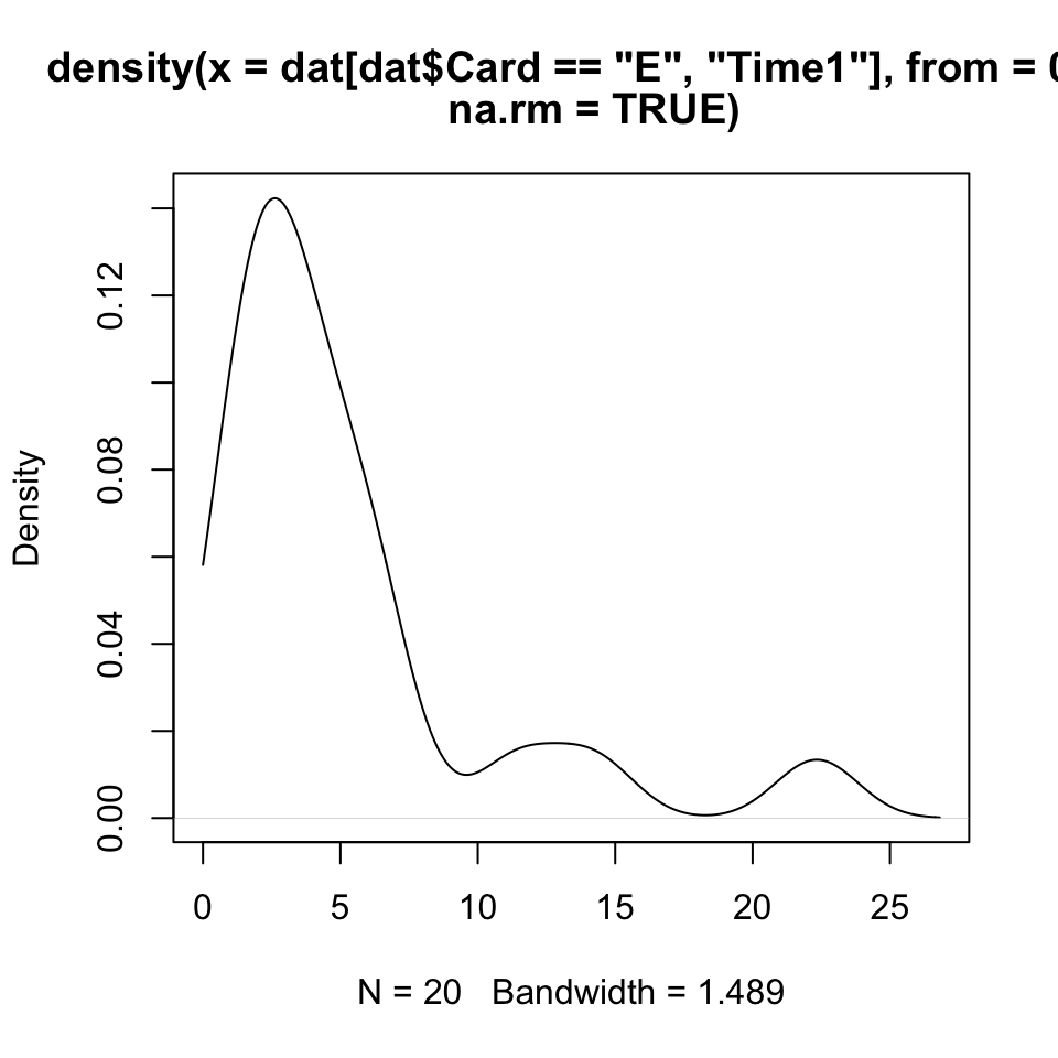
Layering the histograms for additional values of Card onto any one of the panels of Figure 3 gets messy. For just two values, it’s possible to use shading or hashing to emphasize and account for overlaps. Beyond that, it gets more difficult. In order to compare distributions more easily, it helps to represent the distribution by a curve or an empirical density function.
plot(density(dat[dat$Card =="E", "Time1"], from =0, na.rm =TRUE))
Figure 4: Sample empirical density function with the from option set to ensure negative values of the variable are excluded.
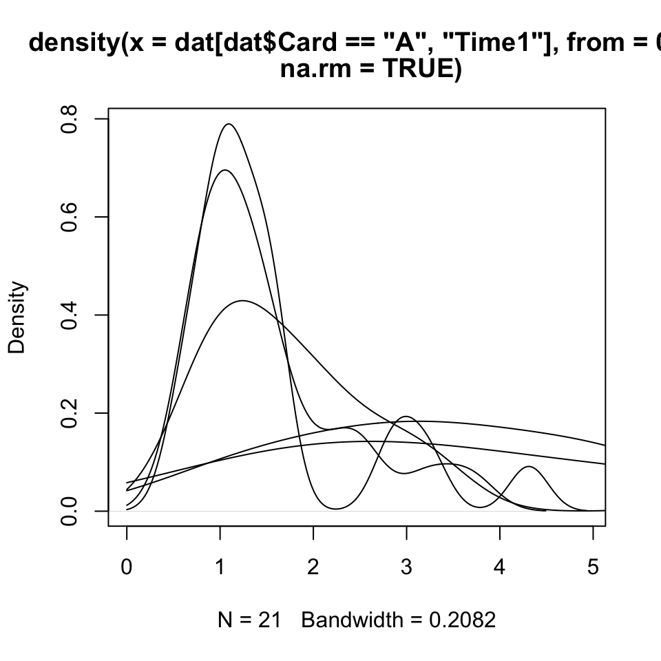
Let’s add layers that represent the computed densities for other card choices. The results shown in Figure 5 border on what is sometimes called a “spaghetti plot”. We definitely would not want to add additional curves to this - 5 to 6 seems to be about the upper limit on what we can generally pay attention to.
plot(density(dat[dat$Card =="A", "Time1"], from =0, na.rm =TRUE))for(card inc("B", "C", "D", "E")){lines(density(dat[dat$Card == card, "Time1"], from =0, na.rm =TRUE))}
Figure 5: Sample empirical density function with the from option set to ensure negative values of the variable are excluded.
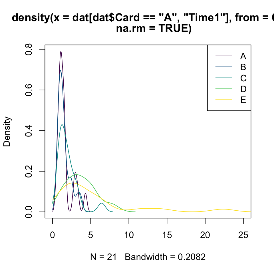
To have any chance interpreting this we need colors to know which curve is which card and a legend or other labeling. Labeling the curves directly would be nice, but each is so distinct, there doesn’t seem to be a nice way to “compute” locations for direct labeling. We will build a legend, the result of which is shown in Figure 6.
cols <-hcl.colors(5, palette ="viridis")cards <-c("B", "C", "D", "E")plot(density(dat[dat$Card =="A", "Time1"], from =0, na.rm =TRUE), xlim =c(0, 25), col = cols[1])for(card in1:4){lines(density(dat[dat$Card == cards[card], "Time1"], from =0, na.rm =TRUE), col = cols[card +1])}legend("topright", c("A", "B", "C", "D", "E"), col = cols, lty =1)
Figure 6: Empirical density functions of reaction time distribution for each card type.
We could have done that a bit more efficiently, but I didn’t want to keep changing things. Revisiting this myself, i probably would define cards <- c("A", "B", ...) and instead of dat$Card == "A", I would use ... == cards[1]. With this I could start the for() loop at 2 and not have to index by card + 1, using just card instead.
warpbreaks data
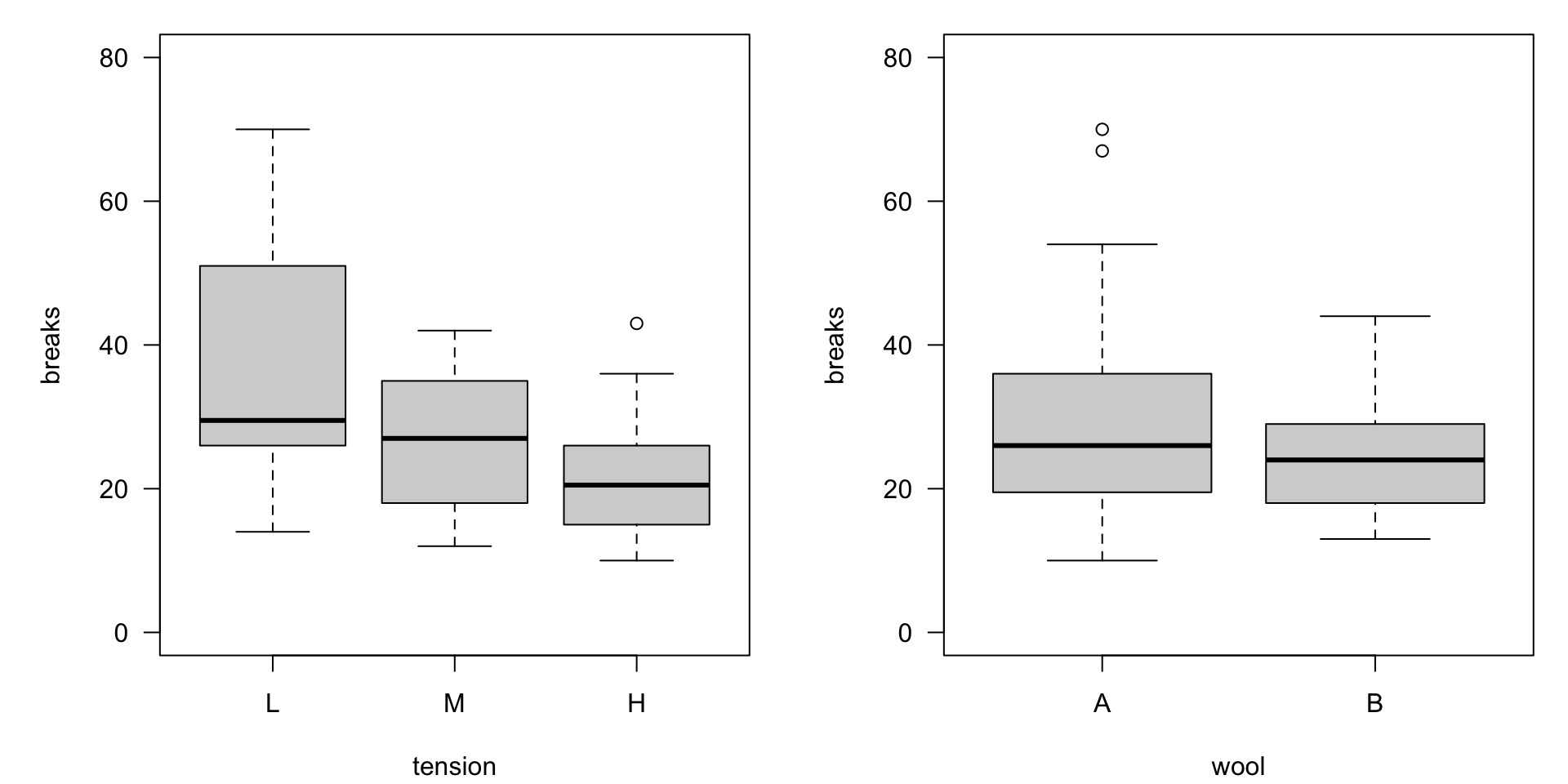
#?warpbreakspar(mfrow =c(1, 2), mar =c(4.1, 5.1, 1.1, 1.1))boxplot(breaks ~ tension, warpbreaks, las =1, ylim =c(0, 80))boxplot(breaks ~ wool, warpbreaks, las =1, ylim =c(0, 80))
Figure 7: Side-by-side box plots of the warpbreaks data.
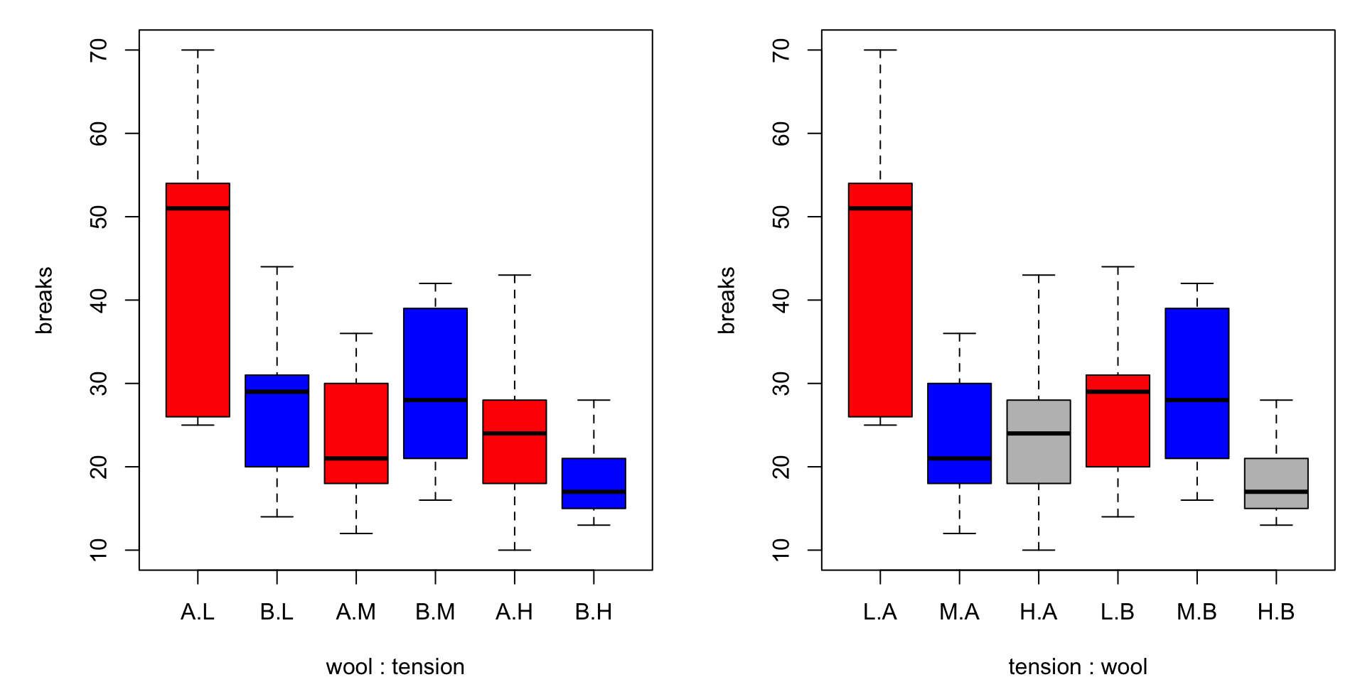
It could be intersting to explore the effect of tension on each wool type, or the reverse.
par(mfrow =c(1, 2), mar =c(4.1, 5.1, 1.1, 1.1))boxplot(breaks ~ wool*tension, warpbreaks, col =c("red", "blue"))boxplot(breaks ~ tension*wool, warpbreaks, col =c("red", "blue", "gray"))
Figure 8: Interaction between wool and tension and the interaction between tension and wool. There is a better way to say this, but quite honestly I’m tired.
We can get some diagnostic information out of a box plot; using plot = FALSE will “compute” the box plot and return information about its construction which will be useful for some of our annotation.
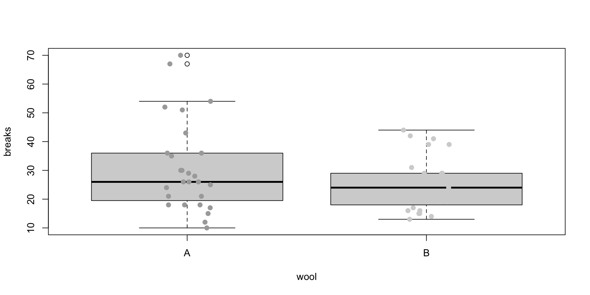
Looking at the contents of bxp gives a little insight into the construction of the graph. This information helps in the construction of Figure 9. Here the goal is to show raw data, somewhat like a “beeswarm” plot.
Figure 9: The boxplot for breaks by wool type, but with raw data shown.
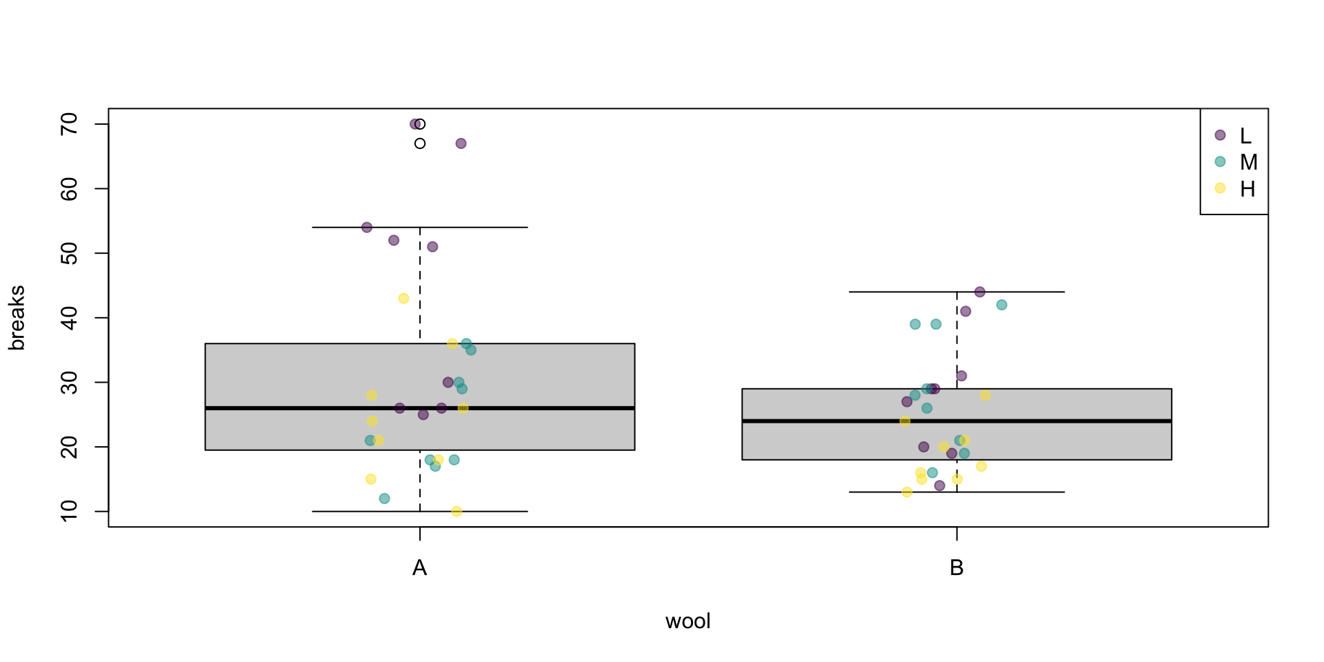
With just one clever change we can incorporate information about the level of tension. Shown in Figure 10, we define three colors from the viridis palette. Including alpha = 0.5 “softens” the color a bit by introducing transparency.Colors are selected by the numeric equivalent of the factor level. To understand this better, run warpbreaks[warpbreaks$wool == "A", "tension"])], then slowly work your way out with as.numeric(...) and then cols[...], as below.