n <- 8
plot(1:8, las = 1, pch = 19, col = 1:8, cex = 2)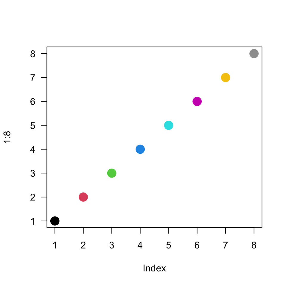
scales: colors and numbers
This page demonstrates a variety of color palette options. Many of these palettes do not align well with accessibility requirements – the goal of this page is largely to demonstrate those pitfalls.
In class we discussed the idea of color contrast and the importance of maintaining certain quantifiable levels of contrast in particular aspects of the figure. Specifically (WCAG 2.2), for text requires
standard defines an acceptable contrast ratio as at least 3:1 for large or bold text and icons and 4.5:1 for general reading text.
and for graphics:
shapes, icons, and large text relative to their background color meets a minimum ratio of 3:1.
So, we set out with the goal of understanding the properties of the defaults and of other common choices. It is important to note that we have not fully resolved this yet, in terms of adopting certain default palette choices on our own. There has been a big push in this direction lately, consequently lots of change in packages, tools, even theory. To he honest, I’m still personally working on some of this myself. This is an exciting time to pay attention to the field of data visualization. Among other things, it seems like people are almost always celebrating new color palettes, big and small, that achieve broad accessibility along with offering built-in style or some level of customization.
We begin the investigation with the fairly recent "R4" color palette, a less-saturated version of the previous, and shockingly named, "R3". This is shown in Figure 1. Notice that after the first 8 numeric color codes, colors "black" and "red" repeat.
n <- 8
plot(1:8, las = 1, pch = 19, col = 1:8, cex = 2)Next we can change the color palette to any one of a number of available palettes, the results of this are shown in Figure 2. This is neat an honestly not something I had ever tried previously, before recently stumbling onto it from within documentation while reading about the properties of color palettes for class. Essentially, in a plot ..., col = 1, ... is typically interchangeable, hence a nicely programmable shortcut, for ..., col = 'black", .... However, but setting a palette different from the default (now R4), you can redefine what colors the numbers are mapped to. This has some neat impacts. We will define a number n that will let us select the same number of colors as points, we could easily change both. Above you woul have to remember to carefully change both places that the 8 appears – if you are going to reuse the same number, and that number could reasonably change some day, define that number as a parameter within the code.
palette("R3")
n <- 10
plot(1:n, las = 1, pch = 19, col = 1:n, cex = 3)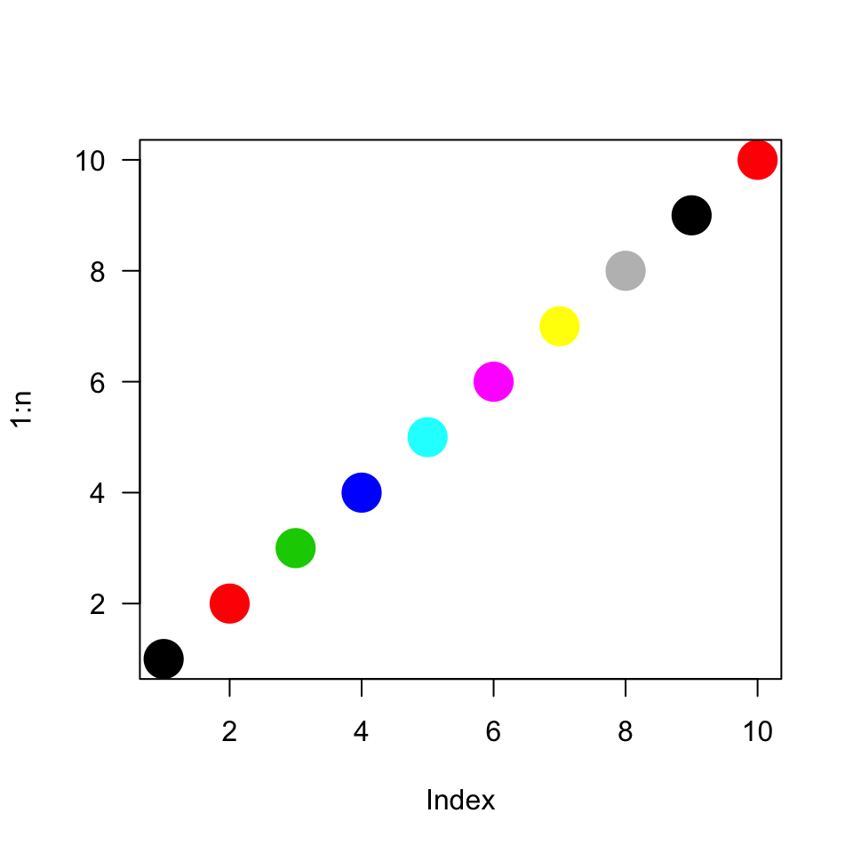
That was all fun enough, but let’s quickly combine these plots in Figure 3 so that the colors are more directly comparable.
palette("R3")
plot(1:n, las = 1, pch = 19, col = 1:n, cex = 3)
palette("R4")
par(new = TRUE)
points(1:n, las = 1, pch = 19, col = 1:n, cex = 1)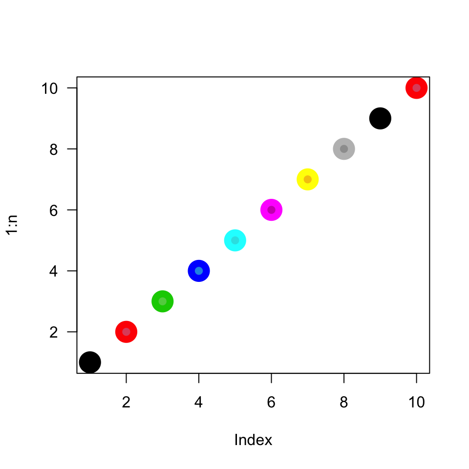
A small, relatively neat project would be to sample a graph like with the contrast checker. Not only could you check the contrast change between new and old versions of the palette1. Alternatively you could look at the pairwise contrasts between the first n colors of a particular palette.
Now we will start looking at recently popularized palettes or tools. Plots using "viridis" are widespread – it is now the default color scheme in matplotlib2. Spanning deep purple to gold, the colors render well in black-and-white. The yellow only has a contrast ratio of 1.3:1 with a white background, but even that is a slight improvement over "R3" yellow at 1.1:1. This is all illustrated in an otherwise minimalist plot in Figure 4
palette(hcl.colors(n, palette = "viridis"))
plot(1:n, las = 1, pch = 19, col = 1:n, cex = 3)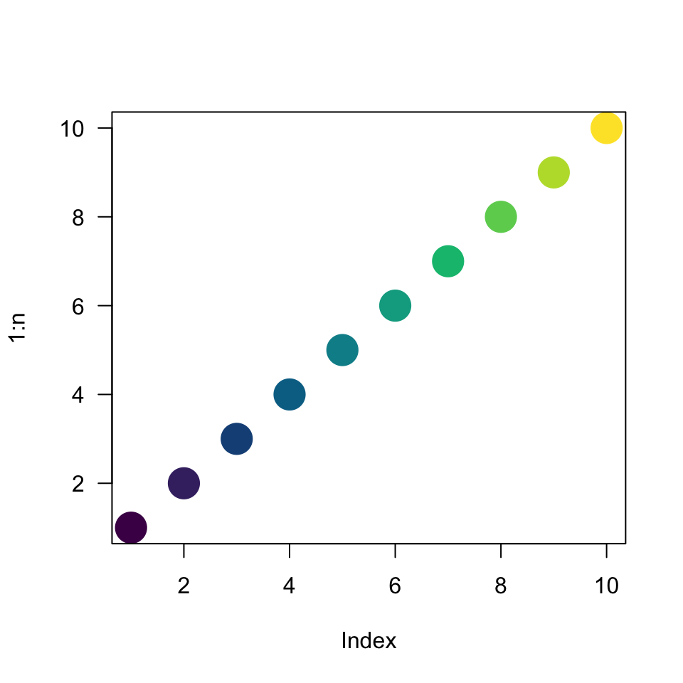
Next we looked at "rainbow()" which requires a number of colors "n" as well, and accepts a variety of other optional arguments. Unfortunately, "rainbow()" is “JET” which is a common, but problematic, palette that has poor properties in terms of perception, essentially it lacks a uniform change in “intensity”. Do you notice any colors in Figure 5 that appear more intense than those around them?
palette(rainbow(n))
plot(1:n, las = 1, pch = 19, col = 1:n, cex = 2)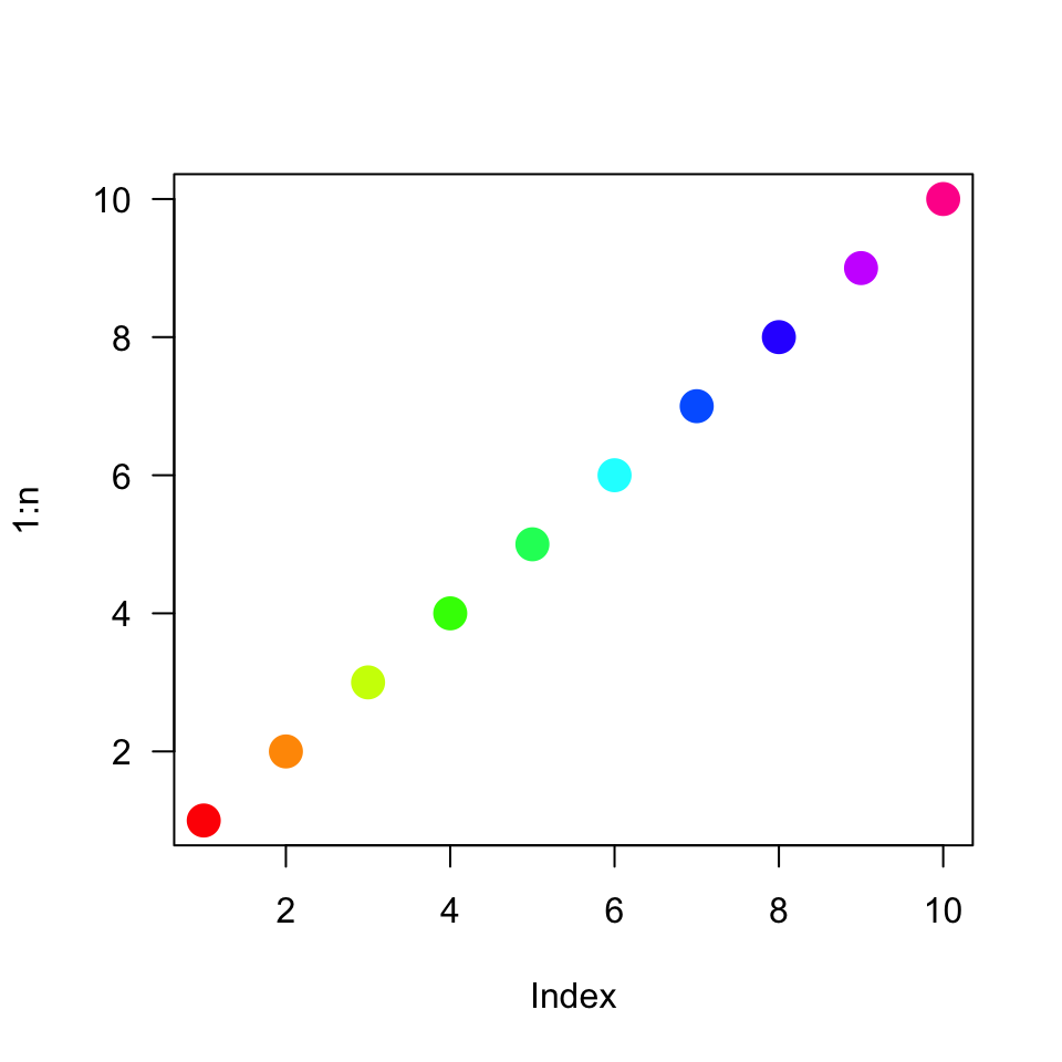
With the goal of reading some documentation (or possibly just following tooltip suggestions), we experiment with a few more palettes and potentially additional optional arguments. Contrast checking suggests that heat.colors() has a contrast ratio of 1.04:1 at the yellow end. Looking at Figure 6, the largest dot is quite hard to see.
You could use a non-white background, but that increase shade would then reduce contrast with colors in the middle. “Who cares about all of these palettes?” you might reasonably ask. Suppose you are trying to find a new color scheme for a new project or change of pace. Many blogs or help file documentation will reference these packages. You might notice the pale yellow dot is a terrible choice, or you might not. Knowing that there are issues with some available tools is helpful. It’s sort of like knowing you might someday hit your thumb with a hammer, but likely less painful.
palette(heat.colors(n))
plot(1:n, las = 1, pch = 19, col = 1:n, cex = 3)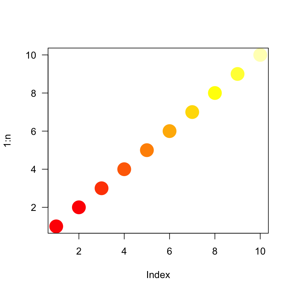
The terrain.colors() palette contains a pale gray with a very low contrast ratio to white (1.12:1). As the name implies this palette had often been used in mapping. Mapping capabilities have changed a lot and satellite or chloropleth (color-filled) maps seem much more common now. This is probably about as red-green vision-impaired unfriendly as it could be.
palette(terrain.colors(n))
plot(1:n, las = 1, pch = 19,  col = 1:n, cex = 2)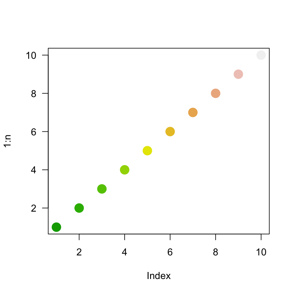
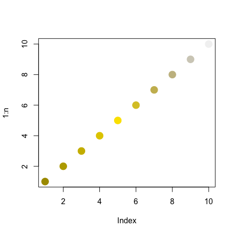
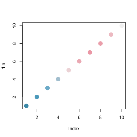
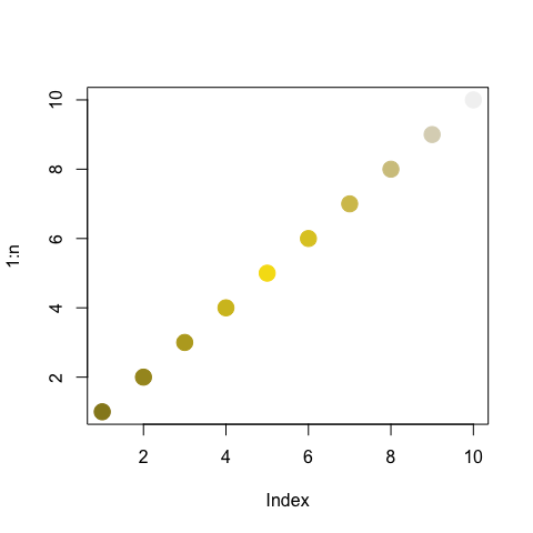
This seems like a time to experiment with simulated color vision changes. The program Fiji (which is just ImageJ) has a wide variety of applications from image processing and quantification (e.g., measuring or counting cells). Results of its color vision simulator are shown in Figure 8, Figure 9, Figure 10, Figure 8.
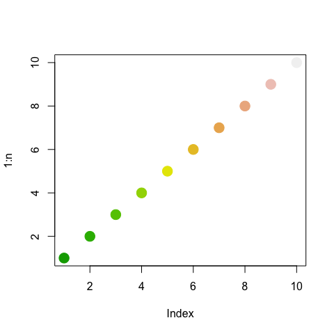
terrain.colors() palette.
Upon independent investigation "Tableau 10" was suggested as being interesting and pretty nice to look at. In fact, I have already painted walls a few of those colors. You can read more about it here. It feels like blue, red, green, purple, and brown are dark and the remaining colors that alternate are light.
palette(palette.colors(palette = "Tableau 10"))
plot(1:n, las = 1, pch = 19, col = 1:n, cex = 2)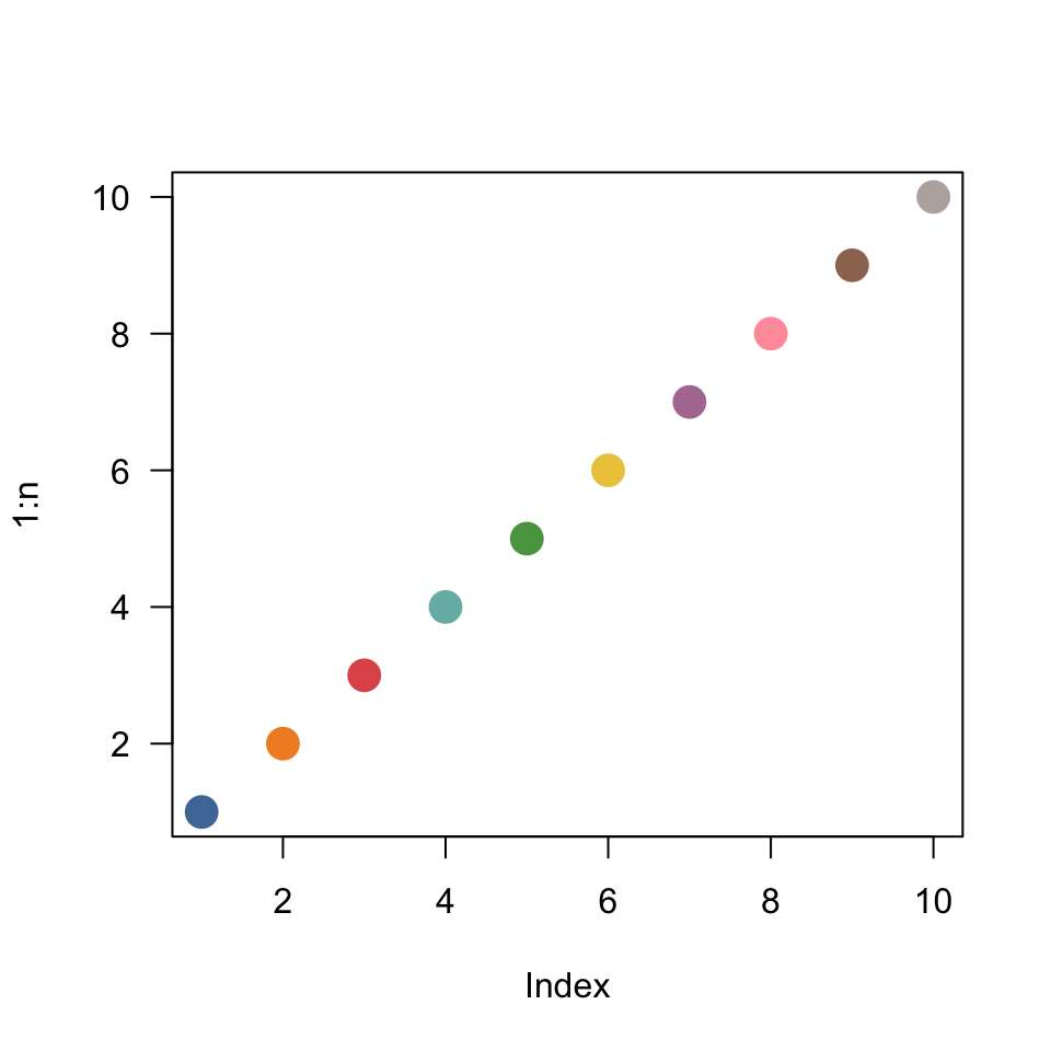
Lastly, we have "ag_sunset", which appears very similar to viridisLite::magma(10).
palette(hcl.colors(n, palette = "ag_sunset"))
plot(1:n, las = 1, pch = 19, col = 1:n, cex = 2)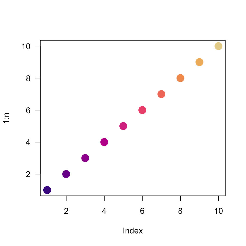
palette(hcl.colors(n, palette = "ag_sunset"))
n <- 10
plot(1:n, las = 1, pch = 19, col = 1:n, cex = 3)
palette(viridisLite::magma(n))
par(new = TRUE)
points(1:n, las = 1, pch = 19, col = 1:n, cex = 1)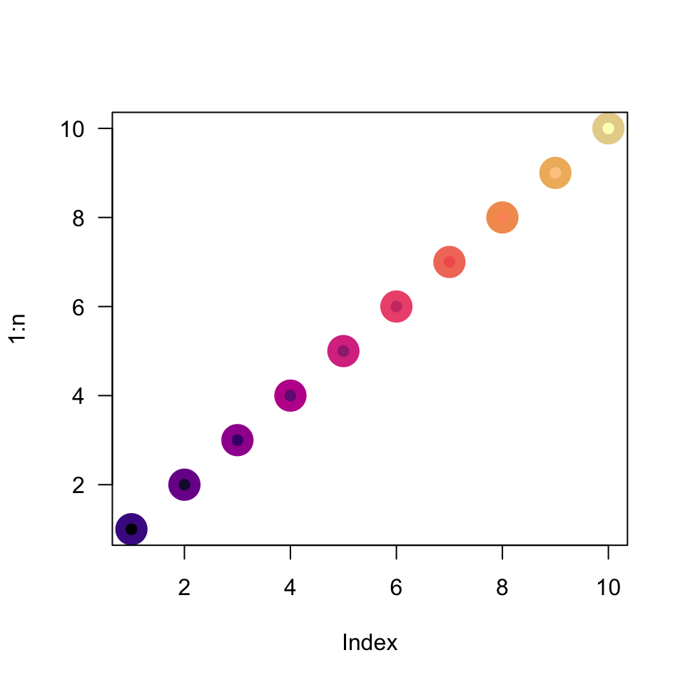
ag_sunset colors are larger circles, inset with smaller circles from the less-saturated magma palette.
Somewhat strangely everything above relates to how we map color on to ordered or unordered categories (e.g., it would be better to use "viridis" for the grade categories if forced to make a pie chart because the visual cues would sort of push you through the colors; whereas, there is no natural eading roder to teh colors from something like "Tableau 10" or rainbow()).
We might otherwise map color to number (e.g., on a surface or map, using "viridis" gold for high values and blue for low values). With that in mind, it makes sense to also think about how we map numbers to space using axes. This is a chance to explore other kinds of default behaviors and to really slow down and think about a graph. It is known that, even among groups of scientists, people struggle to make and interpret graphs on log scales or graphs of log-transformed data. It is worth pointing out, as you will see below, that log() is actually the natural logarithm commonly written ((x)), there is no “ln()” function in R! Below we make explicit use of log10() or log( , base = 10).
The rather simple plot in Figure 15 shows two relatively simple sets of points. It’s hard to know how even these simple data sets compare to one another – notice how we really only see differences among the last few points. Additionally, the vertical axis is mathematically correct, but leaves much room for improvement in terms of aesthetics and comfort.
x <- 0:20
plot(x, 2^x, las = 1)
points(x, 1.9^x, pch = 19)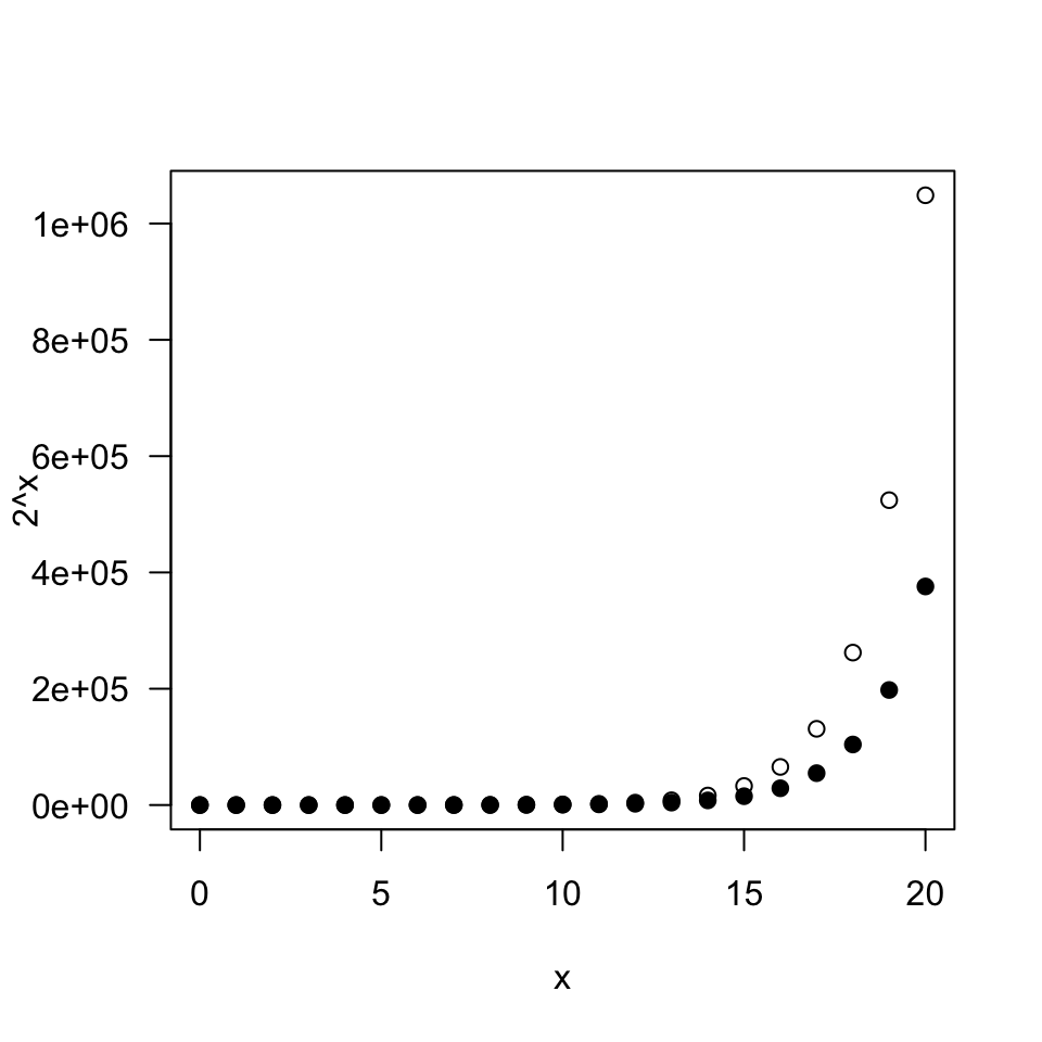
With one small optional argument to the original plot, in Figure 16, we can toggle on the log-vertical axis, commonly a “semilog” plot.
x <- 0:20
plot(x, 2^x, las = 1, log = 'y')
points(x, 1.9^x, pch = 19)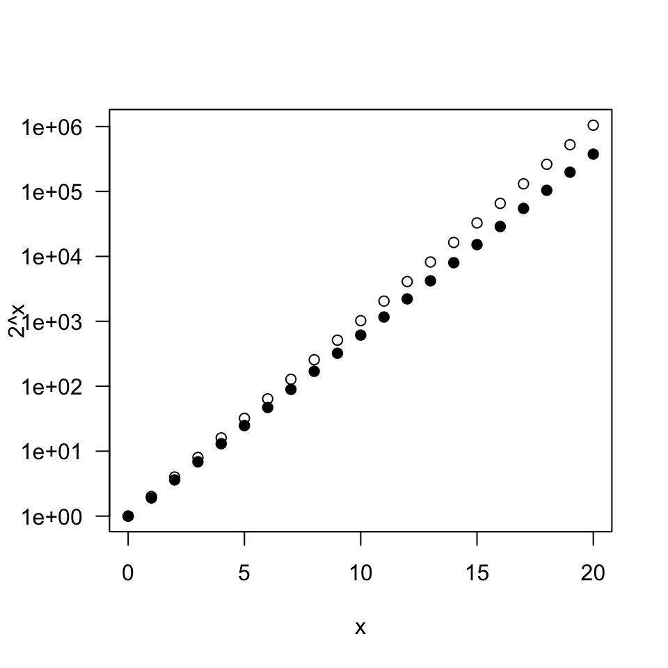
These decisions should not me made lightly with the needs and experience of the audience in mind, but sometimes log-transformed data is presented. Remember that ({10}(1000) = 3) means that (10^3 = 1000). Similarly, since (log{10}(180) ), we have (10^{2.26} ); in other words on a log scale, the data value (180) would be mapped to ()
x <- 0:20
plot(x, log10(2^x), las = 1)
points(x, log(1.9^x, base = 10), pch = 19)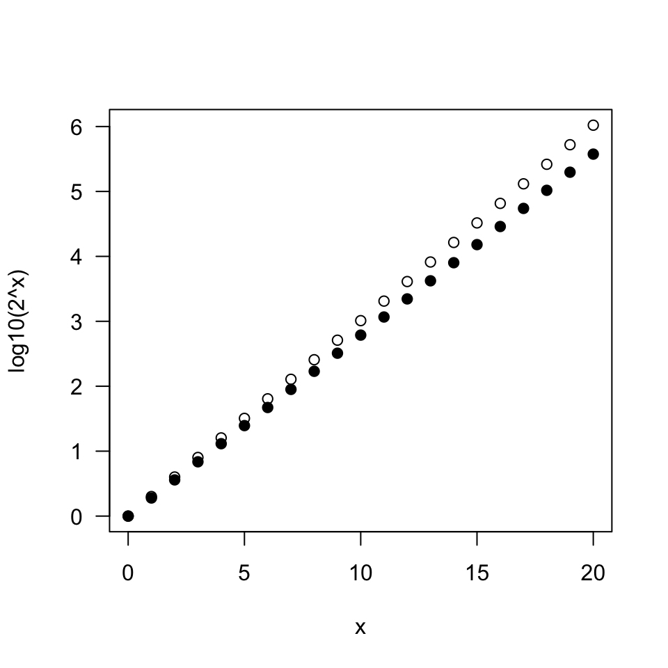
We will end by trying to incorporate data-driven recommendations (citation coming) that are meant to help a user better use and interpret our graph. For now we will stop with what is shown in Figure 18.
x <- 0:20
plot(x, log10(2^x), las = 1, axes = F, xlab = "", ylab = "")
axis(1)
axis(2, at = 0:6, labels = c(10^(0:4), "100K", "1M"), las = 1)
points(x, log(1.9^x, base = 10), pch = 19)
box()
mtext(expression(x), side = 1, line = 2.5)
mtext("Growth on\nlog scale", side = 3, at = 0, line = 0.5)